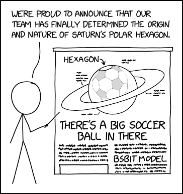
Well, it’s the end of another week. I’ll save the bigger posts I have planned for next week and instead end with this little astronomy/geometry gem from xkcd. It takes a look at Saturn’s polar storm that takes the shape of a hexagon, not a circle or anything else.
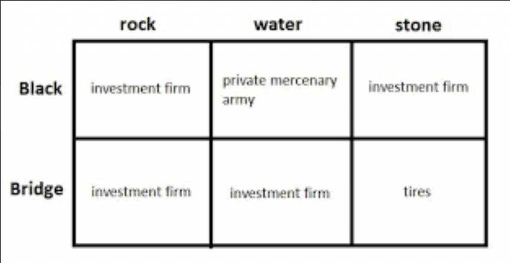
Last Thursday I wrote about the Wagner Group, an off-the-books semi-private army the Kremlin uses wage war where plausible deniability is desired. During that piece I mentioned Blackwater, one of the more infamous American private security contractor firms.
The day before I had seen a tweet, this tweet, where Samantha Stokes created a matrix to help people remember just what Blackwater did, as compared to Blackstone.
Bridgewater buying Bridgestone whose tires were shot out by Blackwater bought by Blackrock.
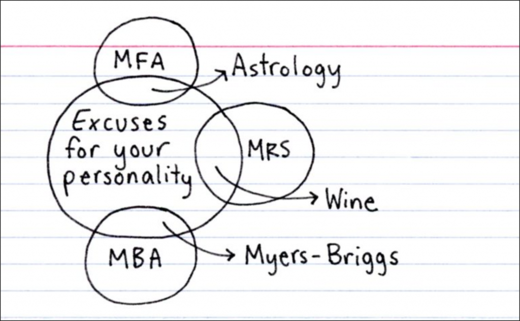
This Friday I want to highlight a graphic from xkcd that, strictly speaking, isn’t really data visualisation, but it does speak to that world because it’s about the underlying data.
And as with the best humour, there’s an element of truth in it.
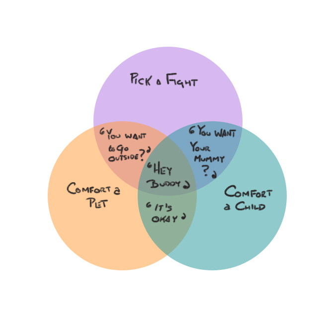
I did not create this, but rather I saw it on a friend’s social media feed. But I didn’t take a screenshot instead I sketched it my sketchbook. So if anybody knows who actually created this I’d like to get the credit correctly attributed.
Anyway, it was just a Venn diagram that made me laugh. And after yesterday’s Covid data update, I feel like we need to at least try to end the week on a laugh.
Last week we ended the week with a Friday post looking at Covid-19 cases. And they are not trending in the right direction, to put it mildly. Now I’m not sure I like the Covid post being on Friday, but it also doesn’t make sense on Mondays any longer given the lack of data updates from Virginia and Illinois at the weekend.
I figured this week we could at least begin with a lighthearted post to balance out last week’s ending. And we have a great piece from Indexed that tackles two of my favourite subjects, astronomy and history. She titled the piece brilliantly, “Regarding both astrophysics and and the popularity of guillotines”.
And hopefully later this week I will address one of those two topics a little more in depth. But for now, begin your week with mirth because I will update you all with the new Covid data later this week. Spoiler: it’s not getting any better.
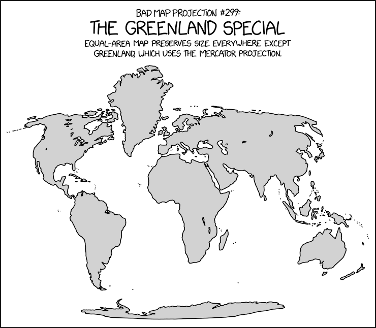
Happy Friday, all. Whether we’re talking melting ice sheets or attempted purchases by the Trump administration, the island of Greenland has often been in the news the last few years.
So here’s an appropriate map from xkcd comparing the size of Greenland to the rest of the world.
Some prime beachfront property in the north Atlantic looks pretty good to me…
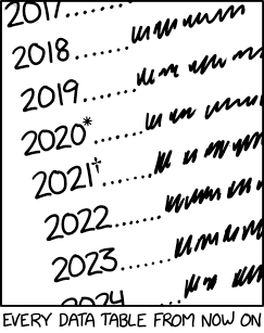
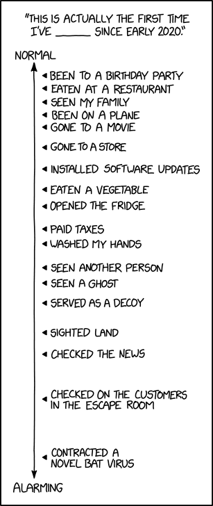
Happy Friday, all. Apologies for the lack of posting yesterday, I wasn’t feeling well and sitting in front of my computer typing stuff up wasn’t happening. But now the weekend is nearly upon us and to get in the mood I wanted to share this great dot plot from xkcd. It captures something I’ve definitely been thinking about.
Hopefully crossing most of these off in the next few weeks/months.
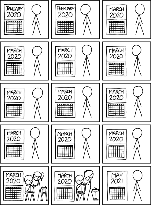
For example, on 3 March 2020, I had a friend over to my flat for drinks and to watch the Super Tuesday Democratic primary results come in. Tomorrow, if all goes according to plan, will be the first time I’ve had company over in 15 months.
In essence we have check boxes of the normal things we did in the before times and we’re just checking them off one by one until we can feel normal again.
Just please don’t contract a novel bat virus again.
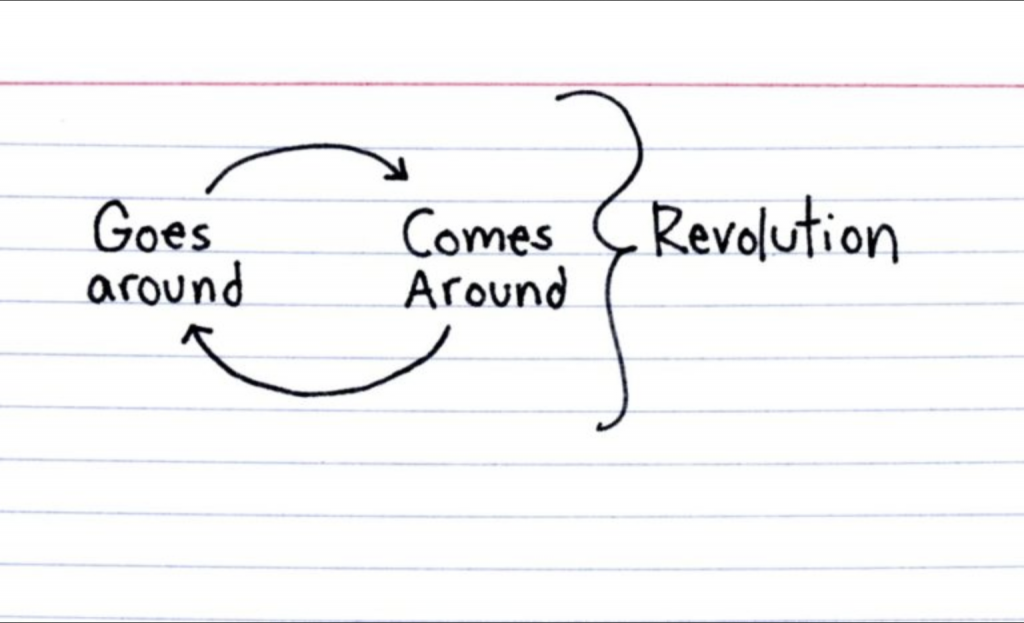
This one from Indexed made me literally laugh out loud. Probably because I, like many of you, know all three types she describes. And after a week, we can probably all use a laugh before starting the weekend.
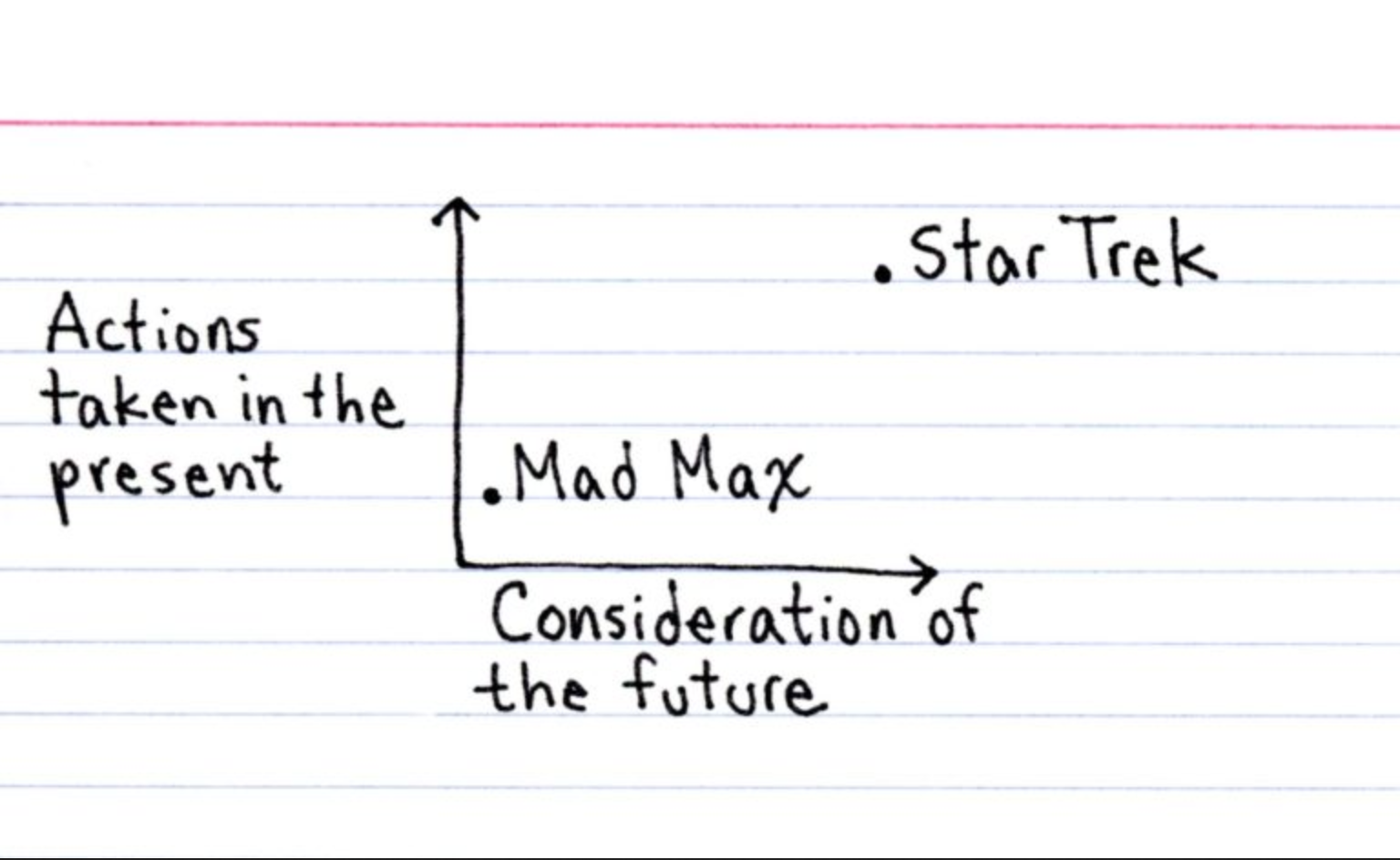
Those of my readers who know me well know that I’ve long been a fan of Star Trek. And so we’ve made it to the weekend. And over at Indexed earlier this month, well, we have a great science fiction comparison.
Here in the states we have a bank holiday Monday, so Star Trek is just a great way to start a holiday weekend.
The needs of the many outweigh the needs of the few. Or the one.
Two Fridays ago I received my second dose of the vaccine. In other words, I’m fully vaccinated and can resume doing…things. Anything. And so this piece from xkcd seemed an appropriate way to wrap up what has been a horrible, no good, terrible year.