
Can we all agree that it was just a long week?
Time to find some funny.
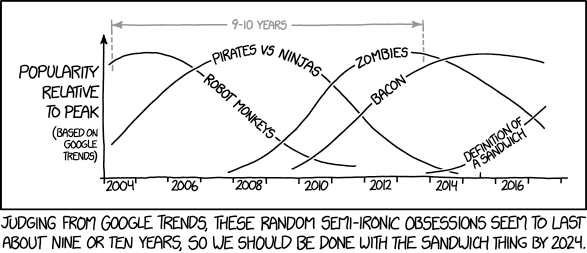
Credit for the piece goes to Randall Munroe.
Can we all agree that it was just a long week?
Time to find some funny.
Credit for the piece goes to Randall Munroe.
Yesterday Oscar Munoz, the CEO of United Airlines, testified to Congress about the airline industry. All of this just a few weeks after such a great week of press coverage. Of course, the last few weeks have also been a wee bit busy, so I was unable to post today’s piece. But with Munoz’s testimony it makes the perfect segue.
Today’s piece is a graphic article from the New York Times. It examines the state of the US airline industry. I use the term graphic article, because outside of headlines and subheads, it uses few words. Instead the point of the article is conveyed via charts. And what I found really nice is that, as the below photo shows, the article comprised most of the front page of the Business section.
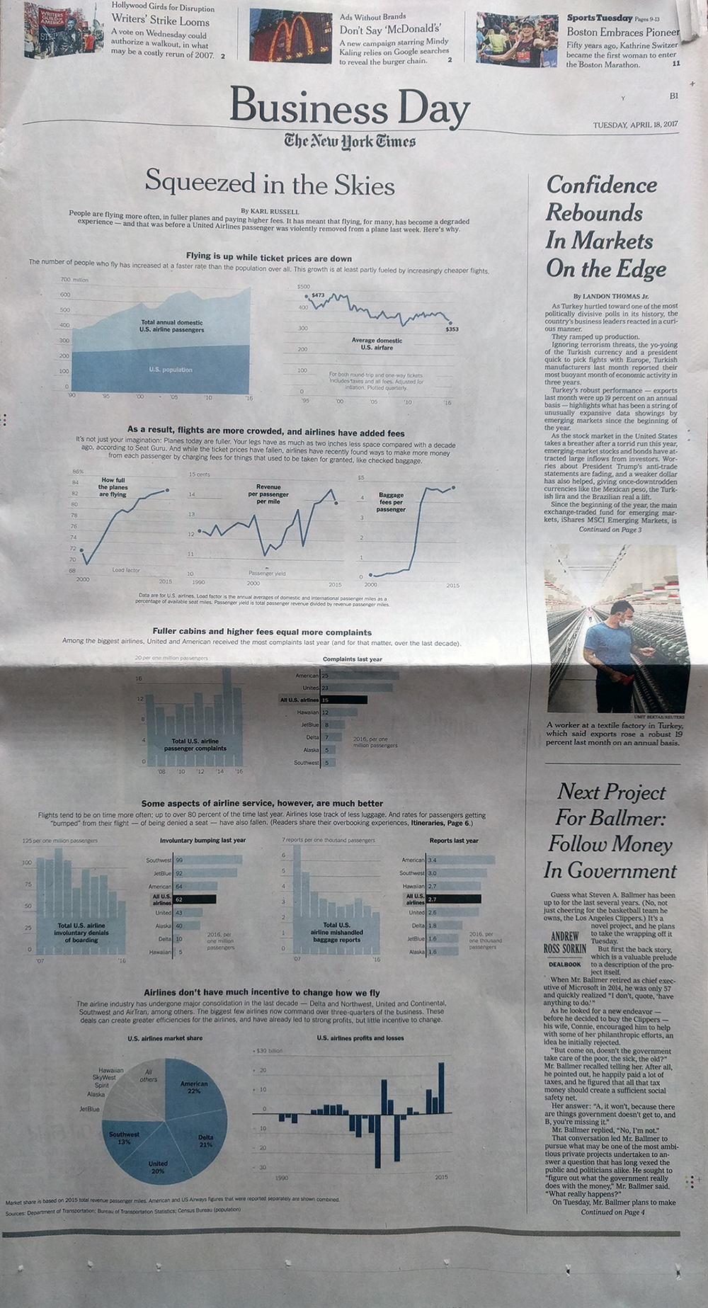
In terms of the structure, the piece did a nice job of giving breathing space around the various elements. This helps focus the reader’s attention on the charts and the data therein. Long headers and subheads break the vertical flow and create sentences or paragraphs that the charts prove.
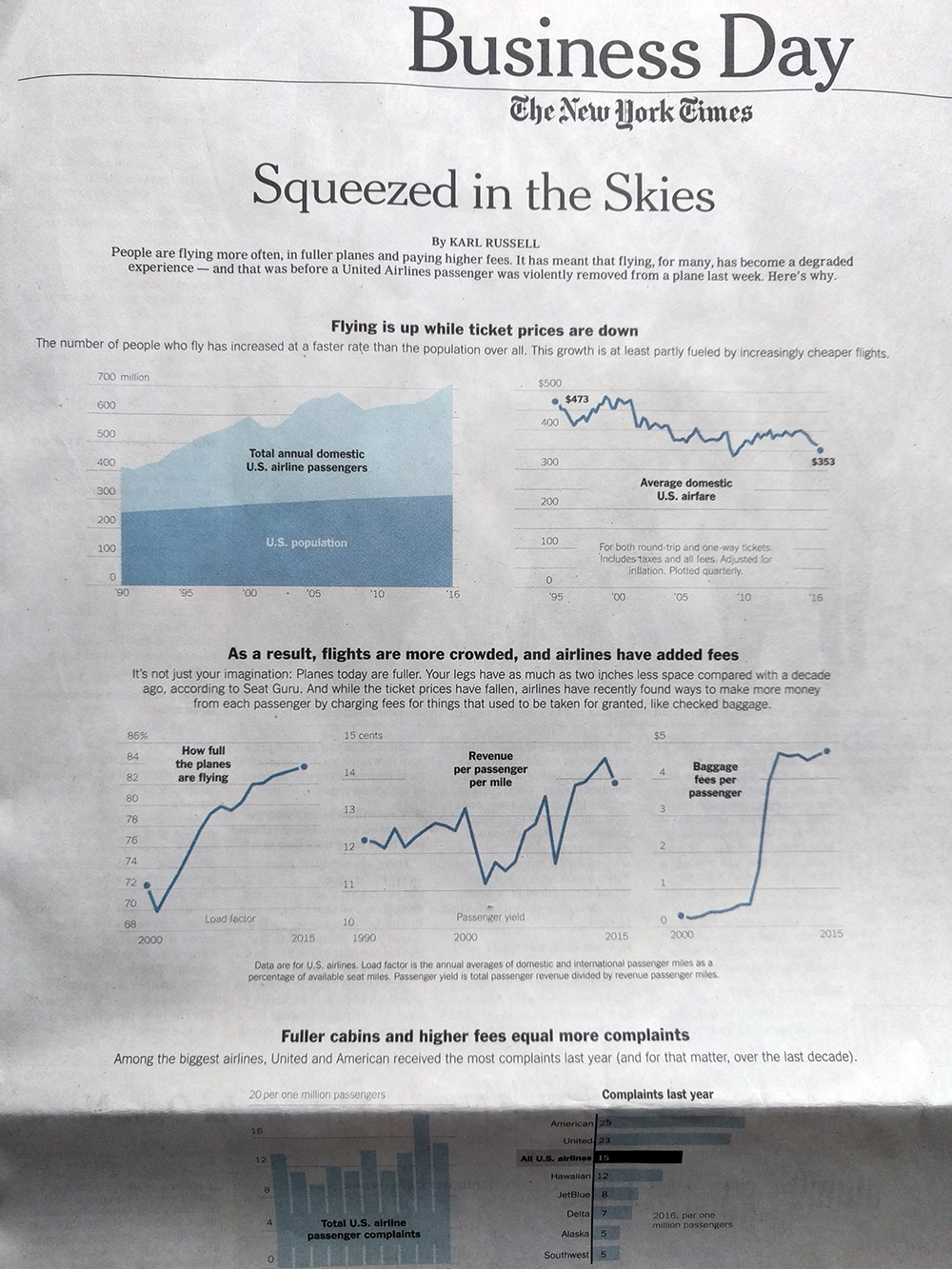
But then we get below the fold and low and behold we have a pie chart. I would have probably used a bar chart to show the market share. Especially with the top-three airlines so close. On the other hand, I can see the argument for the large, colour-filled visual. It does a nice job balancing the area charts at the opening and puts an emphatic period at the end of the piece.
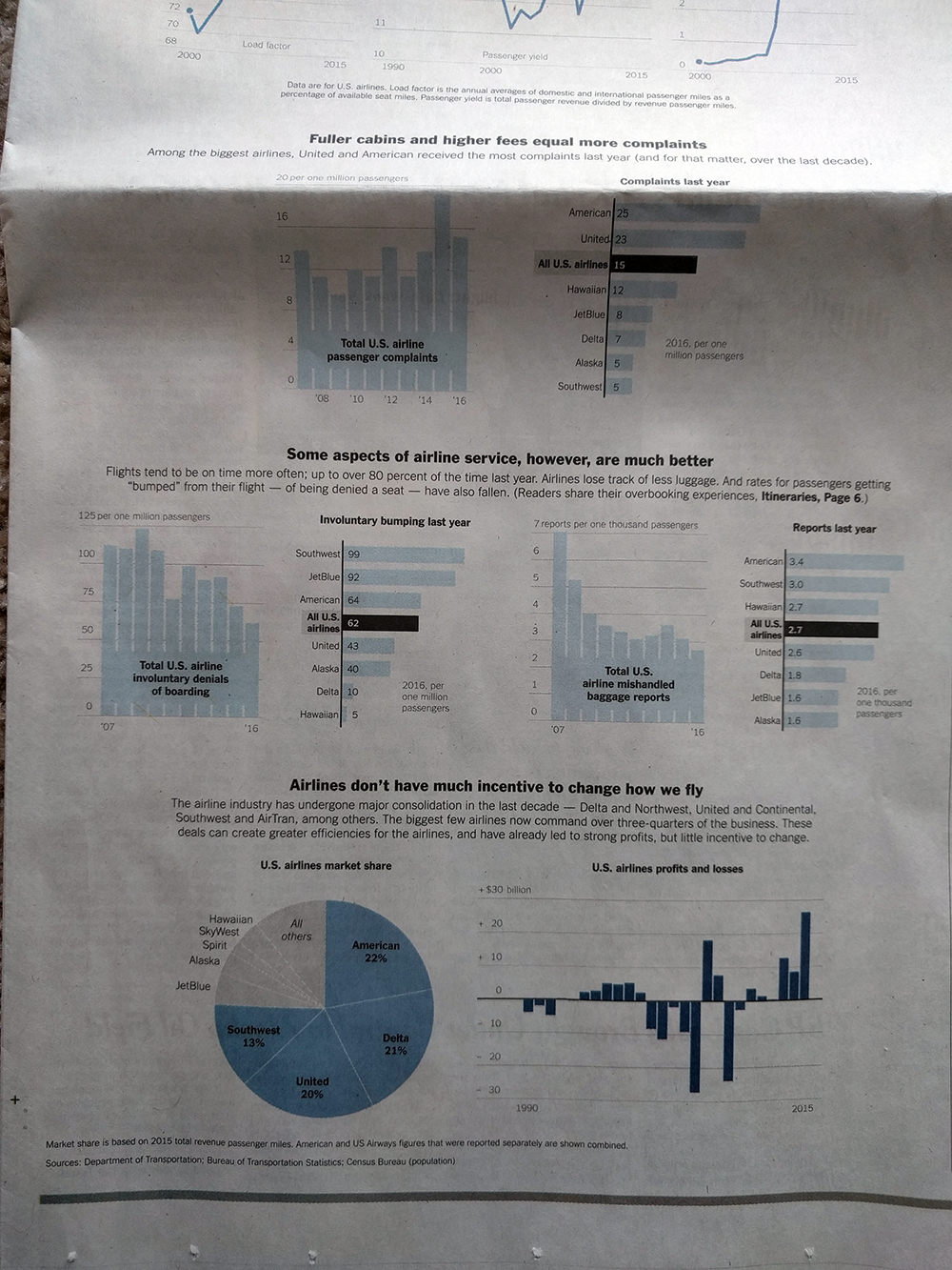
Overall, a solid piece and one that I am glad occupied a significant portion of the Business section front page.
Credit for the piece goes to Karl Russel.
I know I spent yesterday on the NFL Draft and that a lot of you would regard that as the lighthearted piece for the week. But trust me, here in Philly, it’s not so much. Just walk three blocks west from my flat.
So today we have another piece from This Is Indexed that looks at the creative process. And in my 8+ years of experience, this is nothing but true.
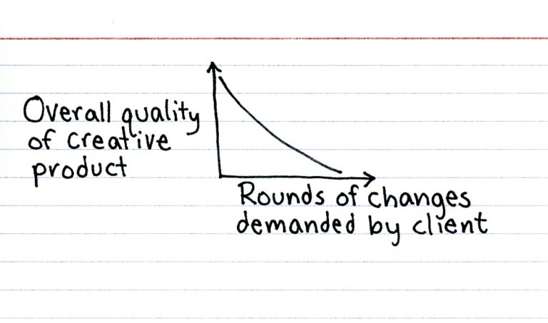
Credit for the piece goes to Jessica Hagy.
On Thursday President Trump announced that the Commerce Department would investigate imports of steel to the United States. This falls under the Buy American campaign pledge. A lot of talk in the media is, of course, about the threat of Chinese steel to the United States. So I dug into the Census Bureau’s website and found their data on steel imports.
Well, it turns out that steel imports were already down by over 5 million tons before Trump took office. And from 2015 to 2016, China fell sharply from 7th to 10th in a ranking of our import partners. In fact the only country from whom we import significant amounts of steel to see a rise over that period was Mexico.
But we’ll probably need their steel to build the wall to keep out their steel.
I visualised the data in this datagraphic. Enjoy. And look for a later post today in the usual, light-hearted vein.
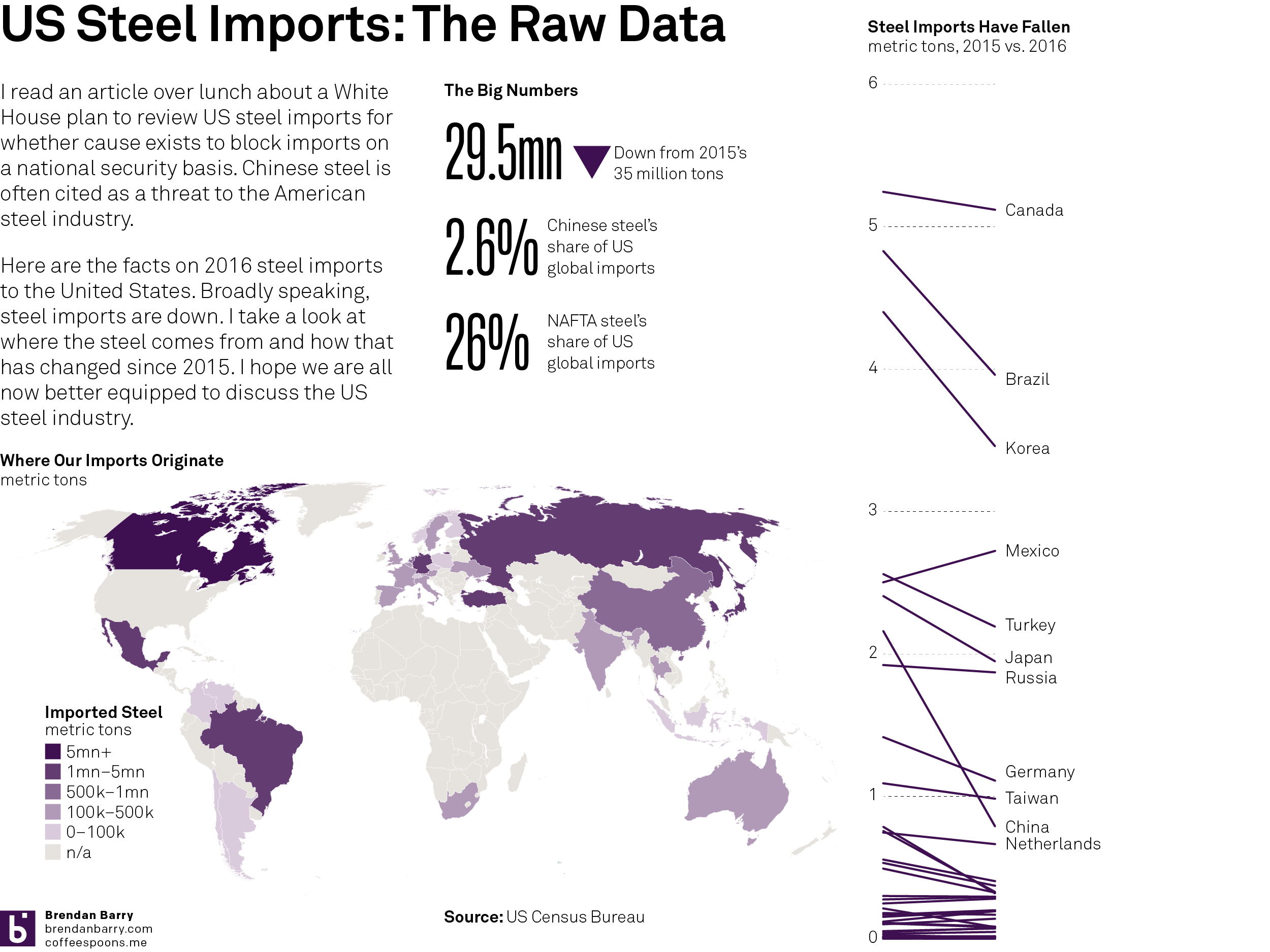
Credit for the data goes to the US Census Burea. The graphic is mine.
Of all the things I expected to cover this week, this was not one of them.
This is Fox New’s firing of Bill O’Reilly, their lead personality and heaviest hitter for the last 21 years, for accusations of sexual harassment both externally and internally. But up until yesterday afternoon, just how important was O’Reilly to Fox News? Well, as you might guess somebody covered just that question. The New York Times addressed the question in this online piece and uses a nice graphic to buttress their argument.
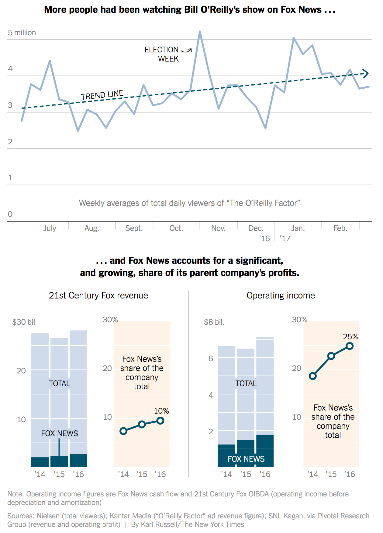
I like the use of the longer time horizon across the top of the graphic. But most important in it is the inclusion of the trend line. It helps the reader find the story amid the noise in the weekly numbers. The big decline towards the end of December looks important until one realises that it probably owes the drop to the Christmas holidays.
Then the bottom piece does something intriguing; it shows both the actuals and percentages side-by-side. Typically people love stacked bar charts—by this point you probably all know my personal reluctance to use them—and that would be that. But here the designer also opts to show the share as a separate data point beside the stacked bar charts.
I think the only thing missing from the piece is a bit more context. Is O’Reilly still the heaviest weight in the lineup? The top chart could have perhaps used some additional context of other shows over the last few months. For example, how does O’Reilly compare to Hannity?
Regardless, this piece does a fantastic job of showing the until-yesterday increasing importance of O’Reilly to Fox News and then Fox News’ importance to 21st Century Fox.
Credit for the piece goes to Karl Russell.
The British government is delivering its budget statement today. So as a teaser, the Guardian published this article with six charts to help understand where things are at. Chart-wise there is nothing radical or revolutionary here, but I have a soft spot for articles driven by data visualisation.
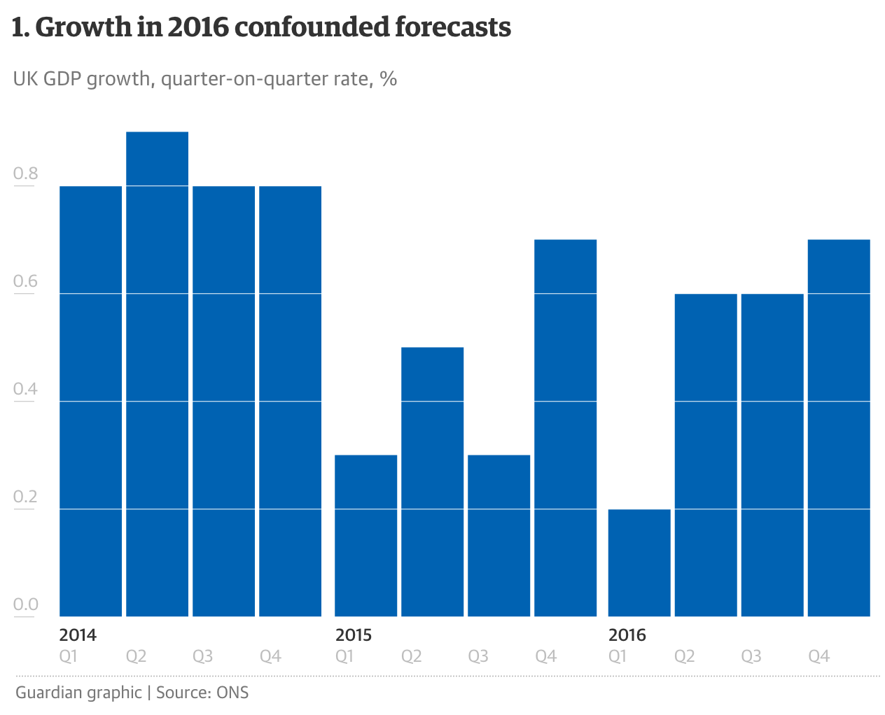
Credit for the piece goes to the Guardian graphics department.
Last Friday the Economist published this article about the odds of Marine Le Pen, the leader of France’s National Front party, winning the French presidential election in April. You may recall I focused on other things last Friday. So today we have this graphic.
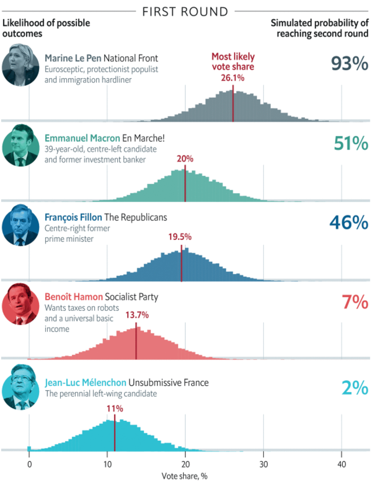
But this morning news broke about new allegations over fraudulent claims by Le Pen and the National Front. This, after claims of fraud against Fançois Fillon and some unhelpful remarks about Algeria from Emmanuel Macron, could be enough to make the French presidential election a complete toss up.
But for now we just wait to see if the rise of populist nationalism continues.
Credit for the piece goes to the Economist’s graphics department.
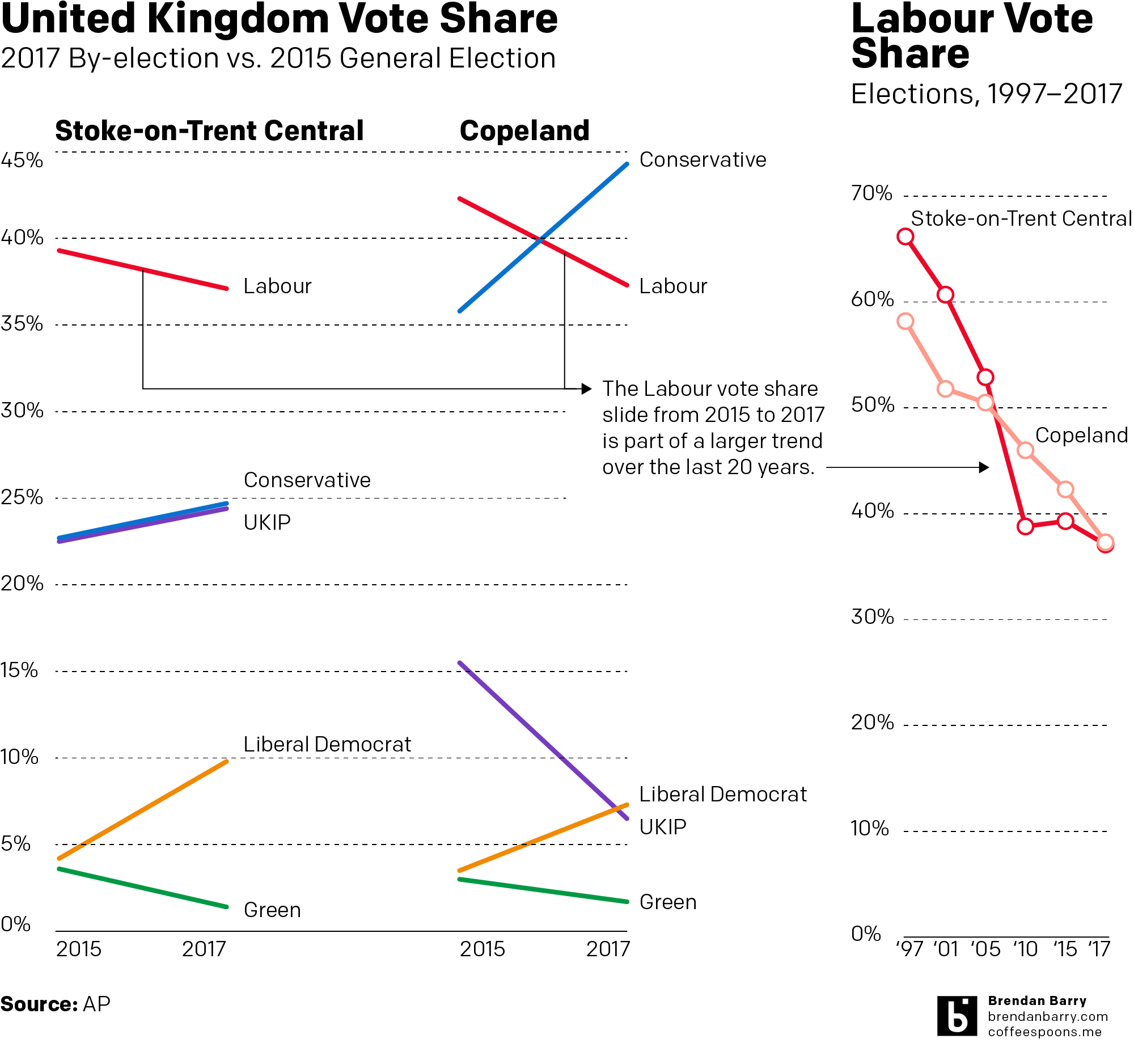
Labour’s collapse in Copeland in particular is comically bad, but this Friday indulge me in a non-comedic post. Instead, Thursday night we had the results for the by-elections in Stoke and Copeland, two long-held Labour Party constituencies.
Generally speaking in a by-election, the government of the UK can expect to see its vote share decrease if not altogether lose seats. Consequently Labour, as the party of the opposition, should have been expected to hold its two seats and increase its vote share.
Well Labour did win in Stoke, but its majority shrank by half. That’s not so good. And then in Copeland, the bottom sort of fell out. The charts I put together using AP data show what in Copeland was an historic win for the Tories. I could get into the hows and the whys, but you’re best off to go read a British politics site for that. But…something something Corbyn.
Well, so about that whole Michael Flynn furore thing I wrote about yesterday…. Time to add another name to the list of people to be appointed—as I said, that post isn’t confirmed, merely appointed.
But today is Valentine’s Day. So for all you lovebirds out there, here are some graphics showing how rate of marriages has declined in the United States.
It does a real nice job of presenting the overall national view, but then breaking that down into a state-by-state comparison over time, the small multiples shown below.
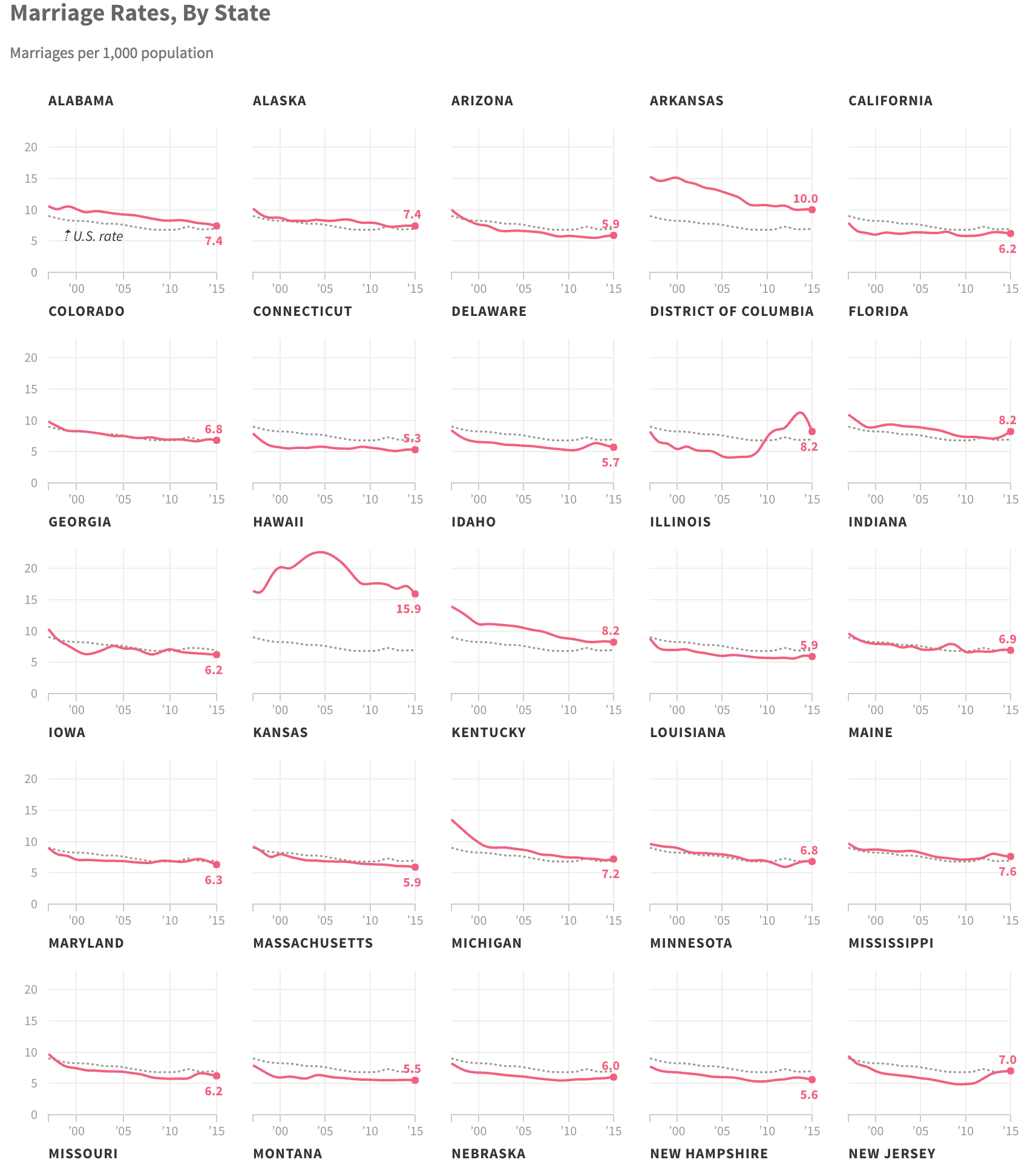
My critique would be the labelling. Note how the state label appears above the chart, but how when stacked in a row, the label for the state below appears far closer to the chart above. The first few times I looked at this, I saw the label for the chart as being below. And I was therefore curious why Kansas was so different from the rest of the plains state. It just goes to show you how important spacing and layout can be on the page.
Credit for the piece goes to Matt Stiles.
As most of you know, I am a huge baseball fan. I am not so much a huge fan of American football. But I will watch it from time to time. And as a Red Sox fan, that means I will root for the Patriots. So I guess you know how my Sunday night went.
But this past week, I started my subscription to the printed New York Times. And on Sunday I opened the sports section to this full-page graphic.
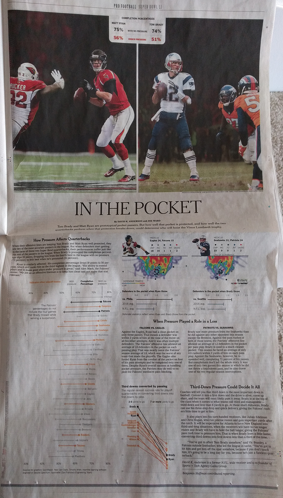
It comprises three graphics: The big one on the left looks at completions under pressure. Despite being a full-colour page, the designers only needed two colours to convey the message—black and orange.
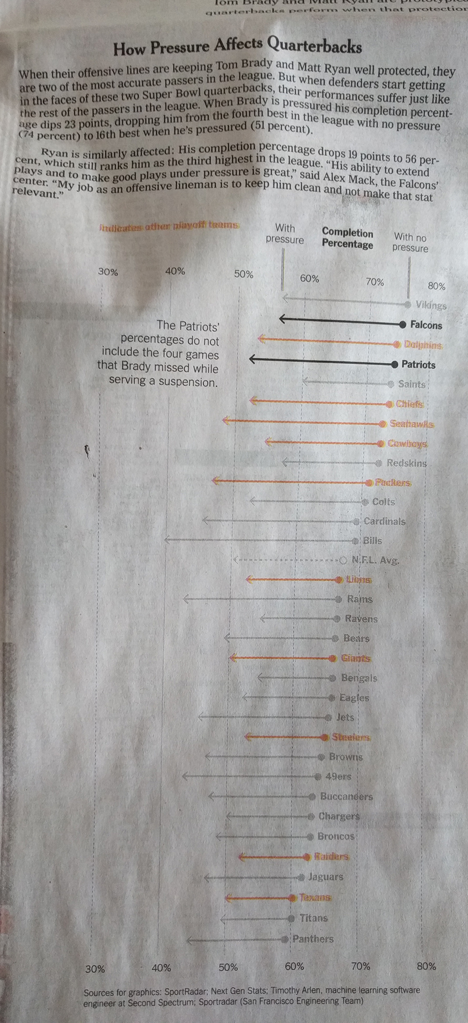
Similarly, on the right, the third-down graphic also uses a more limited palette. But, for the heat map it does make some sense to use a full colour palette.
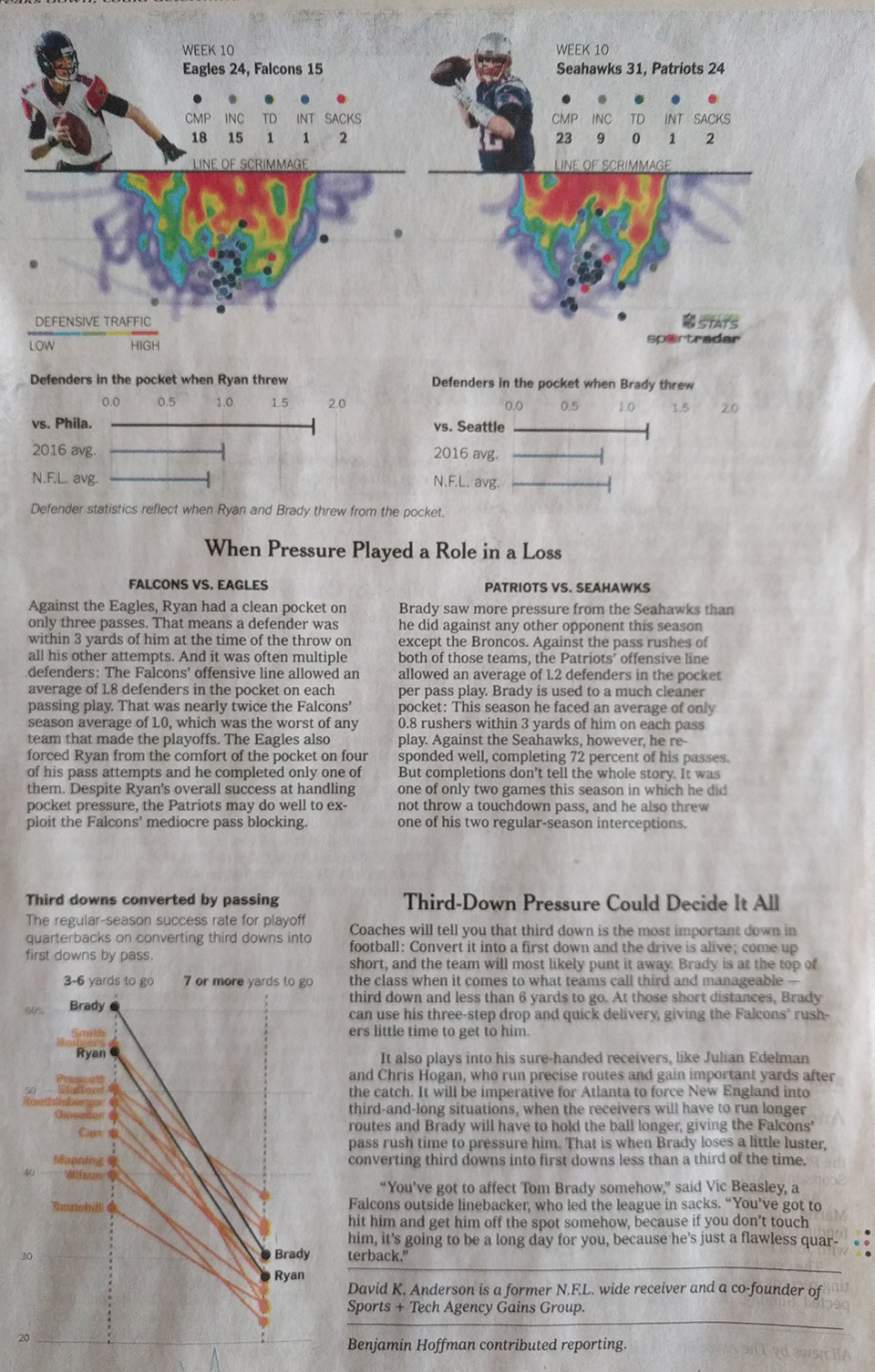
Overall, the page shows that colour, when thoughtfully restrained, makes not just the graphic clearer, but also good sense.
Credit fort he piece goes to David K. Anderson and Joe Ward.