A Look Back

Well, we are one day away now. And I’ve been saving this piece from the New York Times for today. They call it simply 2016 in Charts, but parts of it look further back while other parts try to look ahead to new policies. But all of it is well done.

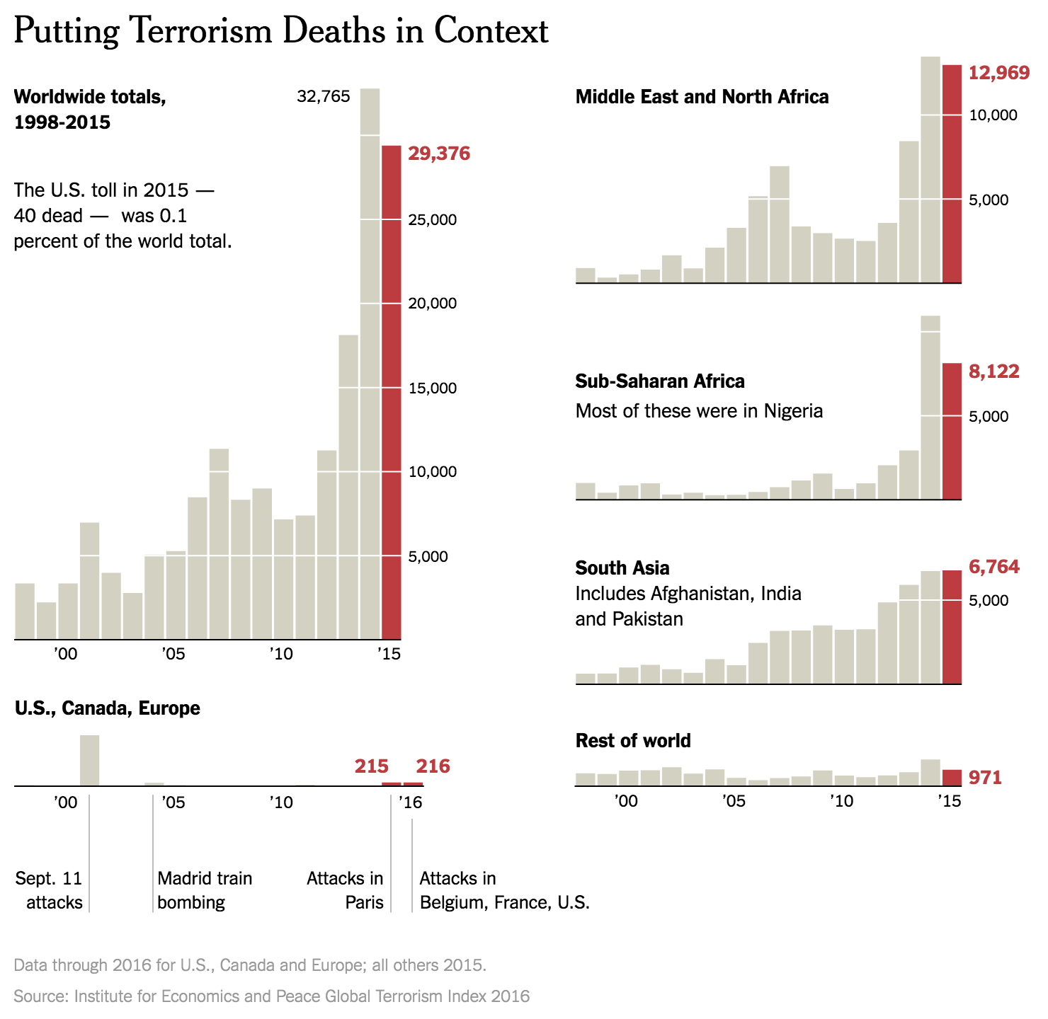
I chose the below set of bar charts depicting deaths by terrorism to show how well the designers paid attention to their content and its placement. Look how the scale for each chart matches up so that the total can fit neatly to the left, along with the totals for the United States, Canada, and the EU. What it goes to show you is best summarised by the author, whom I quote “those 63 [American] deaths, while tragic, are about the same as the number of Americans killed annually by lawn mowers.”

Deaths by terrorism
Deaths by terrorism

I propose a War on Lawn Mowers.

The rest of the piece goes on to talk about the economy—it’s doing well; healthcare—not perfect, but reasonably well; stock market—also well; proposed tax cuts—good for the already wealthy; proposed spending—bad for public debt; and other things.

The commonality is that the charts work really well for communicating the stories. And it does all through a simple, limited, and consistent palette.

But yeah, one day away now.

Credit for the piece goes to Steven Rattner.

The US Abortion Rate

If you have heard enough about the Affordable Care Act, well, you could be listening to the desire to defund Planned Parenthood. Because, while that organisation cannot use any federal funding for abortions, it is the nation’s largest provider of that service. So if you follow that logic, you must strip all federal funds from the organisation.

Yeah, it makes no sense. But whatever, those are part of the Republican plans. But, if you look at the data, abortion rates are now at the lowest level since Roe v. Wade in the 1970s.

The US abortion rate is at its lowest rate since Roe v. Wade

Mole hill, meet Mountain.

Credit for the piece goes to Katie Park.

How Did Obamacare Change Our Healthcare?

We are counting down the days until President Obama steps aside. And shortly thereafter his signature work, the Affordable Care Act, may be repealed. But looking back, what is the legacy of the first few years under Obamacare? Besides the obvious death panels, of course. Well FiveThirtyEight took a look. And in this graphic, we see simple line charts. But what I really like is the attention that went into the titling/labelling. The titles draw you down through the story, explaining just what you are looking at.

How have things changed?

Credit for the piece goes to the FiveThirtyEight graphics department.

Diversity in the 115th Congress

Well, we have arrived at 2017. We all know the big political story in the executive branch. But we also saw elections in the legislative branch. But how different will the 115th Congress look from the 114th? The Wall Street Journal took a look at that in an article.

Congressional diversity

The article’s graphic does a nice job showing the two different compositions. But if we are truly interested in the growth, we could use a line chart to better showcase the data. So what did I do last night? I made that chart. But as I was playing with the data I saw some numbers that stood out for me. So I compared the proportion of minorities in the original graphic to their proportion of the US national population, per Census Bureau data.

Redesigning the original graphic

The line charts, broken out into the House vs. the Senate and then into the two parties, do a really good job of showing how the growth is not equally distributed between the two parties. And the reverse of that is that it shows how one party has failed to diversify between the two congresses.

The 115th Congress might be more diverse than ever. But it has a long way to go.

Credit for the original piece goes to the Wall Street Journal graphics department.

The Federal Funds Rate

In my new role as data visualisation manager at the Philadelphia Federal Reserve, I am learning a lot about what the Fed does and how it does it. Needless to say, this piece from Bloomberg interested me as it displayed how the federal funds rate has changed over time.

How this potential hike cycle would compare to the two previous

What I really enjoy is how they colour-coded the two previous hiking cycles as well as what I think everyone presumes will be a new one. And those colours then move on down the piece into the dot plots. The dot plots show various potential factors in the decision-making process, and just how far off the current hiking cycle is from the two previous.

Credit for the piece goes to Chloe Whiteaker, Jeremy Scott Diamond, and Jeanna Smialek.

The US as an Energy Exporter

Several days ago OPEC, the Organisation of the Petroleum Exporting Countries, announced a cut in production to raise the price of oil. This was big news because Saudi Arabia and others had kept the price low in an attempt to undercut the nascent American shale oil and gas industry. Well…that didn’t work.

In this article from Bloomberg, you can see how the United States could be positioned to become an energy superpower. But, they also lay out the various snags and pitfalls that could dim that outlook. This map from the article details the destinations thus far of America’s natural gas, in liquefied state.

Where US liquefied natural gas (LNG) has been sent

Credit for the piece goes the Bloomberg graphics department.

Andy Murray

A changeup from the political coverage, here we have sportsball! And by sportsball I mean tennis, if you did not get that from today’s post title. Andy Murray won the ATP World Tour finals, and with it won the number one seed in tennis, displacing Novak Djokovic.

When Andy Murray surpassed Novak Djokovic

Nothing super fancy going on here, just a line chart. But, it does do a good job of showing how over the last year, the slow decline of Djokovic and the ascendance of Murray.

Credit for the piece goes to John Saeki.

Mexican Immigration

So following on from my Wednesday post, let’s take another look at the “problem” of Mexican immigration. Because as these graphics from the Pew Research Center show, it’s not really a problem these days.

The unauthorised population is down
We're seeing more leave than enter
We’re seeing more leave than enter

Instead, immigration is down.

Credit for the piece goes to the Pew Research Center graphics department.

Deportation of Immigrants

Donald Trump announced how he wants to deport 2–3 million undocumented immigrants that have criminal convictions or that belong to gangs. I read up on the issue at FiveThirtyEight and came across the following graphic from the US Immigration and Customs Enforcement (ICE).

The government's chart on deportations
The government’s chart on deportations

However, when I review the graphic, I found it difficult to understand the FiveThirtyEight article’s point that President Obama has lessened the focus on deportation, but those deported are those convicted of serious criminal offences. So I expanded the size of the y-axis and broke apart the stacked bar chart to show the convicted criminals vs. the non-criminal immigration violators. This graphic more clearly shows the dramatic falloff in deportations, and the emphasis on those with criminal convictions.

A general decline in deportations has also seen a focus on convicted criminals over non-criminal immigration violators

Credit for the original goes to the graphics department of the US Immigration and Customs Enforcement. The other one is mine.

Boston Beer Company

Boston Beer Company is the parent company of Sam Adams, which is definitely one of those beers I imbibe when I visit Boston. But, as one of the larger craft brewers in the United States, it finds itself under immense competition. This article from Bloomberg examines the situation the brewery finds itself in from a share price, growth, and revenue standpoint.

Small but high-margin

Credit for the piece goes to the Bloomberg graphics department.