Others’ Coverage of Amtrak 188

Tuesday I posted my late-night work on Amtrak No. 188’s derailment, (now with a few minor updates, including the speed information released this afternoon) so you could all get a sense of what happened yesterday. Of course, in the last 24 hours, we have seen a lot of news outlets covering the story.

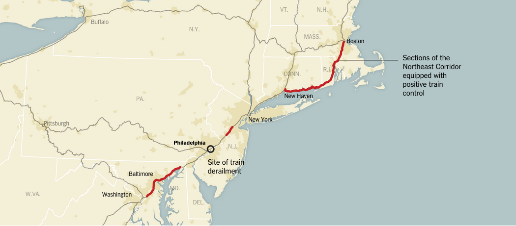
The New York Times has a nice piece mapping out the details of the accident. Of particular interest, they included a map showing the parts of the Northeast Corridor equipped with positive train control. That is a system designed to prevent trains from exceeding their speed limits.

Positive train control implemented on the Northeast Corridor

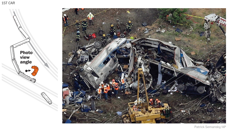
The Washington Post has two nice pieces. The first, below, incorporates both illustration to simplify the wreck site for the audience and then photographs to provide context of just how destroyed some of the train cars are, the first in particular.

Using both illustrations and photographs

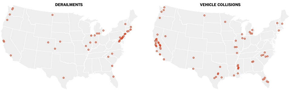
The Post, however, also has a supplemental piece that looks at Amtrak’s accidents over the last ten years. This is the most data-centric piece of all that we are looking at, but that is okay. Most of the story is not reliant on data, but rather illustrations and diagrams trying to piece everything together.

Comparison of derailments vs. vehicle collisions

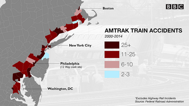
Lastly, the BBC has an article with several small graphics looking at US train risks. Spoiler, American trains, while safe, are far less safe than those in Europe and Asia. Here, though, the map looks at accidents along the Northeast Corridor.

Amtrak accidents
Amtrak accidents

Credit for the New York Times piece goes to Gregor Aisch, Larry Buchanan, Bill Marsh, Haeyoun Park, Sergio Peçanha, Julie Shaver, Joe Ward, and Karen Yourish.

Credit for the Washington Post piece on the derailment goes to Bonnie Berkowitz, Patterson Clark, Alberto Cuadra, Todd Lindeman, Denise Lu, Katie Park, and Gene Thorp.

Credit for the Washington Post piece on Amtrak accidents goes to Dan Keating and Lazaro Gamio.

The UK General Election

Well for those of you among my British audience, today is the big day. Can Malcolm Tucker save Nicola Murray from—wait, nope, that’s fictional British politics. But that doesn’t mean today’s results won’t be exciting. For those of you now from the UK, a majority of my readers, the UK is looking at what is called a hung parliament. In other words, nobody will win a majority of seats, which means that smaller parties will need to be included in a coalition government, a sort of fairly new—but also not really—development in British politics.

We could dive deep into all of these, but I have not the time. But, let’s start with the Guardian. They have a nice set of polling and prediction guesstimators. What is really nice, however, is the seat changing graphics. These show you where the gains and losses are predicted to originate.

The Guardian's predictions
The Guardian’s predictions

The BBC has a much less involved piece. This is the only thing I can find. However, the BBC will undoubtedly have interesting visuals during their live broadcast of the results. Jeremy Vine can always be counted on for weird presentational things. Oh, and they have the swingometer.

The BBC's poll tracker
The BBC’s poll tracker

Back in April we looked at the Fivethirtyeight predictions. And we might as well throw the latest screenshot up and compare that to the Guardian and the BBC.

Fivethirtyeight's updated predictions
Fivethirtyeight’s updated predictions

The Economist has a nice poll tracker with some simple controls for some simple filtering. But, these are, like the BBC’s, without an impact of number of seats. The Economist does, however, offer a separate build-your-own-majority calculator. 

What the Economist shows on their Election homepage

The New Statesmen has built a site dedicated to May 2015, and their current predictions are as follows below.

New Statesmen's predictions
New Statesmen’s predictions

The only drawback to all of these pieces is that I will be busy coaching softball tomorrow night. So I will be unable to watch the BBC’s coverage of election results. And that is most unfortunate, because British politics are far more fascinating than the bland and boring two-party politics of the United States.

Credit for the Guardian piece goes to Caelainn Barr, Helena Bengtssoni, Chia-Jung (Apple) C.Fardel, Seán Clarke, Cath Levett, Alberto Nardelli, and Carlo Zapponi.

Credit for the BBC piece goes to the BBC graphics department.

Credit for the Fivethirtyeight piece goes to Matthew Conien and Ritchie King.

Credit for the Economist piece goes to the Economist’s graphics department.

Credit for the New Statesmen piece goes to the May 2015 graphics team.

The Coal Century

The other day I misread a poster on the road that “The Cool Century” for “The Coal Century”. That is the origin of today’s title. The origin of today’s piece, however, is Bloomberg, which looked at the impact of some new environmental regulations on the coal industry vis-a-vis dozens of coal power plants.

Coal plants
Coal plants

Basically, you have a map with plant size indicated by the dot size, and the type of plant by the colour of the dot. The line chart to the right shows total coal capacity. Overall, it’s a nice, clear, concise graphic. Two buttons give the user immediate access to the story: the pre-regulated environment—see what I did there?—and then then post-regulated one.

Credit for the piece goes to Eric Roston and Blacki Migliozzi.

America’s Long History with Flip-flopping

Today the Supreme Court takes up gay marriage. Again. This is, you know, after they decided two years ago that the federal government has to recognise gay marriages when performed in states where it is legal. Anyway, last week, Bloomberg Business looked at the United States preference for changing its mind through a nice series of charts.

How interracial marriage changed in the US

They took six key issues, including interracial marriage shown above, and looked at how the position shifted over time. They identified the basic trend as being early adopter states followed by rapid acceptance to a critical mass, at which time the federal government stepped in, e.g. via the Supreme Court.

Credit for the piece goes to Alex Tribou and Keith Collins.

Sex, Drugs, and Rock Oil

North Dakota’s economy has been booming because of shale oil. Most of that economic growth has been centred on what was the small city of Williston, North Dakota. Economic growth often leads to population growth, however, and that can at times lead to growth in less than wholesome economic activities. The National Journal took a look at the population growth in the area and what has been happening concurrently in a few metrics of the less wholesome sectors of the economy, i.e. drugs and prostitution. Turns out, they are both up.

Population growth in North Dakota

Credit for the piece goes to Clare Foran and Stephanie Stamm.

It’s Melting! It’s Melting!

Spring has finally arrived. And that means that far to your humble author’s north, the sea ice in the Arctic is beginning to recede from its annual maximum coverage. However, this year’s coverage was the smallest since satellite records began in 1979. The New York Times covers the story in a nice article with two big data pieces. The first is a really nice map—not shown—that looks at this year’s coverage compared to average extents.

The really nice part, however, is a line chart of historical ice coverage from 1979 through to the current date. While the piece is not interactive, the annotations in the graphic do a nice job explaining the different lines and outliers. Overall, a solid piece.

Annual cycle of Arctic ice coverage

Credit for the piece goes to Derek Watkins.

Germanwings Flight 4U 9525

Yesterday an Airbus A320 operated by Germanwings, a subsidiary of Lufthansa, crashed in the French Alps with no survivors. This morning, I am showing the two best graphics I have come across thus far attempting to explain just what happened.

The first is from the New York Times. In a series of maps, it points out through satellite photography the roughness of the terrain and therefore the difficulty likely to be experienced by recovery crews. The final line chart plots the altitude of the flight, which fell from a cruising altitude of 38,000 feet to just over 6,000 feet in eight minutes. Overall, especially given the limited amount of information that we currently possess, not a bad piece.

The New York Times' explainer map
The New York Times’ explainer map

The second comes to us from the Washington Post. What I enjoy about this piece is that it combines the altitude chart with the map. This gives a bit context to the fact that despite being still 6,000 feet above sea level, the aircraft was in fact flying into the high mountains of the Alps.

The Washington Post's explainer map
The Washington Post’s explainer map

Credit for the New York Times piece goes to the New York Times graphics department. And credit for the Washington Post piece goes to Gene Thorp and Richard Johnson.

Lee Kuan Yew Built Modern Singapore

Lee Kuan Yew died this weekend. He is lately responsible for designing and implementing the policies that transformed Singapore from a poor fishing village to a commercial hub. The transformation came at a price of course. Singapore enjoys limited free speech and the country is effectively a one-party state, with the one party now controlled by Lee Kuan Yew’s son. Regardless of the faults, the transformation itself is remarkable. And the Economist put together a timeline to showcase that.

The Life of Lee Kuan Yew and Singapore's development
The Life of Lee Kuan Yew and Singapore’s development

Credit for the piece goes to the Economist’s graphics department.

Boston’s Snowy 2015

Boston has finally had it. And by it I mean the snowfall that broke the record. And by record I mean the record for the most snowfall in a year. Well, at least since they started recording it in 1872. The Washington Post has a nice chart placing the season not just in context, but also showing how quickly the snow fell. Most of the snow has fallen only from 25 January onward. And winter is not yet over.

DC is puny compared to  Boston

Credit for the piece goes to Kevin Uhrmacher.

Presidents Day Popularity Contests

Yesterday was Presidents Day and I had the day off. So today’s post is a bit late, but it still works. Pew Research Centre pulled together data they had on presidential popularity from Eisenhower to Obama. The data point was job approval.

There has been a widening polarity gap

Credit for the piece goes to the graphics department of the Pew Research Centre.