
Today’s piece is an attempt by Alex Bresler to update a chart originally made by the New York Times over ten years ago.
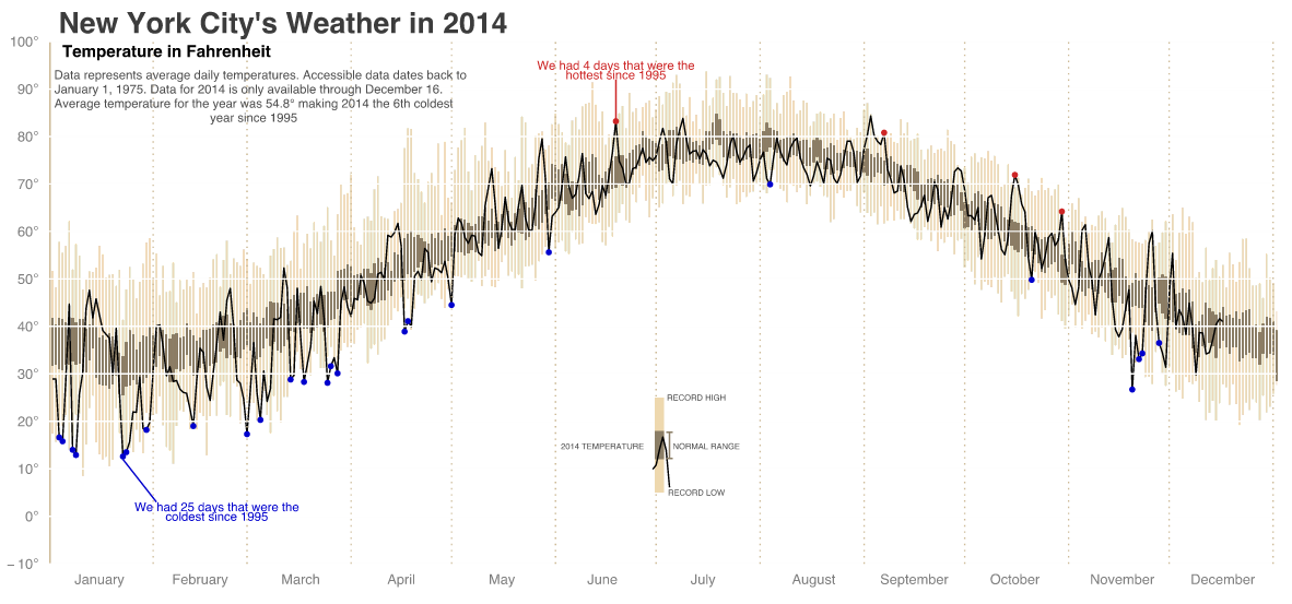
Credit for the piece goes to Alex Bresler.
Today’s piece is an attempt by Alex Bresler to update a chart originally made by the New York Times over ten years ago.
Credit for the piece goes to Alex Bresler.
On New Year’s Eve, well technically in the wee hours of New Year’s Day, the group with which I was spending the holiday broke out Settlers of Catan. We played that game—and drank a few bottles of champagne—until 04.00. My experience of playing the game—not necessarily the part about being inebriated on New Year’s Eve—bears out the increasing popularity of board games. This article from FiveThirtyEight seeks to understand what makes particular board games popular. And, because I am mentioning it on this blog, it has a few charts worth noting.
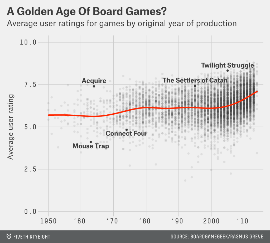
Credit for the piece goes to Rasmus Greve.
I remember the internet from some of the earlier days. So when the Washington Post published this chart in a piece looking at the history of the popular sites on the Internet, well I felt old. Remember Geocities? Looking at this chart, how many of the old web companies can you recall? Does that make you feel old?
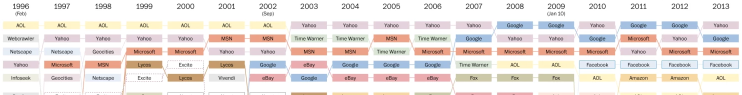
Credit for the piece goes to Philip Bump.
Today’s piece comes via a colleague. It is an article about hit-and-run cycling accidents in and around Los Angeles. The data visualisation in the article is not entirely complex—we are talking only about line charts and bar charts—but they support the arguments and statements in the article. And in that sense they are doing their job.
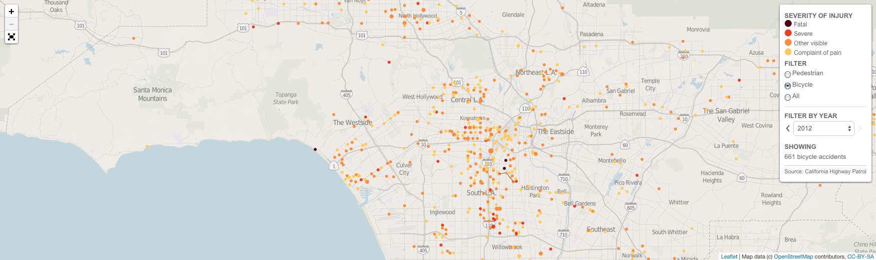
Credit for the piece goes to Armand Emamdjomeh, Laura J. Nelson, and Joseph Serna.
This is an old map that saw the light of day a while back. Featured on Vox, the map supports the notion that some white people are whiter than other white people. The map explores immigrant populations. Using a map for spatial arrangement of integrated components, the data looks at immigrants’ ethnic origins, their workforce breakdown, and their recent growth.
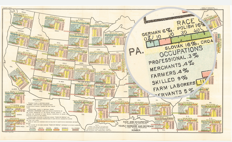
Credit for the piece goes to FS Howell. (I presume.)
Today’s piece comes from the Wall Street Journal. It looks at US retail and foodservice spending through different types of stores.
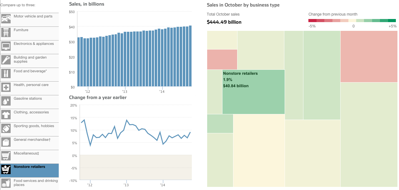
I take issue with a few things, firstly the tree map. Because it’s not really a tree map. Another thing I am not keen on is the comparison feature in the piece. The user can select up to three types of stores to compare. And while the result works in the line chart—three lines—the bar chart devolves into a near useless component. There is no easy way to compare the actual lengths of the individual bars short of mousing over and scribbling down each individual datapoint. In the particular case here, I likely would have changed from bars to line. Because that way I can compare the actual magnitude of each store type.
Credit for the piece goes to Dan Hill.
The subject matter of this one interested me. I am new to hummus. Well, sort of. I never ate it before moving to Chicago. But when I did, I understood it to be essentially a dip made from chick peas. According to an article from Quartz, It turns out that’s what most Americans believe. Even if they’re not necessarily buying it. Literally (sort of). Because some popular brands contain no chick peas. (Disclosure: I work for the company that provided some of the market sizing data used in the piece.)
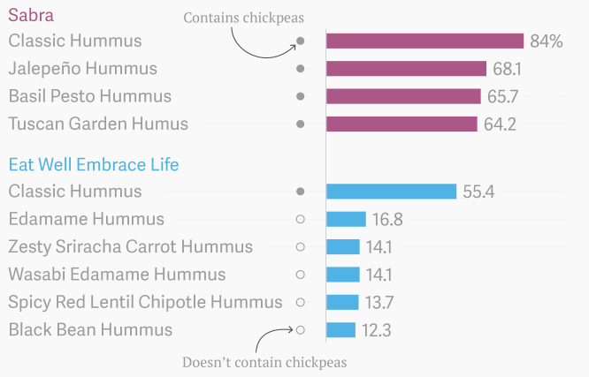
Credit for the piece goes to David Yanofsky.
Last week we covered the fall of the Berlin Wall and the lasting impact in former East Germany vs. former West Germany. This week we look at a piece from Bloomberg Businessweek that looks more broadly at Eastern Europe.
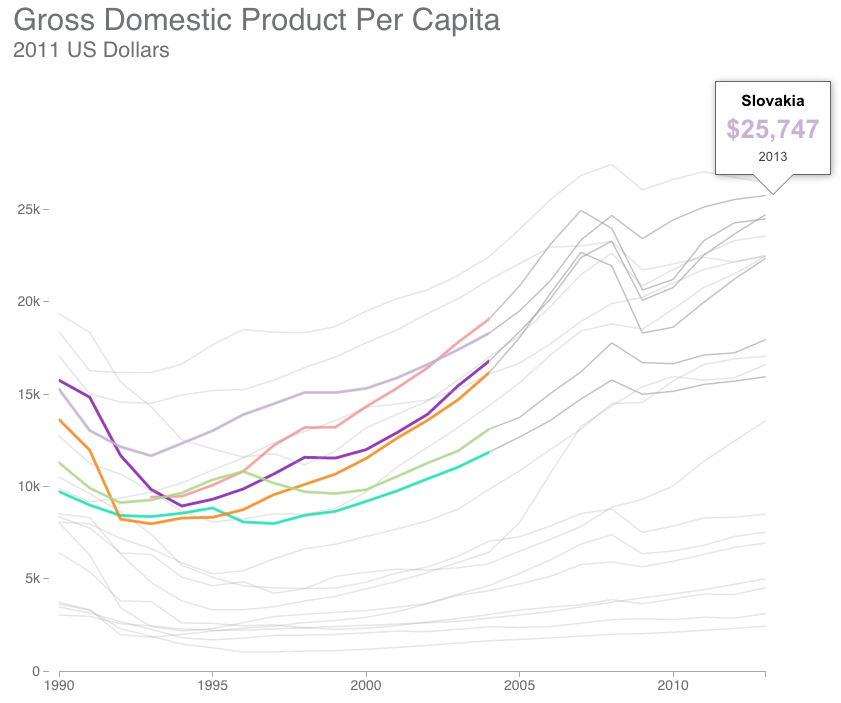
The piece scrolls with the charts updating based upon the available text. And within that text are highlighted keywords with which the user can interact to highlight data within the charts.
Credit for the piece goes to Alex McIntyre, Peter Coy, Christopher Cannon, and Blacki Migliozzi.
The United States and its allies are slowly beginning to pull out of Afghanistan. While several thousand troops will remain, the total will be nowhere near the peak figure a few years ago. This graphic from the Washington Post details just how this transition has been occurring.
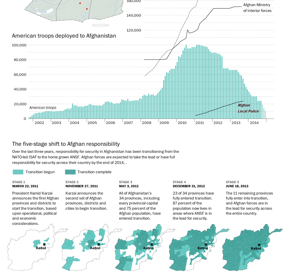
Credit for the piece goes to Richard Johnson.
Yesterday marked the 25th anniversary of the fall of the Berlin Wall. But with the reunification of Germany a year later, has the former East Germany been able to catch up to what was West Germany? The Economist looks at the results in this graphic and the answer is yes. And no.
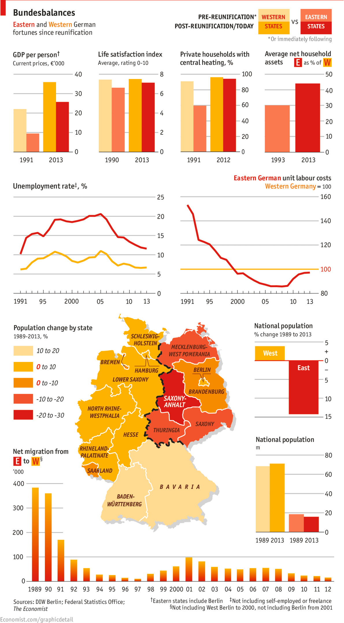
Credit for the piece goes to the Economist’s graphics department.