New New Orleans

Nine years after the impact of Hurricane Katrina upon the city of New Orleans, the touristy French Quarter has returned according to an article in the National Journal. However, the new New Orleans beyond the French Quarter is different from what once was. In short, the new city is whiter and more Hispanic.

And while this graphic that accompanies the piece does a fair job of showing the title, a snapshot, I wish the focus would have been on more of a comparison between pre and post, old and new.

A quick look at New Orleans

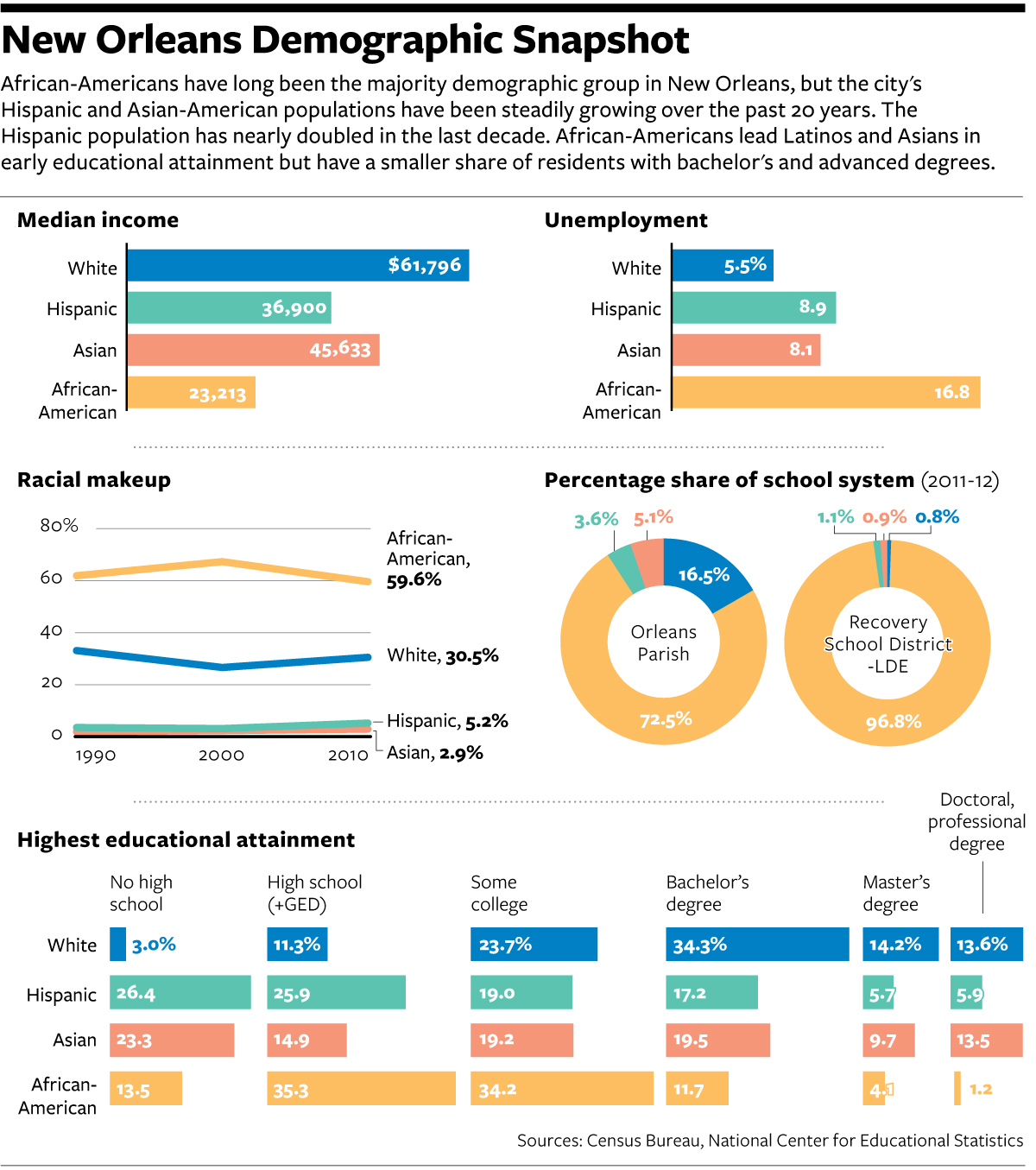
I would not necessarily chosen the same components to tell the story. But, I really want to see more direct comparisons of even just the 2000 census and data to that of 2010.

Credit for the piece goes to the National Journal’s graphics department.

The Libyan Revolution’s Results So Far…

The Libyan Revolution that removed Gaddafi from power was just over three years ago. Unfortunately, if we have not learned by now, the process of building Western-like liberal democracies is clearly a messy process. Because Libya is far from it as this graphic from the Economist shows.

So how's that revolution working out for you?
So how’s that revolution working out for you?

Credit for the piece goes to P.J.W. and L.P.

Eli Manning’s Brother and the Record Books

Two weekends ago Eli Manning’s brother accomplished a feat in American football. And it was not in Indianapolis. The New York Times documented the story in an interactive article.

I have no idea who most of these people are…

In fairness, I generally do not follow American football. I am largely a one sport person and that sport is baseball. But since the active baseball season is over—baseball ends when the Red Sox stop playing—I figured the rest of you might enjoy this.

Credit for the piece goes to Gregor Aisch and Kevin Quealy.

Calories and Consumption

National Geographic recently published a piece designed and built for them by Fathom Information Group. Content-wise, they looked at the historic consumption of food by several different countries. What do individual food groups contribute to the overall nutritional breakdown? For the piece this basically amounted to morphing donut charts. I get the reference, but do not care for the result.

Instead more interesting is the second main view of the piece: meat consumption. Using stacked line charts, National Geographic explores changes in consumption patterns over the last 50 years. Some countries change a bit, others not so much. But as always the best examples are called out with an explanation as to why the changes. Mexico, for example, has the story about slashes in government subsidies and economic problems as to a decline in pork consumption.

Mexican pork consumption

Clearly I still have issues with the data visualisation. I would much rather see the selected view isolate the selection off the common baseline. But a nice touch is the small multiples from the country selection mechanism appearing to the right.

Credit for the piece goes to Fathom Information Design.

Chinese Nuclear Submarine Navy

This weekend the Wall Street Journal published an article that combined my interest in data visualisation with my interest in naval ships. The article looks at the growth of the Chinese nuclear submarine programme. And alongside the article are maps, charts, illustrations, and a narrated video that support the written word.

Choke points for the Chinese navy

Credit for the piece goes to Alberto Cervantes and the Wall Street Journal’s graphics department.

Some of the Best Baseball I’ve Ever Seen

Was ten years ago this time in October. Boston was on their way to winning their World Series in 86 years. But to get there, they had to go through the New York Yankees. And they did it in dramatic fashion, winning a riveting best-of-seven series. Why riveting? Because it had never been done before. (Nor since, actually, but that’s not included in the graphic.)

The improbable comeback

The UK’s Two-party System Continues to Decline

If you missed it, last week the United Kingdom held a few by-elections. For we Americans, those are like special elections for seats in the Senate or the House that are not part of the regular Congressional elections. Anyway, the big news was that the United Kingdom Independence Party (UKIP)—think Tea Party wanting out of the European Union…kind of—won a by-election for Clacton-on-Sea (not surprisingly located on the sea) from the Tories (think establishment Republicans). UKIP almost won a by-election away from Labour (kind of think Democrats?). The former was shocking but not surprising, the latter was both.

Anyway, one of the drivers of the results was the fact that British voters are no longer consistently voting for either the Tories or Labour. The Telegraph used a nice graphic to show just how far the British two-party system has declined from its peak in 1951. The piece is not very fancy, but it does the trick.

Tory–Labour vote share since 1951

Credit for the piece goes to the Telegraph’s graphics department.

Falling Costs of Medicare

Medicare is one of those things that everybody has feared in terms of its impact on our long-term debt and deficit. The New York Times looks at the falling projections over time through a nice, animated line chart. The accompanying article places the cause for these to two factors. First, technical reductions that mean behaviour changes among medical care professionals and patients. Second, to spending reductions through the Affordable Care Act.

Falling spend on Medicare per recipient

Credit for the piece goes to Margot Sanger-Katz and Kevin Quealy.

Twitch.tv

Twitch.tv is a site where people can go to watch streaming video games. While it is not quite my thing, it is a thing for enough people that Amazon bought the site. The New York Times took a look at Twitch’s popularity.

Twitch viewership
Twitch viewership

Credit for the piece goes to Gregor Aisch and Tom Giratikanon.

Cycling Deaths in Australia

Cycling can be quite dangerous. But apparently this summer was quite dangerous over in Australia. So much so that the Guardian did some data reporting on it back in June. Thankfully they included some charts in that reporting, the heat map below being one example.

Cyclist fatalities
Cyclist fatalities

None of the data visualisation in the piece is revolutionary or earth-shattering, but it is a solid piece with some solid charts backing up an interesting story.

Credit for the piece goes to Nick Evershed.