Where the (Disproportionate) Jobs Are

A little while ago, LinkedIn put together a map looking at the disproportionately represented jobs and skills in cities in both the United States and Europe. That is different from the most common jobs but those that are “most uniquely found” in cities.

The unique skills of America's various cities
The unique skills of America’s various cities

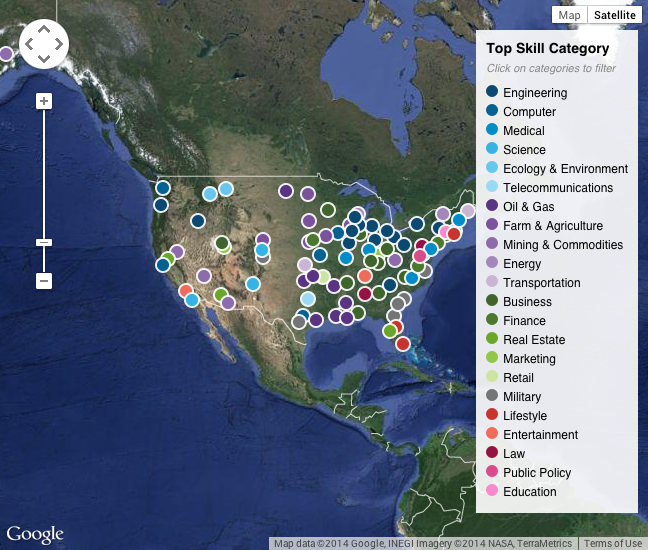
Unfortunately the interface is a bit clumsy. For something that is about exploring different cities, I think the small area of the map could be bigger. And the highlighting functionality lags. But the overall idea is interesting.

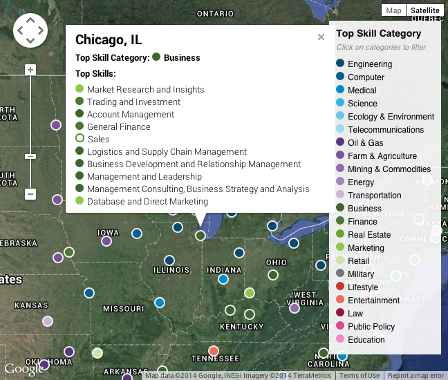
And on a side note, while graphic design is not specifically covered, I found the list of skills for Chicago surprising. If only because I work as a designer for a company in the market research industry.

Kind of explains a lot. Well, to me.

Credit for the piece goes to Sohan Murthy.

Mapping Your LinkedIn Connections

Today’s post comes via a co-worker. LinkedIn’s R&D lab published a tool to map your LinkedIn connections. You login to your account and then receive a social network of map. Mine, seen below, clearly shows three different and generally not inter-connected networks. The orange represents my current employer; the blue is my university network; the green and pink are high school and my employer while in university (they were in the same town).

My LinkedIn network map

To be fair, I’m not a frequent user of LinkedIn. So for those of who you use it more regularly to make connections, contacts, and acquaintances will find yourselves with more complex networks.

Credit for the piece goes to LinkedIn.