Linguistic Empires

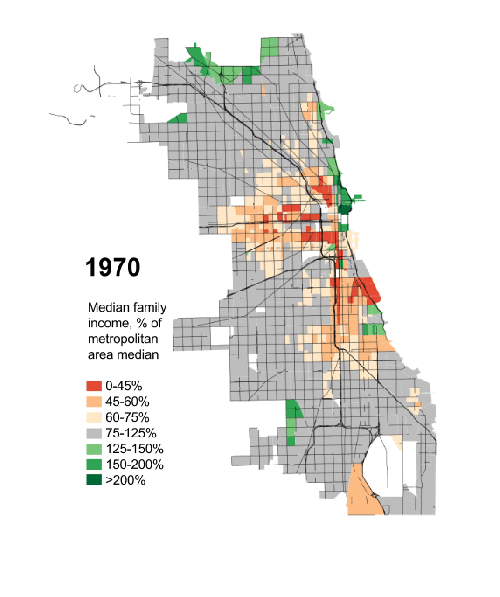
One of the main arguments used by Vladimir Putin to support any possible intervention in Ukraine is the suppression of the rights of Russian language speakers. The Economist wisely decided to wholeheartedly endorse the underlying principle of Putin’s logic and redrew the world map accordingly. You should read the article.

Linguistic empires of the world

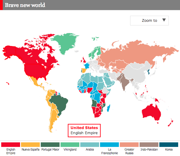
Credit for the piece goes to the Economist’s graphics department.

Wisconsin Politics

Today we dive into state-level politics north of Chicago, in the state of Wisconsin. The Milwaukee Journal Sentinel published an in-depth article looking at the political divide in the Milwaukee metropolitan area. While one could publish an article of that nature with just lots and lots of words, the Journal Sentinel chose to use maps and charts to support their arguments.

Comparing Milwaukee urban vs. suburban voting patterns

Credit for the piece goes to Craig Gilbert and Allan James Vestal.

Comparing the Troop Deployments of Russia and Ukraine

Things remain tense in Ukraine, especially after the violence late last week in Odessa. But in many senses, Ukraine is limited in the operations it can undertake against the separatists, at least with its armed forces. A lot of this has to do with the tens of thousands of Russian troops, tanks, and aircraft now deployed along the border. Thankfully the Washington Post has taken the time to detail just what is known to have happened lately.

The buildup along the Russian–Ukrainian border

Credit for the piece goes to Gene Thorp.

NATO Deployments Near Ukraine

Things continue to deteriorate in eastern Ukraine. And along the other borders of Ukraine, NATO is boosting its presence with planes, ships, and soldiers. This graphic from Jane’s details the recent deployment of aircraft to the theatre.

NATO's deployments
NATO’s deployments

Credit for the piece goes to IHS Jane’s Defence Weekly.

Indoor Plumbing

Today’s post is a small interactive map—nothing fancy there—about indoor plumbing. As it turns out not every home in the United States has it. Of course, last weekend I ended up driving through those dark counties in western Pennsylvania. And I can believe it. And I can definitely say I saw a few outhouses.

Lack of indoor plumbing in western Pennsylvania

Credit for the piece goes to Christopher Ingraham.

Baseball Nation

Baseball is back. And thankfully the New York Times has mapped out most of Major League Baseball’s fans. The glaring exception is, of course the omission of Canada/Ontario, home to the Toronto Blue Jays. The piece maps the data of Facebook likes down to the zip code and then offers details on a few border regions in particular.

Baseball nation, except Canada

And apparently back home, I am not the only person cheering for Boston.

I go for Boston, but most everyone else here is a Phillies phan

Credit for the piece goes to Kevin Quealy, Josh Katz, David Leonhardt, and Tom Giratikanon.

The Interstates and US Highways of, well, the US

On a day when I am going to be travelling across the Midwest for a holiday on Monday (hint, that means no post), what better topic than Cameron Booth’s interstate map as a subway map? Well, how about his most recent project? In it he combines both interstates, e.g. I-76, and US highways, e.g. US-30 and US-202. In his own words, though, the result becomes so complex that it is more akin to a simplified road map than a subway map. Regardless, it’s still pretty impressive.

The northeast quadrant of the United States

Credit for the piece goes to Cameron Booth.

Chicago’s Disappearing Middle Class

President Obama has made a big deal recently about income inequality. The story in short is that the rich in the country are getting rich; the poor are getting poorer; and the people in the middle are fewer in number. Here in Chicago, this has meant that over the last few decades, many of the former middle-class neighbourhoods have been gutted of, well, the middle class. Daniel Kay Hertz has created a series of maps to show just how drastic the change has been since 1970.

Chicago's disappearing middle class
Chicago’s disappearing middle class

Credit for the piece goes to Daniel Kay Hertz.

Building to View London

A little while back, the Economist posted an interesting slideshow piece that showcased the intricacies of London’s skyscraper problem and how many areas are restricted to preserve lines of sight. The user can click through each view and see just where on the map the view falls.

Viewing London
Viewing London

Credit for the piece goes to D.K., L.P., G.D., P.K. and R.L.J.