Mapping the Growth of Cities

This is an older piece from back in August, but I was waiting for a time when I would have some related articles to post alongside it. To start off the series of posts, we start with this piece from CityLab. As my titles implies, it looks at the growth of cities, but not in terms of people or technology but in terms of area/land.

The basic premise is that people look for a 30-minute commute and have done so throughout history. To make that point, the authors look at how transport technology evolved to enable people to live and work at further distances from each other, expanding the urban core.

The designer then chose to overlay the city limits of several cities largely defined by these technologies atop each other.

From small, compact, and dense to large, sprawling, and fluffy.

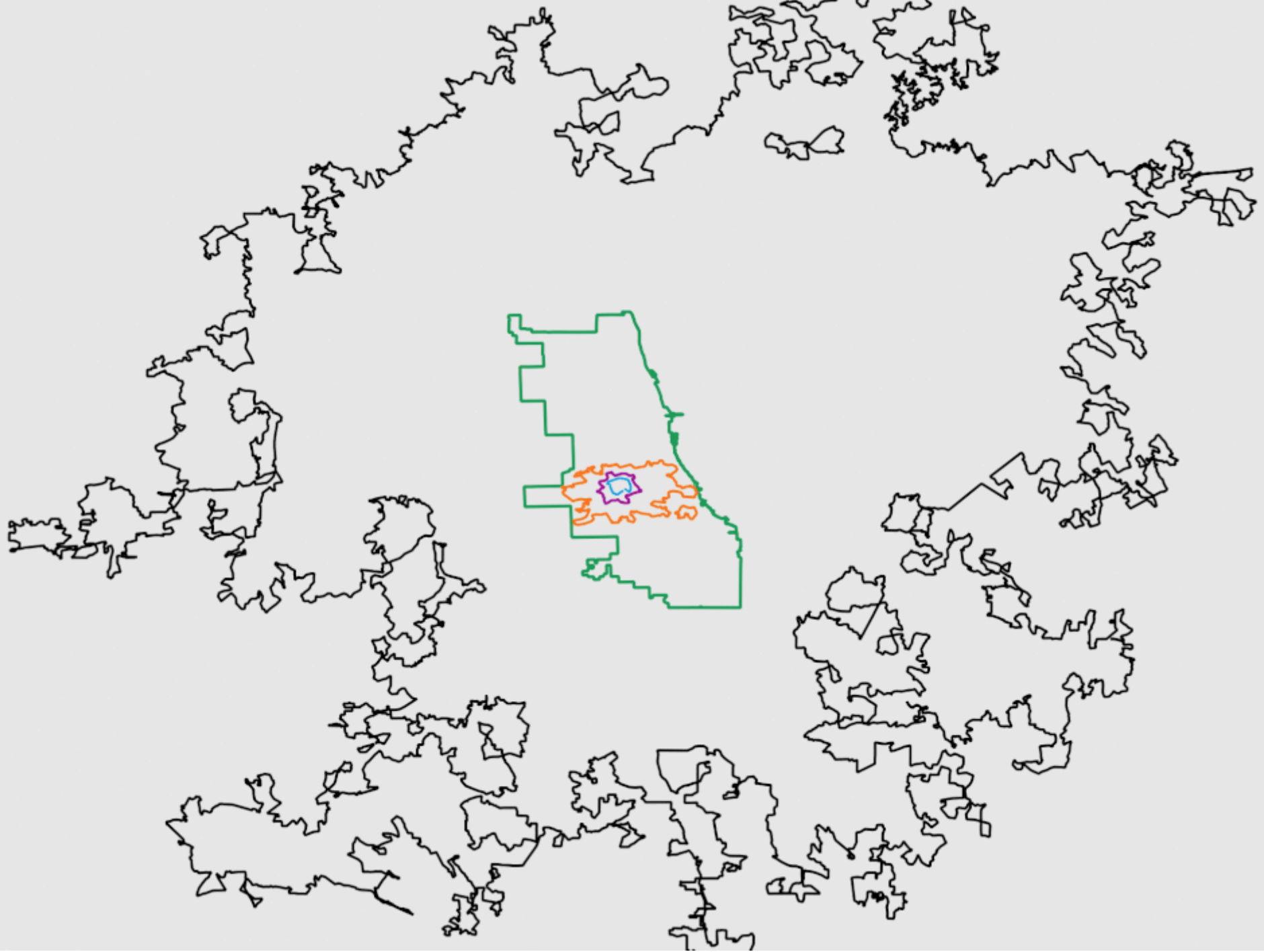
Conceptually the graphic works really well. The screenshot is of an animated. gif leading into the article that step-by-step reveals each city. However, throughout the article, each de facto section is introduced by a city outline graphic.

The graphic does a really nice job of showing how as technology allowed us to move faster, people chose to be further removed from the city core. Of course there are often multiple factors in why people may move out of the core, but transport certainly facilitates it.

Credit for the piece goes to David Montgomery.

It’s Getting Hot in Here

The UN climate summit begins in New York today. So let’s take a look at another data visualisation piece exploring climate change data. This one comes from a Washington Post article that, while largely driven by a textual narrative, does make use of some nice maps.

Ugh.
Ugh.

There is nothing too crazy going on with the actual map itself. I like the subtle use here of a stepped gradient for the legend. This allows for a clearer differentiation between adjacent regions and just how, well, bad things have become.

But where the piece shines is about halfway through. It takes this same map and essentially filters it. It starts with those regions with temperature changes over 2ºC. Then it progressively adds slightly less hotter regions to the map.

I mean at least it could be worse?

It’s a nice use of scrolling and filtering to highlight the areas worst impacted and then move down the horrible impact scale. And because this happens in the middle of the piece, giving it the full column width (online) allows the reader to really focus on the impacts.

Credit for the piece goes to Chris Mooney and John Muyskens.

Urban Boom Towns

Today we look at a piece from the Guardian about the blossoming of some cities from, essentially, out of nowhere. Think similar to how there is really no reason for Las Vegas or Phoenix to exist—cities of hundreds of thousands situated smack in the middle of the desert. But most of these new growth cities, cities from scratch as the Guardian calls them, are sprouting in Africa and Asia.

The piece uses two pretty straight-forward graphics to show the scale of the growth problem.

A lot of urban area growth is yet to come.

I don’t love the area chart, but even for all its flaws, it it still massively obvious just how much Africa will contribute to population growth in the coming decades. And the line chart, which I find far more effective despite its borderline spaghetti-ness, shows just how much of that growth will likely be urban in nature.

But the star of the piece, for which you will need to click over to the original article to enjoy, are the motion graphics. They capture year-by-year the satellite views showing how the cities have grown from almost nothing. This is a screencapture of Ordos, China. But go back a couple of years and it’s almost an empty desert.

Check this out from decades ago and you'll see nothing.
Check this out from decades ago and you’ll see nothing.

Credit for the piece goes to Antonio Voce and Nick Van Mead.

The Sartorial Trump

Happy Friday, all. We made it to the end of the week. Though if you are like me, i.e. living on the East Coast, welcome to Hell. As in so hot and humid.

So last month President Trump visited the United Kingdom on a state visit. He drew attention to himself not just because of his rhetoric, but also for his fashion choices. Consequently, the Washington Post published a piece about those fashion choices from the perspective of a professional tailor.

Look at those shoulders…

The overall piece is well worth a read if you find presidential fashion fascinating. But how does it qualify for Coffeespoons? A .gif that shows how Trump would look in a properly tailored suit.

Since this is a screenshot, you miss the full impact. The piece is an animation of an existing photo and how that then morphs into this for comparison’s sake.

I really enjoy the animated .gif when it works for data visualisation and story-telling.

Credit for the piece goes to Ezra Paul.

Notre Dame Almost Did Collapse

Back in April the famed Notre Dame cathedral in Paris caught fire and its roof and spire spectacularly collapsed. At the time I looked at a few different pieces, including two from the New York Times, that explored the spread of the fire. Several months later the Times has just published a look into how the firefighters saved the cathedral from collapse.

The graphics are the same amazing illustrated models from before. Now with routes taken by firefighters and coloured areas indicating key equipment used in the fight to preserve what could be saved. But the real gem in the article are a series of graphics from the firefighters themselves.

Some pretty hot sketches here

Naturally the annotations are all in French. But this French firefighter and sketch artist detailed the progress of the battle during and in the days after the fire. It makes me wish I could read French to understand the five selected sketches the Times chose to use. And I love this line from the Times.

For all the high-tech gear available to big-city fire departments, investigators still see value in old-school tools.

If you are interested in the story of how the cathedral was saved, read the lengthy article. If you just want to see some really amazing and yet wholly practical sketches, scroll through the article until you get to these gems.

Credit for the overall piece goes to Elian Peltier, James Glanz, Mika Gröndahl, Weiyi Cai, Adam Nossiter, and Liz Alderman.

Credit for the sketches goes to Laurent Clerjeau.

New Orleans Dodges a Bullet

Hurricane/tropical storm Barry has been dumping rain along the Gulf Coast for a few days now. But prior to this weekend, the biggest concern had been for the city of New Orleans, which sits besides the swollen Mississippi River. The river was running already high at 17 feet above normal, and with storm surges and tropical rain levels forecast, planners were concerned not with the integrity of the city’s levee system, rebuilt in the aftermath of Hurricane Katrina, but simply whether they would be tall enough.

So far, they have been.

The Washington Post tracked Barry’s course with the usual graphics showing forecast rainfall amounts and projected tracks. However, the real stunner for me was this cross section illustration of New Orleans that shows just how much of the central city sits below sea level. The cross section sits above a map of the city that shows elevation above/below sea level as well as key flood prevention infrastructure, i.e. levees and pumping stations.

A lot floodable space

The unmentioned elephant remains however. The National Oceanic and Atmosphere Administration’s extreme climate change impact forecast says the water around New Orleans might rise by nearly 13 feet by 2100. Clearly, that is still well below the 20 feet levees of today. But what if there were to be a 17 feet high Mississippi River atop the additional 13 feet? 30 feet would flood the city.

Credit for the piece goes to John Muyskens, Armand Emamdjomeh, Aaron Steckelberg, Lauren Tierney, and Laris Karklis.

Walnut Pancakes in Space

One of the really neat things about space exploration has been the New Horizons probe that raced past Pluto, giving us the image of the now famous heart shape on the dwarf planet. But as it raced past a Kuiper Belt object named Ultima Thule on New Year’s, we received some tantalising first images of a snowman in space. Basically, two spheroid bodies fused together like a snowman or a peanut.

Except it’s not.

It probably doesn't taste like a walnut pancake, though…
It probably doesn’t taste like a walnut pancake, though…

This is a fascinating graphic produced by the science research teams that show how the latest downloaded photographs from New Horizons—it will take many more months for the full set—show Ultima Thule is not very snowman-like in its shape. Instead, it is far flatter and more, in their words, shaped like a dented walnut and a pancake.

The article has some additional material that show how that spin axis changes the view. They are short videos, but if you are interested in space things, it is neat to see. We are accustomed to seeing spherical objects in orbit around the sun. Not pancakes.

Credit for the piece goes to NASA, Johns Hopkins University Applied Physics Laboratory, and Southwest Research Institute.

The Sinking City of Jakarta

Everyone is probably familiar with Venice, slowly sinking below the Adriatic. But, did you know the city of Jakarta, Indonesia is also sinking?

The BBC published an informative article about the city’s looming problem and the piece includes several nice graphics. The screenshot below is an interactive timeline of the amount of subsidence, or sinking, in the the Jakarta region. It’s been notably worst along the coast. But the striking part are the forecasts for 2025 and 2050 that place the city in danger.

The coastline at the north has experienced the worst of it

Photography of the scale of the subsidence feature throughout the story. And about halfway through is a nice motion graphic piece that attempts to explain the sinking. I am not certain it is the best graphic, after all it references two US NBA stars and I wonder how well known they are. (Whereas everyone clearly knows who David Ortiz is.)

I was aware of Jakarta’s peril, but until reading this article, I had not realised just how imperiled the city really is.

Credit for the piece goes to the BBC graphics department.

Natural Decrease

The New York Times has posted a nice piece with an animated graphic. No, not that piece, I’ll probably cover that next week. This one looks at demographic changes in the United States, specifically in the population change at county levels. A number you arrive at by subtracting deaths from births and excluding migration.

That is a lot of red, especially in the Northeast and Midwest…

Basically what we are seeing is a whole lot of red outside the major cities, i.e. the outer suburbs. The article does a nice job of explaining the factors going into the declines and is well worth its quick read.

Credit for the piece goes to Robert Gebeloff.

Missile Defence Systems

North Korea tested another missile yesterday. And while we do not have the precise details, I happened to come across this video from the New York Times exploring the different means by which the United States defends against missile threats. It makes use of some nice illustrations and motion graphics to explain ballistic missiles and missile defence systems.

The Patriot, shown here, defends against theatre-level weapons

Credit for the piece goes to Robin Stein and Drew Jordan.