Sex, Drugs, and Rock Oil

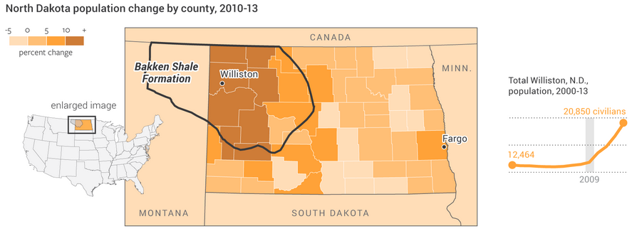
North Dakota’s economy has been booming because of shale oil. Most of that economic growth has been centred on what was the small city of Williston, North Dakota. Economic growth often leads to population growth, however, and that can at times lead to growth in less than wholesome economic activities. The National Journal took a look at the population growth in the area and what has been happening concurrently in a few metrics of the less wholesome sectors of the economy, i.e. drugs and prostitution. Turns out, they are both up.

Population growth in North Dakota

Credit for the piece goes to Clare Foran and Stephanie Stamm.

New New Orleans

Nine years after the impact of Hurricane Katrina upon the city of New Orleans, the touristy French Quarter has returned according to an article in the National Journal. However, the new New Orleans beyond the French Quarter is different from what once was. In short, the new city is whiter and more Hispanic.

And while this graphic that accompanies the piece does a fair job of showing the title, a snapshot, I wish the focus would have been on more of a comparison between pre and post, old and new.

A quick look at New Orleans

I would not necessarily chosen the same components to tell the story. But, I really want to see more direct comparisons of even just the 2000 census and data to that of 2010.

Credit for the piece goes to the National Journal’s graphics department.

The Distribution of Debt in the United States

In a good example of comparing share versus actuals, the National Journal looks at the state of debt across the United States. The choropleth map shows adult share of debt while the bar charts show the regional value of said debt. While the south holds more debt, the west and east coasts have more debt. They also, however, have higher incomes that make servicing or paying off said debt easier than lower income adults in the south.

The South's victory is debt
The South’s victory is debt

Credit for the piece goes to Nancy Cook and Stephanie Stamm.

Views on Gay Marriage Around the World

If you have been living under a rock, Sochi, Russia is hosting the winter Olympics this year. A year in which the Russian government passed legislation banning not same-sex relationships but advocacy for said relationships. Several countries, including the United States, take issue with the legislation. But this graphic from the National Journal hints that in order to reverse such barriers to same-sex marriages, the United States and like-minded societies have a long way to go to convince not just Russians, but many other societies across the world.

Views on gay marriage

Credit for the piece goes to Brian McGill.

The Young and the Educated

Today’s piece comes from the National Journal. It is an interactive bubble chart that compares the educated class of cities in 1980 to those in 2010 (educated meaning the share of population with at least a bachelor’s degree).

College graduate cities

Not a whole lot to say about this one, in a good way. A nice summation at the top with clearly presented data below while annotations on the plot call out particular objects in the series worth noting. And then for those who want to find themselves, a drop down filter at the top allows users to select a particular city.

Credit for the piece goes to Brian McGill and Nancy Cook.

Senate Polarity

Earlier this month I posted about how the New York Times looked at the polarisation of the US Senate. Now the National Journal has another, similar visualisation attempting to explain the political gridlock that was picked up by the Atlantic.

Senate Polarity
Senate Polarity

For those wondering, the National Journal ranks senators on their conservativeness–liberalness by their votes and that is the plotted data.

Credit for the piece goes to the National Journal.