Just before Halloween, NBC News published an article by political analyst David Wasserman that examined what airports could portend about the 2020 American presidential election. For those interested in politics and the forthcoming election, the article is well worth the read.
The tldr; Democrats have been great at winning over cosmopolitan types in global metropolitan areas in the big blue states, e.g. New York and California. But the election will be won in the states where the metropolitan areas that sport regional airports dominate, i.e. Pennsylvania, Michigan, Wisconsin, and North Carolina. And in those districts, support for Democrats is waning.
The closing line of the piece sums it up nicely:
…to beat Trump, Democrats will need to ask themselves which candidates’ proposals will fly in Erie, Saginaw and Green Bay.
But what about the graphics?
We have a line chart that shows how support for Democrats has been increasing amongst those in the global and international airport metros.
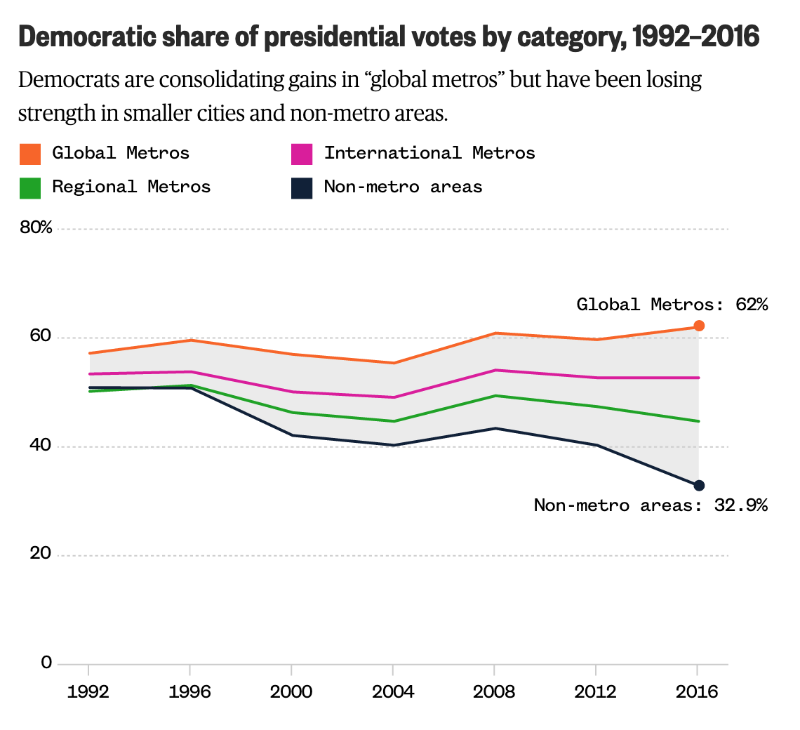
It uses four colours and I don’t necessarily love that. However, it smartly ties into an earlier graphic that did require each series to be visualised in a different colour. And so here the consistency wins out and carries on through the piece. (Though as a minor quibble I would have outlined the MSA being labelled instead of placing a dot atop the MSA.)
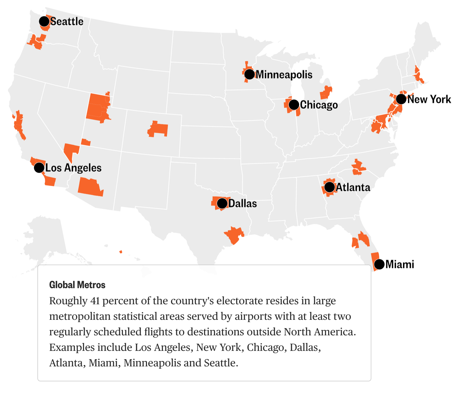
The kicker, however is one of those maps with trend arrows. It shows the increasing Republican support by an arrow anchored over the metropolitan area.
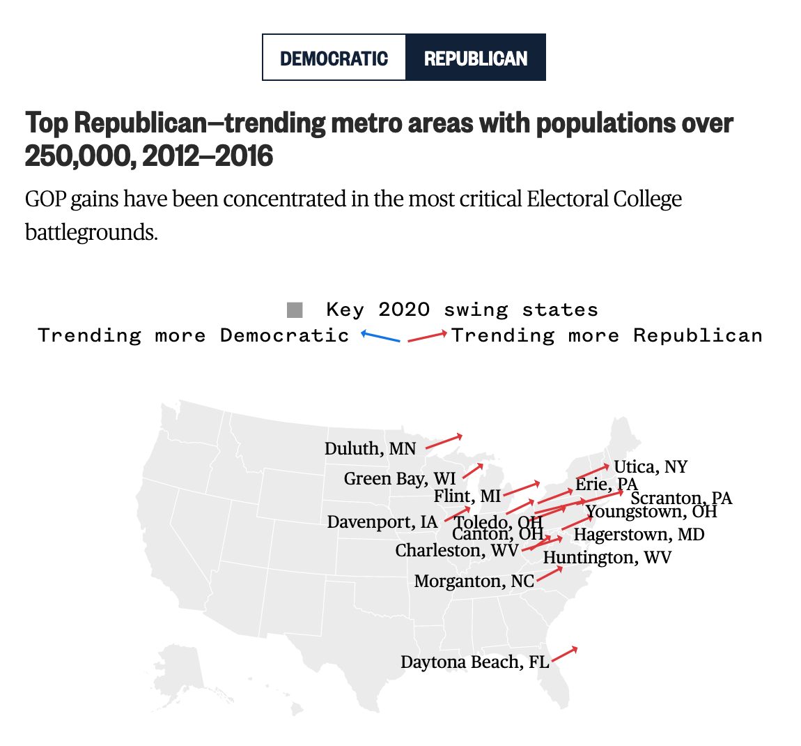
The problem here is many-fold. First, the map is actually quite small in the overall piece. Whereas the earlier maps sit centred, but outside the main text block, this fits neatly within the narrow column of text (on a laptop display at least). That means that these labels are all crowded and actually make it more difficult to realise which arrow is which city. For example, which line is Canton, Ohio? Additionally with the labels, because they are set in black text and a relatively bolder face, they standout more than the red lines they seek to label. Consequently, the users’ focus falls not on the lines, but actually on the labels—the reverse of what a good graphic should do.
Second, length vs. angle. If all lines moved away from their anchor at the same angle, we could simply measure length and compare the trending support that way. However, it is clear from Duluth and Green Bay that the angles are different in addition to their sizes. So how does one interpret both variables together?
Third, I wonder if the map would not have been made more useful with some outlines or shading. I may know what the forthcoming battleground states are. And I might know where they are on a map. But Americans are notorious for being, well, not great when it comes to geography. A simple black outline of the states could have been useful, though it in this design would have conflicted with the heavy black labelling of the arrows. Or maybe a purple shading could have been used to show those states.
Overall, the piece is well worth a read and the graphics generally help tell the narrative visually. But that final graphic could have used a revision or two.
Credit for the piece goes to Jiachuan Wu and Jeremia Kimelman.