Two weeks ago I posted about the death toll in the latest conflict between Israel and Hamas. As it happened, later that morning when I opened the door, there was this graphic sitting above the fold on the front page of the New York Times.
They added a map.
The piece sits prominently on the front page, but tones down the colour and detail on the map to let the graphical elements, the coloured boxes, shine and take their prominent position.
Here’s a detail photo I took in case the above is too small.
Maps make everything cooler.
Ultimately, the piece isn’t too complex and isn’t more than what I made. However, the map adds some important geographical context, showing just where the deaths were occurring.
The piece also highlights the deaths in the West Bank and those in Israel from civil unrest. That was data I didn’t have at the time.
redit for the piece goes to the New York Times graphics department..
As I prepared to reconnect and rejoin the world, I spent most of the weekend prior to full vaccination cleaning and clearing out my flat of things from the past 14 months. One thing I meant to do more with was printed pieces I saw in the New York Times. Interesting pages, front pages in particular, have been piling up and before recycling them all, I took some photos of the backlog. I’ll try to publish more of them in the coming weeks and months.
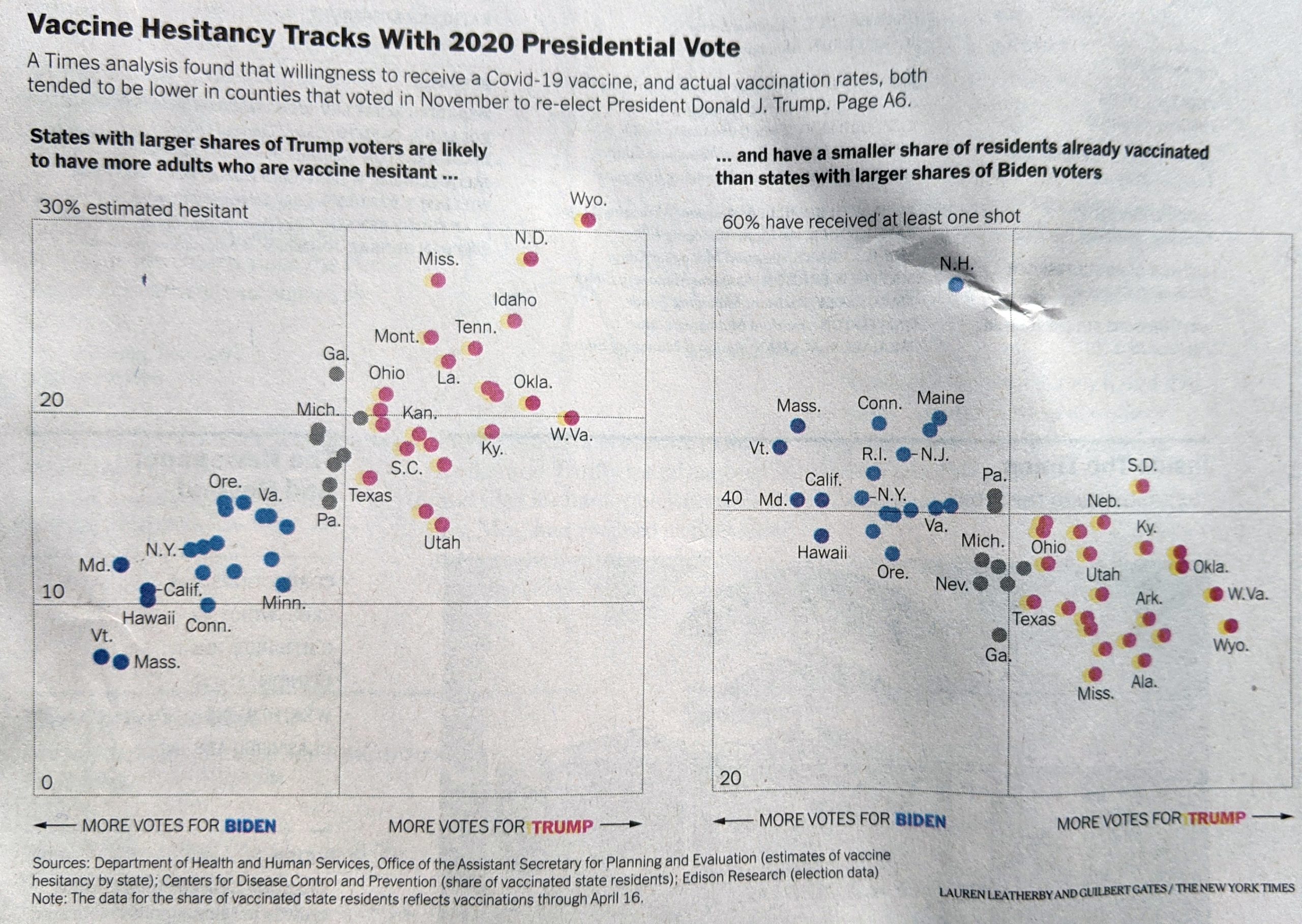
You may recall this time last month I wrote about a piece from the New York Times that examined the politicisation of vaccinations. I meant to get around to the print version, but didn’t, so let’s do it now.
Now in print…
I noted last time the use of ellipses for the title and the lack of value scales on the x-axis. Those did not change from the online version. But look at the y-axis.
For the print piece I noted how the labels were placed inside the chart. I wondered at the time—but didn’t write about—how perhaps that could have been a technical limitation for the web. But here we can see the labels still inside. It was a deliberate design decision.
Keeping with the labelling, I also pointed out Wyoming being outside the plot and it is here too, but I finally noted the lack of a label for zero on the first chart. Here the zero does appear, as I would have placed it. That does make me wonder if the lack of zero online was a technical/development issue.
Finally, something very subtle. At first, I didn’t catch this and it wasn’t until I opened the image above in Photoshop. The web version I noted the use of tints, or lighter shades, for two different blues and two different reds. When I looked at the print, I saw only one red and one blue. But they were in fact different, and it wasn’t until I had zoomed in on the photo I took when I could see the difference.
I’ve got the blues…
The dots do have two different blues. But it’s very subtle. Same with the red.
So all in all the piece is very similar to what we looked at last month, but there were a few interesting differences. I wonder if the designers had an opportunity to test the blues/reds prior to printing. And I wonder if the zero label was an issue for developers.
Credit for the piece goes to Lauren Leatherby and Guilbert Gates.
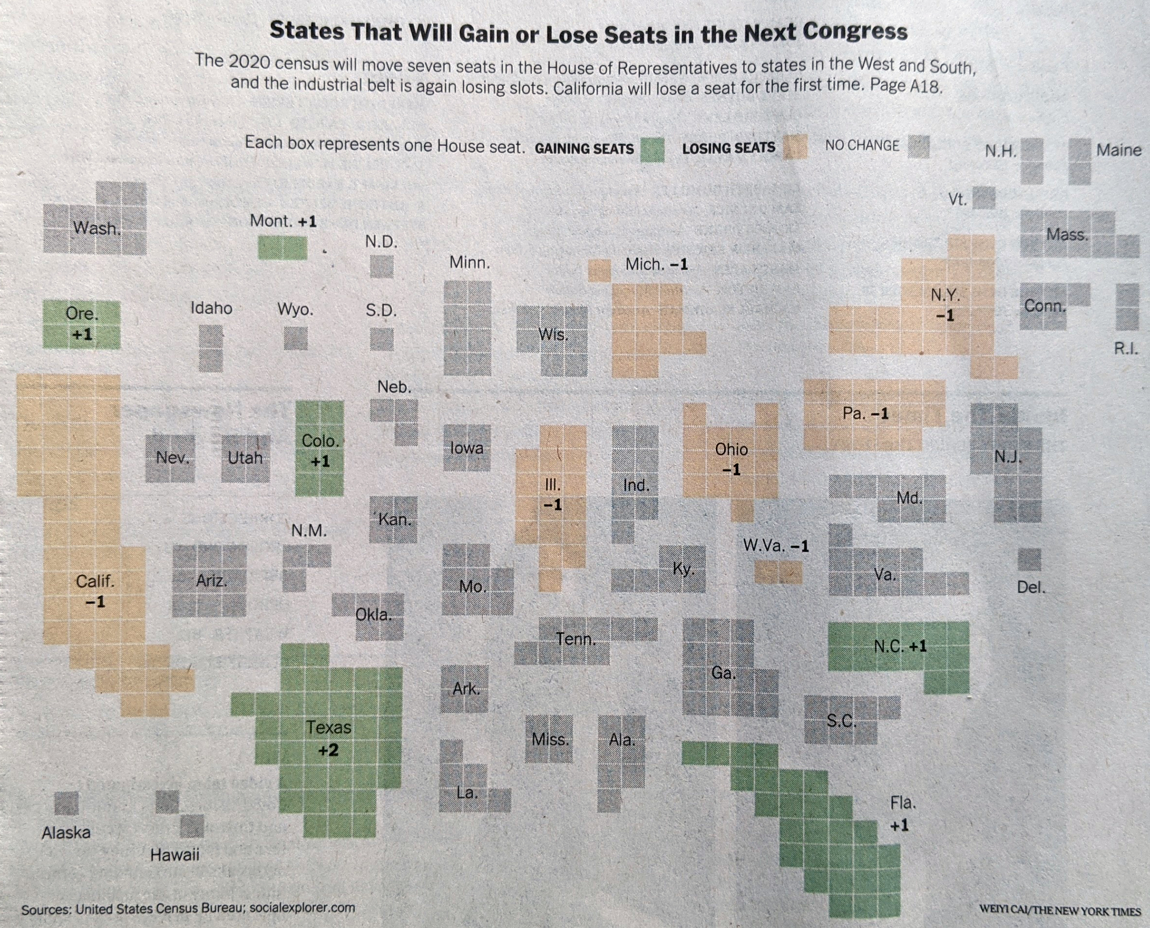
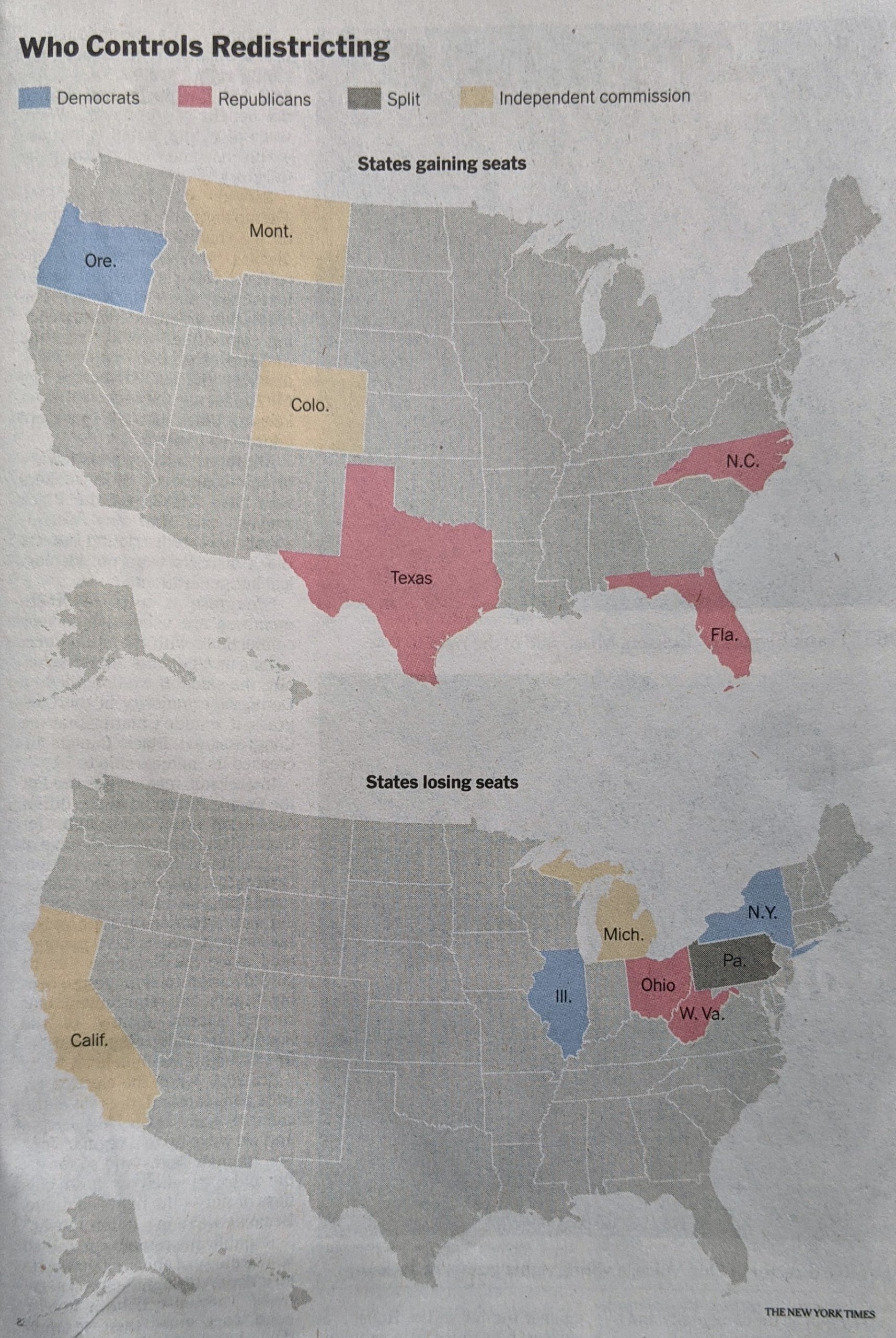
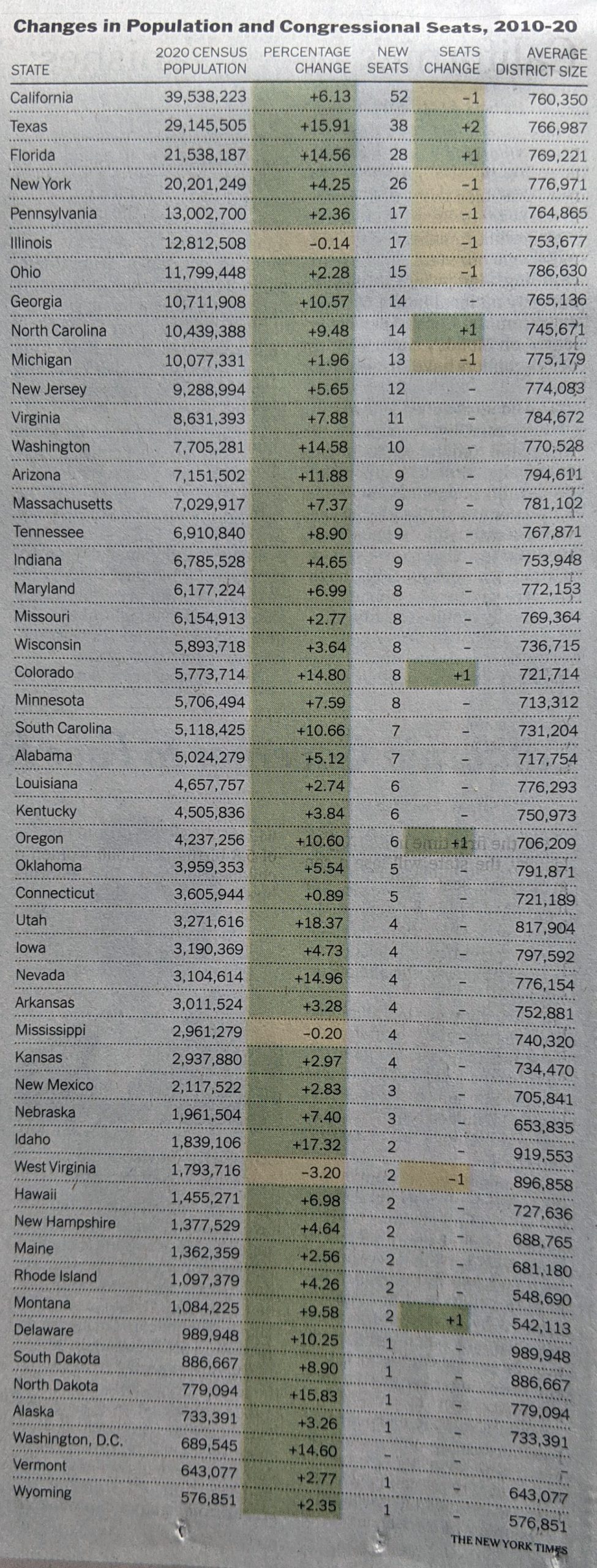
Every ten years the United States conducts a census of the entire population living within the United States. My genealogy self uses the federal census as the backbone of my research. But that’s not what it’s really there for. No, it exists to count the people to apportion representation at the federal level (among other reasons).
The founding fathers did not intend for the United States to be a true democracy. They feared the tyranny of mob rule as majority populations are capable of doing and so each level of the government served as a check on the other. The census-counted people elected their representatives for the House, but their senators were chosen by their respective state legislatures. But I digress, because this post is about a piece in the New York Times examining the new census apportionment results.
I received my copy of the Times two Tuesdays ago, so these are photos of the print piece instead of the digital, online editions. The paper landed at my front door with a nice cartogram above the fold.
A cartogram exploded.
Each state consists of squares, each representing one congressional district. This is the first place where I have an issue with the graphic, admittedly a minor one. First we need to look at the graphic’s header, “States That Will Gain or Los Seats in the Next Congress” and then look at the graphic. It’s unclear to me if the squares therefore represent the states today with their numbers of districts, or if we are looking at a reapportioned map. Up in Montana, I know that we are moving from one at-large seat to two seat, and so I can resolve that this is the new apportionment. But I am left wondering if a quick phrase or sentence that declares these represent the 2022 election apportionment and not those of this past decade would be clearer?
Or if you want a graphic treatment, you could have kept all the states grey, but used an unfilled square in those states, like Pennsylvania and Illinois, losing seats, and then a filled square in the states adding seats.
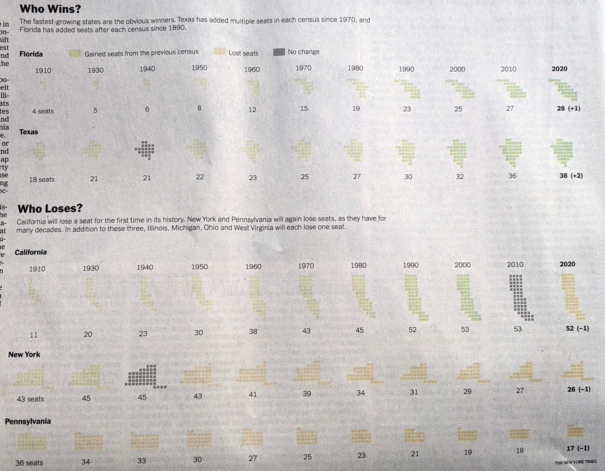
Inside the paper, the article continued and we had a few more graphics. The above graphic served as the foundation for a second graphic that charted the changing number of seats since 1910, when the number of seats was fixed.
Timeline of gains and losses
I really like this graphic. My issue here is more with my mobile that took the picture. Some of these states appear quite light, and they are on the printed page. However, they are not quite as light as these photos make them out to be. That said, could they be darker? Probably. Even in print, the dark grey “no change” instances jump out instead of perhaps falling to the background.
The remaining few graphics are far more straightforward, one isn’t even a graphic technically.
First we have two maps.
Good old primary colours.
Nothing particularly remarkable here. The colours make a lot of sense, with red representing Republicans and blue Democrats. Yellow represents independent commissions and grey is only one state, Pennsylvania, where the legislature is controlled by Republicans and the governorship by Democrats.
Finally we have a table with the raw numbers.
Tables are great for organising information. Do you have a state you’re most curious about, Illinois for example? If so, you can quickly scan down the state column to find the row and then over to the column of interest. What tables don’t allow you to do is quickly identify any visual patterns. Here the designers chose to shade the cells based on positive/negative changes, but that’s not highlighting a pattern.
Overall, this was a really strong piece from the Times. With just a few language tweaks on the front page, this would be superb.
Credit for the piece goes to Weyi Cai and the New York Times graphics department.
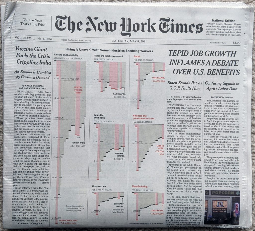
Last Friday, the government released the labour statistics from April and they showed a weaker rebound in employment than many had forecasted. When I opened the door Saturday morning, I got to see the numbers above the fold on the front page of the New York Times.
Welcome to the weekend
What I enjoyed about this layout, was that the graphic occupied half the above the fold space. But, because the designers laid the page out using a six-column grid, we can see just how they did it. Because this graphic is itself laid out in the column widths of the page itself. That allows the leftmost column of the page to run an unrelated story whilst the jobs numbers occupy 5/6 of the page’s columns.
If we look at the graphic in more detail, the designers made a few interesting decisions here.
Jobs in detail
First, last week I discussed a piece from the Times wherein they did not use axis labels to ground the dataset for the reader. Here we have axis labels back, and the reader can judge where intervening data points fall between the two. For attention to detail, note that under Retail, Education and health, and Business and professional services, the “illion” in -2 Million was removed so as not to interfere with legibility of the graphic, because of bars being otherwise in the way.
My issue with the axis labels? I have mentioned in the past that I don’t think a designer always needs to put the maximum axis line in place, especially when the data point darts just above or below the line. We see this often here, for example Construction and Manufacturing both handle it this way for their minimums. This works for me.
But for the column above Construction, i.e. State and local government and Education and health, we enter the space where I think the graphic needs those axis lines. For Education and health, it’s pretty simple, the red losses column looks much closer to a -3 million value than a -2 million value. But how close? We cannot tell with an axis line.
And then under State and local government we have the trickier issue. But I think that’s also precisely why this could use some axis lines. First, almost all the columns fall below the -1 million line. This isn’t the case of just one or two columns, it’s all but two of them. Second, these columns are all fairly well down below the -1 million axis line. These aren’t just a bit over, most are somewhere between half to two-thirds beyond. But they are also not quite nearly as far to -2 million as the ones we had in the Education and health growth were near to -3 million.
So why would I opt to have an axis line for State and local governments? The designers chose this group to add the legend “Gain in April”. That could neatly tuck into the space between the columns and the axis line.
Overall it’s a solid piece, but it needs a few tweaks to improve its legibility and take it over the line.
Credit for the piece goes to Ella Koeze and Bill Marsh.
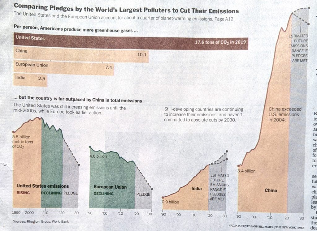
Two Fridays ago, I opened the door and found my copy of the New York Times with a nice graphic above the fold. This followed the announcement from the White House of aggressive targets to reduce greenhouse gas emissions
In general, I love seeing charts and graphics above the fold. As an added bonus, this set looked at climate data.
Need to see more downward trending lines.
But there are a few things worth pointing out.
First from a data side, this chart is a little misleading. Without a doubt, carbon dioxide represents the greatest share of greenhouse gasses, according to the US Environmental Protection Agency (EPA) it was 76% in 2010. Methane contributes the next largest share at 16%. But the labelling should be a little clearer here. Or, perhaps lead with a small chart showing CO2’s share of greenhouse gasses and from there, take a look at the largest CO2 emitters per person.
Second, where are the axis labels?
I will probably have more on this at a later date, but neither the bar chart nor the line charts have axis labels. Now the designers did choose to label the beginning value for the lines and the bars, but this does not account for the minimums or maximums. (It also assumes that the bottom of the lines is zero.)
For example, we can see that China began 1990 with emissions at 3.4 billon metric tons. The annotation makes clear that China’s aggregate emissions surpassed those of the US in 2004. But where do they peak? What about developing countries?
If I pull out a ruler and draw some lines I can roughly make some height comparisons. But, an easier way would be simply to throw some dotted lines across the width of the page, or each line chart.
This piece takes a big swing at presenting the challenge of reducing emissions, but it fails to provide the reader with the proper—and I think necessary—context.
Credit for the piece goes to Nadja Popovich and Bill Marsh.
It’s no secret that Americans—and likely at least Western communities more broadly—live in bubbles, one of which being our political bubbles. And so I want to thank one of my mates for sending me the link to this opinion piece about political bubbles from the New York Times.
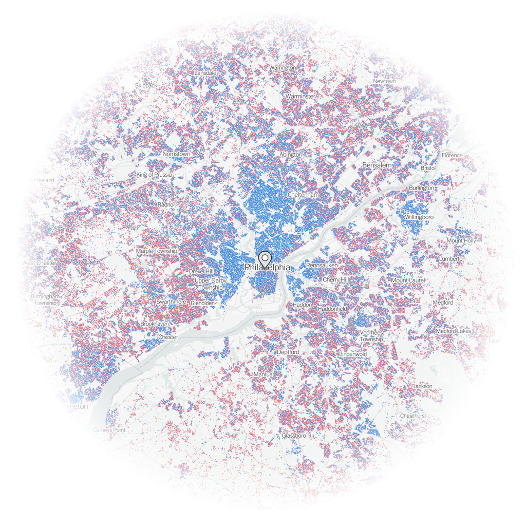
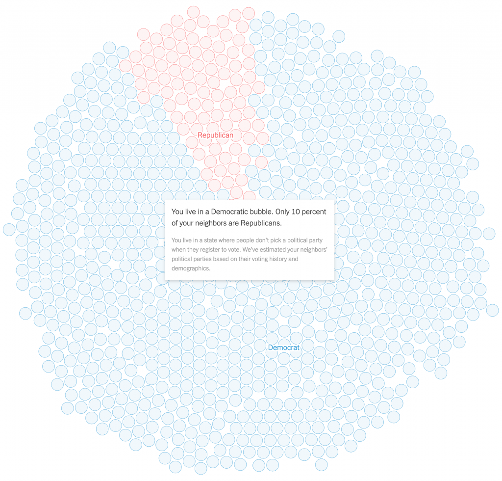
The piece is fairly short, but begins with an interactive piece that allows you to plot your address and examine whether or not you live in a political bubble. Using my flat in Philadelphia, the map shows lots of little blue dots, representing Democratic voters, near the marker for my address and comparatively few red dots for Republicans.
An island of blue in a sea of red.
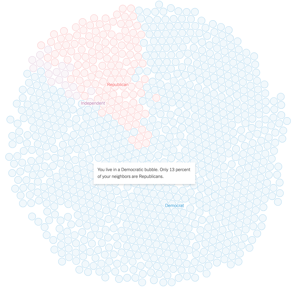
If you then look a bit more broadly, you can see that by summing up the dots, my geographic bubble is largely a political bubble, as only 13% of my neighbours are Republicans. Not terribly surprising for a Democratic city.
A certain lack of diversity in political thought.
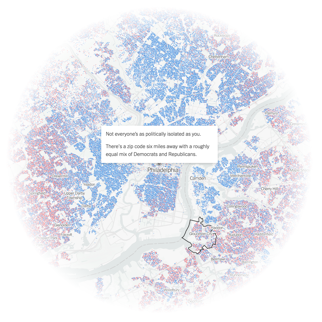
And while the piece does then zoom back out a wee bit, it tries to show me that I don’t live too far from a politically integrated bubble. Except in this case, it’s across a decent sized river and getting there isn’t the easiest thing in the world. I’m not headed to Gloucester anytime soon.
Things are better in Jersey?
These interactives serve the purpose of drawing the user into the article, which continues explaining some of the causes of this political segregation, by both policy, redlining, and personal choice, lifestyle. The approach works, because it gives us the most relatable story in a large dataset, ourselves. We’re now emotionally or intellectually invested in the idea, in this case political bubbles, and want to learn all about it. Because the more you know…
The piece uses the same type of map to showcase the bubbles more broadly from the Bay Area to the plains of Wyoming. (No surprises in the nature of those political bubbles.) It wraps up by showing how politicians can use the geography of our political bubbles to create political geographies via gerrymandering that shore up their political careers by creating safe districts. The authors use a gerrymandered northeastern Ohio district that encompasses two cities, Cleveland and Akron, to make that point.
That’s in part why I’m in favour of apolitical, independent boundary commissions to create more competitive congressional districts. Personally, I would have been fascinated to see how Pennsylvania’s congressional districts, redrawn in 2018 by the Pennsylvania Supreme Court, after the court found the gerrymandered districts of 2011 unconstitutional, created political competition between parties instead of within parties. But I digress.
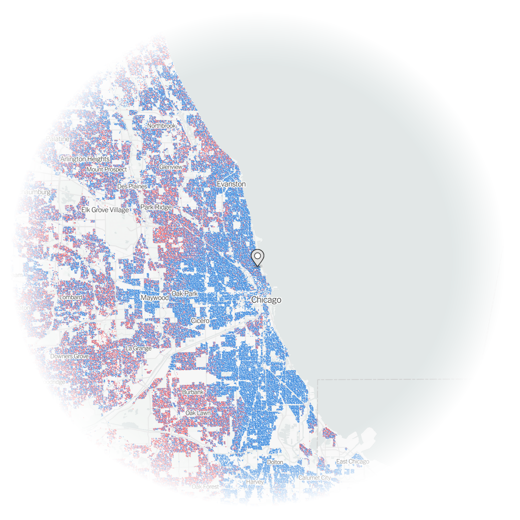
And then for kicks, I looked at how my flat in Chicago compared.
Less island of blue and sea of red, because a lake of blue water alters that geography.
Not surprisingly, my neighbourhood in Lakeview was another political bubble, though this one even more Democratic than my current one.
Lakeview is even more Democratic than Logan Square, Philly’s Logan Square that is.
But if I had wanted to move to an integrated political bubble, instead of Philadelphia, I could have moved to…Jefferson Park.
Because everyone can agree Polish food is good food.
Credit for the piece goes to Gus Wezerek, Ryan D. Enos and Jacob Brown.
Yesterday I wrote my usual weekly piece about the progress of the Covid-19 pandemic in the five states I cover. At the end I discussed the progress of vaccinations and how Pennsylvania, Virginia, and Illinois all sit around 25% fully vaccinated. Of course, I leave my write-up at that. But not everyone does.
This past weekend, the New York Times published an article looking at the correlation between Biden–Trump support and rates of vaccination. Perhaps I should not be surprised this kind of piece exists, let alone the premise.
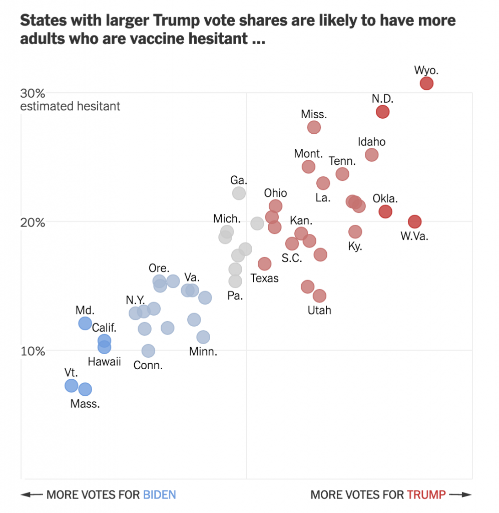
From a design standpoint, the piece makes use of a number of different formats: bars, lines, choropleth maps, and scatter plots. I want to talk about the latter in this piece. The article begins with two side by side scatter plots, this being the first.
Hesitancy rates compared to the election results
The header ends in an ellipsis, but that makes sense because the next graphic, which I’ll get to shortly, continues the sentence. But let’s look at the rest of the plot.
Starting with the x-axis, we have a fairly simple plot here: votes for the candidates. But note that there is no scale. The header provides the necessary definition of being a share of the vote, but the lack of minimum and maximum makes an accurate assessment a bit tricky. We can’t even be certain that the scales are consistent. If you recall our choropleth maps from the other day, the scale of the orange was inconsistent with the scale of the blue-greys. Though, given this is produced by the Times, I would give them the benefit of the doubt.
Furthermore, we have five different colours. I presume that the darkest blues and reds represent the greatest share. But without a scale let alone a legend, it’s difficult to say for certain. The grey is presumably in the mixed/nearly even bin, again similar to what I described in the first post about choropleths from my recent string.
Finally, if we look at the y-axis, we see a few interesting decisions. The first? The placement of the axis labels. Typically we would see the labelling on the outside of the plot, but here, it’s all aligned on the inside of the plot. Intriguingly, the designers took care for the placement—or have their paragraph/character styles well set—as the text interrupts the axis and grid lines, i.e. the text does not interfere with the grey lines.
The second? Wyoming. I don’t always think that every single chart needs to have all the outliers within the bounds of the plot. I’ve definitely taken the same approach and so I won’t criticise it, but I wonder what the chart would have looked like if the maximum had been 35% and the grid lines were set at intervals of 5%. The tradeoff is likely increased difficulty in labelling the dots. And that too is a decision I’ve made.
Third, the lack of a zero. I feel fairly comfortable assuming the bottom of the y-axis is zero. But I would have gone ahead and labelled it all the same, especially because of how the minimum value for the axis is handled in the next graphic.
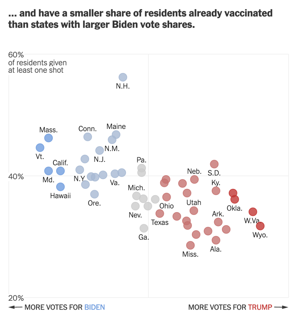
Speaking of, moving on to the second graphic we can see the ellipsis completes the sentence.
Vaccination rates compared to the election results
We otherwise run into similar issues. Again, there is a lack of labelling on the x-axis. This makes it difficult to assess whether we are looking at the same scale. I am fairly certain we are, because when I overlap the graphics I can see that the two extremes, Wyoming and Vermont, look to exist on the same places on the axis.
We also still see the same issues for the y-axis. This time the axis represents vaccination rates. I wish this graphic made a little clearer the distinction between partial and full vaccination rates. Partial is good, but full vaccination is what really matters. And while this chart shows Pennsylvania, for example, at over 40% vaccinated, that’s misleading. Full vaccination is 15 points lower, at about 25%. And that’s the number that needs to be up in the 75% range for herd immunity.
But back to the labelling, here the minimum value, 20%, is labelled. I can’t really understand the rationale for labelling the one chart but not the other. It’s clearly not a spacing issue.
I have some concerns about the numbers chosen for the minimum and maximum values of the y-axis. However, towards the middle of the article, this basic construct is used to build a small multiples matrix looking at all 50 states and their rates of vaccination. More on that in a moment.
My last point about this graphic is on the super picky side. Look at the letter g in “of residents given”. It gets clipped. You can still largely read it as a g, but I noticed it. Not sure why it’s happening, though.
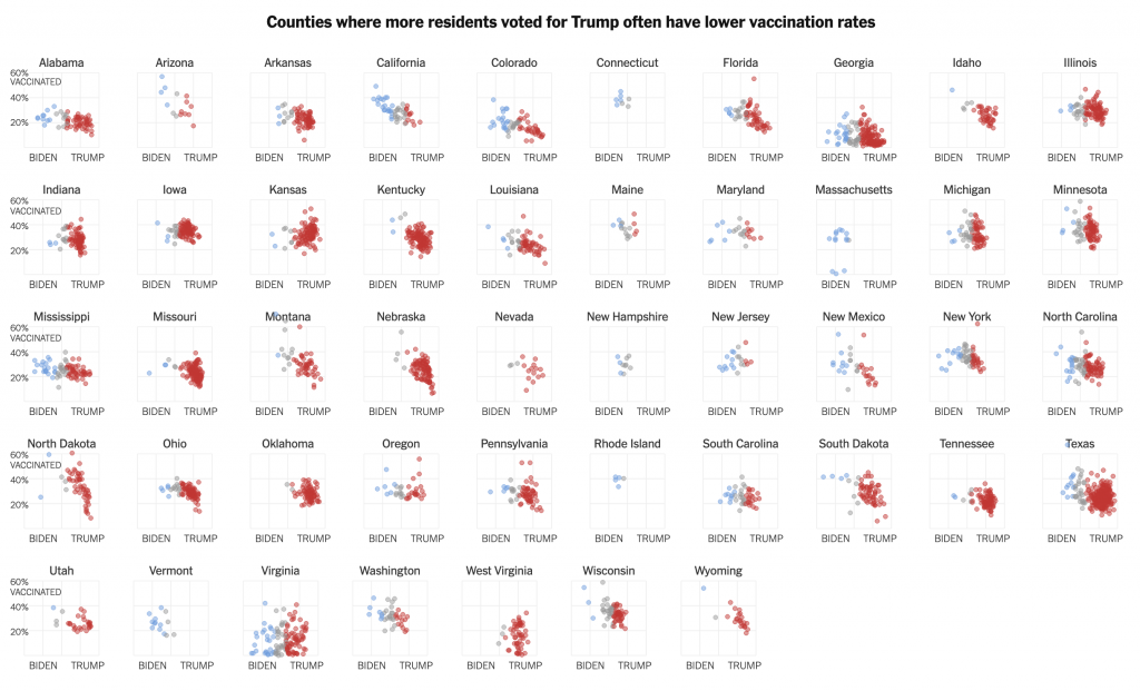
So that small multiples graphic I mentioned, well, see below.
All 50 states compared
Note how these use an expanded version of the larger chart. The y-minimum appears to be 0%, but again, it would be very helpful if that were labelled.
Also for the x-axis in all the charts, I’m not sure every one needs the Biden–Trump label. After all, not every chart has the 0–60% range labelled, but the beginning of each row makes that clear.
In the super picky, I wish that final row were aligned with the four above it. I find it super distracting, but that’s probably just me.
Overall, this is a strong piece that makes good use of a number of the standard data visualisation forms. But I wish the graphics were a bit tighter to make the graphics just a little clearer.
Credit for the piece goes to Danielle Ivory, Lauren Leatherby and Robert Gebeloff.
Last Thursday I wrote about the use of colour in a choropleth map from the Philadelphia Inquirer. Then on Sunday morning, I opened the door to collect the paper and saw a choropleth above the fold for the New York Times. I’ll admit my post was a bit lengthy—I’ve never been one described as short of words—but the key point was how in the Inquirer piece the designer opted to use a blue-to-red palette for what appeared to be a data set whose numbers ran in one direction. The bins described the number of weeks a house remained on the market, in other words, it could only go up as there are no negative weeks.
Compare that to this graphic from the Times.
More choropleth colours…
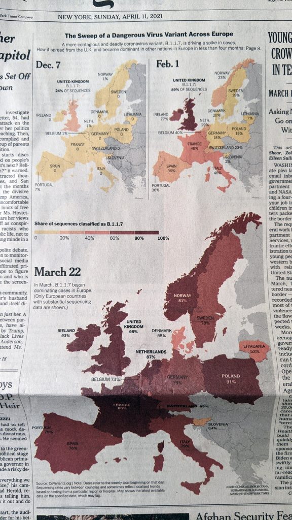
Here we are not looking at the Philadelphia housing market, but rather the spread of the UK/Kent variant of SARS-CoV-2, the virus that causes COVID-19. (In the states we call it the UK variant, but obviously in the UK they don’t call it the UK variant, they call it the Kent variant from the county in the UK where it first emerged.)
Specifically, the map looks at the share (percent) of the variant, technically named B.1.1.7, in the tests reported for each country. The Inquirer map had six bins, this Times map has five. The Inquirer, as I noted above, went from less than one week to over five weeks. This map divides 100% into five 20-percent bins.
Unlike the Inquirer map, however, this one keeps to one “colour”. Last week I explained why you’ll see one colour mean yellow to red like we see here.
This map makes better use of colour. It intuitively depicts increasing…virus share, if that’s a phrase, by a deepening red. The equivalent from last week’s map would have, say, 0–40% in different shades of blue. That doesn’t make any sense by default. You could create some kind of benchmark—though off the top of my head none come to mind—where you might want to split the legend into two directions, but in this default setting, one colour headed in one direction makes significant sense.
Separately, the map makes a lot of sense here, because it shows a geographic spread of the variant, rippling outward from the UK. The first significant impacts registering in the countries across the Channel and the North Sea. But within four months, the variant can be found in significant percentages across the continent.
Credit for the piece goes to Josh Holder, Allison McCann, Benjamin Mueller, and Bill Marsh.
For years, one issue with the American economy had been that we did not save enough. It’s understandable, as it’s hard to keep up with the image of the carefree American without profligate spending. But that’s also not great long-term. But thanks to Covid-19, we’ve now swung to the other side of the spectrum: Americans may be saving too much.
Saying that sounds callous to the devastation the pandemic has wrought upon large swathes of the economy. But it’s true in the aggregate as this New York Times piece explains. In particular, the authors highlight one example. Consider a corporate CEO who earned a $100,000 bonus for keeping the company he runs afloat during the recession. He adds $100k to the aggregate American income. But at a restaurant shuttered by the pandemic, owners lay off a hostess, a server, a bartender, and a dishwasher, each earning $25,000. Their collective lost income is $100,000 and so balances out that one CEO. And as CEOs are more able to work remotely than servers, it’s not hard to see how the upper-income earning cohorts of the economy have done well. In human-terms, four unemployed service industry people is terrible. But statistically, it’s a wash. Once we understand that, it makes the piece sensible.
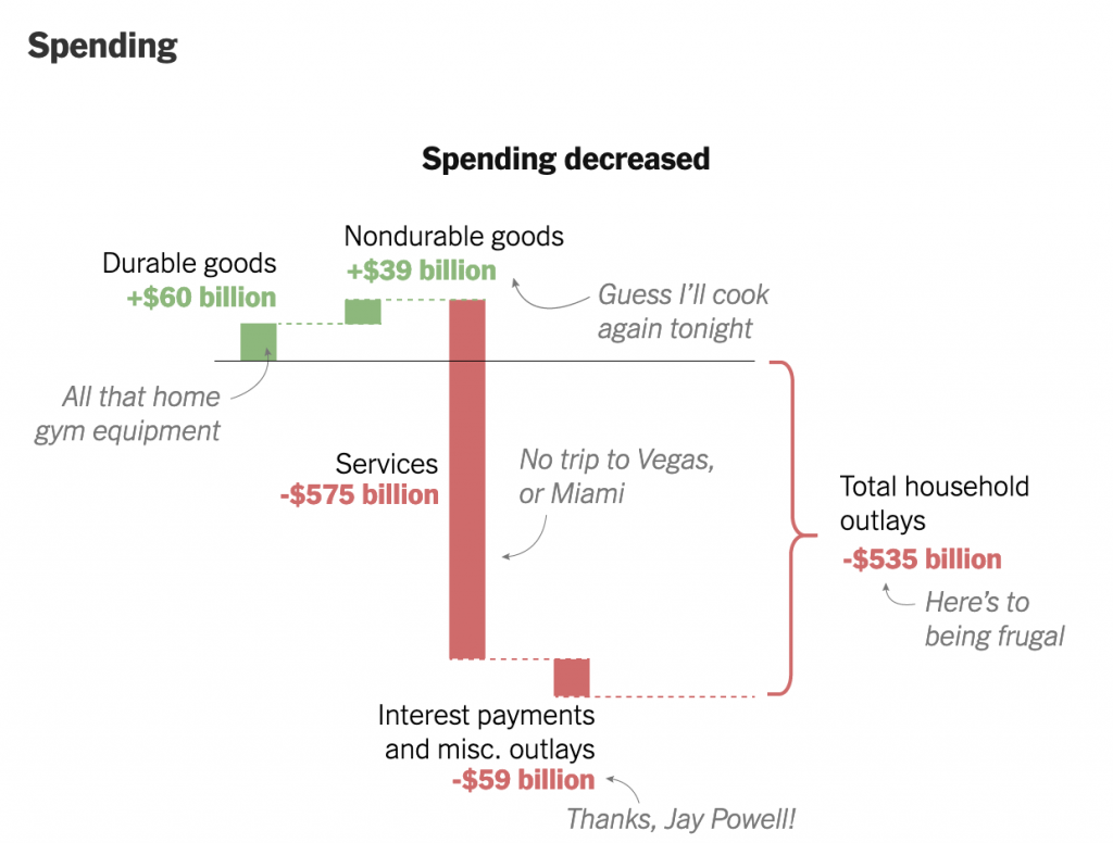
It uses decomposition charts, basically stacked bar charts broken apart, to show what constitutes the two sides of the American household budget: earning and spending. I’ve taken a screenshot of the spending side of the ledger.
This is the aggregate, I’d be curious how this relates to you, my readers.
We see that starting from the baseline, the solid line, American households spent more money this year on durable goods. A dotted line then carries that adjusted baseline to the right for the next component of the ledger: nondurable goods. We spent more on those too, so the baseline moves up. The designers annotated the graphic, adding descriptions of what each bar represents in a casual, lighthearted tone. I’ve definitely been cooking for myself a lot more.
Here I wish we had some more traditional charting elements, e.g. axis lines and labels. Now this piece is published under the Upshot, a more conversational and less formal brand than the Times as a whole. That probably explains the casual annotations. But I think some basic axis labels, e.g. spending more vs. spending less, could add some context without the need for the annotations.
Where the piece might lose people is what happens after durable goods. Americans stopped spending on services, a decline of over half a trillion dollars. That’s a lot of money. And so the adjusted baseline shifts to well below where we started. Add on savings from things like interest rates (Jay Powell is the chair of the Federal Reserve, for whose Philadelphia bank I work in full disclosure) and Americans have spent more than half a trillion dollars less. And as the article explains, we’ve also saved an enormous amount, to the tune of $1 trillion. Add it together and you’ve got America saving $1.5 trillion in 2020.
That money has to go somewhere. And you can see where some of it went when you look at surging prices in GameStop. Longer term, when the pandemic begins to end, we are going to have a pent up demand from people who have had their lives on hold for a year or more. And if there is insufficient supply for whatever’s in demand, prices will rise and we could see a sharp jump in inflation. But that’s a post for another day.
Back to this graphic, as a statistical graphic, it works. But without axis labels and data definitions, barely so. However, I think it’s meant to be more casual and illustrative than data-driven. If I look at this piece through that lens, I do think it works.
Credit for the piece goes to Neil Irwin and Weiyi Cai.
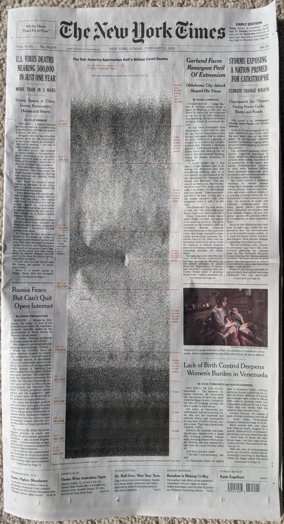
The United States surpassed 500,000 deaths from Covid-19. On Sunday, in advance of that sobering statistic, the New York Times published a front-page graphic that dominated the layout.
Sunday front page for the New York Times
Usually a front-page graphic will make use of the four-colour process and present richly coloured graphics. This, however, starkly lays out the timeline of deaths in the United States in black and white.
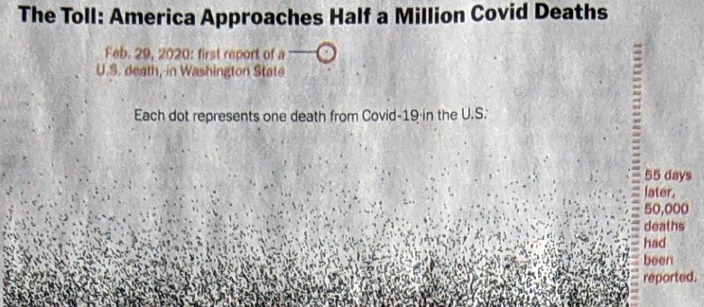
Meaningful graphics do not need to reinvent the wheel. This takes each life lost as a black dot and then, starting at the top in February, plots each day.
Detail of the graphic
The colour here serves as the annotation. The red circle drawing attention to the first reported death. And down the side the tick marks for days. Red lines indicate 50,000 death increments. The labels tell the story, we’ve needed fewer and fewer days to reach each subsequent 50,000 milestone.
As the first wave intensifies in March and April, the space fills with black dots. But as we enter summer and deaths fell, the space lightens. Late autumn and winter bring more death and you can see clearly towards the bottom of the chart, as we approach today, the graphic is nearly solid black.
If we want to look towards a hopeful point in the content, we can see first that it took 17 days then 15 to reach 400,00 deaths and 450,000 deaths, respectively. But it took 19 days to reach 500,000. As a nation we appear to finally be on the downward slope of this wave.
Returning to the piece, it’s a gut punch of simplicity in design.
Credit for the piece goes to Lazaro Gambio, Lauren Leatherby, Bill Marsh, and Andrew Sondern.