New True Blue

Today’s post is not about data visualisation per se, but rather an element of it: colour. Two weeks ago, the Times reported on the creation of a new artificially made pigment of the colour blue.

This screenshot from the article doesn’t do it justice. Click through to see the large photo.

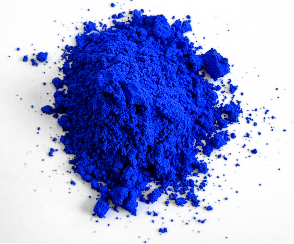
You can read the article for the full details, but the new pigment contains yttrium, indium, and manganese. Combine the symbols for those elements, Y, In, and Mn, and you have YInMn Blue. In particular, the colour exhibits permanence and thus does not fade, say when mixed with water.

And it’s non-toxic, because for those who don’t know, some of the most popular paint colours in history have turned out to be toxic. White paint? Made with lead. Some of your bright, rich reds? Turns out cadmium can kill. And with blues we often see cobalt or chromium as part of the mixture and, guess what, they’re both toxic. But not YInMn.

Last summer, the Environmental Protection Agency (EPA) approved the pigment for commercial use. And so we can begin to use it in oils and watercolour paints. (The EPA had approved its use for industrial purposes back in 2017. Check out this article for an image of the blue used to make an electric guitar.)

For data visualisation and design purposes, for web stuff, colours work differently. The blue in the screenshot above from the Times article, that is made by photons emitted by your computer or mobile phone. Whereas, when you view that pile of pigment in person, or a guitar body, or a painting—all in person—what you are seeing is the absorption and reflection of light waves striking the objects. What you see is the portion of the light wave that is reflected, i.e. not absorbed, by the object.

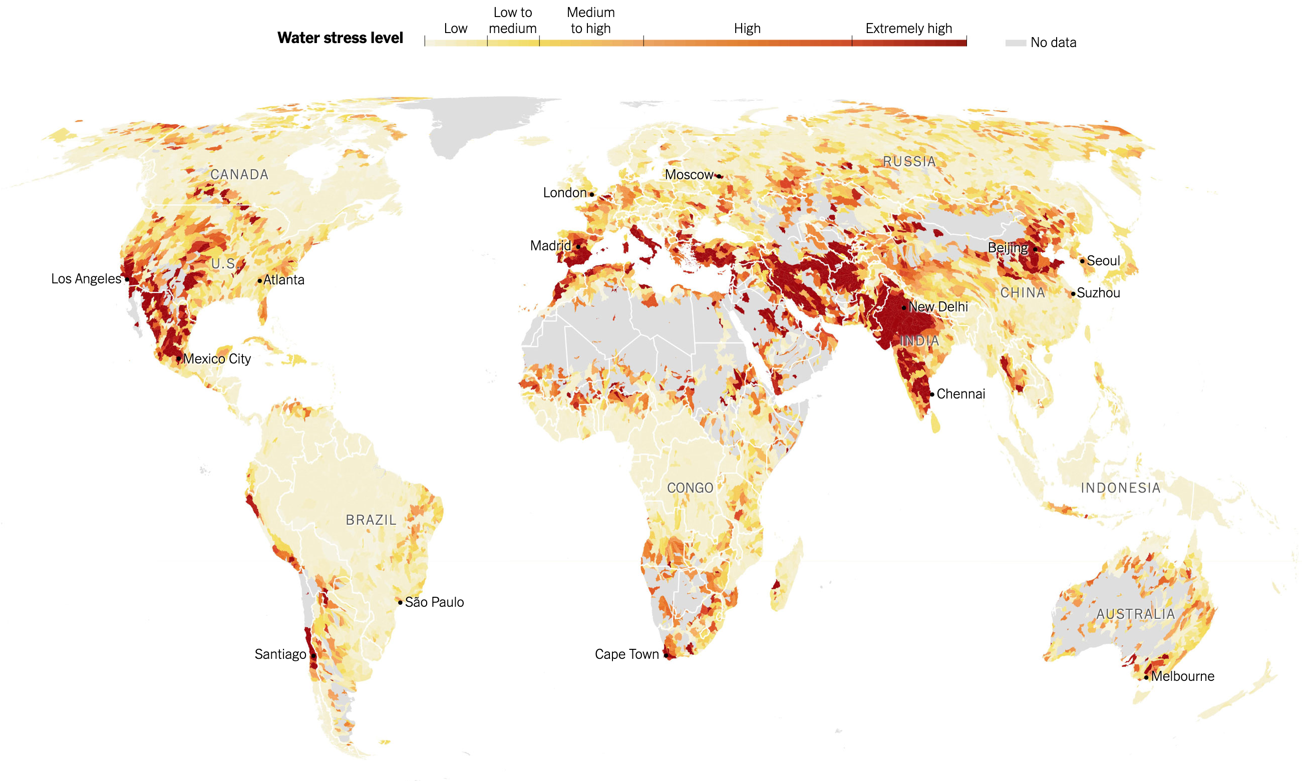
So it’s possible that we could see YInMn Blue as the basis for a paint used in printing and therefore tints of it used to make a choropleth map of freshwater availability. But if your work is strictly digital/web based, this probably won’t make too much of an immediate impact.

Viral Mutations

With Covid-19, one of the big challenges we face is the rapid mutations in the viral genetic code that have produced several beneficial—from the virus’ standpoint—adaptations. Several days ago the New York Times published a nice, illustrated piece that showed just what these mutations look like.

Of course, these were not just nice illustrations of protein molecules, but the screenshot below is of the code itself and you can see how just a few alterations can produce subtle, but impactful, effects.

In a biological sense, these mutations are nothing new. In fact, humanity wouldn’t be humanity but for mutations. Rather we are seeing evolution play out in front of our eyes—albeit eyes locked in the same household for nearly a year now—as the virus evolves adaptations better suited to spreading and surviving in a host population.

The piece includes several illustrations, but begins with an overall, simplified diagram of the virus and where its genetic code lies. And then breaks that code down similar to a stacked bar chart.

Designers identify where in the code the different mutations occur and the type of mutation. Later on in the piece we see a map of where this particular variant can be found.

I might come back to that map later, so I won’t comment too much on it here.

But I think this piece does a great job of showcasing just what we mean when we talk about virus mutations. It’s really just a beneficial slip up in the genetic alphabet.

Credit for the piece goes to Jonathan Corum and Carl Zimmer.

Needle Time

Yesterday was maybe the last election day for the 2020 US General Election. (There are still a few US House seats yet to be called, most notably a contested race in upstate New York.) These were a pair of runoff elections in Georgia for the state’s two US Senate seats (one for a full, six-year term, the other to finish out the final two years of a retiring senator).

I spent most of the night eating pizza and tracking results. One thing that I keep tabs on (in the sense of open tabs in the browser) is the New York Times needle forecast. It has its problems, but I wanted to highlight something I think was new last night. Or, if it wasn’t, I didn’t notice it back in November.

Below the needle was a simple table of results.

The needle speaks

In the past, the needle was a bit opaque and it consumed data and spat out forecasts without users having a sense of what was driving those forecasts. Back in November, there were a few instances where states published incorrect data—that they later fixed—and when the needle consumed it, the needle forecast incorrect results.

But now we have a clear record of what data the forecast consumed in the table below the needles. It’s fairly straightforward as tables go. But tables don’t have to be sexy to be clear and effective.

The table lists the time when the data was added, the number of votes added, the type of vote added, and then the actual data vs. what was expected. And ultimately how that changed the needle. This goes a long way towards data transparency.

Simple colour use, bright blues and reds, show when the result/data favoured the Republican or Democrat. Thin, light strokes instead of heavy black lines for rows and columns place the visual emphasis on the data. And smaller type for the timestamp places the less important data at a lower level of importance.

It’s just very well done.

Credit for the piece goes to Michael Andre, Aliza Aufrichtig, Matthew Bloch, Andrew Chavez, Nate Cohn, Matthew Conlen, Annie Daniel, Asmaa Elkeurti, Andrew Fischer, Will Houp, Josh Katz, Aaron Krolik, Jasmine C. Lee, Rebecca Lieberman, Jaymin Patel, Charlie Smart, Ben Smithgall, Umi Syam, Miles Watkins and Isaac White.

A Foot by Any Other Name

Measurement systems are important. They allow us to compare objects, buy and sell goods, and get from Chicago to Philadelphia. The latter, according to Google, is 759.6 miles. Or 4,010,688 feet.

But what feet?

In this piece from the New York Times we get a look at the two different foot measurements used in the United States. The article provides insight into the history of why we have a standard system of measurement.

Accompanying the wonderful article is an illustration showing how those two feet differ. It’s a simple, scaled illustration. But it does the job.

Of course we would all be better off if the United States joined the rest of the world in using the metric system. Like that time we lost a space probe because we failed to convert from English imperial to metric.

Credit for the piece goes to Eleanor Lutz.

Auto Emissions Stuck in High Gear

The last two days we looked at densification in cities and how the physical size of cities grew in response to the development of transport technologies, most notably the automobile. Today we look at a New York Times article showing the growth of automobile emissions and the problem they pose for combating the greenhouse gas side of climate change.

The article is well worth a read. It shows just how problematic the auto-centric American culture is to the goal of combating climate change. The key paragraph for me occurs towards the end of the article:

Meaningfully lowering emissions from driving requires both technological and behavioral change, said Deb Niemeier, a professor of civil and environmental engineering at the University of Maryland. Fundamentally, you need to make vehicles pollute less, make people drive less, or both, she said.

Of course the key to that is probably in the range of both.

The star of the piece is the map showing the carbon dioxide emissions on the roads from passenger and freight traffic. Spoiler: not good.

From this I blame the Schuylkill, Rte 202, the Blue Route, I-95, and just all the highways

Each MSA is outlined in black and is selectable. The designers chose well by setting the state borders in a light grey to differentiate them from when the MSA crosses state lines, as the Philadelphia one does, encompassing parts of Pennsylvania, New Jersey, Delaware, and Maryland. A slight opacity appears when the user mouses over the MSA. Additionally a little box remains up once the MSA is selected to show the region’s key datapoints: the aggregate increase and the per capita increase. Again, for Philly, not good. But it could be worse. Phoenix, which surpassed Philadelphia proper in population, has seen its total emissions grow 291%, its per capita growth at 86%. My only gripe is that I wish I could see the entire US map in one view.

The piece also includes some nice charts showing how automobile emissions compare to other sources. Yet another spoiler: not good.

I've got it: wind-powered cars with solar panels on the bonnet.
I’ve got it: wind-powered cars with solar panels on the bonnet.

Since 1990, automobile emissions have surpassed both industry emissions and more recently electrical generation emissions (think shuttered coal plants). Here what I would have really enjoyed is for the share of auto emissions to be treated like that share of total emissions. That is, the line chart does a great job showing how auto emissions have surpassed all other sources. But the stacked chart does not do as great a job. The user can sort of see how passenger vehicles have plateaued, but have yet to decline whereas lorries have increased in recent years. (I would suspect due to increased deliveries of online-ordered goods, but that is pure speculation.) But a line chart would show that a little bit more clearly.

Finally, we have a larger line chart that plots each city’s emissions. As with the map, the key thing here is the aggregate vs. per capita numbers. When one continues to scroll through, the lines all change.

Lots of people means lots of emissions.

There's driving in the Philadelphia area, but it's not as bad as it could be.
There’s driving in the Philadelphia area, but it’s not as bad as it could be.

Very quickly one can see how large cities like New York have large aggregate emissions because millions of people live there. But then at a per capita level, the less dense, more sprawl-y cities tend to shoot up the list as they are generally more car dependent.

Credit for the piece goes to Nadja Popovich and Denise Lu.

Water, Water Everywhere Nor Any Drop to Drink

Most of Earth’s surface is covered by water. But, as any of you who have swallowed seawater can attest, it is not exactly drinkable. Instead, mankind evolved to drink freshwater. And as some new data suggests, that might not be as plentiful in the future because some areas are already under extreme stress. Yesterday the New York Times published an article looking at the findings.

More reasons for me not to move to the desert southwest

The piece leads with a large map showing the degree of water stress across the globe. It uses a fairly standard yellow to red spectrum, but note the division of the labels. The High range dwarfs that of the Low, but instead of continuing on, the Extremely High range then shrinks. Unfortunately, the article does not go into the methodology behind that decision and it makes me wonder why the difference in bin sizes.

Of course, any big map makes one wonder about their own local condition. How stressed is Philadelphia, for example? Thankfully, the designers kept that in mind and created an interactive dot plot that marks where each large city falls according to the established bins.

Not so great, Philly

At this scale, it is difficult to find a particular city. I would have liked a quick text search ability to find Philadelphia. Instead, I had to open the source code and search the text there for Philadelphia. But more curiously, I am not certain the graphic shows what the subheading says.

To understand what a third of major urban areas is, we would need to know the total number of said cities. If we knew that, a small number adjacent to the categorisation could be used to create a quick sum. Or a separate graphic showing the breakdown strictly by number of cities could also work. Because seeing where each city falls is both interesting and valuable, especially given how the shown cities are mentioned in the text—it just doesn’t fit the subheading.

But, for those of you from Chicago, I included my former home as a different screenshot. Though I didn’t need to search the source code, because I just happened across it scrolling through the article.

It helps having Lake Michigan right there

Credit for the piece goes to Somini Sengupta and Weiyi Cai.

Notre Dame Almost Did Collapse

Back in April the famed Notre Dame cathedral in Paris caught fire and its roof and spire spectacularly collapsed. At the time I looked at a few different pieces, including two from the New York Times, that explored the spread of the fire. Several months later the Times has just published a look into how the firefighters saved the cathedral from collapse.

The graphics are the same amazing illustrated models from before. Now with routes taken by firefighters and coloured areas indicating key equipment used in the fight to preserve what could be saved. But the real gem in the article are a series of graphics from the firefighters themselves.

Some pretty hot sketches here

Naturally the annotations are all in French. But this French firefighter and sketch artist detailed the progress of the battle during and in the days after the fire. It makes me wish I could read French to understand the five selected sketches the Times chose to use. And I love this line from the Times.

For all the high-tech gear available to big-city fire departments, investigators still see value in old-school tools.

If you are interested in the story of how the cathedral was saved, read the lengthy article. If you just want to see some really amazing and yet wholly practical sketches, scroll through the article until you get to these gems.

Credit for the overall piece goes to Elian Peltier, James Glanz, Mika Gröndahl, Weiyi Cai, Adam Nossiter, and Liz Alderman.

Credit for the sketches goes to Laurent Clerjeau.

British English vs. Irish English

The United Kingdom is known for having a large number of accents in a—compared to the United States—relatively small space. But then you add in Ireland and you have an entirely new level of linguistic diversity. Josh Katz, who several years ago made waves for his work on the differences in the States, completed some work for the New York Times on those differences between the UK and Ireland.

You might know this as tag. At least I do.

Why do I bring it up? Well, your author is going on holiday again, this time back to London. I will be maybe taking some day trips to places outside the capital and maybe I will confirm some of these findings. But if you want, you can take the quiz and see where you fall compared to Katz’s findings.

And it does pretty well. It identified me as being clearly not from the British Isles.

Maybe I'm secretly Cornish?
Maybe I’m secretly Cornish?

But depending upon how you answer a particular question, the article will show you how your answer compares.  Let’s take my answer for scone. In that, I am more Irish.

Or you can just call them fantastic and delicious.

Credit for the piece goes to Josh Katz.

Tariffs Are a Tax

This piece from the New York Times isn’t really even a graphic. It’s a factette, or small fact. The article is about how tariffs are raising the price of certain goods, in this case a bicycle. Tariffs do not add money to the US Treasury, they are instead an additional price paid by US consumers on goods—not services—originating from outside the US.

Thankfully I can't ride a bike
Thankfully I can’t ride a bike

Sometimes a big chart is not as impactful as one big number. And here, in the context of this story, a graphic showing trade flows between the US and Mexico may have been useful. But the real gut punch is showing how the tariffs on Mexico, for this one particular bike, could cost the US consumer an additional $90. A tariff is just another word for a tax paid by the American consumer.

Credit for the piece goes to the New York Times graphics department.