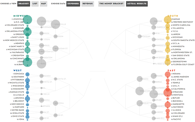
I imagined that I would be finished with posts about this March Madness thing. However, the New Yorker released its own bracket system that interested me—again, with the giant caveat that I know nothing about basketball.
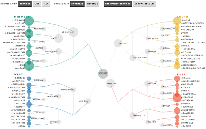
To be an interactive bracket, clearly the piece needs to function as a means of following results. However, the New Yorker offers additional layers as part of the graphic: the programme’s expenses, revenues, and geographical location. Here is the expected bracket of actual results.

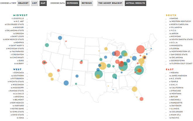
But the first thing I realised when looking at the map is that none of the groupings make any sense. How are schools from within the same city all in separate regions?

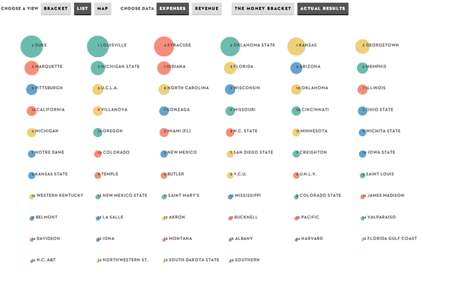
Second, the list shows you the schools ranked, again by either expenses or revenues. The encouraging thing is when you compare this to the results thus far, teams that spend very little money (comparatively) can defeat the big spenders, e.g. Florida Gulf Coast defeated Georgetown.

And that point of course proves that the most interesting view, the money bracket, does not necessarily hold true. Those teams that spend the most will not necessarily be victorious.

Credit for the piece goes to the New Yorker.
