
Yesterday we looked at the shrinking Denver Post. Today we have a graphic from a related story via Politico. The article explores the idea that President Trump performs better in what the article terms “news deserts”, those counties with a very low level of newspaper circulation. (The article explains the methodology in detail.) This piece we are looking at here shows how those counties performed against the circulation rate and their 2016 presidential election result.
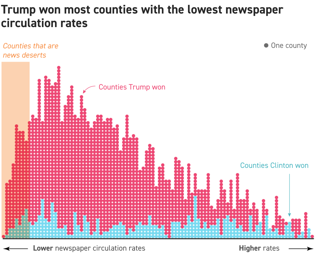
Overall, the work is solid. But I probably would have done a few things differently. First, the orange overlay falls in the middle of one column of dots. Do those dots then fall inside or outside the categorisation of news desert?
Secondly, the dots. If this were perhaps a scatter plot comparing the variables of circulation rates and, perhaps, election vote results as a percent, dots would be perfect. Here, however, they create this slightly distracting pattern in the the main area of counties. When the dots are stacked neatly and apart from other columns, as they are more often on the right, the dots are fine. But in the packed space on the left, not as much.
As I was reading through the article I had a couple of questions. For example, couldn’t the lack of newspapers be reflective of the urban–rural split or the education split, both of which can be seen in the same election results. Thankfully the article does spend time going through those points as well. It is a bit lengthy of a read—with a few other perfectly fine graphics—but well worth it.
Credit for the graphics goes to Jeremy C.F. Lin.