Repealing the Individual Mandate

While I am still looking for a graphic about Zimbabwe, I also want to cover the tax reform plans as they are being discussed visually. But then the Senate went and threw a spanner into the works by incorporating a repeal of Obamacare’s individual mandate. “What is that?”, some of you may ask, especially those not from the States. It is the requirement that everyone have health insurance and it comes with tax penalties if you fail to have coverage.

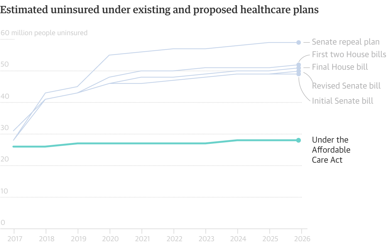
Thankfully the New York Times put together a piece explaining how the mandate is needed to keep premiums low. Consequently, removing it will actually only increase the premiums paid by the poor, sick, and elderly. The piece does this through illustrations accompanying the text.

Exiting the pool
Exiting the pool

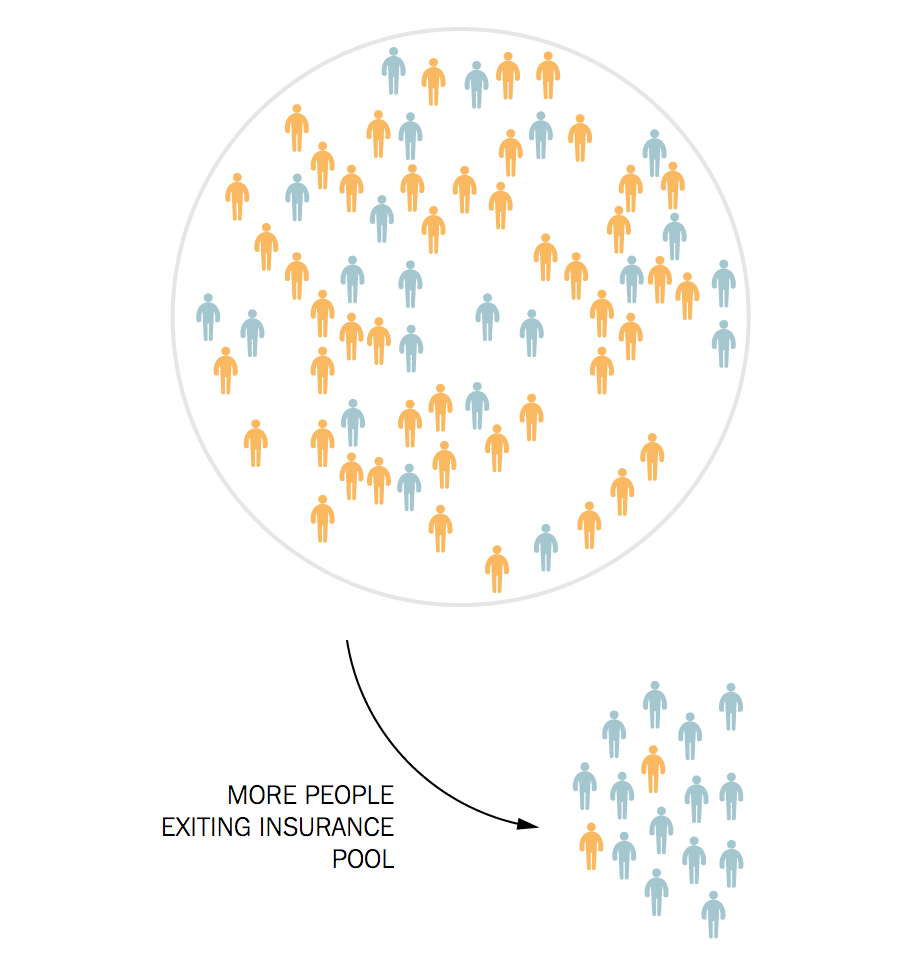
Overall the piece does a nice job of pairing graphics and text to explain just why the mandate, so reviled by some quarters, is so essential to the overall system.

Credit for the piece goes to Haeyoun Park.

(Lack of) Support for Cassidy-Graham Obamacare Repeal

A wee bit of housekeeping here at the top. Your author will be away for work and then enjoying a well-earned, but all-too-brief holiday over the next week.

At the end of the week, the Senate’s window to pass a budget reconciliation measure, i.e. what they need to do to repeal Obamacare with only 51 votes, will close for a year. As of my writing on Monday evening, Susan Collins has just become the third Republican no vote, effectively dooming the bill should it come to the floor for the vote.

But as the week progresses, I fully expect the bill’s authors to add some bells and whistles to try and sweeten the deal. But the problem has always been, the bells for the hardline conservatives push moderates away and the whistles for those same moderates drive away the same hardline conservatives. For the next year and a half or so, the best bet to pass a fix to healthcare is a bipartisan “repair Obamacare” instead of “repeal Obamacare”. Whether or not the Senate will have the stomach for such a compromise is yet to be seen.

In the meantime, this week we have a tracker from the Washington Post examining the latest positions of senators on the Cassidy-Graham bill.

It does a nice job of breaking up the Republican conference not just along the ideological spectrum, but also on the winners and losers spectrum. After all, the bill as written will transfer large sums of aid from states that accepted the expansion of Medicare to those states that rejected expansion.

Who's saying yes and who's saying no
Who’s saying yes and who’s saying no

Credit for the piece goes to Kim Soffen, Amber Phillips, and Kevin Schaul.

The Cassidy-Graham Healthcare Bill

I meant to post this yesterday, but accidentally saved it as a draft. So let’s try this again.

Yesterday the New York Times published a print piece that explored how the Cassidy-Graham bill would change the healthcare system. This would, of course, be another attempt to repeal and replace Obamacare. And like previous efforts, this bill would do real damage to the aim of covering individuals. We know the dollar amounts in terms of changes to aid given to states, but in terms of the numbers of people likely to lose their coverage, that would have to wait for a CBO score.

Hyperlinked to the online version of the article

The graphic makes really nice use of the tall vertical space afforded by two columns. (You can kind of see this too in the online version of the article.) At the beginning of the article, above the title even, are two maps that locate the states with the biggest funding gains and cuts. I wonder if the two maps could have been combined into one or if a small table, like in the online version, would have worked better. The map does not read well in the print version as the non-highlighted states are very faint.

The designer chose to repeatedly use the same chart, but highlight different states based on different conditions. This makes the small multiples that appear below the big version useful despite their small size. Any question about the particular length can be referenced in the big chart at the top.

With the exception of the maps at the top of the piece, this was a great piece that used its space on the page very well.

Credit for the piece goes to Haeyoun Park.

Comparing the US Healthcare System to the World

Spoiler, we don’t look so great.

In this piece from the Guardian, we have one of my favourite types of charts. But, the piece begins with a chart I wonder about. We have a timeline of countries creating universal healthcare coverage, according to the WHO definition—of which there are only 32 countries. But we then plot their 2016 population regardless of when the country established the system. It honestly took me a few minutes to figure out what the chart was trying to communicate.

This is the only graphic I'm not sure of in the entire piece.
This is the only graphic I’m not sure of in the entire piece.

However, we do get one of my favourite charts: the scatter plot over time. And in it we look at the correlation between spending on healthcare compared to life expectancy. And, as I revealed in the spoiler, for all the money we spend on healthcare—it is not leading to longer lives as it broadly does throughout the world. And care as you might want to blame Obamacare, the data makes clear this problem began in the 1980s.

Someone's getting cheated out of a lot of money. Oh wait, that's us…
Someone’s getting cheated out of a lot of money. Oh wait, that’s us…

And of course Obamacare is why the Guardian published this piece since this is the week of the Vote-a-rama that we expect to see Thursday night. The Republicans will basically be holding an open floor to vote on anything and everything that can get some measure of repeal and/or replace 50 votes. And to wrap the piece, the Guardian concludes with a simple line chart showing the number of uninsured out to 2026. To nobody’s surprise, all the plans put forward leave tens of millions uncovered.

When all the options look bad, why not work with what you have?

It is a fantastic piece that is well worth the read, especially because it compares the systems used by a number of countries. (That is largely the text bit that we do not cover here at Coffeespoons.) I found the piece very informative.


Credit for the piece goes to the Guardian graphics department.

The Insurance Exchanges

There is a lot to unpack about last Thursday and Sunday. But before we dive into that, a little story from the New York Times that caught my eye from Friday.

Where there are no real options

The map shows the counties in the United States where there is one health insurer and no health insurer. Further on in the piece a small multiple gallery shows that progression from 2014 and highlights how the drastic changes are seen only in 2017 and 2018.

The problem is often not that people cannot buy insurance if no insurers are in the marketplace. The marketplace is for federally-subsidised coverage and insureres appear to be moving to offering policies outside the marketplace for non-subsidised customers.

The White House claims Obamacare is in a death spiral. It is not. But after seven years it could use a little maintenance.

Credit for the piece goes to Haeyoun Park and Audrey Carlsen.

Here We Go Again

Well as of last night, we are having yet another vote on AHCA, better known as Trumpcare. I will not get into the details of the changes, but basically it can be summed up as waivers for Obamacare regulations. And as of last night, $8 billion over five years to cover those at high-risk. What about after five years? What if, as experts say, that sum is insufficient and it runs out before five years are up?

This is still a bad bill.

But thankfully we have FiveThirtyEight who looked at support before the Upton amendment—the $8 billion bit—and found that the bill could still fail because of a lack of moderate support.

Round and round we go

The basic premise is this: In order to get the conservative Freedom Caucus, which scuppered the bill a few weeks ago, on side Ryan et al. had to make the bill more conservative. They likely had to make it cover fewer people at a higher cost. I say likely because Ryan is not sending this to the Congressional Budget Office (CBO) to score the bill, something typically done to see how much it costs and whether it might work. Problem is, by making the bill more conservative, they push away moderate Republicans. Yes, Virginia, they do exist.

Today’s question is whether an $8 billion throw-in will buy in enough moderate votes.

It’s going to be a long day.

Credit for the piece goes to Harry Enten.

One Insurer Counties

Let’s go back in time briefly to last week and the whole Obamacare thing. It’s not perfect and could be improved. I stridently believe that what the administration proposed was worse. But this article from Vox does highlight one of the things that could be improved—making more choices available to consumers. And they make the point with a map.

Lots of red counties there

That map shows the counties where there is only one insurer and almost a dozen counties in Tennessee where there are none. Note the colour—blue are counties that voted for Clinton and red for Trump. If Trump attempts to “explode” Obamacare, he will—much like the plans from last week—be hurting most those people who voted for him. Very strange politics if you ask me.

Credit for the piece goes to Sarah Frostenson.

Those Who Will Lose Subsidies for Trumpcare

As much as I like trains…we need to get back to Trumpcare. As you probably know, it will cover fewer people than Obamacare. Just how many fewer people? Somewhere in the ten to twenty million range. The poor, the elderly, and the sick are those who will be worse off. Because the poor, the elderly, and the sick are the ones who clearly do not need healthcare. Higher-income young people, your subsidies are about to go up.

But I digress, the Los Angeles Times looked at county electoral and tax data to see just where the pain falls geographically, and more importantly where it falls politically. So they took a look specifically at the bracket that will be hurt the most: the poor and elderly, 60 and earning $30,000.

Trump won the vast majority of counties that will be hardest hit

Well, it looks like all those people who voted against the idea of Obamacare just voted themselves to get even less assistance. Trumpcare’s going to be great, guys. Unless you’re old. Or poor. Or sick.

Credit for the piece goes to Priya Krishnakumar.

How Trumpcare Differs from Obamacare

We are going to have a busy week this week. From the CBO release on Trumpcare costs and coverage to the elections in the Netherlands. Oh, and it might snow a wee bit here in Philadelphia and the East Coast. So let’s dive straight into today’s post, an article all the way from the West Coast and the LA Times.

It looks at a comparison between Trumpcare and Obamacare.

How the changes affect the young, middle-aged, and the elderly by income level

The clearest takeaway is that they are using some pretty good colours here. Because purple.

But in all seriousness, the takeaway from this graphic is that Trumpcare as proposed will cost more for the poor and the elderly. And it will cost especially more for those who live in rural and more isolated areas. And that basically comes down to the fact that Trumpcare will not factor in the local cost of insurance, which generally costs more in non-urban areas.

But for the fullest understanding of the differences, you should read the full piece as it offers a point-by-point comparison.

Credit for the piece goes to Noam N. Levey and Kyle Kim.

A Look Back

Well, we are one day away now. And I’ve been saving this piece from the New York Times for today. They call it simply 2016 in Charts, but parts of it look further back while other parts try to look ahead to new policies. But all of it is well done.

I chose the below set of bar charts depicting deaths by terrorism to show how well the designers paid attention to their content and its placement. Look how the scale for each chart matches up so that the total can fit neatly to the left, along with the totals for the United States, Canada, and the EU. What it goes to show you is best summarised by the author, whom I quote “those 63 [American] deaths, while tragic, are about the same as the number of Americans killed annually by lawn mowers.”

Deaths by terrorism
Deaths by terrorism

I propose a War on Lawn Mowers.

The rest of the piece goes on to talk about the economy—it’s doing well; healthcare—not perfect, but reasonably well; stock market—also well; proposed tax cuts—good for the already wealthy; proposed spending—bad for public debt; and other things.

The commonality is that the charts work really well for communicating the stories. And it does all through a simple, limited, and consistent palette.

But yeah, one day away now.

Credit for the piece goes to Steven Rattner.