Traffic Accidents in Philadelphia

I’m working on a set of stories and in the course of that research I came across this article from Philly.com exploring traffic accident in Philadelphia.

Lots of red there…
Lots of red there…

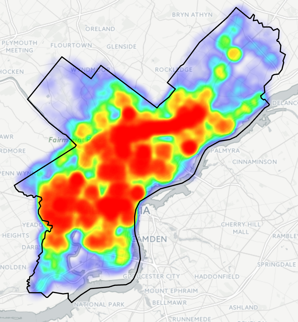
The big draw for the piece is the heat map for Philadelphia. Of course at this scale the map is pretty much meaningless. Consequently you need to zoom in for any significant insights. This view is of the downtown part of the city and the western neighbourhoods.

A more granular view


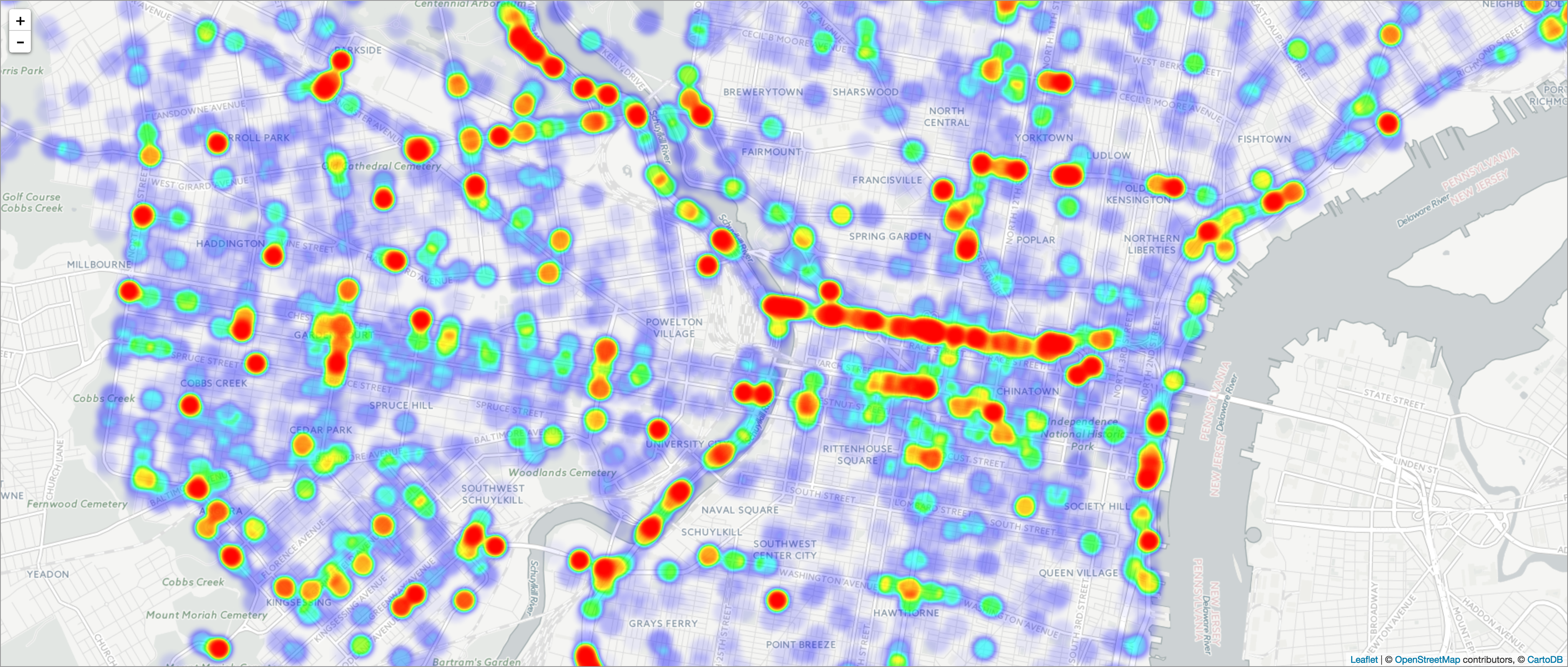
As you can see there are obvious stretches of red. As a new resident of the city, I can tell you that you can connect the dots along a few key routes: I-76, I-676, and I-95. That and a few arterial streets.

Now while I do not love the colour palette, the form of the visualisation works. The same cannot be said for other parts of the piece. Yes, there are too many factettes. But…pie charts.


This is the bad kind of pie

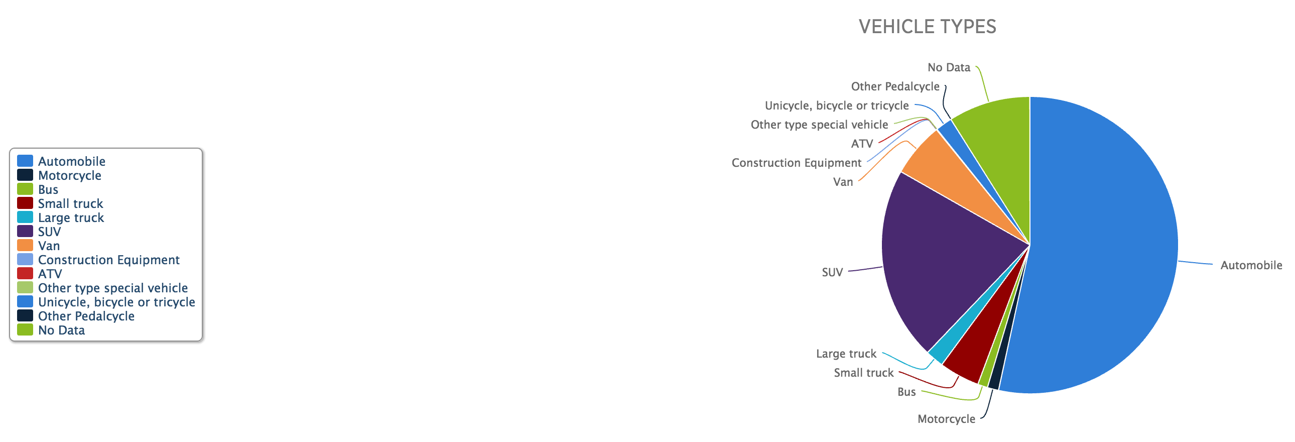
From a design standpoint, first is the layout. The legend needs to be closer to the actual chart. Two, well, we all know my dislike of pie charts, in particular those with lots of data points, which this piece has. But that gets me to point three. Note that there are so many pieces the pie chart loops round its palette and begins recycling colours. Automotives and unicycles are the same blue. Yep, unicycles. (Also bi- and tricycles, but c’mon, I just want to picture some an accident with a unicycle.)

If you are going to have so many data points in the pie chart, they should be encoded in different colours. Of course, with so many data points, it would be difficult to find so many distinguishable but also not garish colours. But when you get to that point, you might also be at the point where a pie chart is a bad form for the visualisation. If I had the time this morning I would create a quick bar chart to show how it would perform better, but I do not. Trust me, though, it would.

Credit for the piece goes to Michele Tranquilli.

Philly Falls from Fifth

Well it finally happened. While the Great Recession spared Philadelphia for several years, Phoenix has finally moved up into the rank of fifth-largest city in the United States.

There are some notable differences that this graphic captures. The big one is that Philly is relatively small at 135 square miles. Phoenix is half the size of Rhode Island. What the graphic does not capture, however, is that Philly is still growing, albeit more slowly than southern and western cities. Because also in the news is the fact that Chicago has shrunk and lost people. Personally I count as a -1 for Chicago and a +1 for Philly.

Comparing size and population

Credit for the piece goes to the Philly.com graphics department.

Snowfall in Philadelphia

Today, 9 February, it finally snowed significantly here in Philadelphia. In Chicago it probably snowed shortly after I moved out in September. Today’s graphic is a forecast map from philly.com using National Weather Service (NWS) data.

Snowfall in Philadelphia

I fail to understand the divergent palette—to be fair this is not the only instance of it throughout the meteorological world. There is a split at the six-inch mark—but why? If anything, my eye would think that the 4–6 range is the heaviest, not the yellow. Snowfall is usually more of a continuous range, and so both within the blues and yellows you get that through a softer edge as the colours become more intense. And then you hit the six-inch mark and a violent shift.

I am also curious as to why the choice to use a coloured map background. Especially if the colour, a lightish green-blue is so close to the lightish blue used by the map to forecast snowfall.

In short, I think this Philadelphia map could use some attention from some designers to make the message a bit clearer.

Credit for the piece goes to the philly.com graphics department.

Septa’s Train and Trolley Service

Well, everyone, today you get two posts. The first and earlier (and planned) post is about polling in Pennsylvania. Relevant to those of you following the US election. But today’s post is about what trains are running in the city of Philadelphia.

If you haven’t heard, the city’s mass transit agency, SEPTA, and its primary union for workers within the city cannot come to an agreement on a contract. So…strike. And for those of you reading this from outside the Philly area, rest assured it’s just chaos right now. To put it into a wee bit of perspective, we have this graphic—actually an interactive map—of train routes in the city. And by train, Philadelphia has your standard suburban commuter heavy rail and subway lines and light rail lines, but we also make use of a number of trolley lines.

What's running and not
What’s running and not

What the map does not show are the city’s various bus routes, all of which that run within the city are suspended. There are bus routes and rail lines outside the city, most notably the commuter rail or the blue lines in the map, operated by a different union that is not on strike.

Credit for the piece goes to the Philly.com graphics department.

Where do Philly’s Cops Live?

I am on holiday for a few days and am visiting Philadelphia. So what better time to cover some Philadelphia-made content? This interactive piece came out last year from Philly.com alongside coverage of the Philadelphia mayoral contest.

Where the cops live
Where the cops live

I want to call out the colour palette for the choropleth in particular. We can see a blue to red system with a stop at yellow in the middle—a divergent palette. With this kind of a setup, I would expect that yellow or the light blue to be zero or otherwise straddle the point of divergence. Instead we have dark blue meaning 0 and dark red meaning 401+. The palette confuses me. It could be that the point of divergence—something around the 200 number—could be significant. It could be the city average, an agreed upon number for good neighbourhood relations, or something. But there is no indication of that in the graphic.

Secondly the colour choice itself. I often hesitate using red (and green) because of the often-made Western connotation with bad. Blue here, it works very well with the concept of the thin blue line, NYPD blue, blue-shirted police. If we assume that there is a rationale for the divergent palette, I would probably place the blue on the high-end of the spectrum and a different colour at the negative end.

Lastly, from the perspective of the layout, Philly has a weird shape. And so that means between the bar chart to the right and the city map on the left the piece contains an awkward negative space. The map could be adjusted to make better use of the space by pointing north somewhere other than up.—why is north up?—to align the Delaware River with the bars. Or, the bars could abut West Philly.

The interactions, however, are very smooth. And a nice subtle touch that orients the reader without distracting them is the inclusion of the main roads, e.g. Broad Street. The white lines are sufficiently thin to not distract from the overall piece.

Credit for the piece goes to Olivia Hall.

Septa’s Silverliner Service Shutdown

Two weeks ago Philadelphia regional rail commuters, a large group to which I belonged for a number of years, experienced a week from hell. On 2 July a yard inspector for Septa, the Philadelphia region’s transit agency, discovered a Silverliner V railcar tilting. For those not familiar with Septa, the Silverliner Vs have been in service for only three years and have been long touted as the future of the Philadelphia commuter rail service. After inspection Septa discovered the tilting railcar suffered from a fatigue crack on the equaliser beam, specifically where it was welded to connect to the wheel bearings. The beam forms part of the truck, which is what connects the railcar to the rails, and any failure at speed could have resulted in an accident, possibly a derailment. The transit agency then quickly inspected the remainder of its fleet of 120 Silverliner Vs. It found the same fatigue crack in a total of 115 cars. By 4 July, Septa pulled all 120 Silverliner Vs from service.

The equaliser beam connects the wheels to the passenger car

So what happened? At this point, we do not know. Septa continues tests to discover just what happened and just what can be done to repair the cars. Because, with a fleet of approximately 400 cars, the Silverliner Vs represent 1/3 of the fleet. And with fewer seats and fewer trains, commuters attempting to ride into the city, particularly from nearer-in suburbs, find trains bypassing stations because they quickly reach capacity.

The additional passenger railcars from other regional transit agencies will make little difference

Consequently, Septa has instituted a reduced service—a modification of the Saturday service—with additional service on subways and other high-speed lines. Additionally, Septa has agreed to lease additional trainsets, i.e. locomotives with passenger cars, from other regional transit agencies: Amtrak, New Jersey Transit (NJ Transit), and the Maryland Area Regional Commuter Train Service (MARC).