Just Keep Grinding it Out

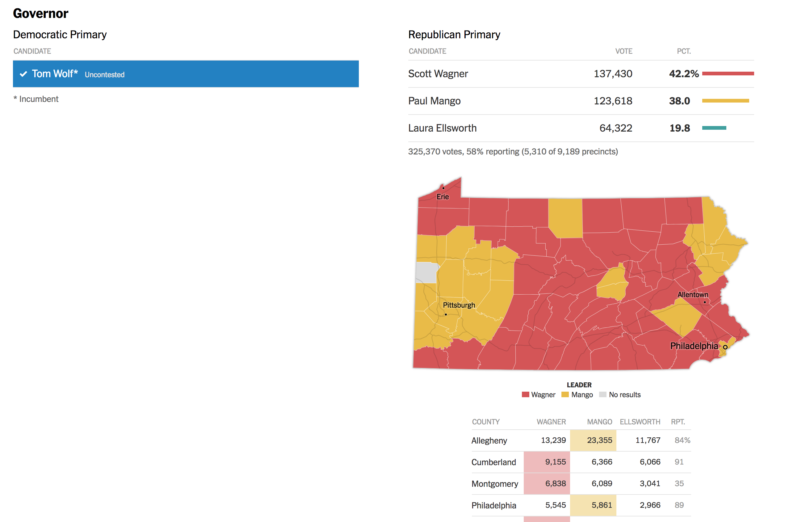
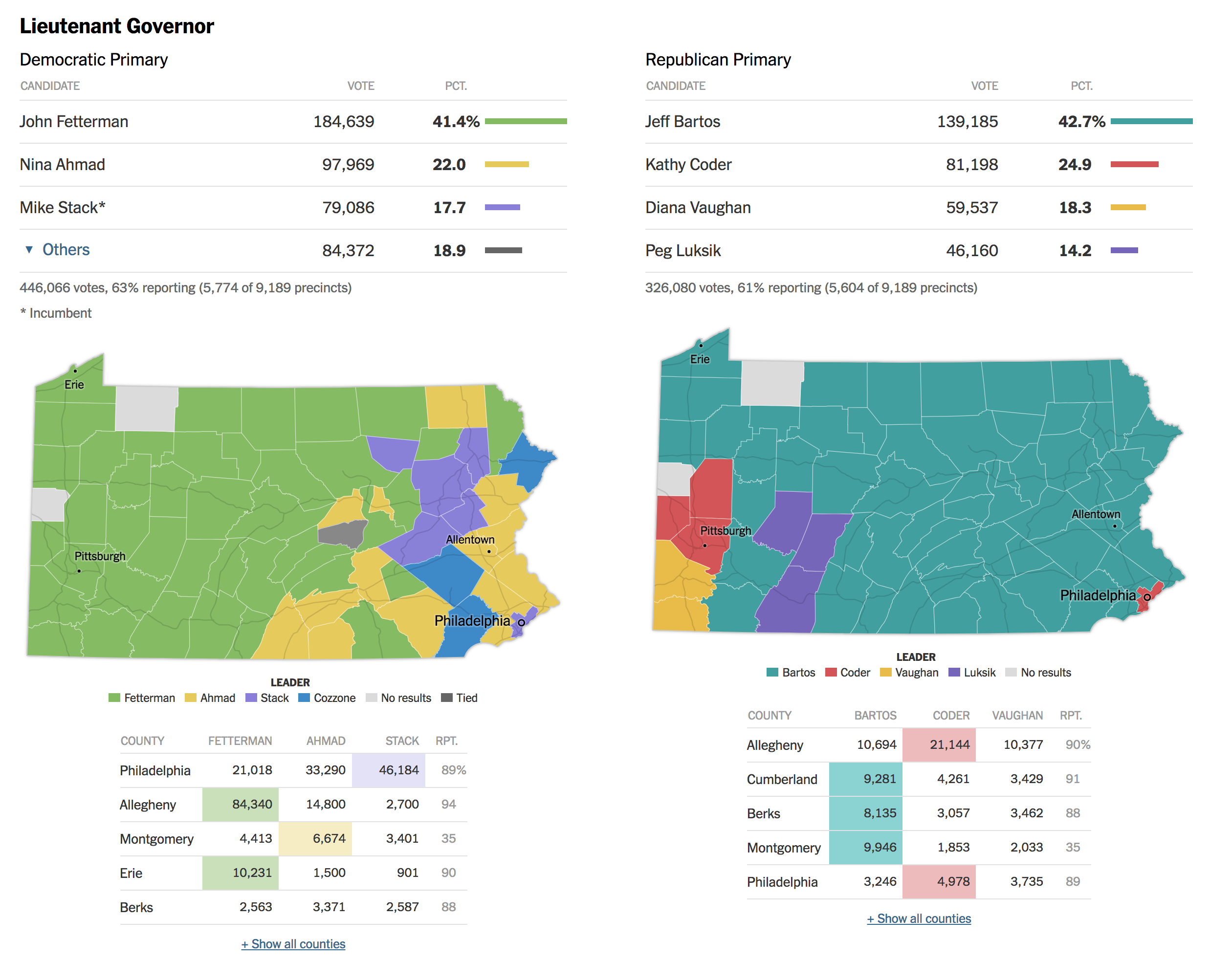
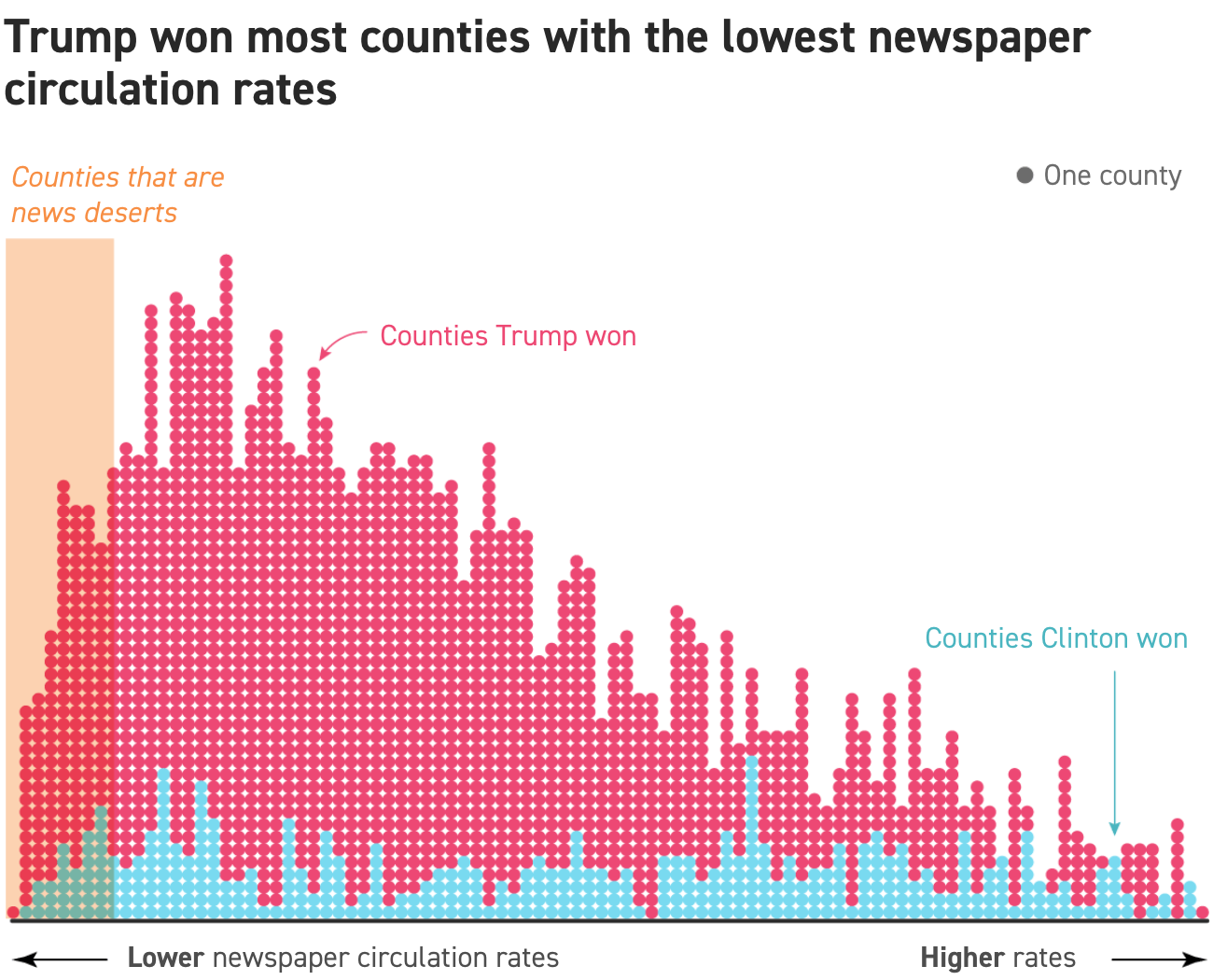
There are certain journalism outlets that I read that consistently do a good job with information design or at least are known for it. Now I try to keep my media diet fairly large and ideologically broad, but in that there are also still some outlets that feature quality design than others. The New York Times, the Washington Post, and the Economist are usually probably top of my list, but you will also see the Wall Street Journal, Philadelphia Inquirer, Boston Globe, the Guardian, and the BBC. I also read more niche outlets for some of my interests, e.g. the Athletic for Red Sox and baseball. But these often don’t feature information design. Politico is one that I read for my political news fix. And when I was reading it whilst on holiday, I was surprised to find an article about the employment market with a really nice line chart.

The article examines the changing labour market where, for over a year now, bargaining power largely resided with employees. If employees wanted raises, benefits, perks, whatever, they could often leave their current employer if their requests weren’t met because another employer, desperate for staff, would likely meet their asks. However, as the economy cools, we would expect the labour market to tighten making few openings available. That begins to reduce the bargaining power of employees as now employers can say “take it or leave it”, knowing that the offers they make to staff aren’t likely to be met by other employers who don’t have open positions or aren’t otherwise hiring.

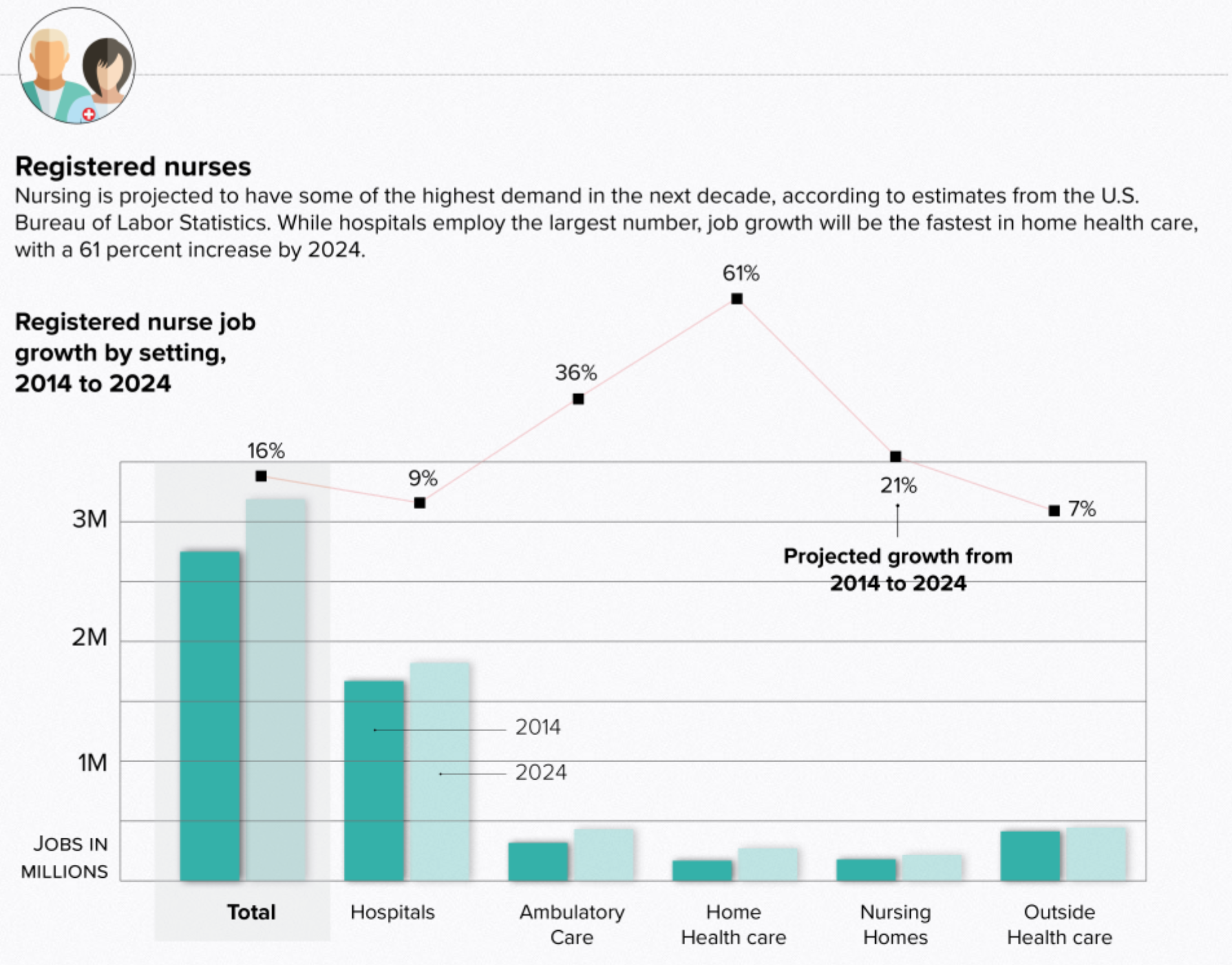
Four graphics punctuate the article, detailing just that changeover. The full article is worth a read, but I wanted to take a look at one graphic that I think best captures the design decisions made.

That looks like an inflection point to me.

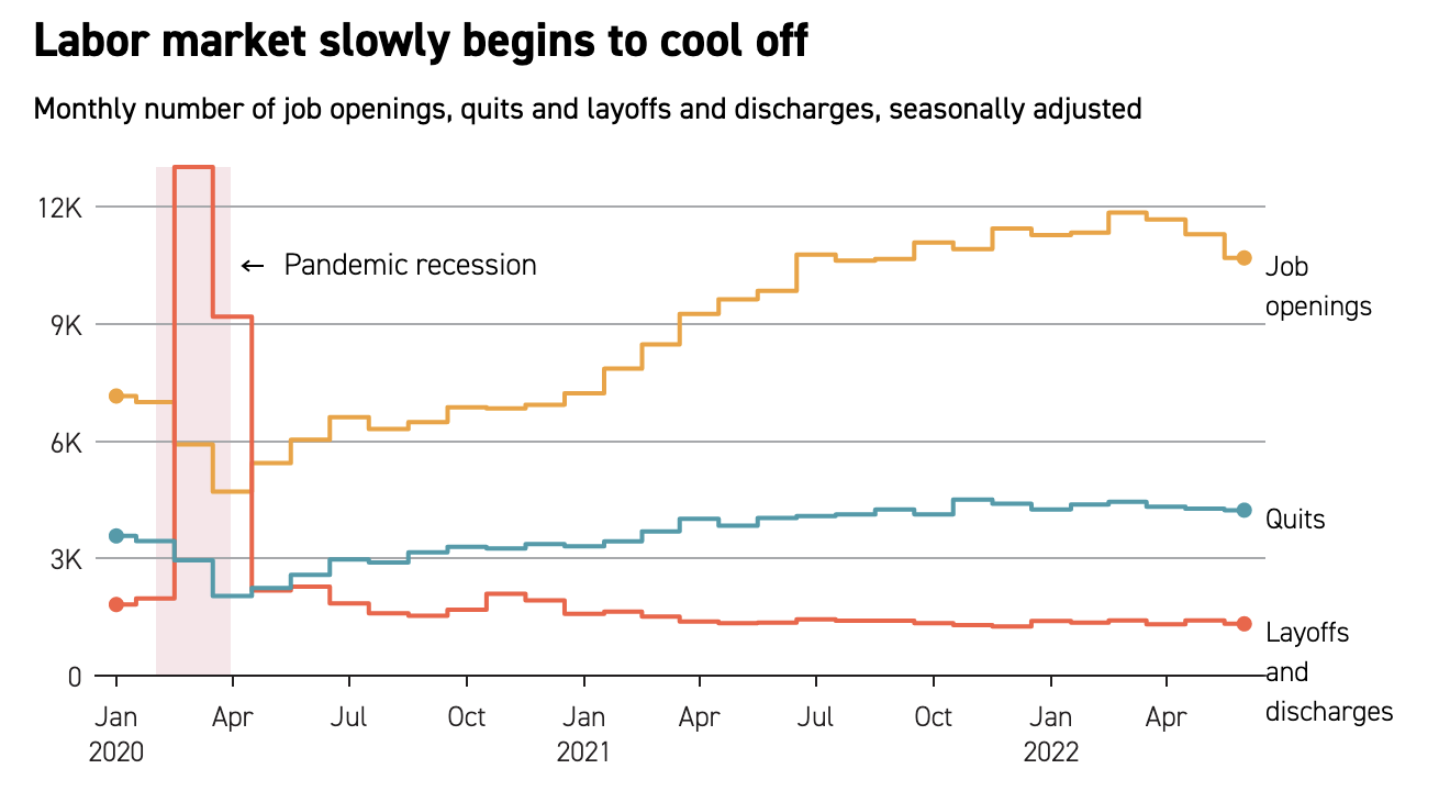
My screenshot above doesn’t capture the interactivity, but we will return to that in a moment. We see three data series: job openings, quits, and layoffs and discharges. The designer represented each with a primary colour, making clear distinctions between the three, and since all three are represented by thousands of units, they can be plotted together. That allows one to make easy comparisons across the three series at particular moments in time, e.g. the Covid recession. My only real quibble is with that recession bar. I probably would have used a neutral colour like a light grey instead of red, because the red appears visually linked to layoffs and discharges when they really are not.

Normally when we see an interactive line chart, we have a small legend above, sometimes below, the graphic. Here, however, the labelling for the lines sit directly next to the line. This makes the display clearer for the reader who scans the data series and I’ve seen the approach often in print, but rarely for interactive work.

And when the reader mouses over the work, the highlight does a few nice things.

See what you want to see.

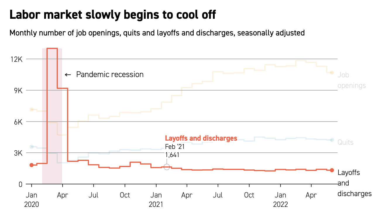
We can first see that the line with which the user is engaged becomes the focus: the remaining two lines recede into the background as they are greyed out. We also get a simple, but well designed text label above the cursor. Note how that behind the text there is a thin white stroke that creates visual separation between the letters and the data line. And that cursor is a small grey circle surrounding the data point, allowing you to see said data point.

Take it all together and you have a very clear and very effective interactive line chart. It’s a job well done.

When I see good work from unexpected places it’s important to call it out and highlight it because it means some design director somewhere cares enough to try and improve their publication’s quality of communication. And in an era when many outlets suffer from disinvestment and cost-cutting staff reductions that leave fewer designers, editors, and photographers on staff it is easy to imagine design quality decreasing.

So credit for this piece goes to Eleanor Mueller.

How Does the UK View Their Political Parties?

The United Kingdom crashes out of the European Union on Friday. That means there is no deal to safeguard continuity of trading arrangements, healthcare, air traffic control, security and intelligence deals, &c. Oh, and it will likely wreck the economy. No big deal, Theresa. But what do UK voters think about their leading political parties in this climate? Thankfully Politico is starting to collect some survey data from areas of marginal constituencies, what Americans might call battleground districts, ahead of the eventual next election.

And it turns out the Tories aren’t doing well. Though it’s not like Labour is performing any better, because polling indicates the public sees Corbyn as an even worse leader than Theresa May. But this post is more to talk about the visualisation of the results.

Of course I naturally wonder the perception of the smaller parties like the Liberal Democrats or Change UK (the Independent Group)

The graphics above are a screenshot where blue represents the Conservatives (Tories) and red Labour. The key thing about these results is that the questions were framed around a 0–10 scale. But look at the axes. Everything looks nice and evenly spread, until you realise the maximum on the y-axis is only six. The minimum is two. It gives the wrong impression that things are spread out neatly around the midpoint, which here appears to be four. But what happens if you plot it on a full axis? Well, the awfulness of the parties becomes more readily apparent.

Neither party looks very good here…

Labour might be scoring around a five on Health, but its score is pretty miserable in these other two categories. And don’t worry, the article has more.  But this quick reimagination goes to show you how important placing an axis’ minimum and maximum values can be.

Credit for the piece goes to the Politico graphics department.

The Entire United States

Last month Politico published an article called the Democrats’ Dilemma. It looked at what will likely be the crux of their debate for their 2020 candidates. Go moderate or hard left? The super simple version of the argument is that do you win by persuading independents and moderate Republicans to vote Democratic? Or do you win by ginning up the fervour of your liberal base and drive out the vote?

The article contrasts those approaches by looking at two neighbouring congressional districts. The first was won by Ilhan Omar, a Somali-American woman who has been at the centre of several causes célèbres in recent months. The second was won by a moderate, wealthy white man who has not really attracted any attention whatsoever.

But I don’t want to talk about the merits of either representative nor the fascinating split the article discusses. Instead, I want to look at a little piece of the graphics used in the article. It uses some simple stacked bar charts to compare and contrast the demographics of the representatives’ districts. Notably, they are different. But it goes on to compare and contrast them to the overall United States.

But what about New Zealand?

The first thing, I probably would have angled Mr. Phillips’ head so his head is straight, but that is a minor detail. The other thing I immediately noticed is a big pet peeve of mine. For the “Entire United States”, we have a map of the United States. Or do we?

What is missing? The entire states of Alaska and Hawaii, that’s what. I can understand not including Puerto Rico or other insular territories like the U.S. Virgin Islands because they are either not states or so small they would not appear visible at such a scale. However, Alaska and Hawaii are both integral parts of the United States. They are not marginal, like former Attorney General Jeff Sessions’ infamous quip about Hawaii being “some island in the Pacific”.

Perhaps at the above scale, Hawaii would be too small to appear—though I doubt it. But what about Alaska? It is the largest state. And Texas isn’t even a close second. So why is Alaska not included? Unfortunately—though fortunately for Politico, whose work I generally like—this is not a problem specific to Politico.

Even my own employer, the Federal Reserve Bank of Philadelphia, gets it wrong. One of their interactive data visualisation pieces, which for the record my team had nothing to do with, also completely omits Alaska and Hawaii in their map of the United States. And it’s a far larger map with ample space.

Still no New Zealand…

Including Alaska and Hawaii should not be afterthoughts. They are not second-class states. They are full constituent parts of the union. And if it is not easy to include them because they are not contiguous nor sharing the same continent, that should not obviate designers from including them in the United States.

Credit for the piece goes to the Politico’s design department and the Philadelphia Fed’s design department.

Fundraising for the Midterms

We are now less than 100 days away—95 to be exact—from the 2018 midterm elections here in the United States. As we get closer and closer we not only get more information from polls, but also campaign finance reports. Those can sometimes serve as a proxy for support as lots of grassroots support can dump lots of cash in a candidate’s war chest. Wheras a candidate who drums up little support might find him or herself with scant funds to fight the campaign.

So what does that funding tell us right now? Well last week Politico posted an article looking at that data. They broke the dataset into chunks by the likelihood of the results. This screenshot is of Pennsylvania’s 1st Congressional District.

What's going on north of Philly
What’s going on north of Philly

Each district is represented by a dot plot, with the total money raised by each candidate plotted, the distance in grey being the amount by which the Democrat outraised the Republican.

This is a nice piece as the hover state provides a nice grey bar behind the district to focus the user’s attention. Then for the secondary level of information in terms of cash on hand for the Democrats, i.e. who has cash now, we get the dot filled in versus the open state for simply money raised. Then of course the hover state reveals the actual numbers for the two candidates along with the difference between the two.

The funny thing with this particular district, the Pennsylvania 1st, is that Wallace is not necessarily raising a lot of money. He is a self-funding millionaire. He also is not the most electable Democrat in a competitive seat. It will be fascinating to watch how this particular district performs over the next few months, but most importantly in November.

Credit for the piece goes to Sarah Frostenson.

Tariffs and Trade with China

Following up on yesterday’s post about the facts on tariffs, today we look at an article from Politico that polled voters on their feelings about trade and trade policy. Now the poll dates from the beginning of June and unfortunately a lot of things have changed since then. But, the data overwhelmingly supports the conclusion that voters, at that time at least, do not support placing tariffs on goods coming into the US.

Let’s take a look at another component of the article, however, a chart exploring the infamous trade deficit. First of all, trade deficits do not work like how the president says they do—but we will come back to that in another post. In short, trade deficits are neither good nor bad. They are just one way of describing one facet of a trade relationship between two countries.

This piece looks at the trade balance between the United States and China.

We will get into why this isn't all bad in another post
We will get into why this isn’t all bad in another post

Now, from the topical standpoint, it does a really nice job of showcasing how our imports have surged above our experts. From a topical standpoint, however, we do not know if this is a total trade deficit or just in goods, like the president prefers to talk about, or in goods and services, the latter of which accounts for way more than half of the US economy.

From a design perspective, I have a few thoughts and the first is labelling. The chart does label the endpoints of the data set, 1985 and 2017. But aside from a grey bar representing the Financial Crisis, there are few other markers to indicate the year. In smaller charts, I often do this myself, because space. But here there is enough space for at least a few intervening years to be labelled.

Secondly, the white outline of the red line. I have talked before of a trend to showcase a line over other lines with that thin stroke. But this is the first time I can recall the effect being used over an area filled with colour. Is it necessary? Because the area is light and the line dark and bright, probably not.

Then the outline appears on the text in the graphic, in particular the labels of imports, exports, and the trade deficit label. The labels for the imports and exports likely are necessary because of that light grey used for the text. But, as with the line for the trade deficit, its label likely provides sufficient contrast the thin white outline isn’t necessary.

Credit for the piece goes to Jeremy C.F. Lin.

Pennsylvania Primary Night

Surprise, surprise. This morning we just take a quick little peak at some of the data visualisation from the Pennsylvania primary races yesterday. Nothing is terribly revolutionary, just well done from the Washington Post, Politico, and the New York Times.

But let’s start with my district, which was super exciting.

The only thing to write home about is how the Republican incumbent dropped out at the last moment and was replaced by this guy…

Moving on.

Each of the three I chose to highlight did a good job. The Post was very straightforward and presented each office with a toggle to separate the two parties. Usually, however, this was not terribly interesting because races like the Pennsylvania governor had one incumbent running unopposed.

Mango is represented by what colour?

But Politico was able to hand it differently and simply presented the Democratic race above the Republican and simply noted that the sitting governor ran unopposed. This differs from the Post, where it was not immediately clear that Tom Wolf, the governor, was running unopposed and had already won.

Clean and simple design. No non-sense here.

The Times handled it similarly and simultaneously displayed both parties, but kept Wolf’s race simple. The neat feature, however, was the display of select counties beneath the choropleth. This could be super helpful in the midterms in several months when key races will hinge upon particular counties.

The Republican primary for the PA governorship has been ugly

But where the Times really shines is the race for Pennsylvania’s lieutenant governor. Fun fact, in Pennsylvania the governor and lieutenant governor do not run as a ticket and are voted for separately. This year’s Democratic incumbent, Mike Stack, does not get on with the governor and had a few little scandals to his name, prompting several Democrats to run against him. And the Times’ piece shows the two parties result, side-by-side.

Pennsylvania's oddest race this time 'round
Pennsylvania’s oddest race this time ’round

Credit for the Post’s piece goes to the Washington Post graphics department.

Credit for Politico’s piece goes to Politico’s graphics department.

Credit for the Times’ piece goes to Sarah Almukhtar, Wilson Andrews, Matthew Bloch, Jeremy Bowers, Tom Giratikanon, Jasmine C. Lee and Paul Murray, and Maggie Astor.

Tracking the Women Running for Office

Yesterday we talked about a static graphic from the New York Times that ran front and centre on the, well, front page. Whilst writing the piece, I recalled a piece from Politico that I have been lazily following, as in I bookmarked to write about another time. And suddenly today seemed as good as any other day.

After all, this piece also is about women running for Congress, and a bit more widely it also looks at gubernatorial races. It tracks the women candidates through the primary season. The reason I was holding off? Well, we are at the beginning of the primary season and as the Sankey diagram in the screenshot below shows, we just don’t have much data yet. And charts with “Wait, we promise we’ll have more” lack the visual impact and interest of those that are full of hundreds of data points.

Still too many unknowns. But at least these are known unknowns…

But we should still look at it—and who knows, maybe late this summer or early autumn I will circle back to it. After all, today is primary day in Pennsylvania. (Note: Pennsylvania is a closed primary state, which means you have to belong to the political party to vote for its candidates.) So this tool is super useful looking ahead, because it also shows the slate of women running for positions.

Aside from just the number of women running, today's primaries will be fascinating because of the whole redistricting thing
Aside from just the number of women running, today’s primaries will be fascinating because of the whole redistricting thing

I really like the piece, but as I said above, I will want to circle back to it later this year to see it with more data collected.

Credit for the piece goes to Sarah Frostenson.

News Deserts

Yesterday we looked at the shrinking Denver Post. Today we have a graphic from a related story via Politico. The article explores the idea that President Trump performs better in what the article terms “news deserts”, those counties with a very low level of newspaper circulation. (The article explains the methodology in detail.) This piece we are looking at here shows how those counties performed against the circulation rate and their 2016 presidential election result.

How the news deserts performed

Overall, the work is solid. But I probably would have done a few things differently. First, the orange overlay falls in the middle of one column of dots. Do those dots then fall inside or outside the categorisation of news desert?

Secondly, the dots. If this were perhaps a scatter plot comparing the variables of circulation rates and, perhaps, election vote results as a percent, dots would be perfect. Here, however, they create this slightly distracting pattern in the the main area of counties. When the dots are stacked neatly and apart from other columns, as they are more often on the right, the dots are fine. But in the packed space on the left, not as much.

As I was reading through the article I had a couple of questions. For example, couldn’t the lack of newspapers be reflective of the urban–rural split or the education split, both of which can be seen in the same election results. Thankfully the article does spend time going through those points as well. It is a bit lengthy of a read—with a few other perfectly fine graphics—but well worth it.

Credit for the graphics goes to Jeremy C.F. Lin.

Bitcoin Land

Sorry, I ran into some technical problems this morning so this is going up this afternoon with an added bit at the end.

I’m not really sure this piece should go onto the blog. But I like it. And this is still my blog. So what the hell.

I grew up a big fan of games like Sim City, where you could create your own universes. And in the world of infographics, you do occasionally see the isometric drawings of cities, but I find they often lack representative value. Here, in this piece from Politico Magazine, we have the Bitcoin landscape.

The different buildings represent different elements of the cryptocurrency’s ecosystem, from supporting markets, regulators, utility companies, &c. Later on in the article, the different sections are broken out and labelled and annotated. Additional elements are also brought in to explain ancillary parts of the Bitcoin landscape. All the while keeping the same style. Very well done.

Reticulating splines

This detail looks at some of the things existing outside the specific Bitcoin environment, e.g. other cryptocurrencies. And the aforementioned utility companies that provide the necessary power for the computations.

It even has a tram system…

I kind of wish the universe was larger, though. If only for the purely selfish purpose of getting lost in the illustrations.

Since I’ve had today to think more about this, it reminded me of one of my favourite projects I got to work on from a couple of years ago.

Unfortunately for me, my illustration skills are not quite top-notch. But I did get to direct a similar project, working with a talented designer—now expert craftsman—who can in fact draw. And since it’s not often I get to show this work, why not. We used consumer survey data describing the average middle class household to, well, visualise said middle class household. It took a lot longer than I think anyone thought, so we never attempted the style again. But the designer did some great work on this.

One of my favourite projects that I oversaw as Captain Art Director (not my real title).

Credit for the Politico piece goes to Patterson Clark and Todd Lindeman.

Credit for the Euromonitor piece goes to Benjamin Byron and myself.

An Ailing Graphic on the Healthcare Labour Force

I know I have said it before, but I like the increasing number of graphics-led articles published by Politico. Many policy and politics stories are driven—or should be driven—by data. But, myself included, we cannot hit it out of the park at every plate appearance. And that is what we have from Politico today, actually last week.

The graphic focuses on the healthcare industry and its need for a larger labour force in coming years as the baby boomers continue to age and start to retire. If their own doctors retire along with them, who will be their new doctors?

But there are two components of the graphic on which I want to focus. The first is the projection of the number of registered nurses (RNs) in 2024 compared to a 2014 baseline.

We need more. Just more.

The story focuses on the future condition, but that colour is set to the lighter green thus drawing the reader’s eyes to the 2014 data point. Flipping those two colours would shift the focus of the chart to the 2024 timeframe, which would better match the text above.

Then we have the design decision to include a line chart for the growth rate, presumably total, for each category of RN from 2014 to 2024. The problem is that the chart itself does not sit on any baseline. While I do not care for the dual axis chart, that format at least keeps an axis legend on the right side of the chart. (You still have the problem of implying certain things based on what scale you choose to use relative to the first data series.) Here, because there is no chart lines associated with the growth data, I wonder if a table below the x-axis labels would be more efficient? Home health care, a very small category, will have the highest growth (a small change from a small base will beat the same small change or even slightly bigger changes from a far larger base) but the eye has the furthest to travel to reach the 61% number from the top of the bars or the labelling.

The other component I wanted to discuss is the scatter plot that compares the number of jobs to their average salary.

Bursting these bubbles…

But this is a bubble chart, not a scatter plot, and so we have a third variable encoded in the size of the dot/bubble. The first thing I looked for was a scale for the size of the circles. What magnitude is the RN circle vs. the Personal Care Aides circle? There is none, but unfortunately that seems to be a common practice with bubble chart. But after failing to find that, I noticed that the circles decrease in size from right to left. That was when I looked to the legend and saw the y-axis in numbers of jobs and the x-axis in average salary. But then the circles are sized in proportion to the average salary of each profession to the other. In other words, the circles are basically re-plotting the x-axis. The physical therapist circle should be roughly twice as large, by area, than the vocational nurses. But we can also just see by the x-axis coordinates. The bubble chart-ness of the chart is unnecessary and the data could be told more clearly by stripping that away and making a straight-up scatter plot where all the circles are sized the same.

Credit for the piece goes to Christina Animashaun.