2020 Census Apportionment

Every ten years the United States conducts a census of the entire population living within the United States. My genealogy self uses the federal census as the backbone of my research. But that’s not what it’s really there for. No, it exists to count the people to apportion representation at the federal level (among other reasons).

The founding fathers did not intend for the United States to be a true democracy. They feared the tyranny of mob rule as majority populations are capable of doing and so each level of the government served as a check on the other. The census-counted people elected their representatives for the House, but their senators were chosen by their respective state legislatures. But I digress, because this post is about a piece in the New York Times examining the new census apportionment results.

I received my copy of the Times two Tuesdays ago, so these are photos of the print piece instead of the digital, online editions. The paper landed at my front door with a nice cartogram above the fold.

A cartogram exploded.

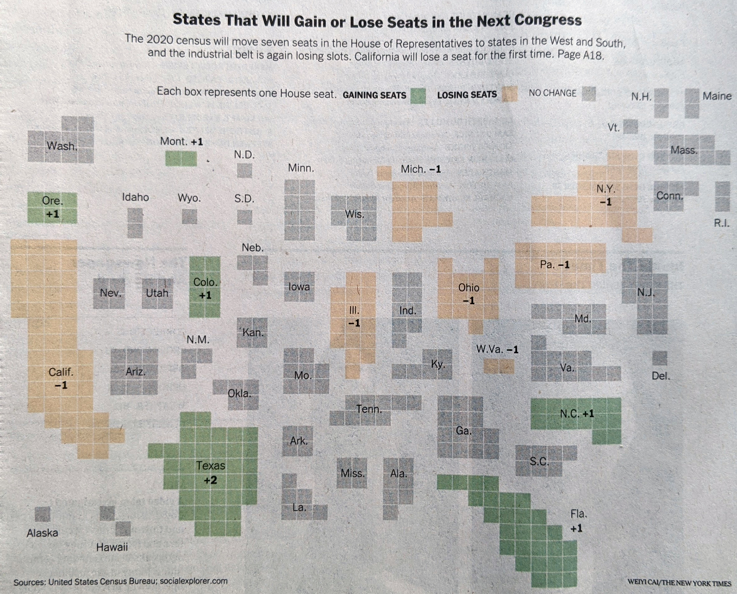
Each state consists of squares, each representing one congressional district. This is the first place where I have an issue with the graphic, admittedly a minor one. First we need to look at the graphic’s header, “States That Will Gain or Los Seats in the Next Congress” and then look at the graphic. It’s unclear to me if the squares therefore represent the states today with their numbers of districts, or if we are looking at a reapportioned map. Up in Montana, I know that we are moving from one at-large seat to two seat, and so I can resolve that this is the new apportionment. But I am left wondering if a quick phrase or sentence that declares these represent the 2022 election apportionment and not those of this past decade would be clearer?

Or if you want a graphic treatment, you could have kept all the states grey, but used an unfilled square in those states, like Pennsylvania and Illinois, losing seats, and then a filled square in the states adding seats.

Inside the paper, the article continued and we had a few more graphics. The above graphic served as the foundation for a second graphic that charted the changing number of seats since 1910, when the number of seats was fixed.

Timeline of gains and losses

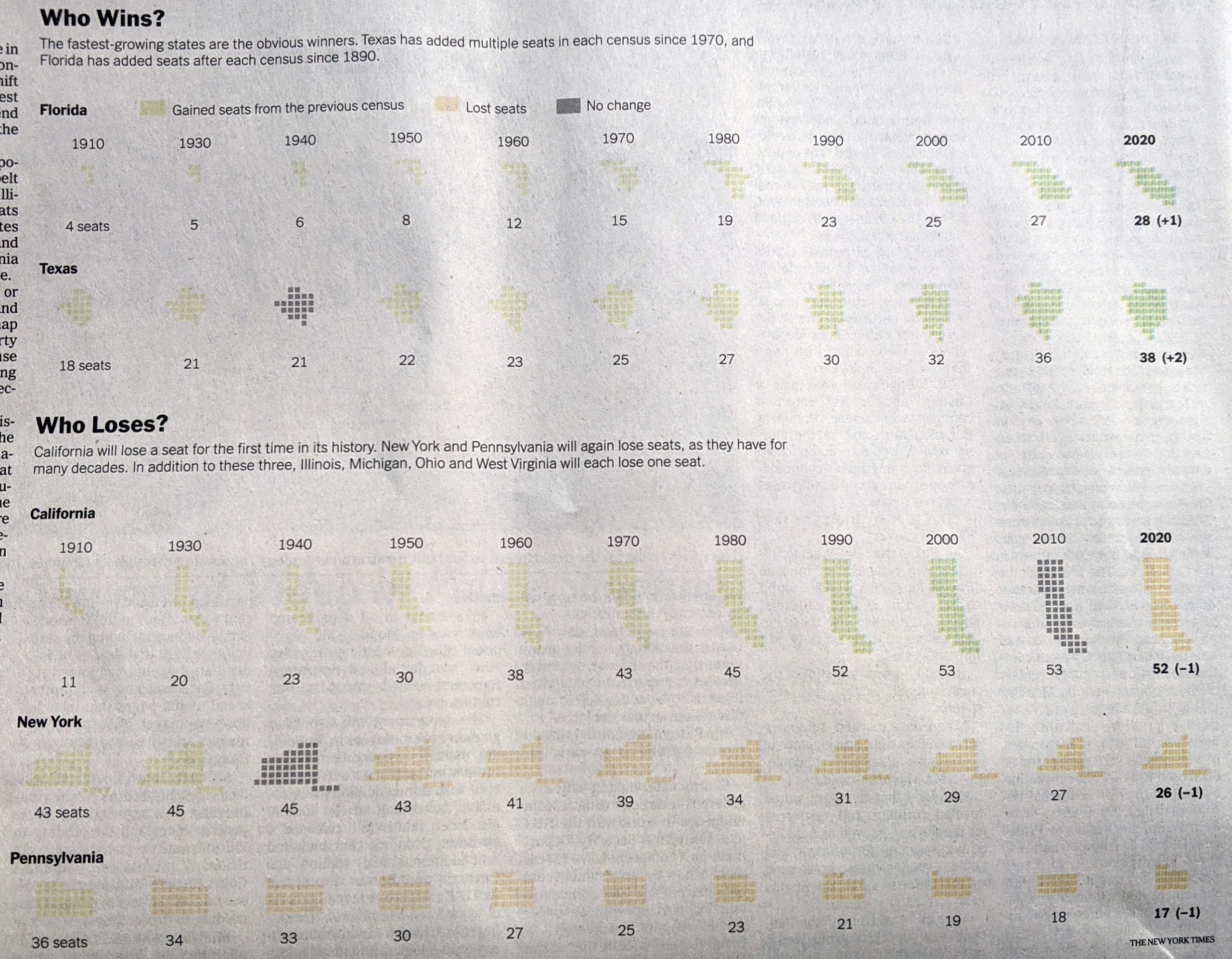
I really like this graphic. My issue here is more with my mobile that took the picture. Some of these states appear quite light, and they are on the printed page. However, they are not quite as light as these photos make them out to be. That said, could they be darker? Probably. Even in print, the dark grey “no change” instances jump out instead of perhaps falling to the background.

The remaining few graphics are far more straightforward, one isn’t even a graphic technically.

First we have two maps.

Good old primary colours.

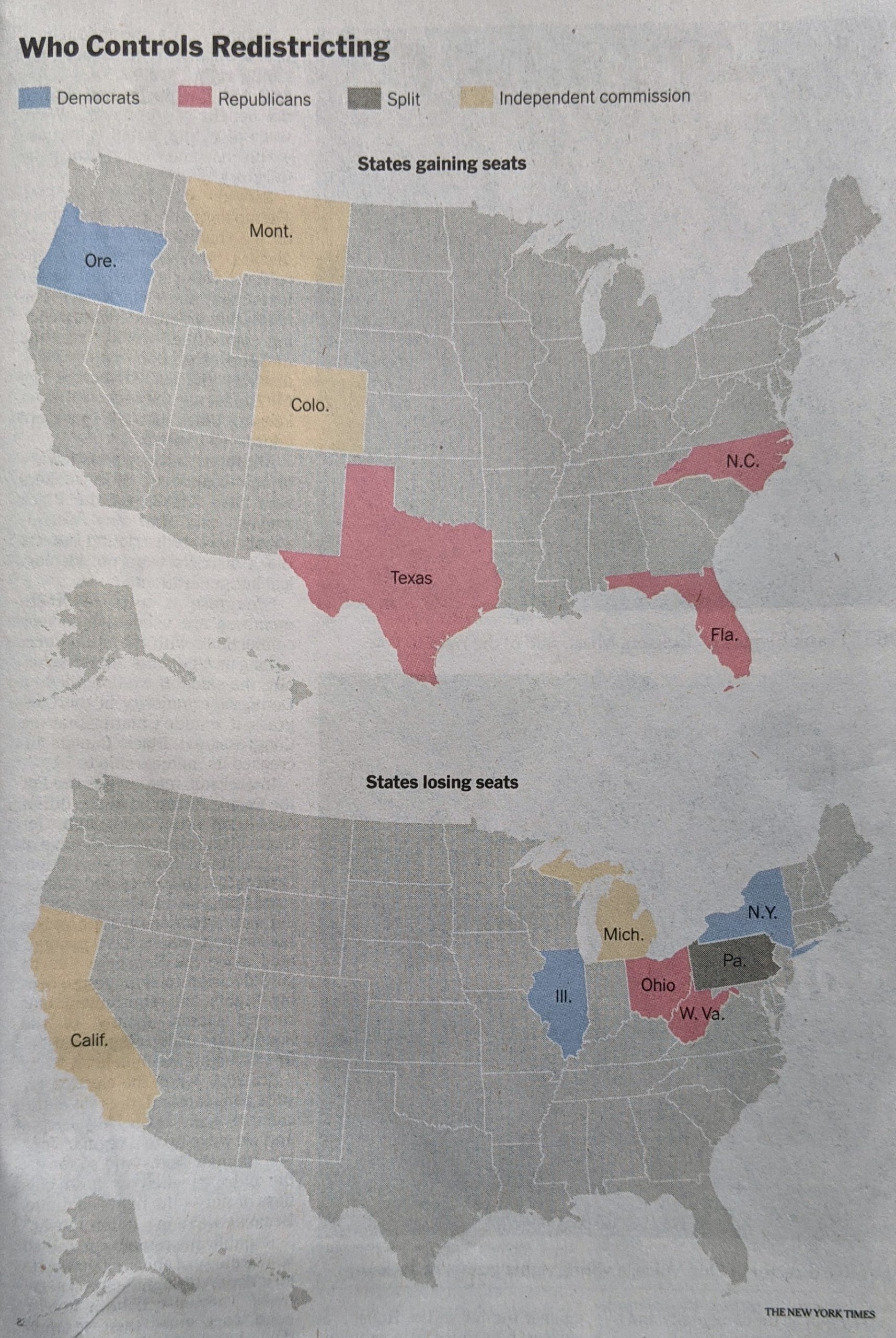
Nothing particularly remarkable here. The colours make a lot of sense, with red representing Republicans and blue Democrats. Yellow represents independent commissions and grey is only one state, Pennsylvania, where the legislature is controlled by Republicans and the governorship by Democrats.

Finally we have a table with the raw numbers.

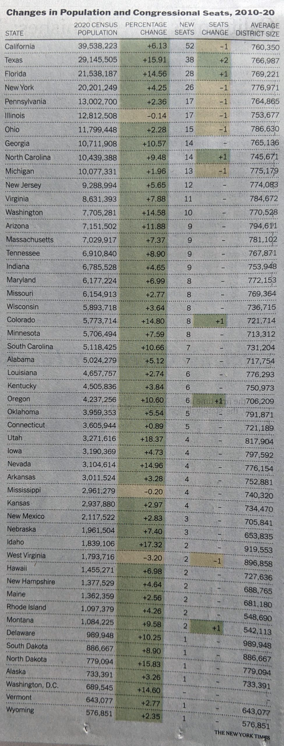
Tables are great for organising information. Do you have a state you’re most curious about, Illinois for example? If so, you can quickly scan down the state column to find the row and then over to the column of interest. What tables don’t allow you to do is quickly identify any visual patterns. Here the designers chose to shade the cells based on positive/negative changes, but that’s not highlighting a pattern.

Overall, this was a really strong piece from the Times. With just a few language tweaks on the front page, this would be superb.

Credit for the piece goes to Weyi Cai and the New York Times graphics department.

Can We Pop Our Political Bubbles?

It’s no secret that Americans—and likely at least Western communities more broadly—live in bubbles, one of which being our political bubbles. And so I want to thank one of my mates for sending me the link to this opinion piece about political bubbles from the New York Times.

The piece is fairly short, but begins with an interactive piece that allows you to plot your address and examine whether or not you live in a political bubble. Using my flat in Philadelphia, the map shows lots of little blue dots, representing Democratic voters, near the marker for my address and comparatively few red dots for Republicans.

An island of blue in a sea of red.

If you then look a bit more broadly, you can see that by summing up the dots, my geographic bubble is largely a political bubble, as only 13% of my neighbours are Republicans. Not terribly surprising for a Democratic city.

A certain lack of diversity in political thought.

And while the piece does then zoom back out a wee bit, it tries to show me that I don’t live too far from a politically integrated bubble. Except in this case, it’s across a decent sized river and getting there isn’t the easiest thing in the world. I’m not headed to Gloucester anytime soon.

Things are better in Jersey?

These interactives serve the purpose of drawing the user into the article, which continues explaining some of the causes of this political segregation, by both policy, redlining, and personal choice, lifestyle. The approach works, because it gives us the most relatable story in a large dataset, ourselves. We’re now emotionally or intellectually invested in the idea, in this case political bubbles, and want to learn all about it. Because the more you know…

The piece uses the same type of map to showcase the bubbles more broadly from the Bay Area to the plains of Wyoming. (No surprises in the nature of those political bubbles.) It wraps up by showing how politicians can use the geography of our political bubbles to create political geographies via gerrymandering that shore up their political careers by creating safe districts. The authors use a gerrymandered northeastern Ohio district that encompasses two cities, Cleveland and Akron, to make that point.

That’s in part why I’m in favour of apolitical, independent boundary commissions to create more competitive congressional districts. Personally, I would have been fascinated to see how Pennsylvania’s congressional districts, redrawn in 2018 by the Pennsylvania Supreme Court, after the court found the gerrymandered districts of 2011 unconstitutional, created political competition between parties instead of within parties. But I digress.

And then for kicks, I looked at how my flat in Chicago compared.

Less island of blue and sea of red, because a lake of blue water alters that geography.

Not surprisingly, my neighbourhood in Lakeview was another political bubble, though this one even more Democratic than my current one.

Lakeview is even more Democratic than Logan Square, Philly’s Logan Square that is.

But if I had wanted to move to an integrated political bubble, instead of Philadelphia, I could have moved to…Jefferson Park.

Because everyone can agree Polish food is good food.

Credit for the piece goes to Gus Wezerek, Ryan D. Enos and Jacob Brown.

Politicising Vaccinations

Yesterday I wrote my usual weekly piece about the progress of the Covid-19 pandemic in the five states I cover. At the end I discussed the progress of vaccinations and how Pennsylvania, Virginia, and Illinois all sit around 25% fully vaccinated. Of course, I leave my write-up at that. But not everyone does.

This past weekend, the New York Times published an article looking at the correlation between Biden–Trump support and rates of vaccination. Perhaps I should not be surprised this kind of piece exists, let alone the premise.

From a design standpoint, the piece makes use of a number of different formats: bars, lines, choropleth maps, and scatter plots. I want to talk about the latter in this piece. The article begins with two side by side scatter plots, this being the first.

Hesitancy rates compared to the election results

The header ends in an ellipsis, but that makes sense because the next graphic, which I’ll get to shortly, continues the sentence. But let’s look at the rest of the plot.

Starting with the x-axis, we have a fairly simple plot here: votes for the candidates. But note that there is no scale. The header provides the necessary definition of being a share of the vote, but the lack of minimum and maximum makes an accurate assessment a bit tricky. We can’t even be certain that the scales are consistent. If you recall our choropleth maps from the other day, the scale of the orange was inconsistent with the scale of the blue-greys. Though, given this is produced by the Times, I would give them the benefit of the doubt.

Furthermore, we have five different colours. I presume that the darkest blues and reds represent the greatest share. But without a scale let alone a legend, it’s difficult to say for certain. The grey is presumably in the mixed/nearly even bin, again similar to what I described in the first post about choropleths from my recent string.

Finally, if we look at the y-axis, we see a few interesting decisions. The first? The placement of the axis labels. Typically we would see the labelling on the outside of the plot, but here, it’s all aligned on the inside of the plot. Intriguingly, the designers took care for the placement—or have their paragraph/character styles well set—as the text interrupts the axis and grid lines, i.e. the text does not interfere with the grey lines.

The second? Wyoming. I don’t always think that every single chart needs to have all the outliers within the bounds of the plot. I’ve definitely taken the same approach and so I won’t criticise it, but I wonder what the chart would have looked like if the maximum had been 35% and the grid lines were set at intervals of 5%. The tradeoff is likely increased difficulty in labelling the dots. And that too is a decision I’ve made.

Third, the lack of a zero. I feel fairly comfortable assuming the bottom of the y-axis is zero. But I would have gone ahead and labelled it all the same, especially because of how the minimum value for the axis is handled in the next graphic.

Speaking of, moving on to the second graphic we can see the ellipsis completes the sentence.

Vaccination rates compared to the election results

We otherwise run into similar issues. Again, there is a lack of labelling on the x-axis. This makes it difficult to assess whether we are looking at the same scale. I am fairly certain we are, because when I overlap the graphics I can see that the two extremes, Wyoming and Vermont, look to exist on the same places on the axis.

We also still see the same issues for the y-axis. This time the axis represents vaccination rates. I wish this graphic made a little clearer the distinction between partial and full vaccination rates. Partial is good, but full vaccination is what really matters. And while this chart shows Pennsylvania, for example, at over 40% vaccinated, that’s misleading. Full vaccination is 15 points lower, at about 25%. And that’s the number that needs to be up in the 75% range for herd immunity.

But back to the labelling, here the minimum value, 20%, is labelled. I can’t really understand the rationale for labelling the one chart but not the other. It’s clearly not a spacing issue.

I have some concerns about the numbers chosen for the minimum and maximum values of the y-axis. However, towards the middle of the article, this basic construct is used to build a small multiples matrix looking at all 50 states and their rates of vaccination. More on that in a moment.

My last point about this graphic is on the super picky side. Look at the letter g in “of residents given”. It gets clipped. You can still largely read it as a g, but I noticed it. Not sure why it’s happening, though.

So that small multiples graphic I mentioned, well, see below.

All 50 states compared

Note how these use an expanded version of the larger chart. The y-minimum appears to be 0%, but again, it would be very helpful if that were labelled.

Also for the x-axis in all the charts, I’m not sure every one needs the Biden–Trump label. After all, not every chart has the 0–60% range labelled, but the beginning of each row makes that clear.

In the super picky, I wish that final row were aligned with the four above it. I find it super distracting, but that’s probably just me.

Overall, this is a strong piece that makes good use of a number of the standard data visualisation forms. But I wish the graphics were a bit tighter to make the graphics just a little clearer.

Credit for the piece goes to Danielle Ivory, Lauren Leatherby and Robert Gebeloff.

Biden’s Cabinet

Note: I wanted this to go up on Inauguration Day, but I had some server issues last week. And while I got everything back for Friday and Monday, I didn’t want to wait too long to post this. You’ll note at the end that I have questions about General Austin and whether he could be confirmed as Defence Secretary. Spoiler: He was.

Today is Inauguration Day and at noon, President Trump returns to being a citizen and Joe Biden assumes the office of the presidency. He comes to office with arguably the most diverse cabinet in American history supporting him and his agenda.

CNN took a look at that diversity with this piece, which uses an interactive, animated stacked bar chart.

The proposed cabinet vs. the US ethnic breakdown

I took a screenshot at the ethnic/racial diversity. At the top, each bar represents one member of cabinet who you can reveal after mousing over the bar. Below is a stacked bar chart showing the racial makeup of the United States. You can see how it does resemble, and in some cases exceeds, the diversity of the broader United States.

One thing to note, however, is that we see 26 members of Cabinet. Some of those are the heads of the big executive departments like Treasury and Defence. But I’m not certain everyone is technically a cabinet-level position, e.g. Celia Rouse, Chair of the Council of Economic Advisors. It could be that the position is being elevated to cabinet level like John Kerry’s role as climate envoy. And if I just missed the press announcement, that’s on me. But that could affect the overall numbers.

Regardless, the nominated cabinet is more diverse than the previous two administrations as the CNN piece also shows.

The proposed cabinet vs. the preceding inaugural cabinets

I should point out that usually an incoming administration usually has a few of its national security positions already confirmed or confirmed on the first day, e.g. Defence and State. However, the Republican Senate, obsessed with the lie of a fraudulent election, has only just begun to start the confirmation process. In fact, as of late last night, only Avril Haines has been confirmed by the Senate (84–10) for Director of National Intelligence.

Furthermore, almost every administration has one or two nominations that fail to pass the Senate. George W Bush had Linda Chavez, Barack Obama had Tom Daschle, and Donald Trump had Andrew Puzder, just to give one from each of the last three administrations.

With a 50–50 Senate, I would expect there to be a few nominees who fail to make it over the line. Austin could be one, there appears to be some bipartisan agreement that we ought not nominate recent military officials as civilian heads of said military. Another to keep an eye out for is Neera Tanden. She riles conservatives and angers Bernie Sanders supporters, so whether the Senate will confirm her as Director of the Office of Management and Budget remains an open question in my mind.

Credit for the piece goes to Priya Krishnakumar, Catherine E. Shoichet, Janie Boschma and Kenneth Uzquiano.

2020 Election Results…

Via xkcd.

It’s Friday and we’ve made it all to the end of the week. A little while back xkcd posted about the 2020 US election, showing where the votes for both candidates are approximately located.

This isn’t quite funny like I normally might post on a Friday, but it felt appropriate after this week we had with the impeachment.

Lot of blue in the Northeast

Credit for the piece goes to Randall Munroe.

Impeachment 2: The Insurrection

Like many Americans I closely followed the outcome of yesterday’s historic vote by the House of Representatives to impeach President Trump for his incitement of an insurrection at the US Capitol in a failed coup attempt to overturn the 2020 election.

Words I still never thought I’d write describing an American election.

So at the end of the vote, I created this first graphic to capture the bipartisan nature of the impeachment. Ten Republicans broke ranks and voted with the Democrats. Keep in mind that in 2020, zero Republicans did the same. Justin Amash had by then resigned from the Republican Party and sat as an independent.

But I was also interested in how “courageous” these votes could be seen. Trump remains immensely popular with his base despite his attempt to overthrow the US government and keep himself in power. Did the Republicans who supported impeachment sit in districts won by Biden?

The answer? Not really. Two did: congressmen from New York and California. But a look at the other eight reveals they represent Trump-supporting districts.

To be fair, there are probably three tiers of seats in that group. Liz Cheney, the No. 3 Republican in the House, is in her own Trump-supporting seat as Wyoming’s at large representative. But four other Republicans have seats where Trump won by more than 10 points.

Three more Republicans are in seats I’d label competitive, but lean Republican.

Clearly the argument can be made that for most of these Republicans, it was not a politically safe choice to vote for impeachment. House seats will be redistricted this year for the 2022 midterms, but I’ll be curious to see how these Republicans fare in those redistricting proceedings and then in the ultimate elections thereafter.

Credit for the piece is mine.

Red Shift, Blue Shift

Last night I published a graphic on Instagram that I think people may find helpful if they try to follow Election Day results on Tuesday. I wanted to explain the concept of a red shift or blue shift. (I’ve also seen it described as states having a red mirage or a blue mirage.)

For my non-American readers, it’s important to understand that while this is a national election, the United States’ federal system means that each state runs its own election with its own rules and they can vary some state to state. For example, early or mail-in voting can vary significantly from state to state with some states allowing it only in emergencies (and some of those this cycle will not allow people to cite COVID-19 as an emergency).

Another factor for everyone to consider is that polling indicates President Trump’s fraudulent messaging about, well, voting fraud has shifted a normally split use of early/mail-in voting to a Democratic advantage. In other words, Democrats are far more likely to vote early, either in person or by post. Republicans are far more likely to vote on Election Day.

Combine those two factors and we get Red Shift vs. Blue Shift.

Some states allow election officials to begin counting their early votes prior to Election Day. Other states forbid counting until Election Day morning, or in some cases until after the polls close.

In states where early votes can be counted—the swing states Arizona, Florida, and North Carolina are among this group—it is possible that when the polls close, or shortly thereafter, we will see an instant and enormous lead for Joe Biden. But, as the states begin to count in-person day-of votes, which again favour Republicans, Trump may begin to eat into those margins. The question will be, can Trump’s numbers eat in so much that when the final counts are complete, he can overtake those Biden numbers? This is the Red Shift.

Conversely we have the Blue Shift. In these states—swing states like Georgia, Michigan, Pennsylvania, Texas, and Wisconsin are in this group—election officials cannot begin to count early votes either until the morning or when the polls close. In these states we may see the in-person day-of votes, largely expected to be for Republicans, run up to high totals fairly quickly. At that time, Trump may have a significant lead. Then when officials pivot to counting the early votes, Biden will begin to eat into those margins. And again, the question will be, can Biden eat into those margins sufficiently to shift the outcome after all the votes are counted?

Be prepared to hear about these scenarios Tuesday night.

Credit for the piece is mine.

Choose Your Own FiveThirtyEight Adventure

In case you weren’t aware, the US election is in less than a week, five days. I had written a long list of issues on the ballot, but it kept getting longer and longer so I cut it. Suffice it to say, Americans are voting on a lot of issues this year. But a US presidential election is not like many other countries’ elections in that we use the Electoral College.

For my non-American readers, the Electoral College, very briefly, was created by the country’s founding fathers (Washington, Jefferson, Adams, Franklin, et al.) to do two things. One, restrict selection of the American president to a class of individuals who theoretically had a broader/deeper understanding of the issues—but who also had vested interests in the outcome. The founders did not intend for the American people to elect the president. The second feature of the Electoral College was to prevent the largest states from dominating smaller states in elections. Why else would Delaware and Rhode Island surrender their sovereignty to join the new United States if Virginia, Pennsylvania, and New York make all the decisions? (The founders went a step further and added the infamous 3/5 clause, but that’s another post.)

So Americans don’t elect the president directly and larger states like California, New York, and Texas, have slightly less impact than smaller states like Wyoming, Vermont, and Delaware. Each state is allotted a number of Electoral College votes and the key is to reach 270. (Maybe another time I’ll get into the details of what happens in a 269–269 tie.) Many Americans are probably familiar with sites like 270 To Win, where you can determine the outcome of the election by saying who won each state. But, even though the US election is really 50 different state elections, common threads and themes run through all those states and if one candidate or another wins one state, it makes winning or losing other states more or less likely. FiveThirtyEight released a piece that attempts to link those probabilities and help reveal how decisions voters in one state make may reflect on how other voters decide.

The interface is fairly straightforward—I’m looking at this on a desktop, though it does work on mobile—with a bunch of choices at the top and a choropleth map below. There we have a continually divergent gradient, meaning the states aren’t grouped into like bins but we have incredibly subtle differences between similar states. (I should also point out that Maine and Nebraska are the two exceptions to my above description of the Electoral College. They divide their votes by congressional district, whoever wins the district gets that Electoral College vote and then the state overall winner receives the remaining two votes.)

Below that we have a bar chart, showing each state, its more/less likely winner state and the 270 threshold. Below that, we have what I’ve read/heard described as a ball plot. It represents runs of the simulation. As of Thursday morning, the current FiveThirtyEight model says Trump has an 11 in 100 chance of winning, Biden, conversely, an 89-in-100 chance.

But what happens when we start determining the winners of states?

Well, for my non-American readers, this election will feature a large number of voters casting their ballots early. (I voted early by mail, and dropped my ballot off at the county election office.) That’s not normal. And I cannot emphasise this next point enough. We may not know who wins the election Tuesday night or by the time Americans wake up on Wednesday. (Assuming they’re not like me and up until Alaska and Hawaii close their polls. Pro-tip, there’s a potentially competitive Senate race in Alaska, though it’s definitely leaning Republican.)

But, some states vote early and/or by mail every year and have built the infrastructure to count those votes, or the vast majority of them, on or even before Election Day. Three battleground states are in that group: Arizona, Florida, and North Carolina. We could well know the result in those states by midnight on Election Day—though Florida is probably going to Florida.

So what happens with this FiveThirtyEight model if we determine the winners of those three states? All three voted for Trump in 2016, so let’s say he wins them again next week.

We see that the states we’ve decided are now outlined in black. The remainder of the states have seen their colours change as their odds reflect the set electoral choice of our three states. We also now have a rest button that appears only once we’ve modified the map. I’m also thinking that I like FiveyFox, the site’s new mascot? He provides a succinct, plain language summary of what the user is looking at. At the bottom we see what the model projects if Arizona, Florida, and North Caroline vote for Trump. And in that scenario, Trump wins in 58 out of 100 elections, Biden in only 41. Still, it’s a fairly competitive election.

So what happens if by midnight we have results from those three states that Biden has managed to flip them? And as of Thursday morning, he’s leading very narrowly in the opinion polls.

Well, the interface hasn’t really changed. Though I should add below this screenshot there is a button to copy the link to this outcome to your clipboard if, like me, you want to share it with the world or my readers.

As to the results, if Biden wins those three states, Trump has less than a 1-in-100 chance of winning and Biden a greater than 99-in-100.

This is a really strong piece from FiveThirtyEight and it does a great job to show how states are subtly linked in terms of their likelihood to vote one way or the other.

Credit for the piece goes to Ryan Best, Jay Boice, Aaron Bycoffe and Nate Silver.

Cheesesteaks and Politics

For those unaware, Pennsylvania matters in the 2020 election. And it has mattered for years as a perennial swing state. There are of course the visits to steel mill cities like Pittsburgh, deindustrialised places like Johnstown, and unions love visits to places in Lackawanna and Luzerne. (You can read more about Pennsylvania as a swing state in my latest analysis here.)

But I want to focus on visits to Philadelphia. Because they inevitably involve the candidate consuming a cheesesteak. The Economist’s sister magazine, 1843, recently published an article on this very subject. And the whole thing is worth a read.

How have I managed to find this relevant to a blog about data visualisation? Well, they included a recipe to help people understand just what goes into the traditional Philadelphia dish.

Personally, I always have to confess, I’ve never been a huge fan. But, I’ll take provolone over whiz any day.

Credit for the piece goes to Jake Read.