Alcohol-related Traffic Fatalities

Earlier this year the National Transportation Safety Board (NTSB) recommended changes in the current blood alcohol limits to reduce youth drunk driving. The NTSB wants the limit dropped/increased from 0.08 to 0.05. Fun side note, technically, the NTSB needs to have the states enact this on their own accord because such limits are not federal power. Instead, the federal government uses the threat of witholding federal transport money as a means of urging states to comply.

Anyway, the New York Times took a look at the data on fatal crashes and blood alcohol in two heat charts. The first looks at the ages of drivers. The youth problem is self-evident.
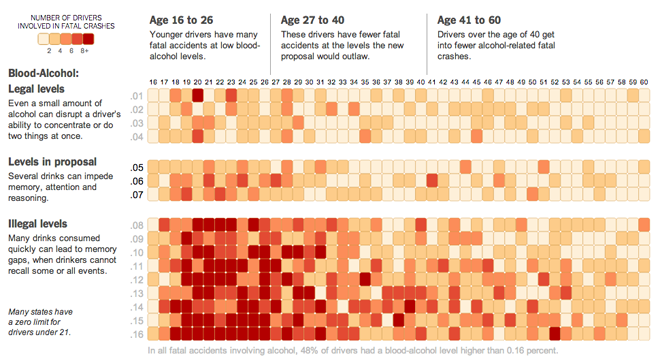
Alcohol-related traffic fatalities by age

Toggling to time of day shows perhaps a more commonly thought pattern: drunk driving rises significantly after midnight.
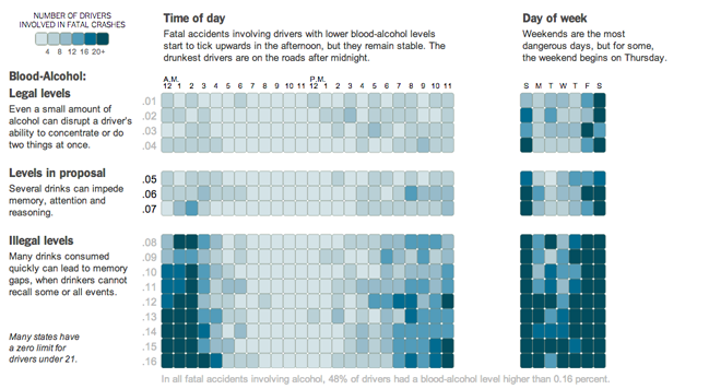
Alcohol-related fatalities by time of day

In general I think the piece is very successful. In particular, the breakout or separation of the new limits shows in clear relief how important those three hundredths could be in lowering alcohol-related traffic fatalities. And as seems to be increasingly the case with at least the Times, the use of annotations makes the story told by the data far clearer.

Perhaps the only design quibble I have is the shape of the squares. The rounded corners create weird, little white gaps between cells. And especially in the darker fields, they distract me more so than small, thin borders otherwise would.

Credit for the piece goes to Alastair Dant, Hannah Fairfield, and Andrew W. Lehren.

Gay Acceptance

Last week I looked at a piece from the Washington Post about the possible impact of the Supreme Court rulings on gay marriage in the United States. But with the rulings yesterday, we step back and look at globally how the progression of gay rights has taken steps forward or backward.

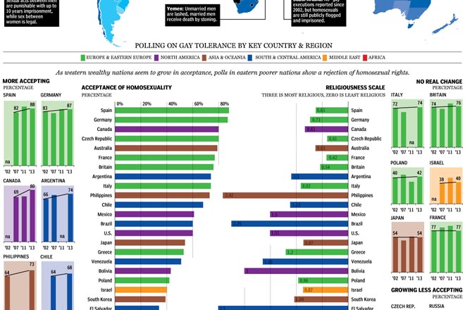
The National Post looked at the reversal of bans of gay marriage as well as polling from several countries to look at changing opinions and perspectives across the world. Fascinating/horrifying are some of the stories about specific countries in the map.

Gay acceptance
Gay acceptance

My only real criticism is that the colour-coding of regions seems a bit jarring. I wonder if grouping countries by region would not have allowed the same data to be presented in a bit quieter tone.

Credit for the piece goes to Richard Johnson.

The Massachusetts Special Election

As I have been blogging the past several days, today the Supreme Court will announce its rulings on the two gay marriage cases. But, I have already looked at that twice now. Today I want to look at the results of the Massachusetts special election for the US Senate, necessitated by John Kerry resigning from the seat to become Secretary of State.

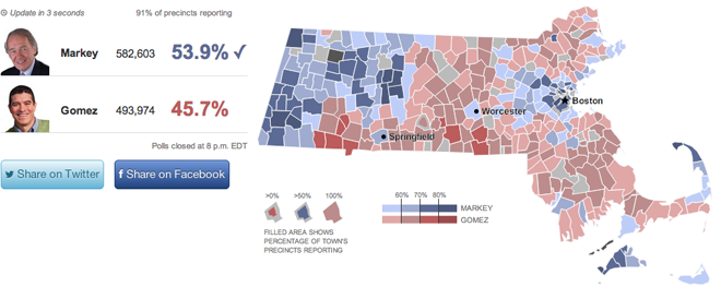
This work comes from the Huffington Post. It offers the usual map fare with towns coloured by the victor and tinted by the share of the vote. Though do note the interesting—is this novel?—means of filling in the town with colour to represent the percent of the town reporting. My screenshot is a bit late, but check out Warren near Springfield or Boston and Cambridge—a bit harder to see because of their size and shape.

Looking across the state for the results

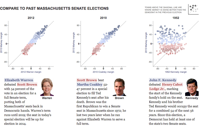
However, the fascinating thing is the use of the small multiples of scatter plots to look at historic elections. The designers included a small key in the upper-right explaining that dots above the line represent towns where Ed Markey, the Democrat who won, outperformed the historic Democrat. I have not seen anybody attempt to portray the data in this fashion before.

Using a scatter plot to chart the results

Credit for the piece goes to Aaron Bycoffe and Jay Boice.

Trending Towards Gay Marriage

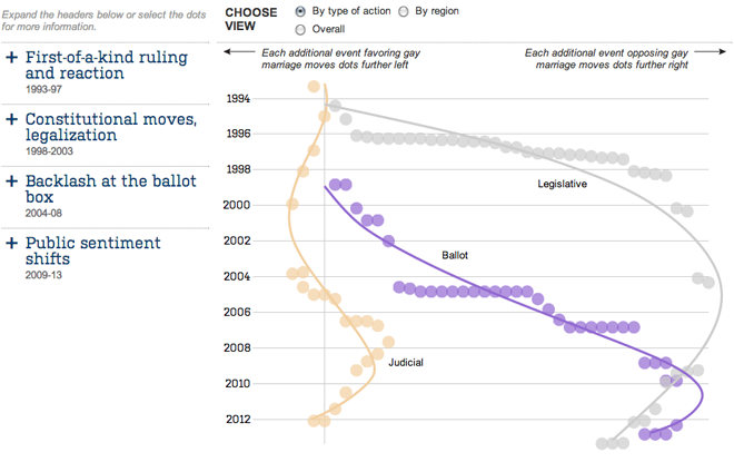
We are (still) waiting for a ruling on many things this week from the Supreme Court, including the rulings on DOMA and Prop 8. Today, we look at an interactive chart by the Wall Street Journal that plots different ballot measures, legislative actions, and court rulings regarding gay marriage. Lines of best fit provide a general trend line, and as the default view shows, the trend is clearly in favour of legalisation.

Trends for ballot measures, legislative actions, and court rulings for/against gay marriage

The piece is quite nice. After the default view, you can change the view to look at events not by type of action but by geographic region. This is one of those instances where the regional data provides an interesting look at the story. Additionally, the headlines on the left expand to provide not just context, but highlight the events plotted from that era.

Credit for the piece goes to Randy Yeip, Colleen McEnaney, and Chris Canipe.

Potential Voting Rights Act Impacts

Last Thursday we looked at the impact of potential outcomes by an expected Supreme Court ruling on two gar marriage cases. (We’re still waiting, probably until this Thursday, though it could be today.) Today, we look at the impact of potential outcomes of another big case before the Court, the Voting Rights Act. Broadly (and quickly), Shelby County, Alabama is challenging the federal government, which according to the act, must approve any changes to electoral law in those places that have had problems in their history of disenfranchising black citizens (and more recently non-English speaking citizens, i.e. Hispanics). The act was renewed for 25 years by President Bush back in 2006.

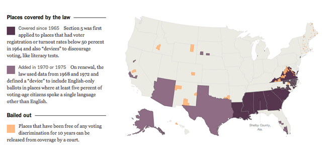
The New York Times explains through interactive maps first the geographic scope of this federal approval. As one might expect, it significantly impacts southern states. But the rules used to determine that coverage are decades old.

Current coverage
Current coverage

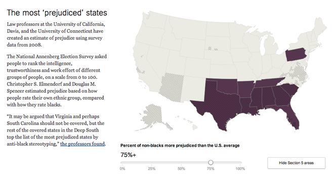
But if the current process must change, several different metrics by which alternative coverage could be determined would offer different coverage. The New York Times allows user to see those different metrics, and then adjust filters to fine tune those areas covered. A nice feature for all of these views is the ability to show/hide those areas under the current coverage.

Using prejudice to define coverage

Credit for the piece goes to the New York Times graphics department.

Gay Marriage Ruling Outcomes

The Supreme Court issues its rulings usually on, if I recall, Mondays and Thursday. And you know what today is, right? One of the last Thursday sessions of the current sitting. So…if not this week then next week the Supreme Court will (likely) rule on several big, hairy, tangly cases. One of those issues, but two of the cases, is same sex marriage. Specifically, a ruling on California’s Proposition 8 and another on the Defence of Marriage Act.

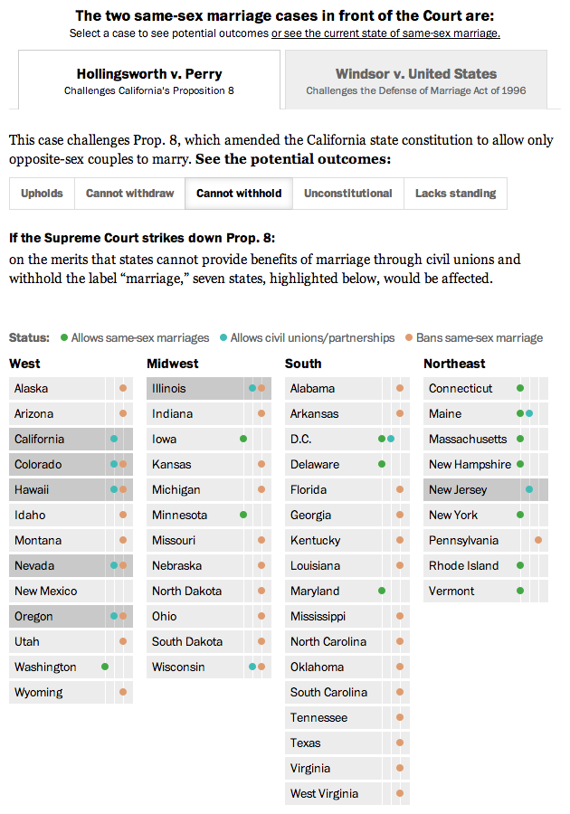
Thankfully, the Washington Post has a great interactive piece that attempts to simplify and explain just how the possible rulings on each of the two cases would impact same sex marriages in all fifty states. Click around and read the explanations to see just how complicated the cases are, especially Prop 8.

Just one of the different outcomes

Credit for the piece goes to Masuma Ahuja, Robert Barnes, and Emily Chow.

Tax Breaks for the Wealthy

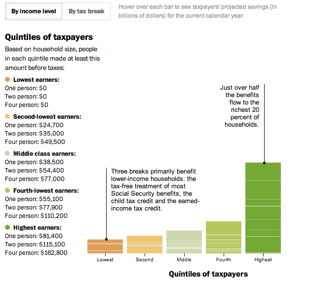
In today’s post we look at a small interactive piece from the Washington Post. Everybody pays taxes. And everybody seeks to find ways to pay less in taxes. This interactive stacked bar chart (and bar matrix) examines how much the different available tax benefits help Americans, grouped into income quintiles. The measure is dollars, not percentage of income (either personal or national), so clearly highest income Americans are the big winners in tax benefits while low income Americans lose out. For example, most low income people do not make enough money to invest in the stock market. Therefore they cannot reap the benefit of preferential tax treatment of dividend income as opposed to wage income.

A look at tax benefits in the US

Credit for the piece goes to Darla Cameron.

Who Has Your Photograph

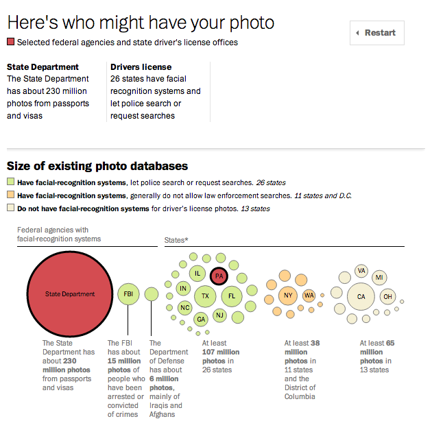
Privacy is the hot topic these days. And in this interactive piece from the Washington Post, we can see which state and federal agencies may have your photograph to run face recognition software without your arrest. The bubble chart, which is broken into four different levels of search permissions, maps out how many photographs are stored. Beyond that, however, the piece personalises the story by asking you a few simple questions to reveal just who may very well have your face. Below is where my ugly mug is stored.

My photograph can likely be found in red.

Credit for the piece goes to Darla Cameron and Craig Timberg.

Campaign Contributions

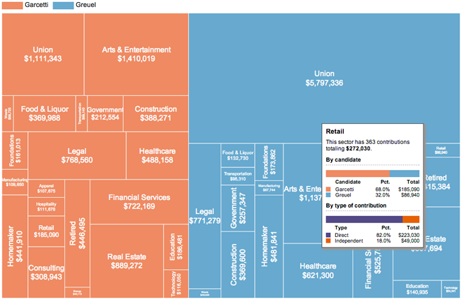
On 21 May, Angelenos went to the polls to elect the next mayor of Los Angeles. The contest followed an earlier vote that prompted the day’s run-off election. This graphic from the Los Angeles Times examined the contributions to the campaigns of the two finalists, Eric Garcetti and Wendy Greuel.

The overall piece features an interesting interactive component that allowed the user to switch from a scatter plot view to a stacked bar chart view and then filter those results based on whether they were direct or indirect contributions. Generally speaking, that element worked. However, I want to focus on the second big component: an interactive tree map.

Tree map with rollover

While not all tree maps have to be squarified, by converting datapoints to (roughly) similar shapes the user should have an easier time comparing the area of the objects. This tree map is not squarified and so the user must strain to convert all the different shapes into roughly equal shapes for a visual comparison. Nor is there an inherent ranking within the map—at least not that I can find. That would also help.

So while the tree map is not a success in and of itself, the rollover condition makes for a more interesting overview of the different sectors of contributions. But despite this added value in the rollover,  the data powering the tree map would still be better presented in a different format.

Credit for the piece goes to Maloy Moore and Anthony Pesce.

Political Pangea

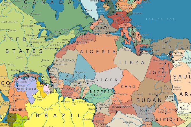
Theoretical/hypothetical maps can be a lot of fun, as well as informative. Today’s post exemplifies both. Pangea was one of those super-continents where all the Earth’s landmass was mashed together into one giant continent. It broke up a few hundred million years ago into the geography with which we are roughly familiar. But I have always been curious which places were where. But thanks to this map, I no longer have to wonder.

Political Pangea
Political Pangea

Credit for the piece goes to Massimo Pietrobon.