With the release of the 2020 US Census’ topline data, we can see which state populations increased and which few decreased. And in that we can sort, or resort, states by population. The Washington Post did this a few weeks ago with an interactive ranking chart in a nice online article. (I’d be curious what the print version was, alas I only receive the New York Times.)
The piece begins with a nice intro motion graphic that selects states and shows how their ranking among the other states (plus the District of Columbia, DC), has evolved since 1920.
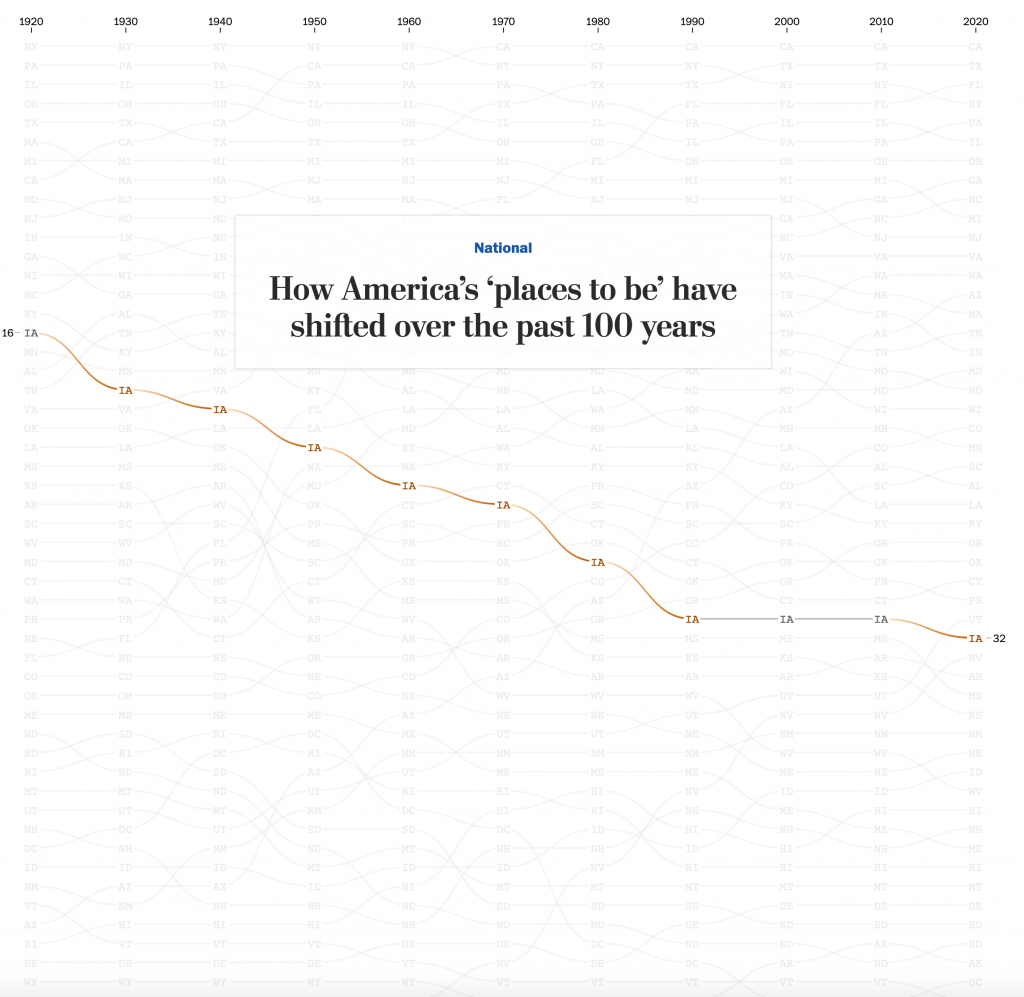
After scrolling down briefly, the reader enters a portion of the story displayed by keeping the hero graphic static whilst blurbs of texts scroll over the lines. As the blurbs move past, different states or sets of states become highlighted to draw attention to them.
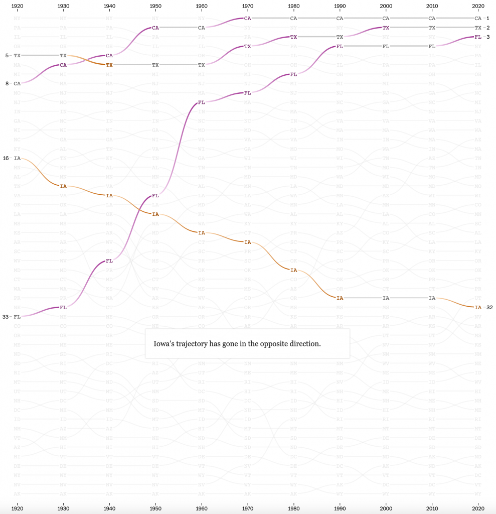
This works really well. When discussing the case of Iowa vis-a-vis the growth of California, Texas, and Florida, I don’t need to see the story of Nebraska. Especially as the end of the piece features this hero graphic as an interactive, explore-the-data piece of content. I don’t have a screenshot of that, because it’s really just the above two but with a dropdown selector and a legend.
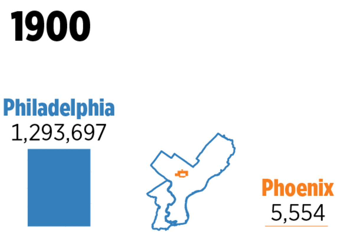
As the user scrolls through the story, they move past the semi-motion graphic and into a text-driven narrative for each region of the United States. I’ve highlighted only the Northeast, where I was born, raised, and presently live. As an aside, I remember my family completing the 2000 Census around the kitchen table. The 2010 Census I filled out at a small desk not long after I moved into my second flat in Chicago. And this most recent one I completed whilst under quarantine here in Philadelphia.
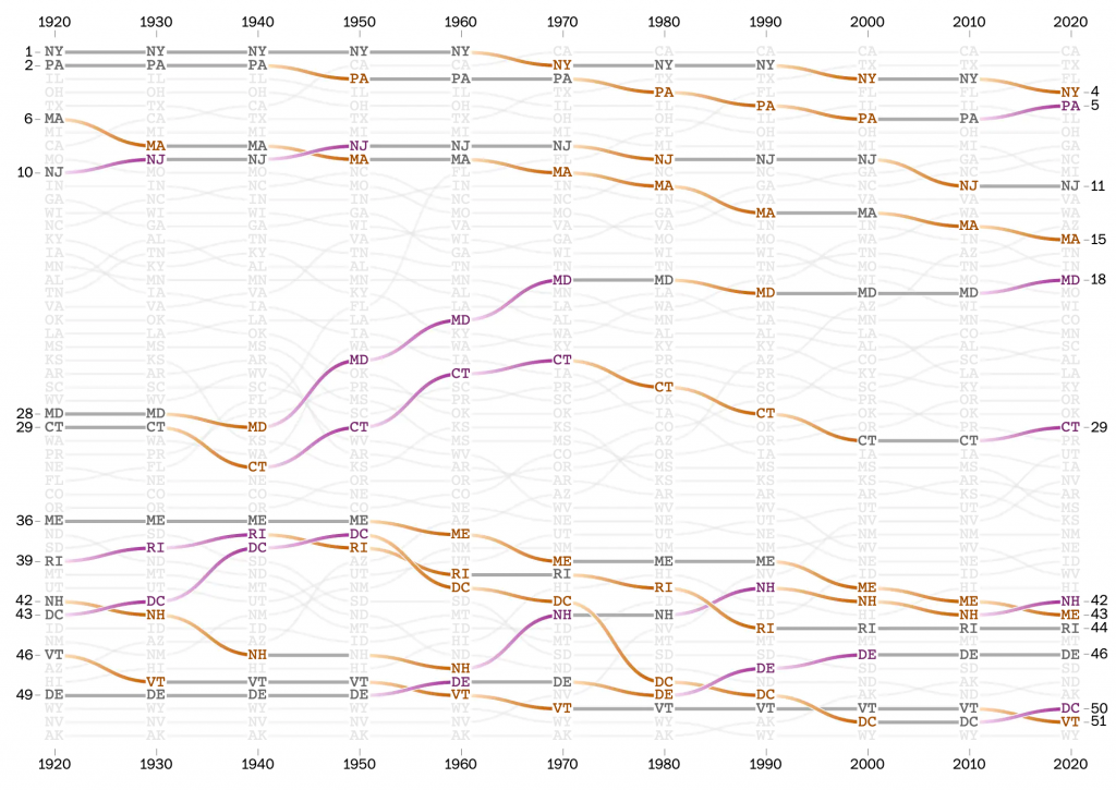
This section of the article uses static images with the region’s constituent states highlighted. Again, this works really well, because when looking at the Northeast, I’m still not interested in Nebraska. And also again, we have the interactive explorer at the end of the article.
Overall this is a really strong piece from the Post. I have some quibbles with the design, primarily I don’t understand the function of the connecting lines’ fades and curves. But I find neither too terribly distracting from the content of the graphic.
Credit for the piece goes to Harry Stevens and Nick Kirkpatrick.