Europe By Rail

Many of us have pent up travel demand. Covid-19 remains with us, lingering in the background, but it’s largely from our front-of-mind. For those of my readers in Europe, or just curious how superior European rail infrastructure is over American, this piece from Benjamin Td provides some useful information.

From central London

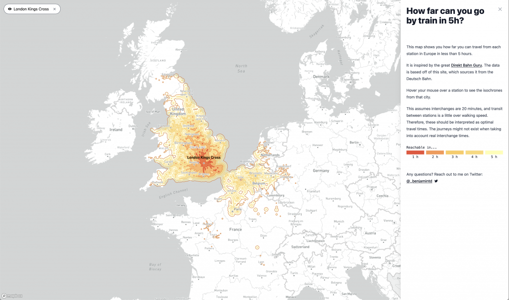
It uses isochrones to map out how much a traveller could travel if he would travel five hours. For this screenshot I chose London’s King’s Cross station. In red we see distances within a one-hour rail ride from said station. In the lightest yellow are those places within the five-hour distance.

The interactive map allows users to investigate stations throughout Europe. Mousing over various parts brings up different stations. Clicking on the station freezes the station on the map allowing the user to zoom in or out and investigate different areas of Europe.

Colour-wise, things work well. The desaturated map allows the yellow-to-red palette to shine. And to the right a closable legend, which unfortunately cannot be reopened once closed for the only real blemish on the piece. Even typographically, the labels appear in grey whereas selected stations appear in black.

A well done piece.

Credit for the piece goes to Benjamin Td.

Choo Choo

I took two weeks off as work was pretty crazy, but we’re back to covering data visualisation and design with a graphic about trains. And anybody who knows me knows how I love trains. One of the early acts of the Biden administration was funding a proper expansion of rail service in the United States.

Last week the Washington Post published an article that explored some of the difficulties Amtrak, the national rail company, faces in that expansion. Most of it has to deal with the fact that outside the Northeast Amtrak largely uses rail lines owned by freight companies.

The article uses a map to show Amtrak routes and, in particular, where Amtrak wants to increase service or create new service.

No Alaska, no Hawaii

As far as the map goes, it does a nice job needing not to reinvent the wheel. When an existing route will have expanded service, e.g. the Northeast Corridor, the blue line sits next to the dotted white line. What remains a bit unclear to me is the use of black text for Chicago, Atlanta, Dallas, and Los Angeles. The bold type for New Orleans and Mobile makes sense because of the story’s focus on that particular route. Chicago is mentioned once, but Dallas is not. So that is unclear.

But what really stood out to me was what happened when I re-read the story on my mobile. The graphic split from a full map to three narrow graphics, each featuring 1/3 of the United States. The designers moved the text labels so that they are fully visible in each graphic.

Overall, the piece does a great job at showing the map, but in particular it shines when it swaps out the large map for the smaller graphics on small screens. And the attention to detail in moving the text labels makes it all the better.

Credit for the piece goes to Luz Lazo.

Septa’s Silverliner Service Shutdown

Two weeks ago Philadelphia regional rail commuters, a large group to which I belonged for a number of years, experienced a week from hell. On 2 July a yard inspector for Septa, the Philadelphia region’s transit agency, discovered a Silverliner V railcar tilting. For those not familiar with Septa, the Silverliner Vs have been in service for only three years and have been long touted as the future of the Philadelphia commuter rail service. After inspection Septa discovered the tilting railcar suffered from a fatigue crack on the equaliser beam, specifically where it was welded to connect to the wheel bearings. The beam forms part of the truck, which is what connects the railcar to the rails, and any failure at speed could have resulted in an accident, possibly a derailment. The transit agency then quickly inspected the remainder of its fleet of 120 Silverliner Vs. It found the same fatigue crack in a total of 115 cars. By 4 July, Septa pulled all 120 Silverliner Vs from service.

The equaliser beam connects the wheels to the passenger car

So what happened? At this point, we do not know. Septa continues tests to discover just what happened and just what can be done to repair the cars. Because, with a fleet of approximately 400 cars, the Silverliner Vs represent 1/3 of the fleet. And with fewer seats and fewer trains, commuters attempting to ride into the city, particularly from nearer-in suburbs, find trains bypassing stations because they quickly reach capacity.

The additional passenger railcars from other regional transit agencies will make little difference

Consequently, Septa has instituted a reduced service—a modification of the Saturday service—with additional service on subways and other high-speed lines. Additionally, Septa has agreed to lease additional trainsets, i.e. locomotives with passenger cars, from other regional transit agencies: Amtrak, New Jersey Transit (NJ Transit), and the Maryland Area Regional Commuter Train Service (MARC).

Hudson River Tunnels

Readers of this blog know that I am a fan of rail travel. And in particular, how the rail system on the East Coast is brilliant when compared to anywhere else in the States. Unfortunately, the railway system on the East Coast is also old and in need of serious capital investment. The tunnels linking New York and New Jersey beneath the Hudson River are a prime example. But a few years ago, Governor Christie of New Jersey killed Amtrak’s plans to build new tunnels to provide a backup to the existing infrastructure and increase overall capacity. The Wall Street Journal takes a look at Amtrak’s new plan to cross the Hudson. Let’s hope this venture is a bit more successful.

The new project
The new project

Credit for the piece goes to the Wall Street Journal graphics department.