Well, Super Tuesday is over. And if you spent last night under a rock, Donald Trump and Hillary Clinton cleaned almost enough house to brush away their competition. Almost. The political analysis begins…now. But we will leave that for another day. I liked this one particular chart from FiveThirtyEight’s coverage.
Media coverage
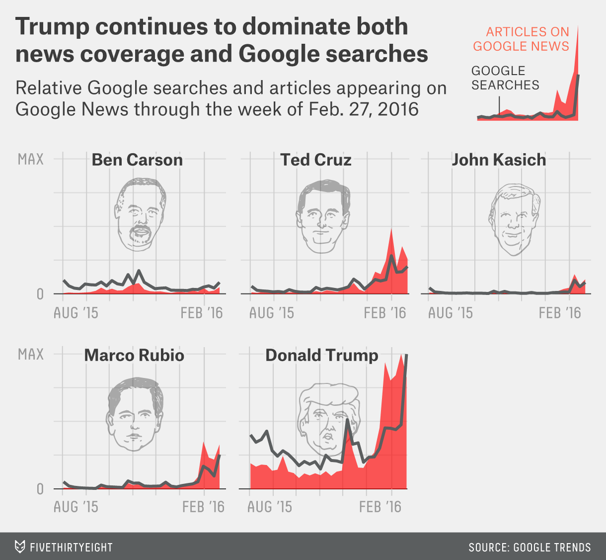
We have a nice set of small multiples—please kill the cute illustrations of the candidates’ heads—comparing the number of items in Google News and Google Searches. The graphic goes a long way in showing just how much coverage Trump has received over the past few months against very little for others.
Credit for the piece goes to FiveThirtyEight’s graphics department.
If you did not realise it, today is the first day of the second phase of the American presidential election process. Phase 1 was all the posturing and getting-to-know-me stuff from every candidate. A few dropped out, but now the first votes will be placed in the cold and later tonight snowy town centres of Iowa. The big story for Iowa is can Trump fend off Cruz and can Hillary fend off Bernie. (I like how we can clearly delineate the two parties by whether we use surnames or given names.)
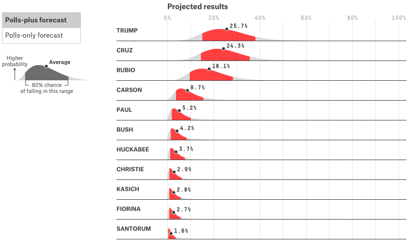
I love election season and in particular the visualisations that go along with them. But I have been making a conscious effort not to go overboard. But that phase is over, so today we look at FiveThirtyEight’s range plots that I have enjoyed for some time now.
Who will be first in Iowa?
They are sort of like a more intuitive version of the familiar box plot. Your highest probability falls within the red—what other colour did you expect—and the average value is denoted. But you can also see that the curves are asymmetric. In short, anybody from Carson up really has a shot. But expect to see Trump or Cruz on top in Iowa.
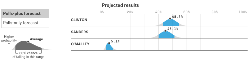
The race, however, is not quite as exciting on the Democratic side. However, much like I am surprised that Trump is not just still running, but leading, I am surprised about Bernie Sanders’ strength. While he is further behind than Cruz is behind Trump, it is still quite possible for Iowa to “feel the Bern” as they say.
The Democratic plots
There are of course other visualisation pieces out there—on this page even—but how about we ease into the commentary? After the presidential election is much more a marathon than a sprint. Anyway, I guess we will all see how accurate these plots are come this time Tuesday.
Credit for the piece goes to the FiveThirtyEight design team.
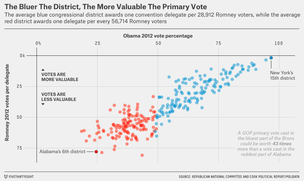
The day after Election Day—no, not that Election Day—we take a look at a nice scatter plot from FiveThirtyEight. They explore how an eventual conservative candidate, whoever that may be, will face a structural challenge. There are slightly more delegates at play in blue states than red. And typically those blue Republicans are “less religious, more moderate and less rural.” The big graphic supporting their argument looks at the value of the primary votes. Surprise, surprise, the higher-value primary votes come from blue states.
The relative value of the votes
Credit for the piece goes to the FiveThirtyEight graphics department.