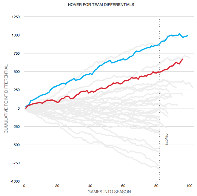
So the basketball finals begin tonight with the Cleveland Cavaliers taking on the Golden State Warriors. This is also the part of the post where I fully admit I know almost nothing about basketball. I did, however, catch this so-labelled infographic from ESPN contrasting the two teams.

What I appreciate at this piece is that ESPN labelled it an infographics. And while the data might be at times light, this is more a data-rich experience than most infographics these days. Additionally the design degrades fairly nicely as your browser reduces in size.
The chart formats themselves are not too over-the-top (that seemed like a decent basketball pun when I typed it out) with bars, line, and scatter plots. Player illustrations accent the piece, but do not convey information as data-encoded variables. I quibble with the rounded bar charts for the section on each team’s construction, but the section itself is fascinating.
I might not know most of the metrics’ definitions, but I did not mind reading through the piece.
Go Red Sox.
Credit for the piece goes to Luke Knox and Cun Shi.


