
I mean really, given the rampant and pervasive nature of the Russian state-aided doping programme, how could I not use the Russian reversal? Yesterday WADA, the international anti-doping agency, released its findings on Russian doping at the Olympics. And, suffice it to say, the report is rather damning. The BBC published this graphic in an article to help demonstrate the scheme.
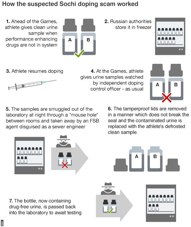
Unlike the evidence of doping, I find the graphic itself lacking. More could have been done to create more consistent type. Text justification ranges (pun intended) from left to right, without any clear system. Why do some stages, e.g. four, align to the right and then others, e.g. seven, align to the left?
Also, I believe more could have been done with the illustrations, in particular the bottles labelled A and B, to better differentiate between a clean sample and a contaminated sample. Why, for instance, does Step 1 include both an A and a B when it mentions only one sample?
In short, the story certainly warrants explanatory graphics, especially as to how the sealed lids were removed, but this piece is not the solution (pun also intended).
Credit for the piece goes to the BBC graphics department.