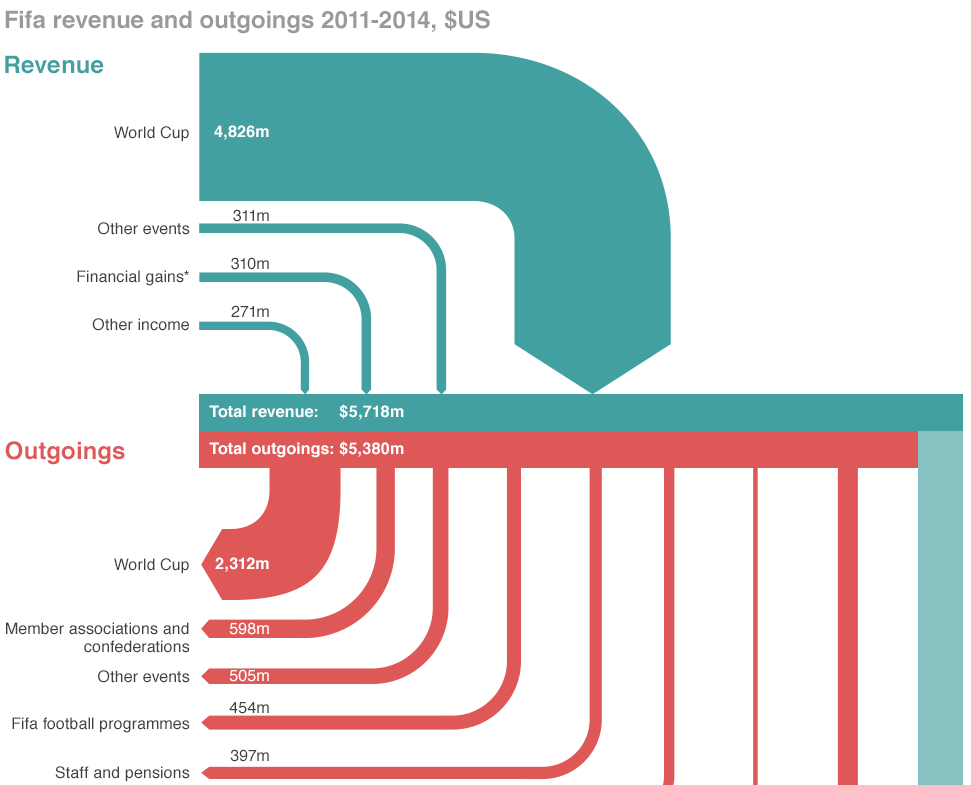
If you did not hear about it the other day, the head of FIFA resigned. That is kind of a big deal because football (in the rest-of-the-world sense of the word) is kind of a big deal. But the organisation that runs it is generally seen as wholly corrupt. So this BBC piece takes a look at the revenue and spending—at least so far as we know about it.
Sort of a Sankey diagram
Credit for the piece goes to the BBC graphics department.
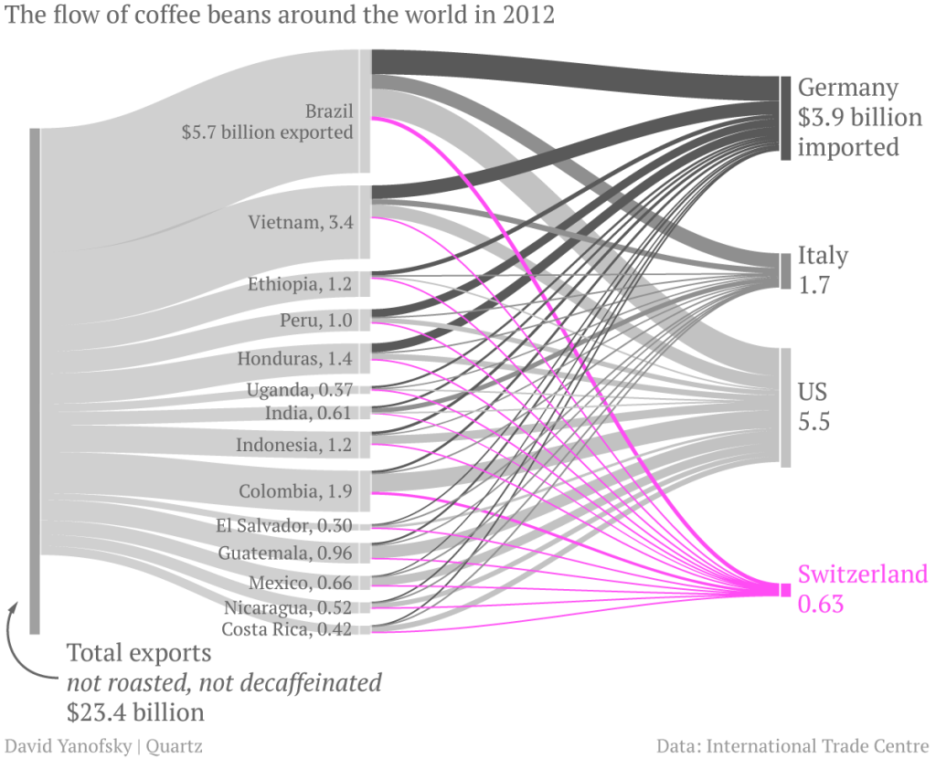
While I hate coffee, I do like sankey charts. And this piece from Quartz makes use of one when discussing the exports of coffee. In particular, the article focuses on the value that coffee manufactures, e.g. Nestle, add to Swiss imports of un-roasted beans before exporting them roasted. (Increasingly in little pods.) Overall, the piece is of a digestible length and worth a read. If you like coffee. Personally, I’m sticking with tea.
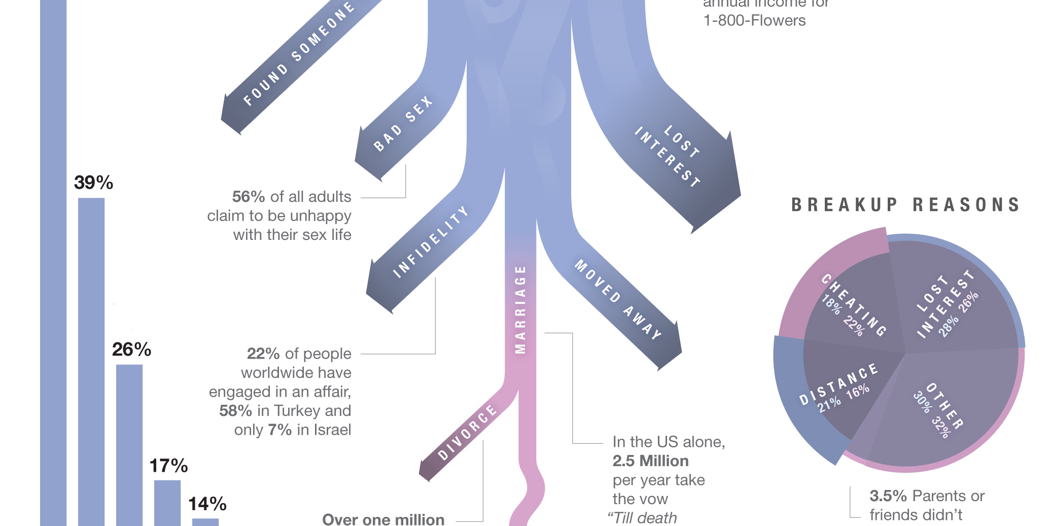
To celebrate, here’s a cropping from an infographic about breakups. From a whole series of graphics about breakups. You can thank me with some dead and rotting flowers.
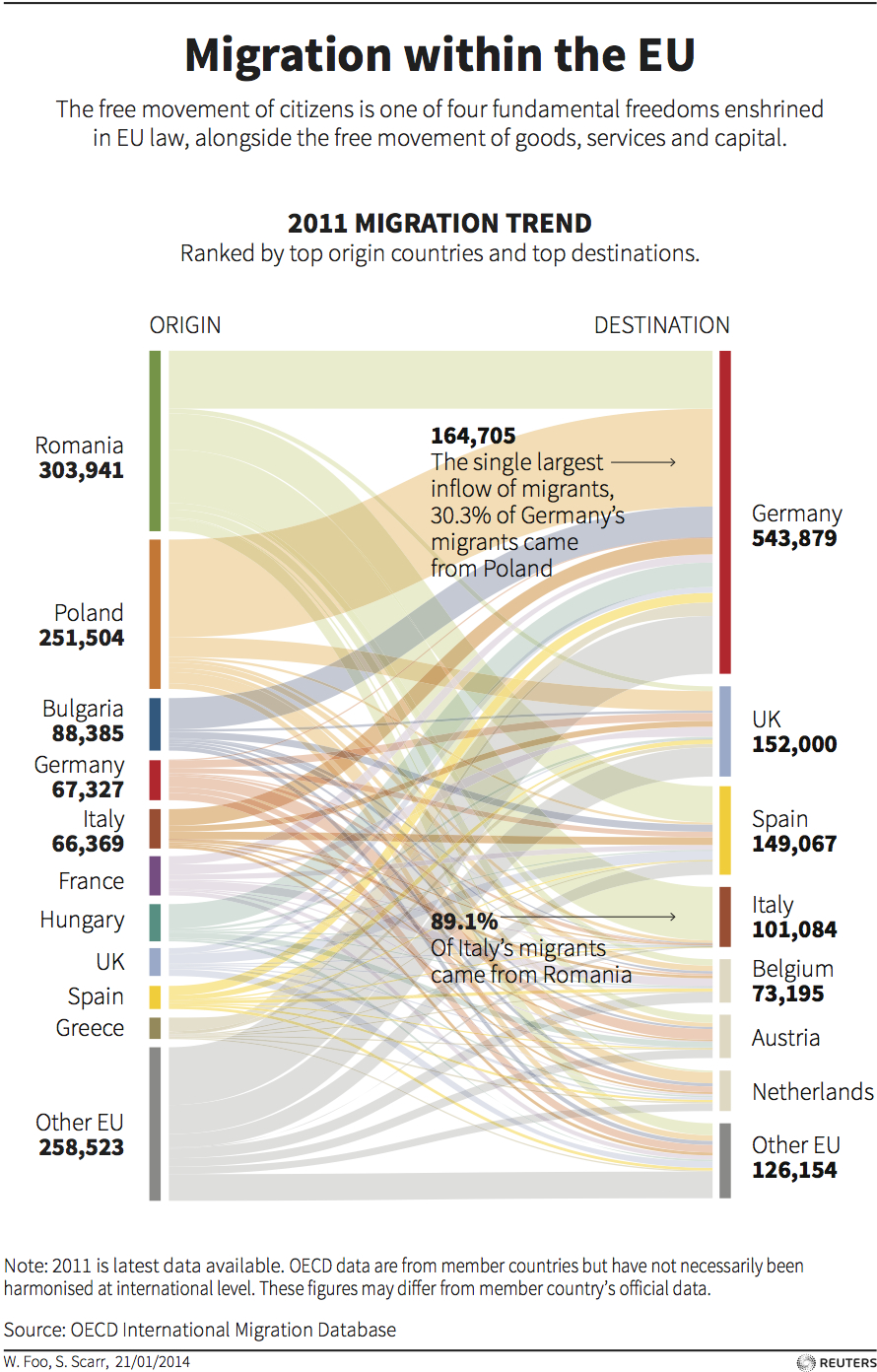
Today’s post comes via one of my coworkers. She sent me this graphic from Thomson Reuters that uses a Sankey diagram to show the movement of European Union citizens within the EU. As with my post yesterday, I feel this piece would benefit from even limited interactivity. Exploring individual countries or individual flows by touch or by mouse would be more useful than relying on annotations. But also as I said, that might not have been possible within the production constraints of this piece.
War is good for the arms business. So a long and bloody civil war in Syria is just what arms manufacturers want. And while arming the Syrian government is fairly easy, how do you get weapons and ammunition to the Syrian rebels? The New York Times maps the flow of arms through an almost Sankey-like diagram where the number of flights determines the width of the arrows from source to destination.
And while that would be sufficient information to warrant a map, the Times adds a further layer by showing when the flights arrived. Clearly the civil war began with a certain number of arms. But as the war has both drawn on and become bloodier, new weapons are needed and ammunition needs to be restocked. Those needs likely explain a recent surge in flights.
Map of routes used to arm Syrian opposition forces
Today’s post features a Sankey diagram from the New York Times that looks at how the Obama administration has been failing to help homeowners with mortgage problems. Less than 25% of applicants have seen successful modifications of their home loans. The diagram here clearly shows the process and the failures that have led to so many Americans not receiving the help they sought.