Spread of the Caldor Wildfire

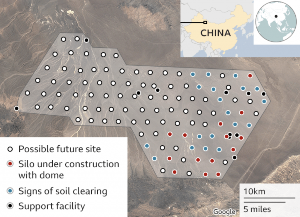
I’ve been searching to see if I could find a better motion graphic of this, alas not. I saw a post on Instagram from the Washington Post that featured a timelapse video or graphic of the spread of the Caldor Wildfire. The Caldor Wildfire presently rages southwest of Lake Tahoe and has now forced the evacuation of South Lake Tahoe, a city of more than 20,000 people.

If you can’t stand the heat?

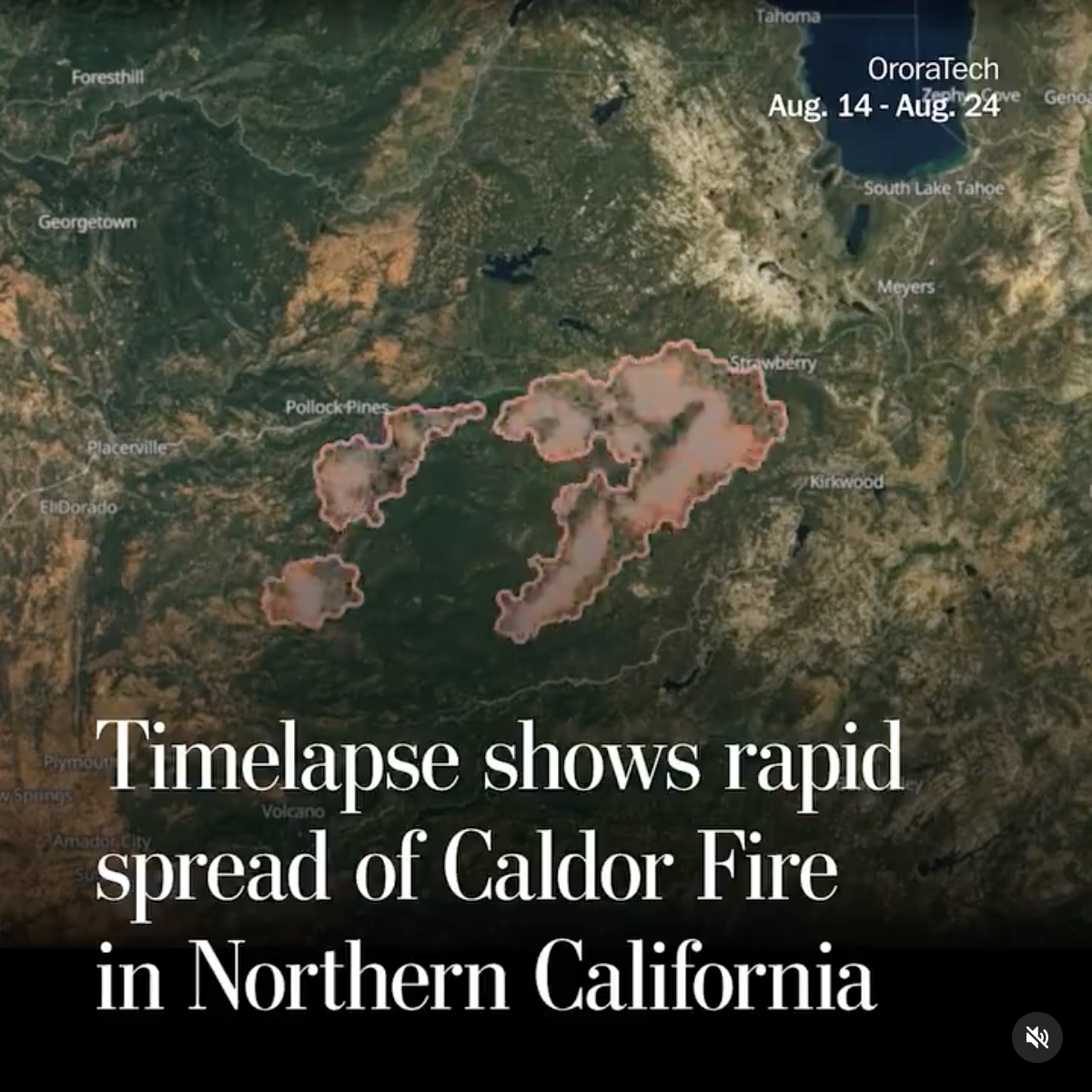
The motion graphic just does a nice job of simply capturing the spread, in both direction and speed, of the wildfire. Obviously, the whole area could use the inches of rain that Hurricane Ida is dumping on the eastern half of the country.

Credit for the piece goes to the Washington Post graphics department.

You Thought That Was All China Was Doing in Its Western Deserts?

Yesterday I wrote about some new ICBM silos China is building in its western desert. These things clearly interest me and so I was doing a little more digging when I found this even more recent article, this one from the BBC about an entirely different ICBM silo field that China is building in another western desert.

In terms of data visualisation and information design, we are looking at the same kind of graphic: an annotated satellite photograph. But the story it paints is the same: China is rapidly expanding its nuclear missile arsenal.

Similar to the earlier piece we see dots to indicate missile silo construction sites. But the Federation of American Scientists noted these silos appear to be at earlier phase of the construction process given that sites were still being cleared and prepared for construction activity.

You get a silo, and you get a silo, and you get a silo…

But put it together with the publicly available information from yesterday and, again, we can only draw the conclusion that China wants to greatly increase its nuclear arsenal. And like yesterday we’re left with the same question:

How will the United States and her allies respond?

Credit for the piece goes to the Federation of American Scientists.

It’s the Big Things That’ll Kill You

We can move from the microscopic things that will kill us to the very big things that will kill us. Nuclear missiles.

Because satellite photography from late June indicated that China is presently building over 100 ICBM silos in its western deserts. China has long had nuclear weapons, but has also long kept its arsenal small, compared to the two nuclear behemoths: the United States and the Soviet Union/Russia. But you don’t begin building over 119 missile silos unless you intend to build ICBMs.

To be clear, this doesn’t mean that China will build 119 missiles. More than likely it’ll be a very expensive and potentially deadly shell game. How many missiles are underneath the silo covers? Can you keep track of them? But even if China builds a fraction of 100, modern ICBMs come with multiple independent reentry vehicles (MIRVs) that allow a single missile to target several cities independently.

We also know that China has been building shorter and more intermediate range ICBMs. But some of those are thought to be equipped with conventional warheads, designed to target and sink American supercarriers in the Pacific. The goal to deny American sea and airpower effective bases to defend Taiwan or other allies in the South China Sea.

We know about this most recent buildup because of a Washington Post article that used satellite photography to pinpoint those new silos.

Beware the missile gap

Of course this isn’t news to the defence and intelligence agencies. For sometime now they’ve been warning of China’s build-out of its military capacities. The question will be is how does the United States and her allies respond?

Credit for the piece goes to Planet/Center for Nonproliferation Studies.

Urban Boom Towns

Today we look at a piece from the Guardian about the blossoming of some cities from, essentially, out of nowhere. Think similar to how there is really no reason for Las Vegas or Phoenix to exist—cities of hundreds of thousands situated smack in the middle of the desert. But most of these new growth cities, cities from scratch as the Guardian calls them, are sprouting in Africa and Asia.

The piece uses two pretty straight-forward graphics to show the scale of the growth problem.

A lot of urban area growth is yet to come.

I don’t love the area chart, but even for all its flaws, it it still massively obvious just how much Africa will contribute to population growth in the coming decades. And the line chart, which I find far more effective despite its borderline spaghetti-ness, shows just how much of that growth will likely be urban in nature.

But the star of the piece, for which you will need to click over to the original article to enjoy, are the motion graphics. They capture year-by-year the satellite views showing how the cities have grown from almost nothing. This is a screencapture of Ordos, China. But go back a couple of years and it’s almost an empty desert.

Check this out from decades ago and you'll see nothing.
Check this out from decades ago and you’ll see nothing.

Credit for the piece goes to Antonio Voce and Nick Van Mead.

The Changing Shape of Anak Krakatau

A few weeks ago we took a look at an interactive piece from the BBC that used a slider to show before and after photos of Anak Krakatau. For those that forget, that was the volcano that exploded and created a tsunami in Indonesia, which killed over 400 people. Well, geography is always changing and so has the shape of the volcano.

The BBC published a piece about two weeks ago that looked at new details from a Finnish radar satellite. These show how the crater of the volcano has been cut off from the ocean and is now a little lake.

Maybe not the most ideal lounging lagoon

This piece is not really revolutionary in its design. But it does provide a nice follow-up on a story that piqued my interest.

Credit for the piece goes to ICEYE.

Burning Out the Rohingya

For years the Rohingya people, largely Muslim, in Burma (also known as Myanmar) have faced persecution from the majority Buddhist Burmese to the point that they are not considered citizens. Over the last several weeks, the Burmese government has reacted to assaults against civil authorities by armed Rohingya groups by burning villages wholesale. Burma denies it, occasionally going so far as to say that the Rohingya have in fact burned their own villages.

Sure.

The New York Times had an article on the Rohingya crisis, which if it is not already is now perilously close to being ethnic cleansing. Online, an article offered more, comparing satellite views of villages before and after their burning to the ground.

Before and after
Before and after

This week global leaders are meeting in New York at the UN General Assembly. Undoubtedly and rightly they should discuss issues like North Korea’s two programmes, one of developing nuclear weapons and the other of developing intercontinental ballistic missiles. But, hopefully they will not be silent on this issue.

Credit for the piece goes to Sergio Peçanha and Jeremy White.

How Big Was Irma?

Like many Americans I followed the story of Hurricane Irma over the weekend. One of my favourite pieces of reporting was this article from the Washington Post. It did a really nice job of visually comparing Irma to some recent and more historic storms, such as 1992’s Hurricane Andrew.

It can be difficult to truly compare hurricanes, sometimes they are small and compact, other times more dispersed. Irma was just big with lots of potentially destructive power spread out across a wide area, almost the width of the Floridian peninsula. The article uses several graphics—I am also quite partial to the satellite image comparison so check out the article—but this one is perhaps my favourite.

A look at four big storms

It uses a colour palette that deepens in redness nearer the storm’s centre. This allows the user to compare the geographic area or footprint of the storms destructive winds.

I wonder, however, what would happen if the designers had superimposed each graphic atop the other. It might have allowed for an even better comparison of size instead of having to have the user mentally transpose each hurricane.

Still, a really nice graphic and visual article.

Credit for the piece goes to Bonnie Berkowitz, Laris Karklis, Reuben Fischer-Baum, and Chiqui Esteban.

Piece, Larsen C

When I was in high school in 2002, it was big news when one of the three Larsen ice shelves in Antarctica, Larsen B, collapsed. And then when I was at university, the band British Sea Power wrote a song titled “Oh Larsen B” that I have always enjoyed.

Now Larsen B was not the first Larsen ice shelf to collapse. That dubious honour belongs to Larsen A, which collapsed in 1995. But, Larsen B will not be the last as the third, Larsen C, is now on the verge of collapse. This graphic from Adrian Luckman, reproduced by the BBC, illustrates how the rift calving the shelf has seen accelerated growth recently.

The rift's growth has accelerated lately
The rift’s growth has accelerated lately

I believe the colours could have been designed a bit better to show more of the acceleration. The purple fades too far into the background and the yellow stands out too much. I would be curious if the data existed to create a chart showing the acceleration.

The inclusion of the map of Wales works well for showing the scale, especially for British audiences. In other words, an iceberg 1/4 the size of Wales will be released into the Southern Ocean. For those not well versed in British geography, that means an iceberg larger than the size of Delaware. That’s a big iceberg.

Credit for the piece goes to Adrian Luckman.

Airplanes in Hangars

Today’s post features a simple set of graphics on the BBC, however the creators were actually the Asia Maritime Transparency Initiative. The background? The increasingly tense geopolitical situation in the South China Sea, where China claims numerous islands and reefs claimed by other countries—and to a smaller extent other countries make similar such claims. Just a few weeks back, the Hague ruled against Chinese claims against islands within the Philippines territorial waters. But as these graphics show, it takes more than a legal decision to effect change on the ground.

Satellite photography shows military installations on numerous Chinese-held islands. But what makes the images potent in the communicative sense is the simple overlay of white plane illustrations. They show how many fighter jets, support aircraft, patrol aircraft, &c. that China can base at the various military installations. It is a simple but incredibly effective touch.

Fiery Cross Reef
Fiery Cross Reef

Credit for the piece goes to the Asia Maritime Transparency Initiative.

Zaatari Refugee Camp for Displaced Syrians

The Syrian crisis is pushing people out of Syria. Unfortunately, most of the refugees are fleeing to places not wholly equipped or supplied to handle such large numbers. In this interactive piece of journalism, the BBC explores the difficulties in just one camp, Zaatari in the desert of Jordan.

My favourite element is this interactive map. It uses four satellite photographs taken at a few months interval and compares the growth of the camp; the growth is striking. The piece contains a diagrammatic view of the camp, identifying key areas, e.g. education areas, as well as a comparison to a new refugee camp named Azraq to host the overflow population. Fortunately, that camp is being designed with the lessons learned from Zaatari.

Zaatari Camp in November 2012

Credit for the piece goes to the BBC graphics team.