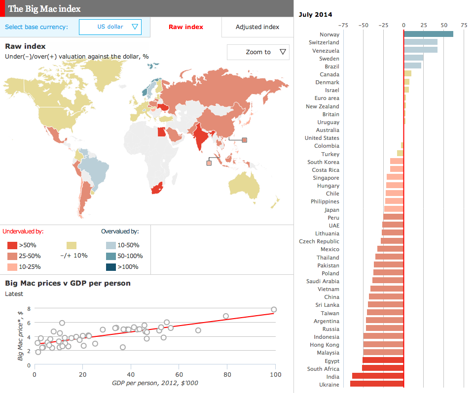
For years, the Big Mac Index from the Economist has been a standard of sorts for examining differences in currencies across the world. Well now we have an online, interactive version of the index.
The Big Mac Index
Credit for the piece goes to the Economist’s graphics department.
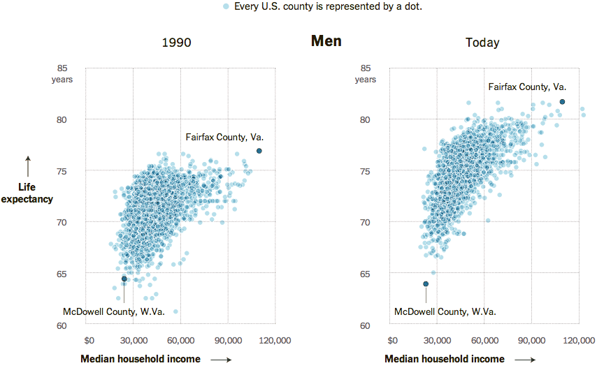
Today’s post comes via the New York Times. It’s a simple concept, but shown clearly in this collection of scatter plots. Growth in income for many counties has meant a growth in life expectancy. Unfortunately, not all counties are prospering and so the gap between rich and poor, and therefore the long-lived and shorter-lived, has grown.
Household income vs. life expectancy for men
Perhaps the only criticism I have about this piece is that for the highlighting of Fairfax County, Virginia and McDowell Country, West Virginia, an additional component could have summarised the growing gap between the two. For example, a bar chart along the axes of each could measure the growth in income disparity and the growth in life expectancy disparity.
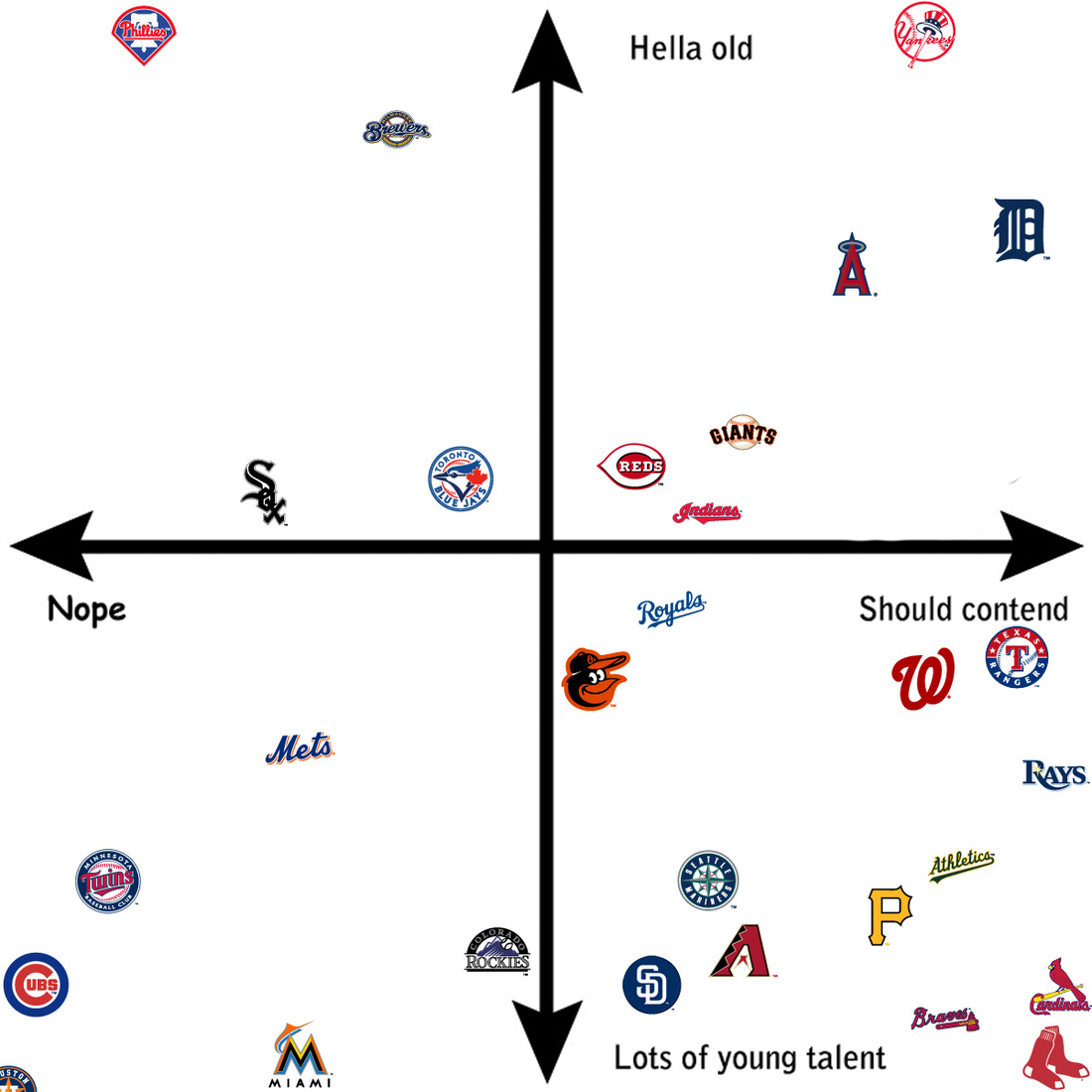
Spring training has begun for baseball fans. The glow from the Red Sox victory last October is fading as we now wonder if we can repeat. Fans of other teams now wonder if this is their year. Over at SB Nation, an article plotted 29 baseball teams—ignoring the Dodgers— and looked at their chances in the upcoming years. The article continues using the chart to explain which teams fall where.
Baseball windows
And for the designers, note the type choice for “Nope”.
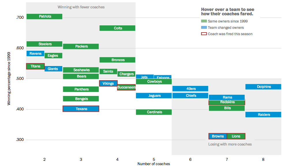
This weekend we will have yet more football. My preferred team, the Philadelphia Eagles, is of course now out of contention. But more than likely, the coach’s job is secure for at least another year. As we have already seen, however, that cannot be said for other coaches. So the Washington Post looked at ownership’s role in the success of their respective team by the hiring and firing of coaches.
Coaches in the NFL
Credit for the piece goes to Bonnie Berkowitz, Darla Cameron, Dan Keating, and Rick Maese.
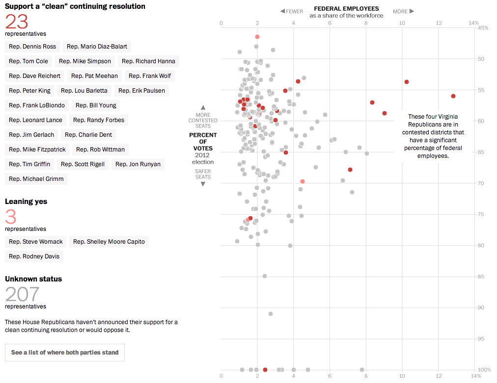
Yesterday, we looked at the new Conservative Party of America. But those are the votes that John Boehner fears to upset—and possibly fracture his party and cost him his job—if he should let a clean budget resolution come to the floor and should it pass. But why would it pass if it needs 217 votes and there are only 200 Democrats? Well, now we have a nice interactive graphic from the Washington Post that explores the moderate Republicans. Which, if this count is accurate, would provide enough votes when combined with Democrats to pass a clean budget.
The moderate Republicans…
Why are these Republicans in favour of a clean budget resolution? The y-axis shows that they are in moderate or mixed congressional districts, i.e. not Conservative districts. The x-axis shows that a fair number of these moderates have a high proportion of federal workers within their respective district. And who’s not working/earning money during the shutdown? Yep, a lot of federal workers.
Credit for the piece goes to Aaron Blake, Dan Keating, Ted Mellnik, and Darla Cameron.
Major League Baseball is set to suspend Alex Rodriguez this morning—if the news reports are true. That will all but end the season for Rodriguez, though he could well play through his appeal so you never really know. But what does this mean for the Yankees and their offense?
The New York Times put together an interactive scatter plot charting the annual salary against the number of hits (roughly a measure of offensive production throughout the year) with benchmark lines for the league average of both. First, the user can see the team averages.
Comparing baseball teams salaries vs. offensive production
At the team-level, one can see that, roughly speaking, the more money a team pays to hitters, the more productive the team. Production it should be noted, does not necessarily equal wins. Look at the Angels, who have some of the most hits, but are in fourth place (out of five) and in a difficult place to make the playoffs.
Quick comparison of the Red Sox's hitters to the Yankees' hitters
But then the user can switch to the top-10 paid hitters on each team. (Four presets are offered beneath the piece, but click on a player from any team and his compatriots will appear.) You can see how the Yankees are hitting poorly in comparison to the Red Sox. (The only reason the Yankees are not truly awful is because their pitching has not been horrible.)
So if Rodriguez is suspended for this year and next, maybe they can use his salary for next year to buy a one-year free agent that isn’t at the bottom right of the this chart.
Credit for the piece goes to Mike Bostock and Joe Ward.
If all is going according to plan, I should be somewhere in the Carpathian Mountains at this point, specifically in the Presov region of Slovakia. So as a reminder of just what that means, here is a (recycled) piece I created this time last year about the Carpatho-Rusyns (sometimes known as Ruthenians) living in Slovakia. Click the image to go to the full infographic.
Cropping of the Rusyns of Slovakia
Credit goes to me for the piece, but to the statistics office of Slovakia for the data.
As I have been blogging the past several days, today the Supreme Court will announce its rulings on the two gay marriage cases. But, I have already looked at that twicenow. Today I want to look at the results of the Massachusetts special election for the US Senate, necessitated by John Kerry resigning from the seat to become Secretary of State.
This work comes from the Huffington Post. It offers the usual map fare with towns coloured by the victor and tinted by the share of the vote. Though do note the interesting—is this novel?—means of filling in the town with colour to represent the percent of the town reporting. My screenshot is a bit late, but check out Warren near Springfield or Boston and Cambridge—a bit harder to see because of their size and shape.
Looking across the state for the results
However, the fascinating thing is the use of the small multiples of scatter plots to look at historic elections. The designers included a small key in the upper-right explaining that dots above the line represent towns where Ed Markey, the Democrat who won, outperformed the historic Democrat. I have not seen anybody attempt to portray the data in this fashion before.
Using a scatter plot to chart the results
Credit for the piece goes to Aaron Bycoffe and Jay Boice.