How Healthy Is It?

Happy Friday after the election. Now that we have had our fill on sweets and bitters, we probably need to move towards a more balanced, more moderate diet. A couple of months ago the New York Times put together this scatter plot from the difference between public and nutritionist opinion on whether certain common foods are healthy.

I normally do not comment on the design of my Friday posts, since I intend them to be on the lighter, more humourous side of things. But this piece interests me, because despite the seriousness of the subject matter I find it lighter and less serious. Why? After studying it, I think it is because of the inclusion of photographs of the items. With the labels still present, I am left thinking that a small dot would be equally effective in communicating what falls where.

In general, try to be in the upper right

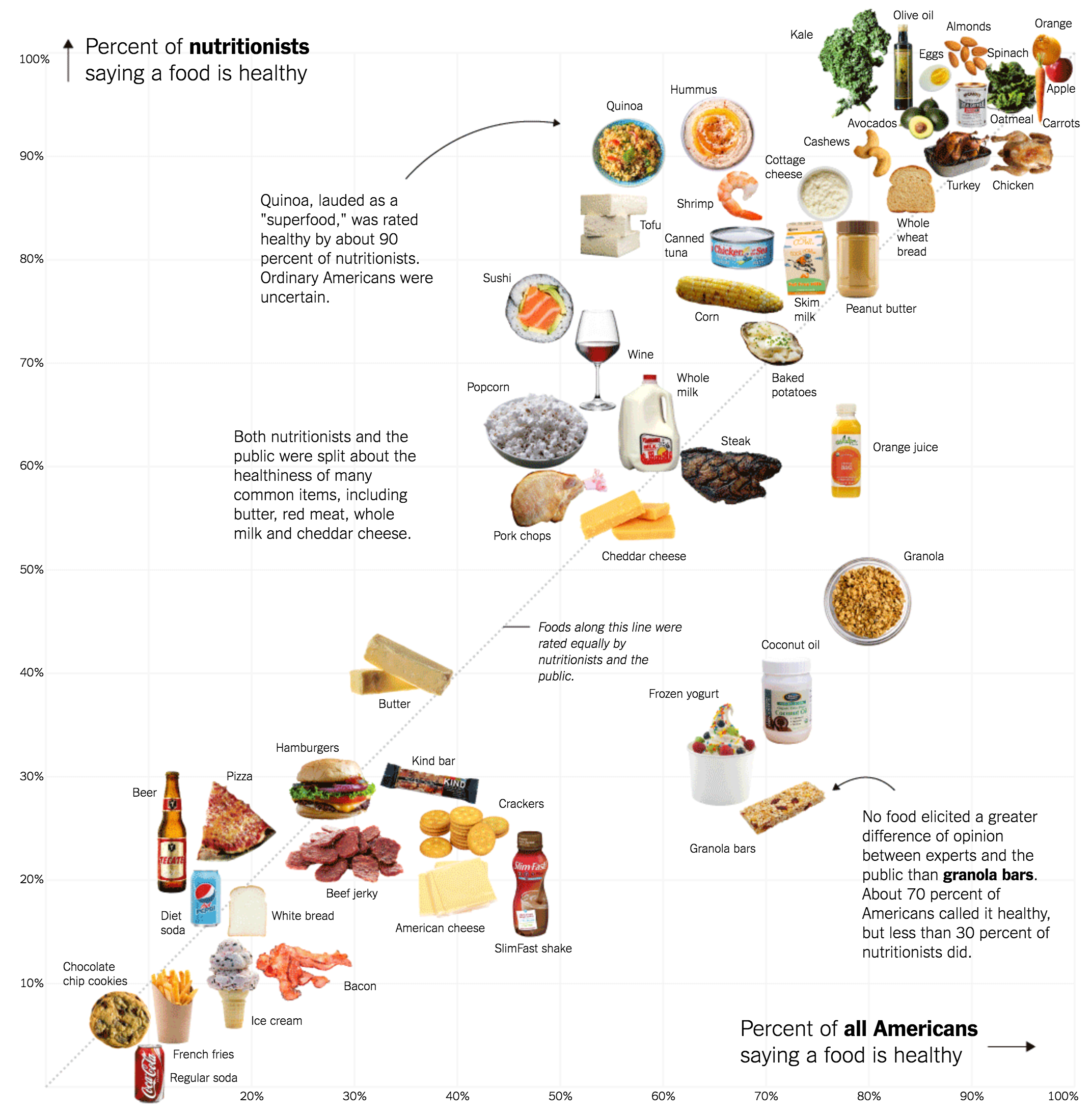
But more importantly, look at the sizes of the images relative to the plot. Take the bowls of granola or popcorn, for example. They occupy almost an entire square; the actual value could be anywhere with the 10 percentage point range either vertically or horizontally. And for those two, it does not matter a great deal. Each falls firmly on one side of the line. But what about butter? Kind bars? Cheddar cheese? The large graphic size straddles the line, but because the designers opted for photos over more precise dots, we cannot ascertain whether these foods fall on one side of the line or the other.

The point is that the graphics and design of a piece can influence the perceived seriousness of a piece. An image of a can of Coca-Cola certainly can be more engaging than a 10-pixel dot. But the precision of the dot over the image can also be engaging to the right audience, an audience interested in the data behind the story. There are ways of integrating both, because later on in the same article, we see a means of doing just that.

The image lives on the left of the table

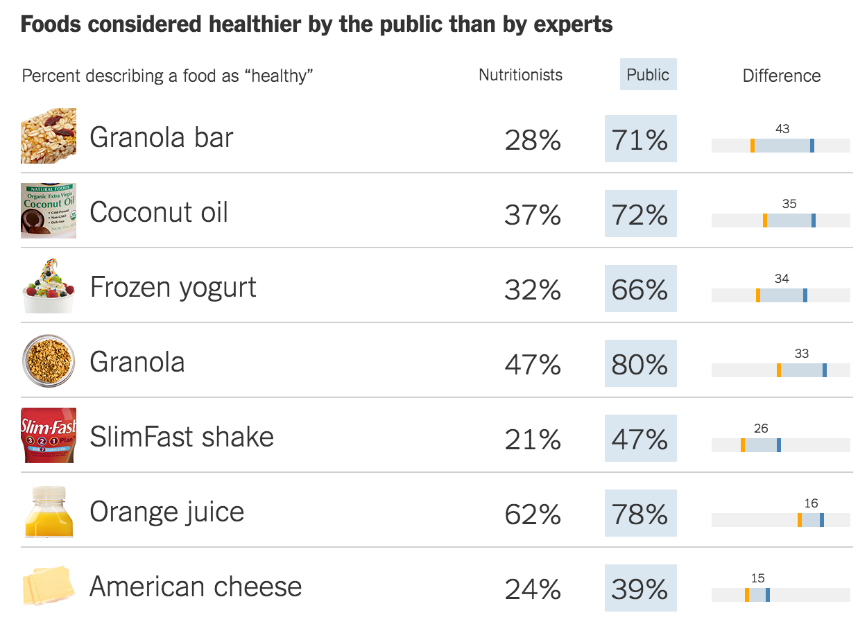
Here the image provides supplemental information. Just what does a granola bar look like? Well here you can see it. But even here, despite the smaller size and cropped dimensions, the photographs steal a bit of emphasis from the numbers and the charts to the right. (For things like SlimFast, that is no surprise, because the package is designed to capture your attention.)

At the end of the day, the piece interests me because the data interests me. And the story interests me. And I generally like the data visualisation forms the designers chose. But I keep getting hung up the photographs. And not in a good way. What do you think? Do the photos add to the story? Do they make the data clearer?

Credit for the piece goes to Kevin Quealy and Margot Sanger-Katz.

Road to Victory

Among my recent life changes, I have moved back to Philadelphia from Chicago. That means Sundays the bars and streets are full of people wearing the jerseys of their favourite Eagles (American) football players. And apparently this year, they are off to a good start. FiveThirtyEight took a look at other 3-0 teams to compare the 2016 Eagles and examine their chances for the playoffs.

Comparing the Eagles offense and defence

Credit for the piece goes to Chase Stuart.

Religiousness

Today’s post is about religion. One of the two things you are never supposed to talk about in good company. And since the other is politics and since I cover that here frequently, let’s just go all in, shall we?

FiveThirtyEight has an interesting piece about religious diversity and a corresponding lack of religiousness. From a graphics standpoint, the central piece is this chart below.

Diversity and religiousness compared

What I would love, however, is for the plot to be interactive. It would be great to let people check out their own individual home states and see how they compare to the everyone else.

Credit for the piece goes to the FiveThirtyEight graphics department.

Covering Terrorism

Last week we witnessed the lorry attack in Nice, France. This week we have the axeman attack on a German train. Does anybody note, however, the recent terror attacks in Dhaka, Bangladesh? Probably not, according to this insightful piece from FiveThirtyEight. They took a look at journalism’s coverage of terror attacks and whether there are discrepancies based on geography. Turns out that yes, there are. But, the article does make a point to note some reasons why that might be. One, we have covered it a lot more often since 11 September 2001. Anyway, the whole piece is worth a read.

All countries are equal, but some are more equal than others

Credit for the piece goes to the FiveThirtyEight graphics department.

Expensive Wines

Another Monday, another week, another post. But this week we will try to get by without any more Brexit coverage. So what better way to cure a hangover than with more booze? So let’s start with some fancy wine.

I meant to post this piece a little while back, but yeah that unmentionable thing occurred. Now we have the time to digest as we sip and not slam our beverage of choice—the Sun’s over the yardarm somewhere I figure. FiveThirtyEight took a look at expensive wines. It compares the pricing at various vintages for France, California, and other wine-producing regions. On the balance, a very smart piece with some great graphics.

But since I had to pick just one, since this isn’t a full-on critique, I opted for this set of small multiples. It compares the price vs. vintage for a number of California red wines. (One of which I had this weekend.)

California reds
California reds

Credit for the piece goes to Oliver Roeder.

Comparing the Brexit Results Designs: Part 3

Last one of these critiques—I promise. Earlier this week I looked at the New York Times’ coverage and the BBC’s coverage. Well, today I want to examine the Guardian’s coverage of the Brexit vote results. This piece differs the most from the preceding work and it starts right from the top, literally.

The faces of the campaigns

I am not the biggest fan of the illustrations of David Cameron and Boris Johnson, but in a sense, neither is a throw-in. For the last few months, the Guardian has been using these and similar illustrations of US presidential candidates to tie results into different political camps. Thus in that sense, they do fit the Guardian’s current brand. Interestingly, neither remains (pun intended) in the picture for the future of the Tories.

Data-wise, however, the decision to use the bar chart at the outset of the piece reflects an understanding of the importance of the top-line number. Districts count, but only at that granular level I discussed. What truly matter, though, is the aggregate. And this is a no-doubt-about-it means of conveying that information. (I will admit the David Cameron frowny face does help a wee bit.)

And if the use of big numbers and illustrations at the top of the piece broke with the choropleth map we saw with the New York Times and the BBC, well, we have another clear break.

Hexagonal representation

Instead of using a geographic map, the Guardian employs a cartogram with hexagons. I have covered similar uses a several times before today. The hexagon shape allows better retention of familiar geographic shapes, while still providing a means of solving the small district problem, especially in places like central London.

From another design perspective, that of colour, we see an improvement over the blue–yellow spectrum used by the BBC. You may recall from yesterday:

Having multiple tints and shades of yellow makes the map difficult to read.

Here, the Guardian instead opted for a simplified, and easier to read, two-step split. Bright blue and yellow with each have a call it half-tint. With only two blues and, more importantly, two yellows to distinguish, the map becomes easier to read. The trade-off, the darker of the colours represents anything above a 15% majority.

Clicking on the map then provides with a small summary of the district results.

A look at Watford
A look at Watford

Here we see nothing too dissimilar from how the BBC treated the interaction with their map. A small, subtle design element I enjoy, however, is the inclusion of the national average. The 50% marker indicates clearly which side won, but the tick below the bar gives the reader context of where the district fell into relation to the remainder of the country.

And that leads us into the next set of comparisons.

Comparisons based on demographics

The Guardian took local district results and compared them against several different demographic and socio-economic indicators. This allowed them to present various correlations of the vote. It turns out that higher education correlated best with the results of the UK vote. From a design perspective, the linked circles provides some stability. However, I would have preferred the ability to click a geography and have it remain sticky and bring up the specific figures. Additionally, some sort of text search for geographies would be helpful.

And then the Guardian’s piece closes as strongly as it opened.

Votes along the Tyne

The piece examines three riverside areas to provide specific analysis to the vote. The screenshot above focuses on the Tyne, which runs alongside the aptly named Newcastle upon Tyne. The Guardian uses the previous general election results for the area to contrast with the referendum results. It does similar analysis for the Thames (London) and the Mersey (Liverpool).

Similar to the New York Times piece, the Guardian’s piece responds well to viewing the content on a small screen. The changes are less complex and they deal mostly with the arrangement of the various components instead of the layout of contextual data. But the Guardian clearly considered how the piece would work on a mobile phone up through a widescreen monitor.

Overall the piece is quite strong and does an excellent job of showcasing the results data and providing insightful analysis that complements the vote totals.

Credit for the piece goes to the Guardian graphics department.

Contextual Scatter Plots

I know I mentioned that I would review the coverage of the Orlando shootings this week in more depth than I did on Monday. But, allow me an interruption for a nice little piece that I wanted to get to last week. If anything, it’s far less serious.

Scatter plot
Scatter plot

My apologies for my focus of late on small graphics, but I really think they are underappreciated component of providing context to written analysis. And this piece from FiveThirtyEight about the point scoring accompanies some good analysis that actually made some sense to this non-basketball fan.

Note the two finals-playing teams are highlighted—and importantly how the text is cleared with interrupted chart lines, a very nice touch—while other teams remain visible but unidentified for context.

Credit for the piece goes to Neil Paine.

Independent Candidates

Well, the election battleground has been set: Trump vs. Clinton. (Yes, I know the District of Columbia has yet to vote.) For those unhappy with the choices presented, the question of “what about a third party candidate?” arises. (Yes, I know there is both a Libertarian Party and Green Party already.) Months ago, FiveThirtyEight looked at where Michael Bloomberg fell as a third party candidate, a run he briefly considered. Turns out he too moved out of the middle and into one of the four corners of the board.

The lay of the land for outsider candidates, ca January

Credit for the piece goes to Nate Silver.

Basketball Finals

So the basketball finals begin tonight with the Cleveland Cavaliers taking on the Golden State Warriors. This is also the part of the post where I fully admit I know almost nothing about basketball. I did, however, catch this so-labelled infographic from ESPN contrasting the two teams.

Point differential
Point differential

What I appreciate at this piece is that ESPN labelled it an infographics. And while the data might be at times light, this is more a data-rich experience than most infographics these days. Additionally the design degrades fairly nicely as your browser reduces in size.

The chart formats themselves are not too over-the-top (that seemed like a decent basketball pun when I typed it out) with bars, line, and scatter plots. Player illustrations accent the piece, but do not convey information as data-encoded variables. I quibble with the rounded bar charts for the section on each team’s construction, but the section itself is fascinating.

I might not know most of the metrics’ definitions, but I did not mind reading through the piece.

Go Red Sox.

Credit for the piece goes to Luke Knox and Cun Shi.

The Quadrants of Trump

My apologies to you for the blog being down the last week and a half. This is what happens when I get 33,000 spam comments in the span of 24 hours: the blog crashes. Rest assured, I have lots of things to post.

But for today, we are picking up after a yuuugge night for Donald Trump so let’s get on with the data visualisations. Trump decisively won Connecticut, Delaware, Maryland, Pennsylvania, and Rhode Island with a majority of votes in every state. As he made sure to point out, winning 50–60% in a three-way race is quite difficult to do. Simply put, Cruz and Kasich got destroyed.

Why is that? Well a few days ago—can you tell I meant to post this then?—David Wasserman over at FiveThirtyEight posted an insightful article about the various counties thus far contested and how, when divided into quadrants based on socioeconomics and conservativeness, Trump has won three out of four quadrants. The whole article is worth the read.

The Quadrants of Trump

Credit for the piece goes to David Wasserman.