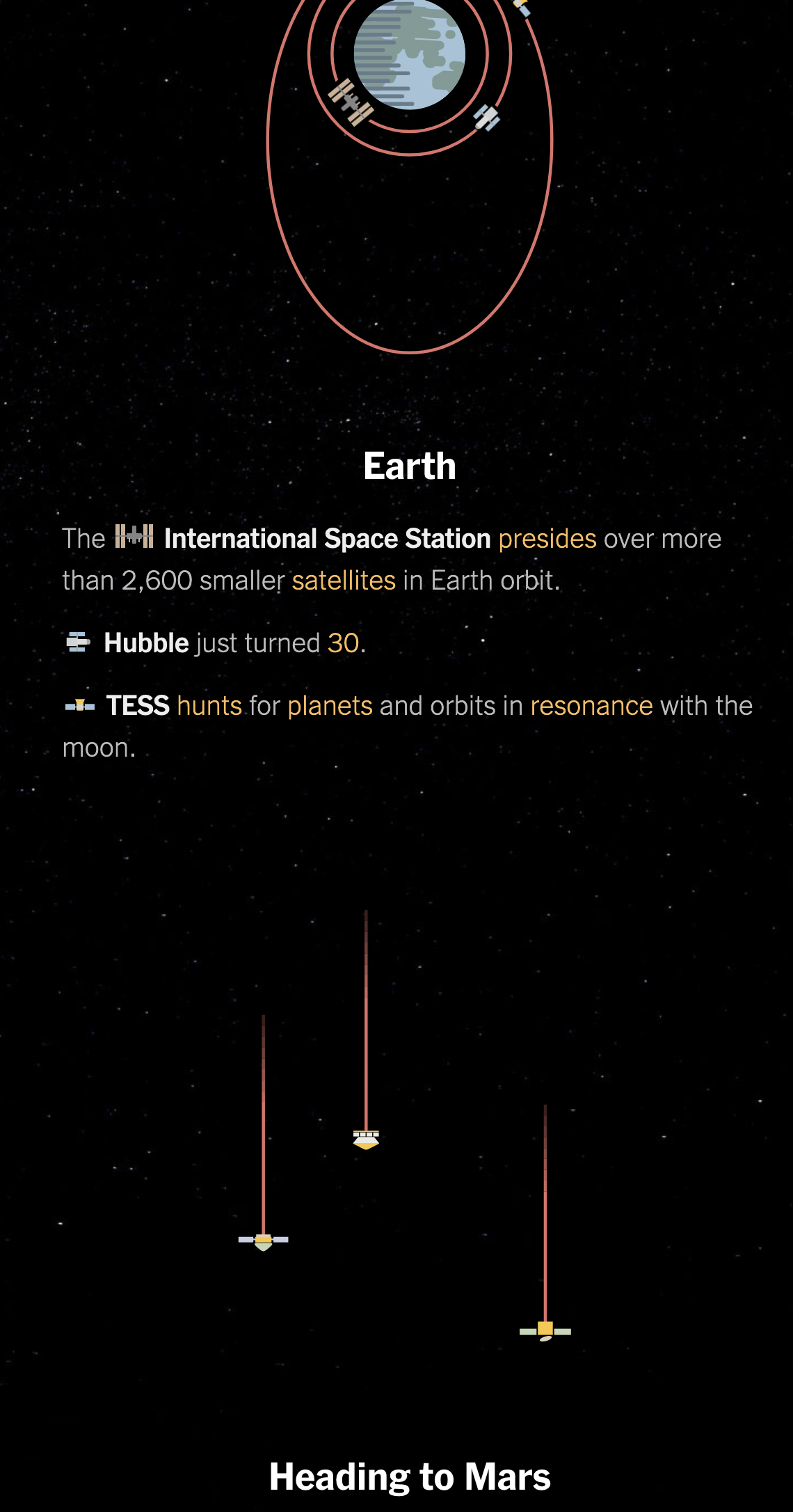
Early tomorrow morning, weather permitting, NASA’s Perseverance rover will blast off from Cape Canaveral on a six-plus month trip to Mars. There, hopefully it will land successfully and join all the rovers that have come before.
And so this piece from the New York Times feels appropriate. It’s a great illustration of all the spacecraft we have sent into space, including the active and inactive, with some notable exceptions.
I really like how it pays attention not just to the planets and their satellites (like the Moon), but also the comets, asteroids, and even the Lagrange points. And it does this all with small illustrations of the spacecraft.
Over the last several days, along with most of the country, I’ve taken an interest in the spread of the novel coronavirus named COVID-19. Though, to be fair, it’s actually been in the news since early January, though early news reports like this from the Times, simply called it a mysterious new virus. At the time I thought little of it, because the news out of China was that it did not appear it could spread amongst humans. How did that idea…wait for it…pan out?
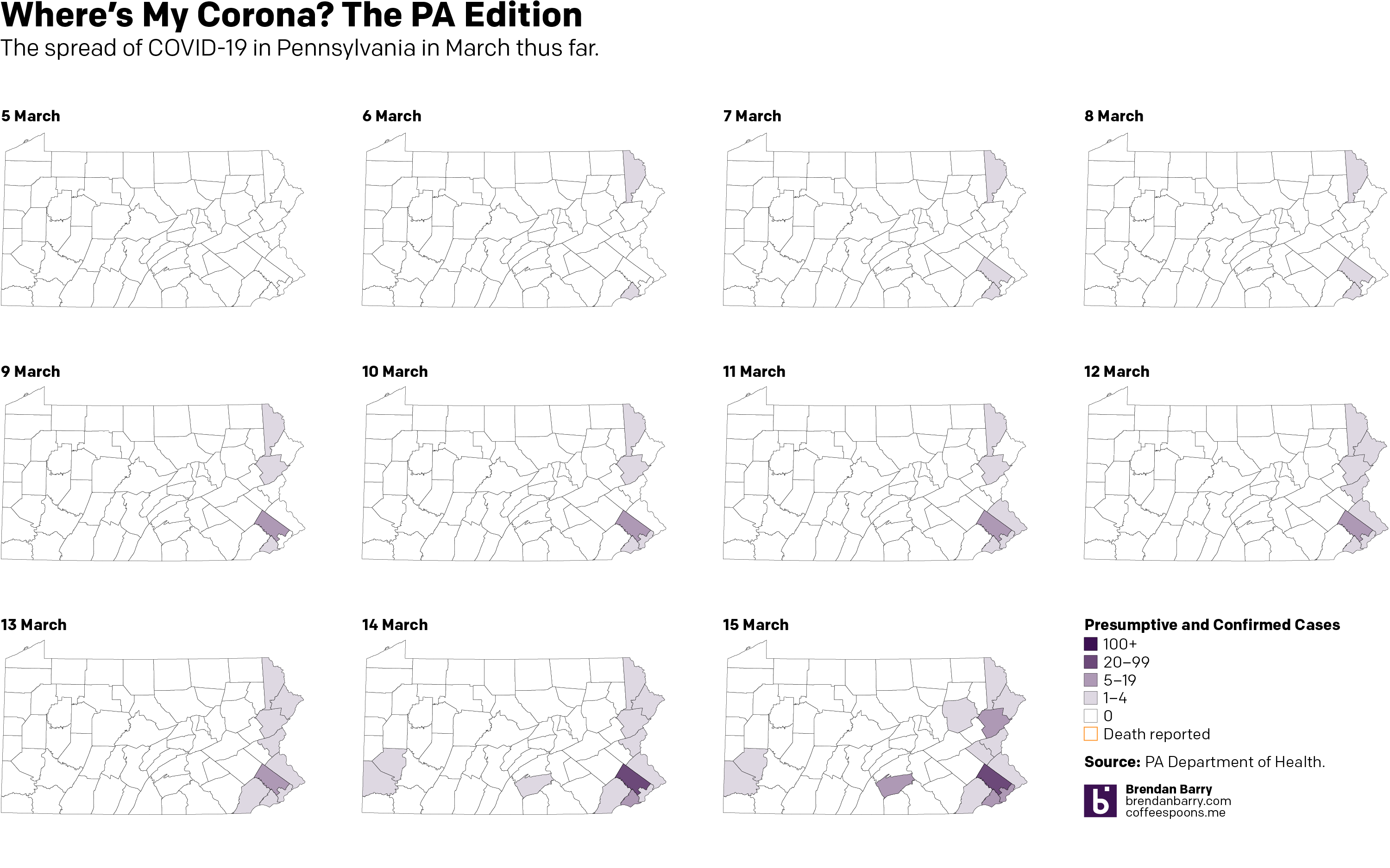
Anyway, over the last couple of days I’ve been making some maps for Instagram because people tend to look at a national map and see every nearly state infected when, in reality, there are pockets and clusters within those states. So I started looking at Pennsylvania. And initially, the cluster was along the Delaware River, namely Pennsylvania as well as its upper reaches near the Lehigh Valley and in the far northeast of the state.
But the spread has grown, and fairly quickly, with Montgomery County, a Philadelphia suburb, a hotspot. Consequently, the Pennsylvania governor has shut down all schools across the state and ordered non-essential shops, restaurants, and bars in the counties surrounding Philadelphia—as well as the county containing Pittsburgh—closed.
So 11 days in, here’s where we stand. (To be fair, I looked at including the early numbers out of today, but nothing has really changed, so I’ll wait until the evening figures are released before I update this again.)
Credit is mine. Data is the Pennsylvania Department of Health.
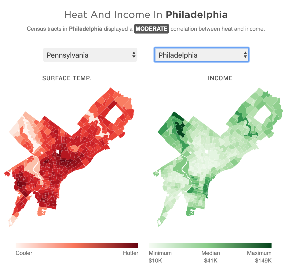
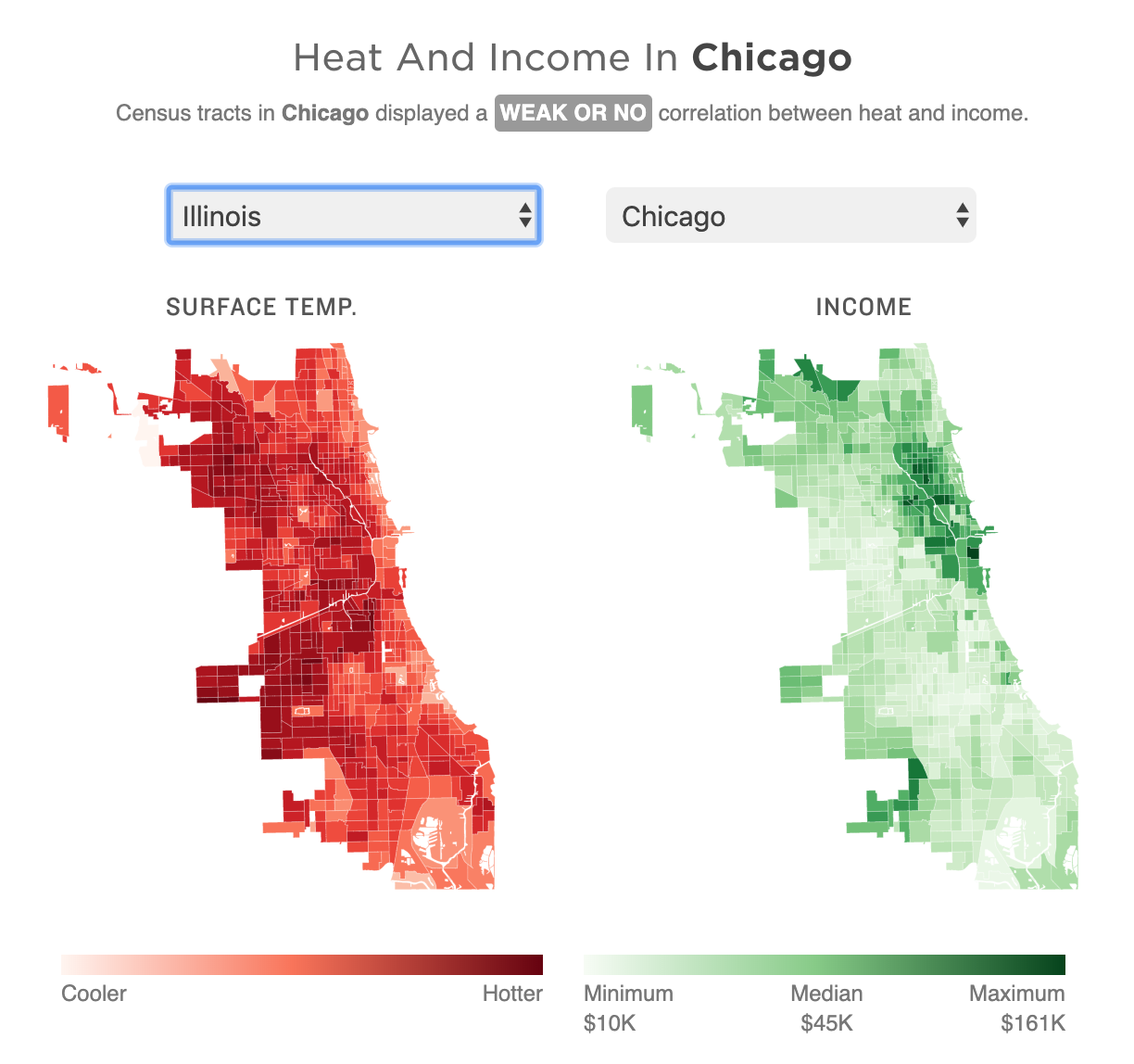
Yesterday was the first day of 32º+C (90º+F) in Philadelphia in October in 78 years. Gross. But it made me remember this piece last month from NPR that looked at the correlation between extreme urban heat islands and areas of urban poverty. In addition to the narrative—well worth the read—the piece makes use of choropleths for various US cities to explore said relationship.
My neighbourhood’s not bad, but thankfully I live next to a park.
As graphics go, these are effective. I don’t love the pure gradient from minimum to maximum, however, my bigger point is about the use of the choropleth compared to perhaps a scatter plot. In these graphics that are trying to show a correlation between impoverished districts and extreme heat, I wonder if a more technical scatterplot showing correlation would be effective.
Another approach could be to map the actual strength of the correlation. What if the designers had created a metric or value to capture the average relationship between income and heat. In that case, each neighbourhood could be mapped as how far above or below that value they are. Because here, the user is forced to mentally transpose the one map atop the other, which is not easy.
For those of you from Chicago, that city is rated as weak or no correlation to the moderately correlated Philadelphia.
I lived near the lake for eight years, and that does a great deal for mitigating temperature extremes.
Granted, that kind of scatterplot probably requires more explanation, and the user cannot quickly find their local neighbourhood, but the graphics could show the correlation more clearly that way.
Finally, it goes almost without saying that I do not love the red/green colour palette. I would have preferred a more colour-blind friendly red/blue or green/purple. Ultimately though, a clearer top label would obviate the need for any colour differentiation at all. The same colour could be used for each metric since they never directly interact.
Overall this is a strong piece and speaks to an important topic. But the graphics could be a wee bit more effective with just a few tweaks.
Credit for the piece goes to Meg Anderson and Sean McMinn.
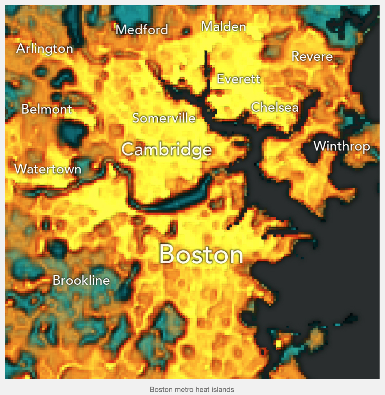
Though the temperatures might not always feel it, at least in Philadelphia, summer is ending and autumn beginning. Consequently I wanted to share this neat little work that explores urban heat islands. Specifically, this post’s author looks at Massachusetts and starts with a screenshot of the Boston area.
Wicked hot
The author points out that the Boston Common and Public Garden are two areas of cool in an otherwise hot Boston. He also points out the Charles River and the divide between Boston and Brookline. I would like to add to it and point out the Fens and the Emerald Necklace.
I wonder if a scale of sorts would help, though the shift from warm yellows and reds to cooler greens and blues certainly helps differentiate between the cooler and warmer areas.
I mean come on, guys, did you really expect me to not touch this one?
Well we made it to Friday, and naturally in the not so serious we have to cover the sharpie map. Because, if the data does not agree with your opinions, clearly the correct response is to just make shit up.
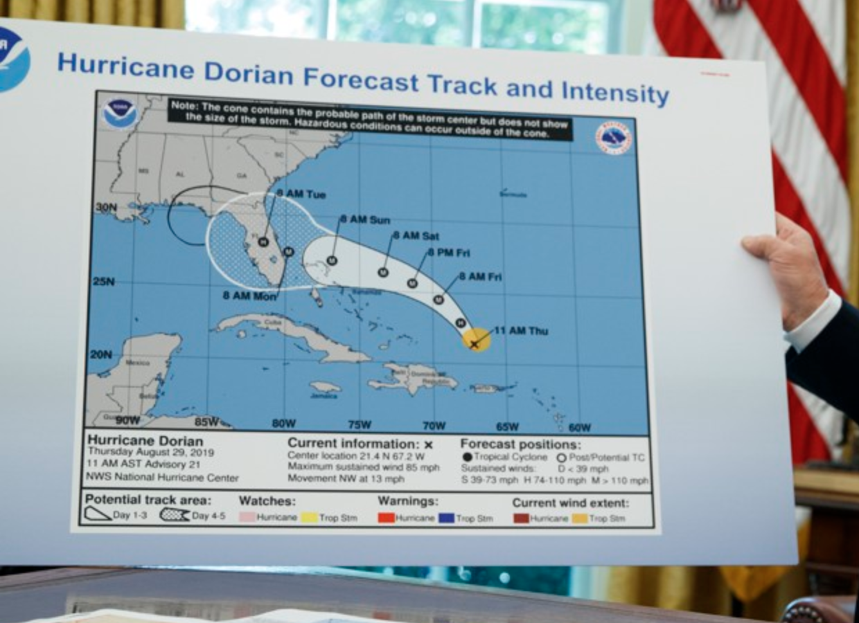
By now you have probably all heard the story about how President Trump tweeted an incorrect forecast about the path of Hurricane Dorian, warning how Alabama could be “hit (much) harder than anticipated”. Except that the forecast at the time was that Alabama wasn’t going to be hit. Cue this map, days later. As in days. As in this news story continued for days.
Note the sharpie weirdly extending the cone (in black, not the usual white) into Florida and onward into Alabama.
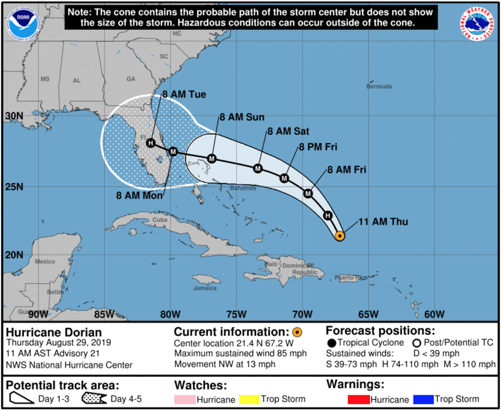
So to be fair, I went to the NOAA website and pulled down from their archive the cone maps from the date of the graphic Trump edited, and the one from the day when he tweeted about Alabama being hit by the hurricane.
Important to note that this forecast dates from 29 August. This press conference was on 4 September. He tweeted on 1 September. So in other words, two days after he used the wrong forecast, he had printed a big version of a contemporaneously two-day old forecast to show that if he drew a sharpie line on it, it would be correct.
Here is the original, from the National Hurricane Centre, for 29 August. Note, no Alabama.
No Alabama in this forecast, the OG, if you will (and if I’m using that term correctly).
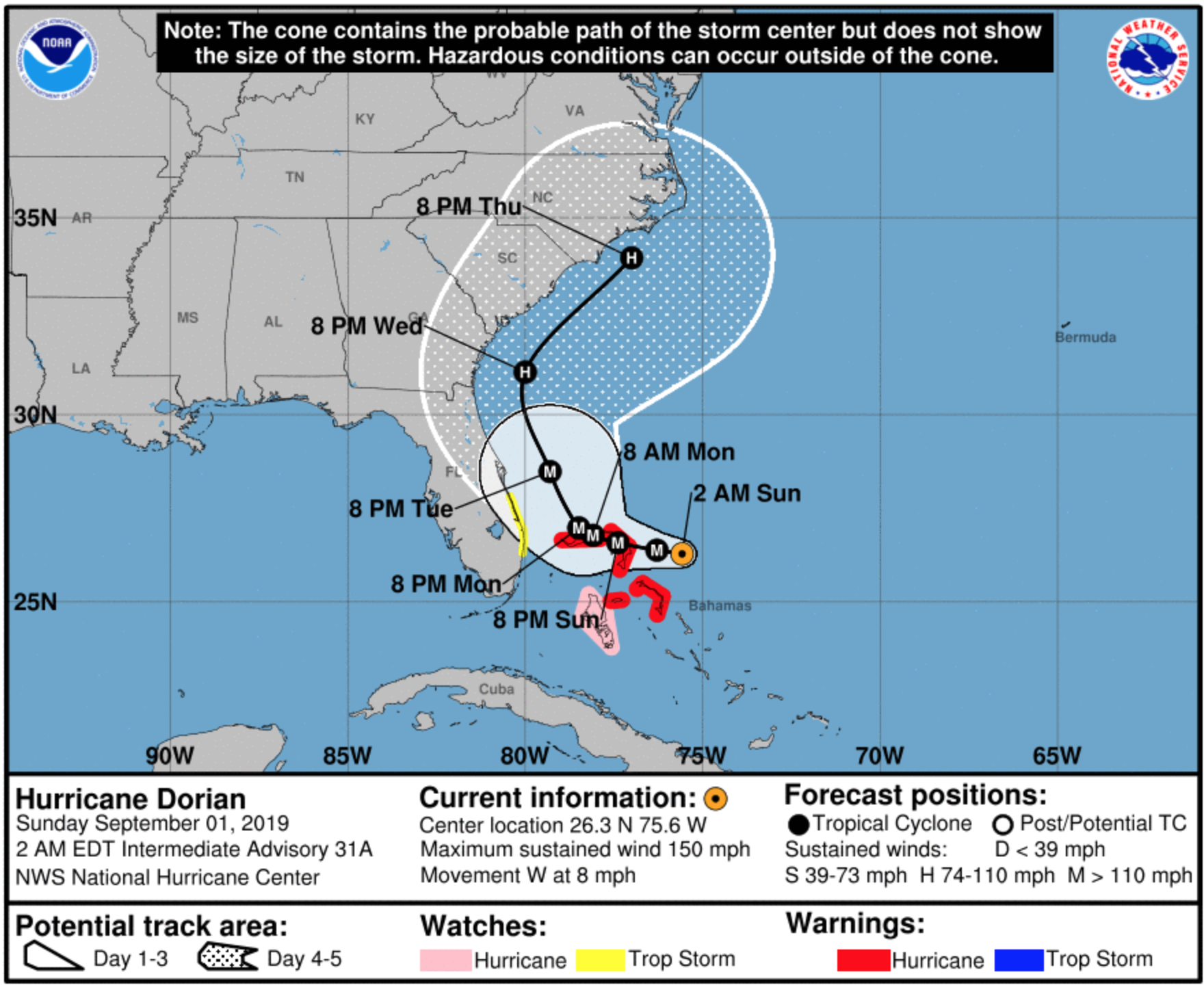
And then Trump tweeted on 1 September. So let’s take the 02.00 Eastern time 1 September forecast from NOAA.
By 30 August the forecast was already tracking northward, not westward. So by 1 September the idea that the hurricane would hit Alabama was just nonsense.
Definitely no Alabama in that forecast.
This could have all gone away if he had just admitted he looked at the wrong forecast and tweeted an incorrect warning. Instead, we had the White House pressuring NOAA to “fix” their tweet.
Now we can all chalk this up as funny. But it does have some serious consequences. Instead of people in the actual path of Dorian preparing, because of the falsely wide range of impacts the president suggested, people in Alabama needlessly prepared for a nonevent.
But more widely, as someone who works with data on a daily basis, we need to agree that data is real. We cannot simply change the data because it does not fit the story we want to tell. If I could take a screenshot of every forecast and string them together in an animated clip, you would see there was never any forecast like the sharpie forecast. We cannot simply create our own realities and choose to live within them, because that means we have no common basis on which to disagree policy decisions that will have real world impacts.
Credit for the photo goes to Evan Vucci of the AP.
Credit for the National Hurricane Centre maps goes to its graphic team.
For all my American readers, I hope you all enjoyed their Labour Day holiday. For the rest of you, today is just a Tuesday. Unless you live in the Bahamas, then today is just another nightmarish day as Hurricane Dorian continues his assault on the islands.
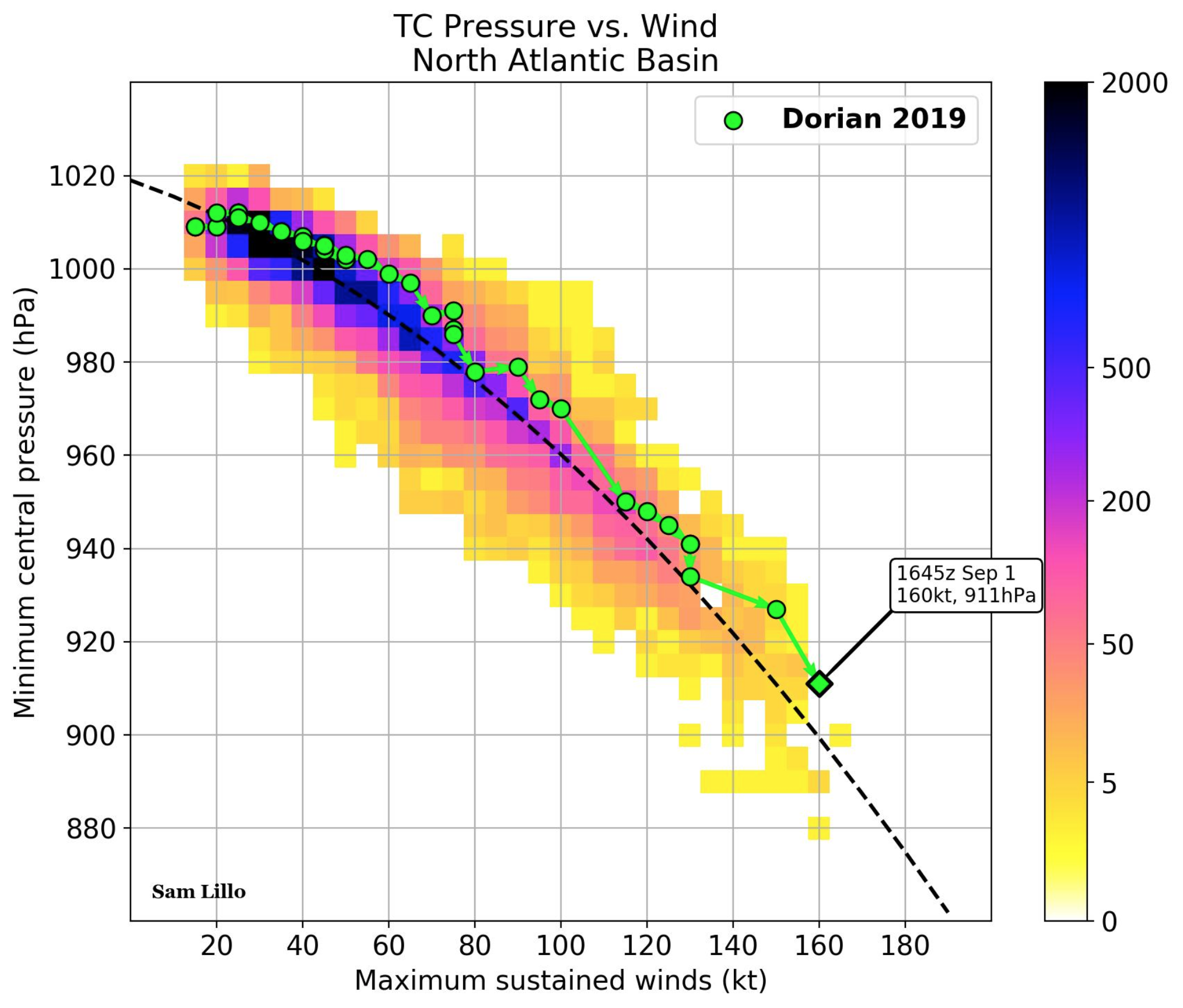
The storm will be one for the record books when all is said and done, and not just because of the damage likely to be catastrophic when people can finally emerge and examine what remains. The storm, by several metrics, is one of the most powerful in the Atlantic since we started recording data on hurricanes. If we look at pressure and sustained wind speeds, i.e. not wind gusts, Sam Lillo has plotted the path of Dorian through those metrics and found it sitting scarily in the lower-right corner of this plot.
How low can it go? Probably not much, thankfully.
The graphic does a couple of nice things here. I like the use of colour to indicate the total number of observations in that area. Clearly, we see a lot more of the weaker, higher pressure storms. Hence the dark blue in the upper-left. But then against that we have the star of the graphic, and my favourite part of the plot: the plot over time of Dorian’s progress and intensification as a storm. The final green dot indicates the point of the last observation when the graphic was made.
Overall this is a simple and solid piece that shows in the available historical context just how powerful Dorian is. Unfortunately that correlates with likely heavy damage to the Bahamas.
Credit for the piece I presume goes to Sam Lillo, though with the Twitter one can never be entirely certain.
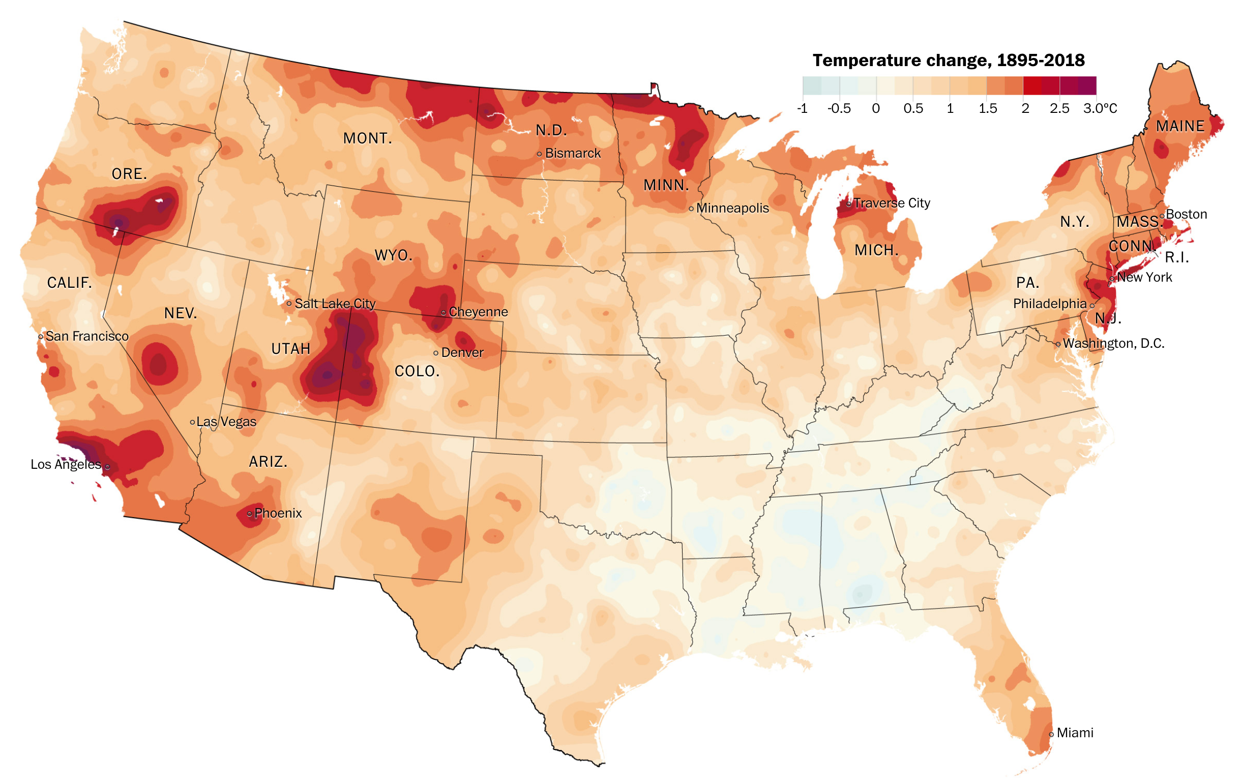
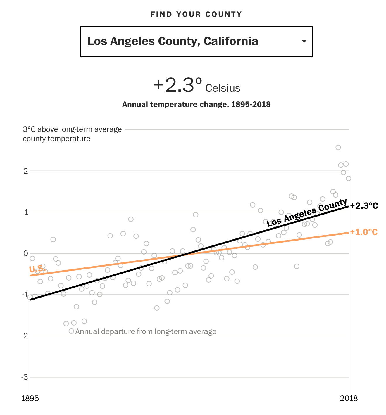
Last week we looked at a few posts that showed the future impact of climate change at both a global and US-level scale. In the midst of last week and those articles, the Washington Post looked backwards at the past century or so to identify how quickly the US has changed. Spoiler: some places are already significantly warmer than they have been. Spoiler two: the Northeast is one such place.
The piece is a larger and more narrative article using examples and anecdotes to make its point. But it does contain several key graphics. The first is a big map that shows how temperature has changed since 1895.
The Southeast is an anomaly, but its warming has accelerated since the 1960s
The map does what it has to and is nothing particularly fancy or groundbreaking—see what I did there?—in design. But it is clear and communicates effectively the dramatic shifts in particular regions.
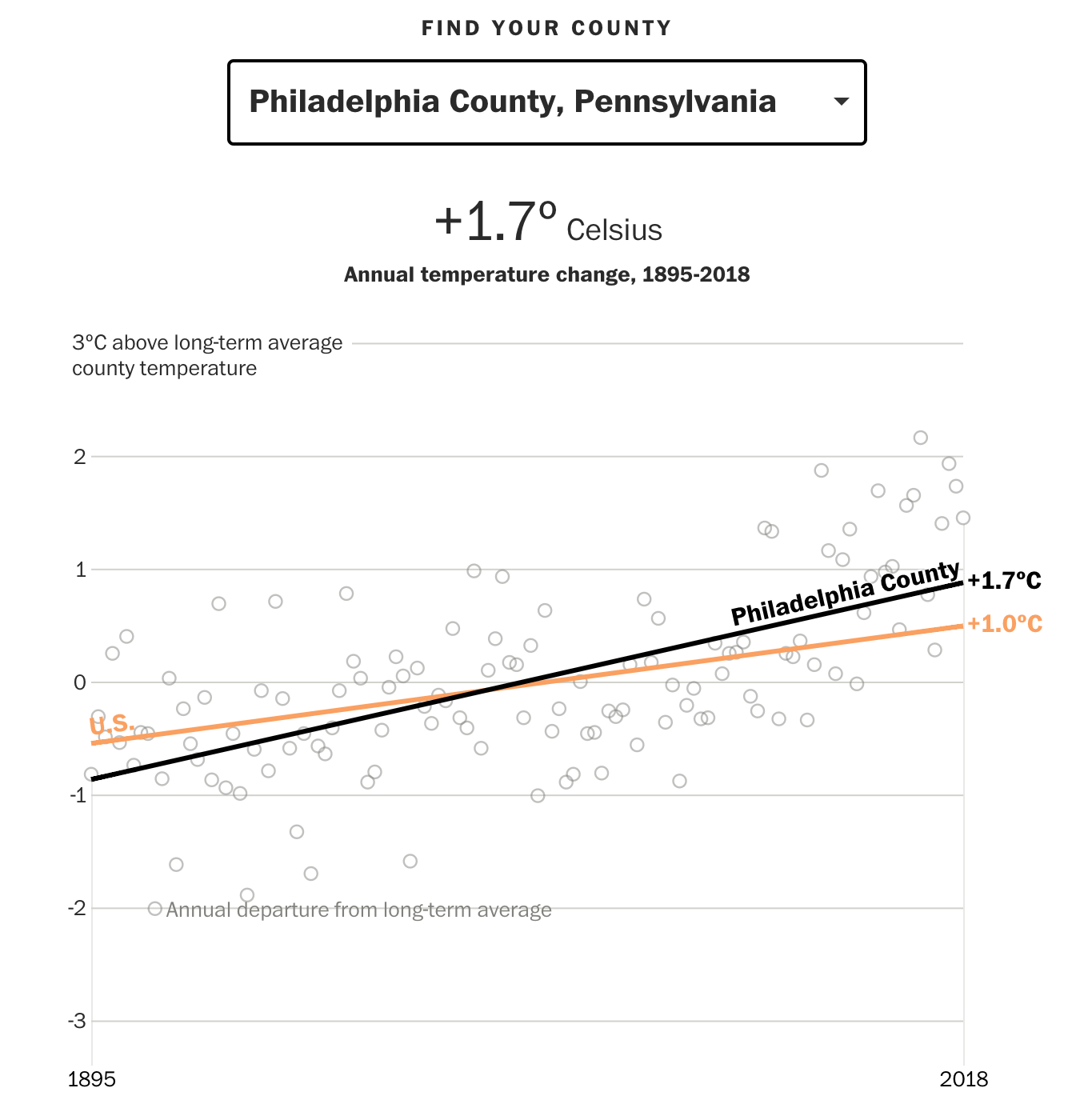
The more interesting part, along with what we looked at last week, is the ability to choose a particular county and see how it has trended since 1895 and compare that to the baseline, US-level average. Naturally, some counties have been warming faster, others slower. Philadelphia County, the entirety of the city, has warmed more than the US average, but thankfully less than the Northeast average as the article points out.
This ain’t so good
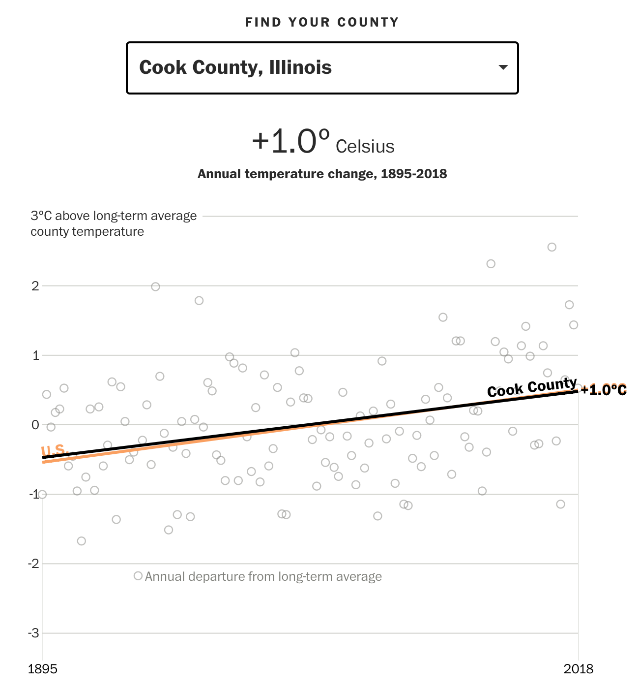
But, not to leave out Chicago as I did last week, Cook County, Illinois is right on line with the US average.
Nor is this, but it’s average
But the big cities on the West Coast look very unattractive.
Tinseltown is out of the question
The interactive piece does a nice job clearly focusing the user’s attention on the long run average through the coloured lines instead of focusing attention on the yearly deviations, which can vary significantly from year to year.
And for those Americans who are not familiar with Celsius, one degree Celsius equals approximately 1.8º Fahrenheit.
Overall this is a solid piece that continues to show just what future generations are going to have to fix.
Credit for the piece goes to Steven Mufson, Chris Mooney, Juliet Eilperin, John Muyskens, and Salwan Georges.
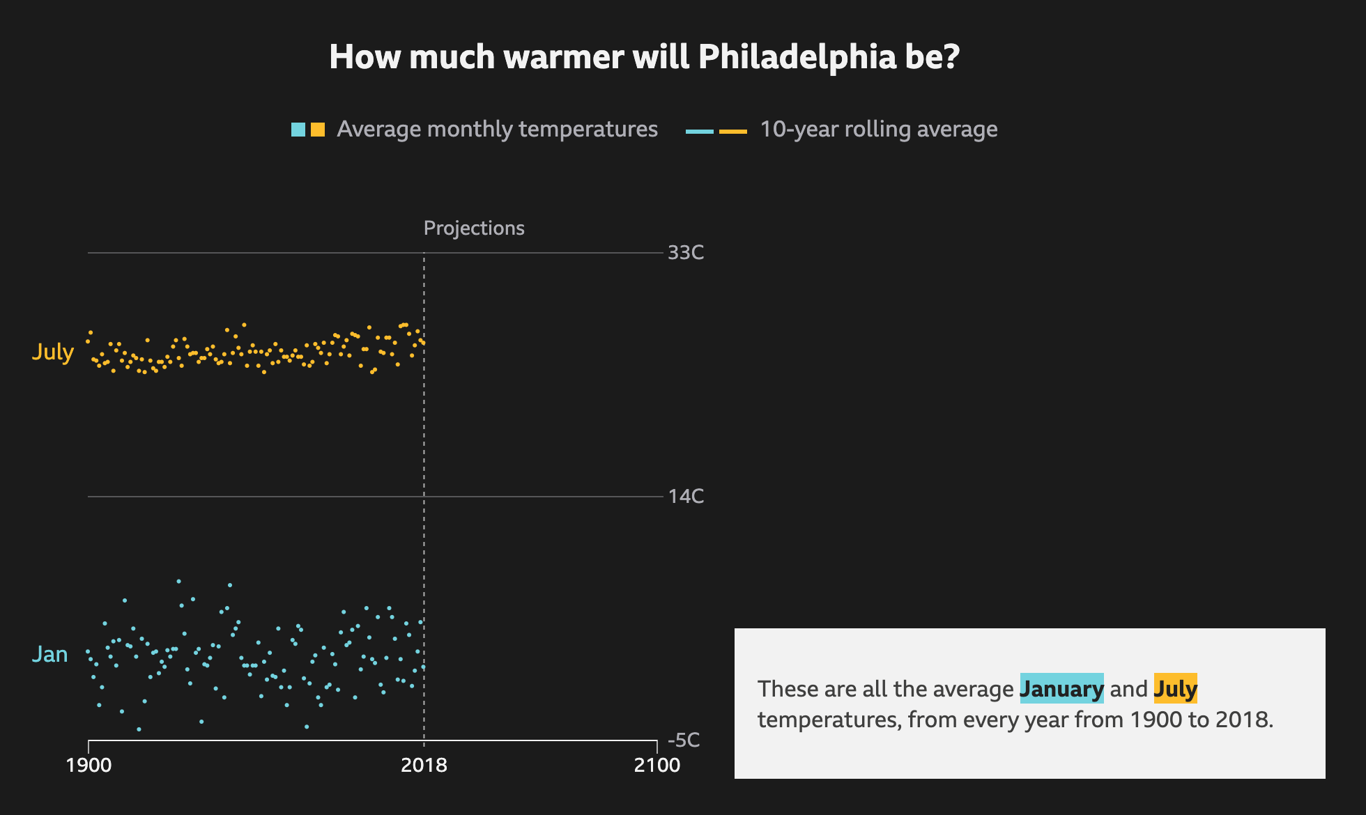
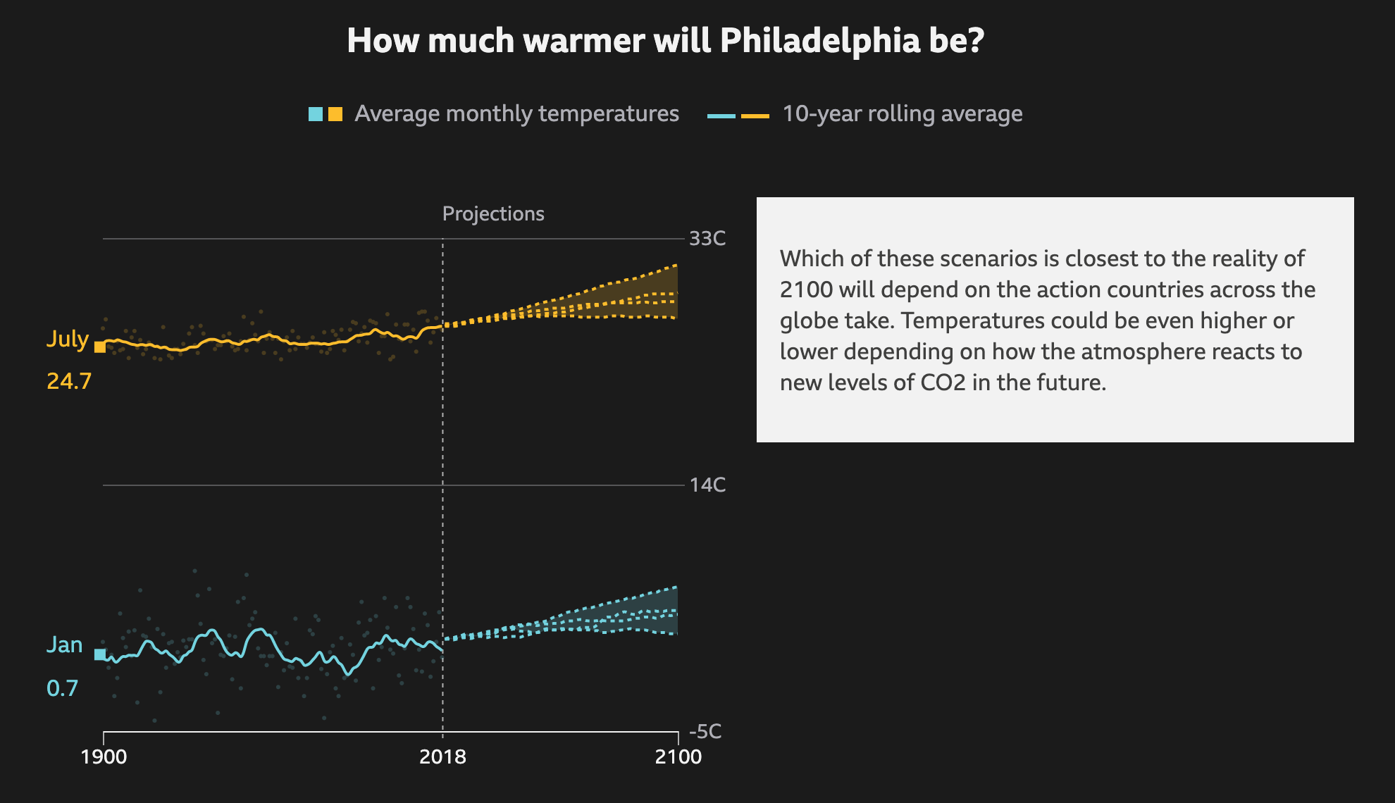
In Philadelphia, this summer has been warmer than average. But with most recent years being warmer than average, that might not mean much. However, a valid question is that with climate change, how much warmer will the city get on average? The BBC recently published an article that explored the temperature changes in cities around the world according to several different models for best to worst case scenarios.
The raw data so to speak
It does a nice job via scrolling of showing how the averages work as a rolling average and the increase over time. It runs through each scenario, from best case to worst case, as a dotted line and then plots each in comparison to each other to show the range of possible outcomes.
Ew. Just ew.
I know that dark or black background is in style for big pieces. But I still do not love them. Thankfully the choice of these two colours work here. The dotted lines also work for showing the projections. And in the intermediate steps, not screencaptured, the previous projections go dark and only the current one is highlighted.
Thankfully the text boxes to the right capture the critical numbers: the actual projection numbers for the monthly average. And they tie them to the lines via the colours used.
Not shown here are a few other elements of the piece. The top of the article starts with a spinning globe that shows how the average temperature across the globe has already changed. Spoiler: not well. While the spinning globe adds some interactivity to the article, it by definition cannot display the entire world all at once, like flat, two-dimensional projections do. This makes it difficult to see impacts across the globe simultaneously. A more standard projection map could have worked really well.
Lastly, the article closes with a few stories about specific locations and how these temperature increases will impact them. These use more illustrations and text. The exception, however, is a graphic of the Arctic that shows how summer sea ice coverage has collapsed over the last few decades.
Overall this is a strong piece that shows some global impacts while allowing the user to dive down into the more granular data and see the impact on some of the world’s largest cities.
Credit for the piece goes to BBC Visual and Data Journalism team.
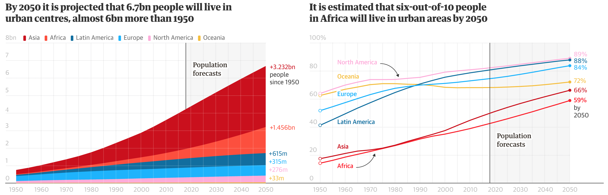
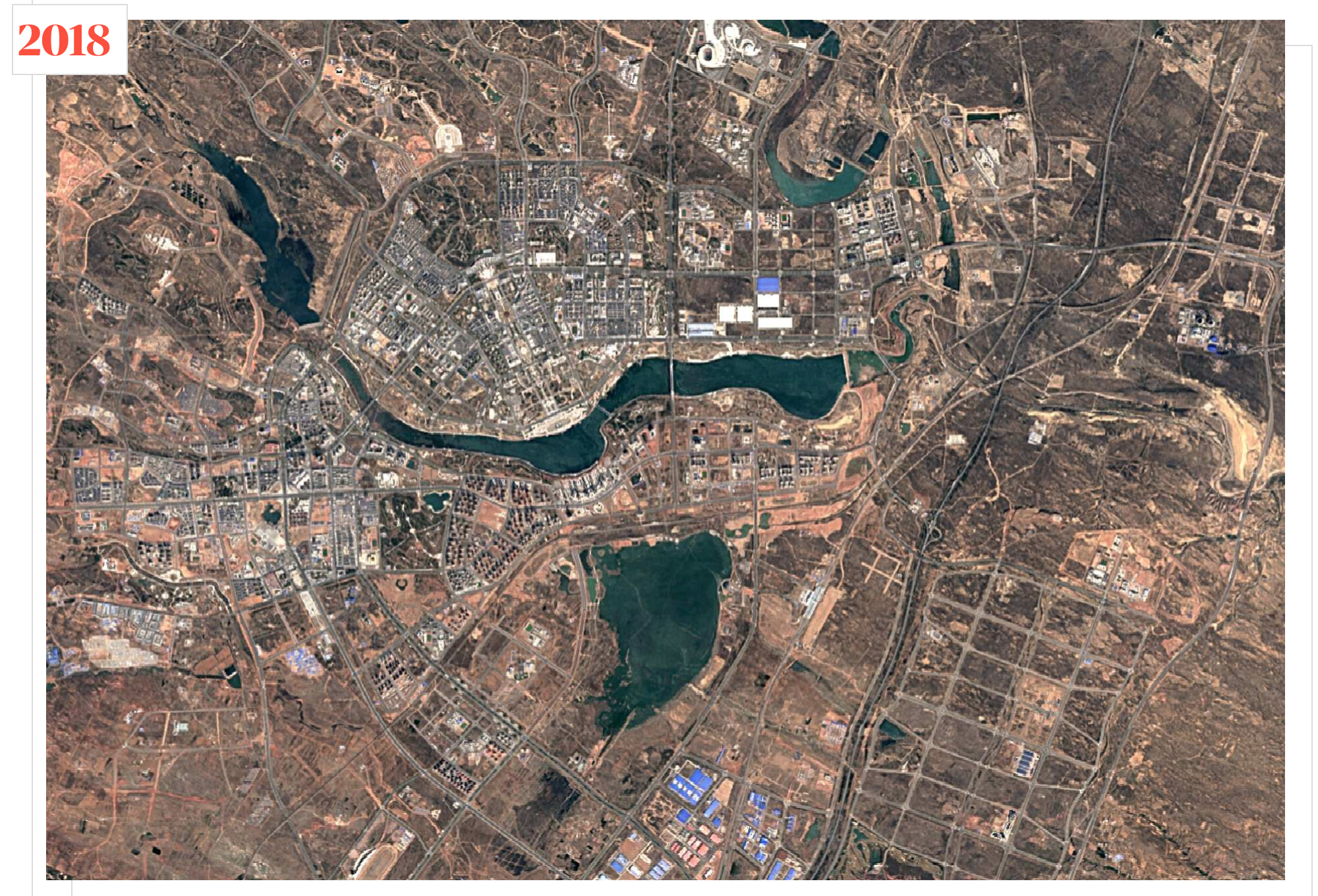
Today we look at a piece from the Guardian about the blossoming of some cities from, essentially, out of nowhere. Think similar to how there is really no reason for Las Vegas or Phoenix to exist—cities of hundreds of thousands situated smack in the middle of the desert. But most of these new growth cities, cities from scratch as the Guardian calls them, are sprouting in Africa and Asia.
The piece uses two pretty straight-forward graphics to show the scale of the growth problem.
A lot of urban area growth is yet to come.
I don’t love the area chart, but even for all its flaws, it it still massively obvious just how much Africa will contribute to population growth in the coming decades. And the line chart, which I find far more effective despite its borderline spaghetti-ness, shows just how much of that growth will likely be urban in nature.
But the star of the piece, for which you will need to click over to the original article to enjoy, are the motion graphics. They capture year-by-year the satellite views showing how the cities have grown from almost nothing. This is a screencapture of Ordos, China. But go back a couple of years and it’s almost an empty desert.
Check this out from decades ago and you’ll see nothing.
Credit for the piece goes to Antonio Voce and Nick Van Mead.
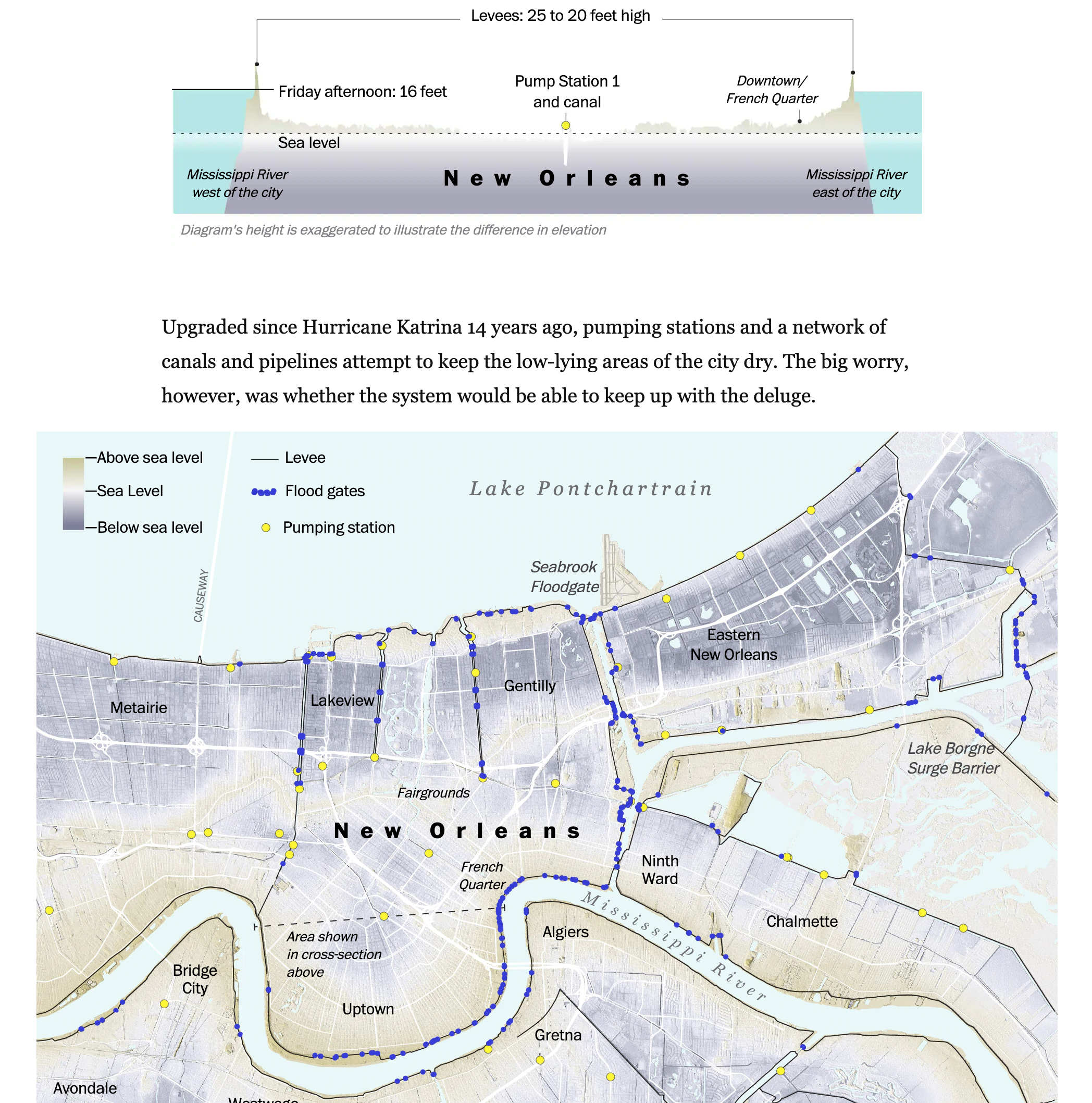
Hurricane/tropical storm Barry has been dumping rain along the Gulf Coast for a few days now. But prior to this weekend, the biggest concern had been for the city of New Orleans, which sits besides the swollen Mississippi River. The river was running already high at 17 feet above normal, and with storm surges and tropical rain levels forecast, planners were concerned not with the integrity of the city’s levee system, rebuilt in the aftermath of Hurricane Katrina, but simply whether they would be tall enough.
So far, they have been.
The Washington Post tracked Barry’s course with the usual graphics showing forecast rainfall amounts and projected tracks. However, the real stunner for me was this cross section illustration of New Orleans that shows just how much of the central city sits below sea level. The cross section sits above a map of the city that shows elevation above/below sea level as well as key flood prevention infrastructure, i.e. levees and pumping stations.
A lot floodable space
The unmentioned elephant remains however. The National Oceanic and Atmosphere Administration’s extreme climate change impact forecast says the water around New Orleans might rise by nearly 13 feet by 2100. Clearly, that is still well below the 20 feet levees of today. But what if there were to be a 17 feet high Mississippi River atop the additional 13 feet? 30 feet would flood the city.
Credit for the piece goes to John Muyskens, Armand Emamdjomeh, Aaron Steckelberg, Lauren Tierney, and Laris Karklis.