Slaveholders in the Halls of Congress

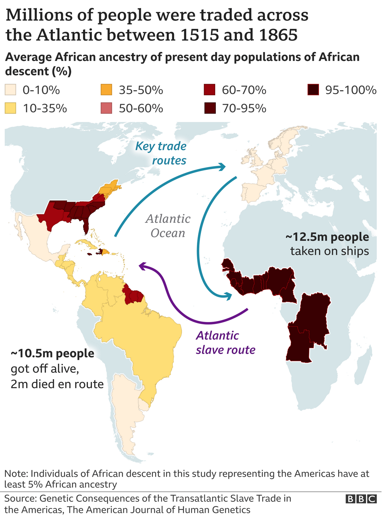
Taking a break from going through the old articles and things I’ve saved, let’s turn to a an article from the Washington Post published earlier this week. As the title indicates, the Post’s article explores slaveholders in Congress. Many of us know that the vast majority of antebellum presidents at one point or another owned slaves. (Washington and Jefferson being the two most commonly cited in recent years.) But what about the other branches of government?

The article is a fascinating read about the prevalence of slaveholders in the legislative branch. For our purposes it uses a series of bar charts and maps to illustrate its point. Now, the piece isn’t truly interactive as it’s more of the scrolling narrative, but at several points in American history the article pauses to show the number of slaveholders in office during a particular Congress. The screenshot below is from the 1807 Congress.

That year is an interesting choice, not mentioned explicitly in the article, because the United States Constitution prohibited Congress from passing limits on the slave trade prior to 1808. But in 1807 Congress passed a law that banned the slave trade from 1 January 1808, the first day legally permitted by the Constitution.

Almost half of Congress in the early years had, at one point or another, owned slaves.

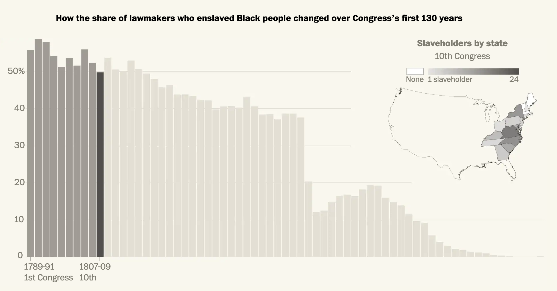
Graphic-wise, we have a set of bar charts representing the percentage and then a choropleth map showing each state’s number of slaveholders in Congress. As we will see in a moment, the map here is a bit too small to work. Can you really see Delaware, Rhode Island, and (to a lesser extent) New Jersey? Additionally, because of the continuous gradient it can be difficult to distinguish just how many slaveholders were present in each state. I wonder if a series of bins would have been more effective.

The decision to use actual numbers intrigues me as well. Ohio, for example, has few slaveholders in Congress based upon the map. But as a newly organised state, Ohio had only two senators and one congressman. That’s a small actual, but 33% of its congressional delegation.

Overall though, the general pervasiveness of slaveholders warrants the use of a map to show geographic distribution was not limited to just the south.

Later on we have what I think is the best graphic of the article, a box map showing each state’s slaveholders over time.

How the trends changed over time over geography.

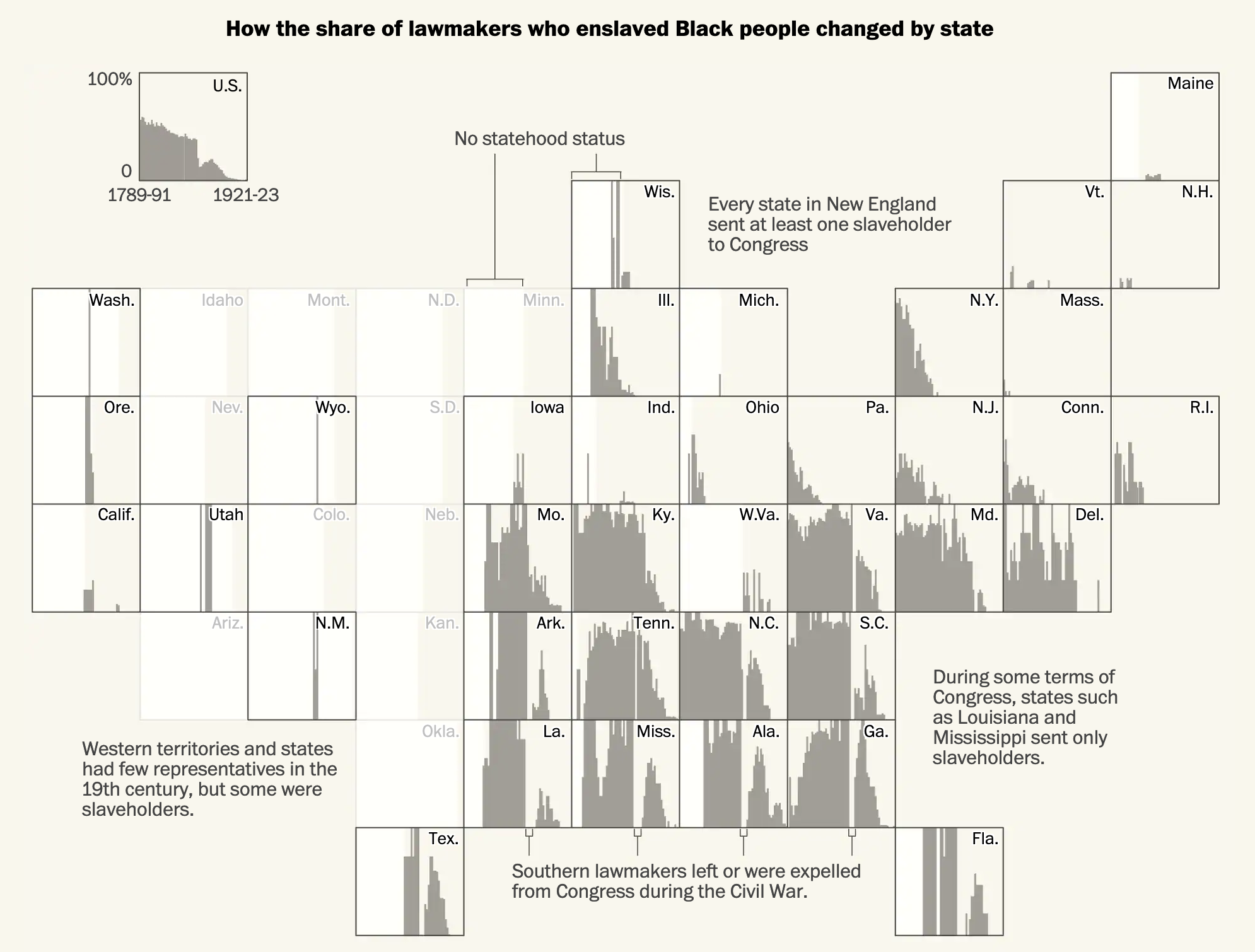
Within each state we can see the general trend, including the legacy of the Civil War and Reconstruction. The use of a light background allows white to represent pre-statehood periods for each state. And of course some states, notably Alaska and Hawaii, joined the United States well after this period.

But I also want to address one potential issue with the methodology of the article. One that it does briefly address, albeit tangentially. This data set looks at all people who at one point or another in their life held slaves. First, contextually, in the early years of the republic slavery was not uncommon throughout the world. Though by the aforementioned year of 1807 the institution appeared on its way out in the West. Sadly the cotton gin revolutionised the South’s cotton industry and reinvigorated the economic impetus for slavery. There after slavery boomed. The banning of the slave trade shortly thereafter introduced scarcity into the slave market and then the South’s “peculiar institution” truly took root. That cotton boom may well explain how the initial decline in the prevalence of slaveholders in the first few Congresses reversed itself and then held steady through the early decades of the 19th century.

And that initial decline before a hardening of support for slavery is what I want to address. The data here looks only at people who at one point in their life held slaves. It’s not an accurate representation of current slaveholders in Congress at the time they served. It’s a subtle but important distinction. The most obvious result of this is how after the 1860s the graphics show members of Congress as slaveholders when this was not the case. They had in the past held slaves.

That is not to say that some of those members were reluctant and, in all likelihood, would have preferred to have kept their slaves. And therefore those numbers are important to understand. But it undermines the count of people who eventually came to realise the error of their ways. The article addresses this briefly, recounting several anecdotes of people who later in life became abolitionists. I wonder though whether these people should count in this graphic as—so far as we can tell—their personal views changed so substantially to be hardened against slavery.

I would be very curious to see these charts remade with a data set that accounts for contemporary ownership of slaves represented in Congress.

Regardless of the methodology issue, this is still a fascinating and important read.

Credit for the piece goes to Adrian Blanco, Leo Dominguez, and Julie Zuazmer Weil.

African Descent in African Americans

A study published last week explores the long-lasting impact of the Atlantic triangle trade of slaves on the genetic makeup of present day African Americans. Genetic genealogy can break down many of what we genealogists call brick walls, where paper records and official documentation prevent researchers from moving any further back in time. In American research, slavery and its lack of records identifying specific individuals by name, birth, and place of origin prevents many descendants from tracing their ancestry beyond the 1860s or 50s.

But DNA doesn’t lie. And by comparing the source populations of present day African countries to the DNA of present day Americans (and others living in the Western hemisphere), we can glean a bit more insight into at least the rough places of origin for individual’s ancestors. And so the BBC, which wrote an article about the survey, created this map to show the average amount of African ancestry in people today.

Average amount of African genetic ancestry in present day populations of African descent

There is a lot to unpack from the study, and for those interested, you should read the full article. But what this graphic shows is that there is significant variation in the amount of African descent in African-[insert country here] ethnic groups. African-Brazilians, on average, have somewhere between 10–35% African DNA, whereas in Mexico that figures falls to 0–10%, but in parts of the United States it climbs upwards of 70–95%.

In a critique of the graphic itself, when I look at some of the data tables, I’m not sure the map’s borders are the best fit. For example, the data says “northern states” for the United States, but the map clearly shows outlines for individual states like New York, Pennsylvania, and New Jersey. In this case, a more accurate approach would be to lump those states into a single shape that doesn’t break down into the constituent polities. Otherwise, as in this case, it implies the value for that particular state falls within the range, when the data itself does not—and cannot because of the way the study was designed—support that conclusion.

Credit for the piece goes to the BBC graphics department.

Angela from Jamestown

Today we move from royalty to slavery. Earlier this week the Washington Post published an article about an African woman (girl?) named Angela. She was forcibly removed from West Africa to Luanda in present-day Angola. From there she was crammed into a slave ship and sent towards Spanish colonies in the Caribbean. Before she arrived, however, her ship was intercepted by English pirates that took her and several others as their spoils to sell to English colonists.

The article is a fascinating read and for our purposes it makes use of two graphics. The one is a bar chart plotting the Atlantic slave trade. It makes use of annotations to provide a rich context for the peaks and valleys—importantly it includes not just the British colonies, but Spanish and Portuguese as well.

My favourite, however, is the Sankey diagram that shows the trade in 1619 specifically, i.e. the year Angela was transported across the Atlantic.

Too many people took similar routes to the New World.

It takes the total number of people leaving Luanda and then breaks those flows into different paths based on their geographic destinations. The width of those lines or flows represents the volume, in this case people being sold into slavery. That Angela made it to Jamestown is surprising. After all, most of her peers were being sent to Vera Cruz.

But the year 1619 is important. Because 2019 marks the 400th anniversary of the first slaves being brought into Jamestown and the Virginia colony. The Pilgrims that found Plymouth Bay Colony will not land on Cape Cod until 1620, a year later. The enslavement of people like Angela was built into the foundation of the American colonies.

The article points out how work is being done to try and find Angela’s remains. If that happens, researchers can learn much more about her. And that leads one researcher to make this powerful statement.

We will know more about this person, and we can reclaim her humanity.

For the record, I don’t necessarily love the textured background in the graphics. But I understand the aesthetic direction the designers chose and it does make sense. I do like, however, how they do not overly distract from the underlying data and the narrative they present.

Credit for the piece goes to Lauren Tierney and Armand Emamdjomeh.

Why the Civil War?

Yesterday, President Trump asked why there had been no discussion about the causes of the Civil War.

No, that is not a joke.

Well, Mr. President, turns out that there has been quite a bit of discussion over the last few years. And the broad consensus?

Do I even have to?
Do I even have to?

Note the above, with the darker shaded counties representing those with greater percentages of the population held in slavery. What do most of those states have in common with the Confederacy? That they are in the Confederacy.

To be clear, the Union was not perfect. Delaware, Maryland, Kentucky, and Missouri remained part of the Union, but were states where slavery was legal. In fact both Kentucky and Missouri had two governments. Kentucky provides a great example of the fault line with the pro-Union capital of Frankfort situated in the low-slavery east whereas the Confederate capital was located in western, high-slavery Kentucky.

But the point stands. Slavery was the link between Confederate states and Confederate-aligned parallel governments in Union states. So, Mr. President, when you are asked about the cause of the Civil War, now you know the answer.

Credit for the piece goes to E. Hergeshimer of the US Census Bureau.