Spoiler alert, it’s big. Thankfully Scientific American has attempted to put the West African outbreak in the context of all other Ebola outbreaks. I think the one thing missing, rather the one thing I would have done differently, is to include some kind of background element to show the difference in scale. A giant circle behind the whole graphic. Or a giant diamond. Of course the designer may not have had the space to do that, because the scale difference is just that extreme.
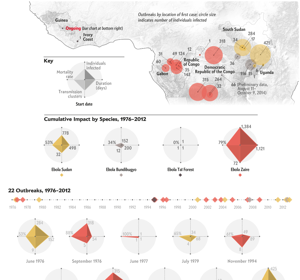
Credit for the piece goes to Pitch Interactive for Scientific American.