Gay Acceptance

Last week I looked at a piece from the Washington Post about the possible impact of the Supreme Court rulings on gay marriage in the United States. But with the rulings yesterday, we step back and look at globally how the progression of gay rights has taken steps forward or backward.

The National Post looked at the reversal of bans of gay marriage as well as polling from several countries to look at changing opinions and perspectives across the world. Fascinating/horrifying are some of the stories about specific countries in the map.
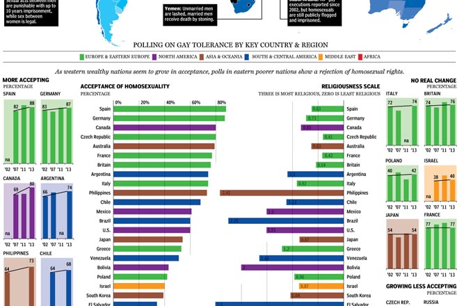
Gay acceptance
Gay acceptance

My only real criticism is that the colour-coding of regions seems a bit jarring. I wonder if grouping countries by region would not have allowed the same data to be presented in a bit quieter tone.

Credit for the piece goes to Richard Johnson.

The Massachusetts Special Election

As I have been blogging the past several days, today the Supreme Court will announce its rulings on the two gay marriage cases. But, I have already looked at that twice now. Today I want to look at the results of the Massachusetts special election for the US Senate, necessitated by John Kerry resigning from the seat to become Secretary of State.

This work comes from the Huffington Post. It offers the usual map fare with towns coloured by the victor and tinted by the share of the vote. Though do note the interesting—is this novel?—means of filling in the town with colour to represent the percent of the town reporting. My screenshot is a bit late, but check out Warren near Springfield or Boston and Cambridge—a bit harder to see because of their size and shape.

Looking across the state for the results

However, the fascinating thing is the use of the small multiples of scatter plots to look at historic elections. The designers included a small key in the upper-right explaining that dots above the line represent towns where Ed Markey, the Democrat who won, outperformed the historic Democrat. I have not seen anybody attempt to portray the data in this fashion before.

Using a scatter plot to chart the results

Credit for the piece goes to Aaron Bycoffe and Jay Boice.

Dambusters

More formally known as Operation Chastise, the Dambusters Raid occurred just over 70 years ago on 16 May 1943. That night, 19 RAF Lancaster bombers flew over the English Channel with the objective of busting open three dams to flood and cripple the electricity- and water-supplies to the all-important German Ruhr industrial valley.

Canada’s National Post looked at the bombing raid not just because of the story but also because the unit consisted of not just British airmen, but also those from Canada along with Australia and New Zealand. Per usual, their graphics team did an excellent job illustrating the details of the raid. They traced the route, explained how the unusual bombs were carried, released, and detonated and then looked at the success of the mission.

The Dambusters Raid
The Dambusters Raid

Credit for the piece goes to Mike Faille, Andrew Barr, and Richard Johnson.

Changes in Global Life Expectancy

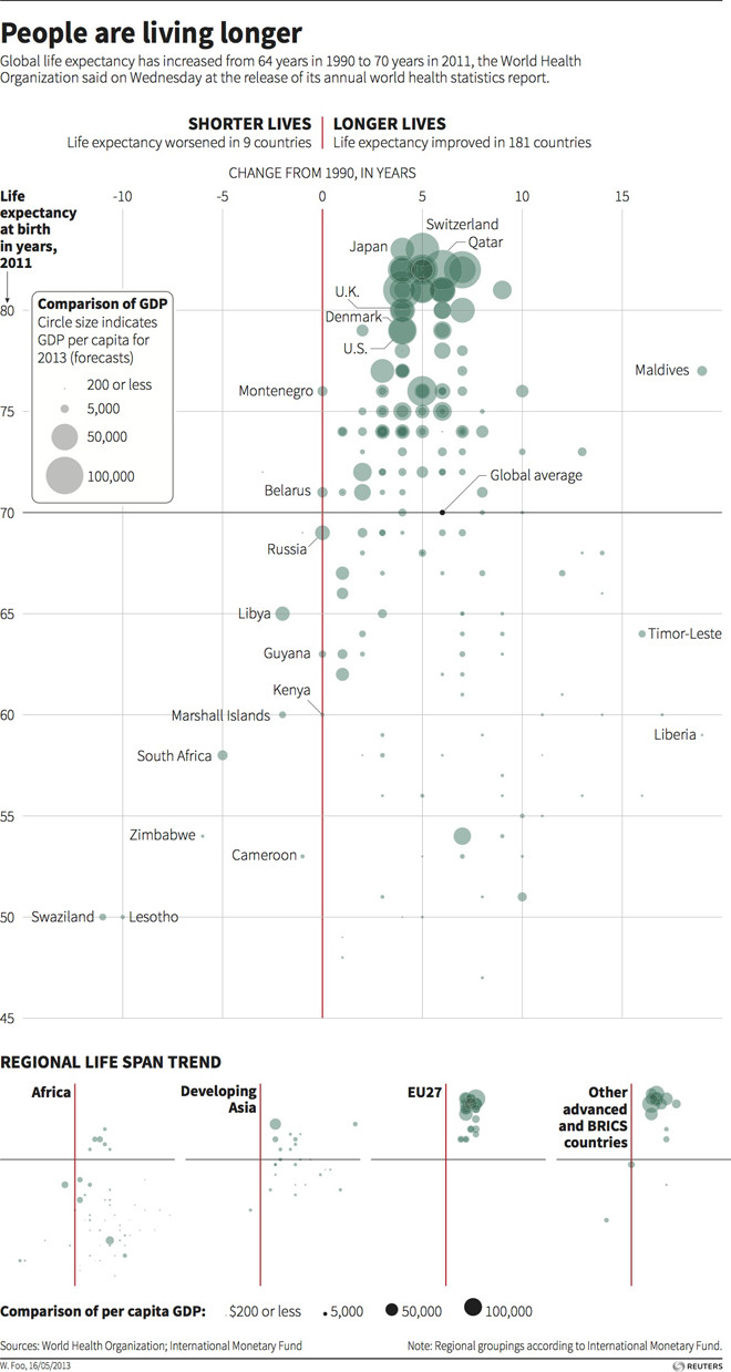
Today’s post is a scatter plot from Thomson Reuters looking at changes in global life expectancy since 1990. What is really nice about this piece is the main space for the data visualisation presents all of the data for all of the available countries. Beneath the main visualisation, the designer chose to use small multiples of the same chart to highlight broader regional trends.

Change in global life expectancy

Credit for the piece goes to, I think, Hwei Wen Foo. (Credit on the graphic is W. Foo.)

Strikeouts on the Upswing

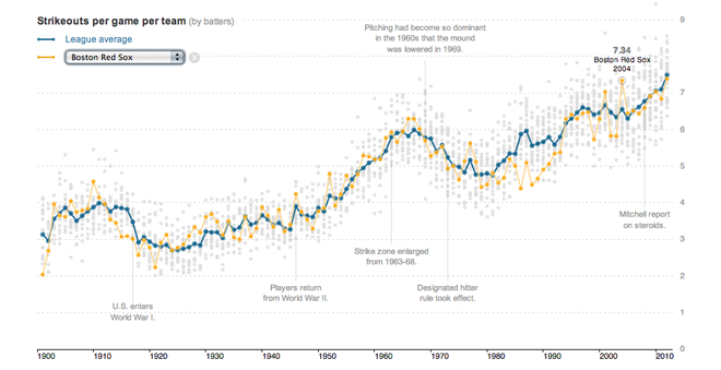
Strikeouts are an important part of baseball. They are the moments where the pitcher wins the duel between pitcher and batter that is the essential element of baseball. But over the years the game has seen more and more batters striking out more often. Earlier this year the New York Times looked at the rising rates of strikeouts in a story supported by interactive data visualisation components.

Strikeouts on the upswing

Like the piece on Bryce Harper, this piece on strikeouts is more of a narrative with the interactive graphics supporting the written words. It is not as lengthy as the Washington Post’s piece, but this one is far more interactive as the user can select his or her favourite teams and follow their performance over time.

Credit for the piece goes to Shan Carter, Kevin Quealy and Joe Ward.

Bryce Harper

Bryce Harper is undoubtedly one of the best baseball players in the game today. To put it simply, he hits. And he hits well. And he hits well often. So the Washington Post put together an interactive, long form piece about Harper’s swing and hitting.

Pitching to Bryce Harper

The piece begins with a narrated video outlining the science behind Harper’s swing. Then the reader can down into the piece and learn more about Harper’s history and development and how he compares to other hitters. Statistics and data visualisation pieces show just how impressive Harper is as a hitter and how pitchers are trying to combat that.

Interactive long form articles are appearing more and more often online. But this is perhaps the most data- and science-intensive piece I have seen thus far. What is particularly nice about the format is that, as I have often noted, annotations and explanations are what make good infographics and what move data visualisation from presentational to informational. That this piece in particular happens to be about baseball, well, all the better.

Credit for the piece goes to Adam Kilgore, Sohail Al-Jamea, Wilson Andrews, Bonnie Berkowitz, Todd Lindeman, Jonathan Newton, Lindsay Applebaum, Karl Hente, Matthew Rennie, John Romero, and Mitch Rubin.

More Cicadian Rhythms

On Tuesday I shared with you some work by Jonathan Corum at the New York Times on the 17-year cicadas now starting to emerge back east. (And as I recall from my childhood, I assure you that they are quite loud.) Today we look at an illustration of the cicada life cycle via the Washington Post.

As I discussed the other day about other graphics, there are differences in how the two newspapers are presenting the same topic or subject matter. The New York Times piece concerns itself with the emergence over time of cicadas across the United States and links to historical articles about those events. Here, however, the Washington Post instead explains just how you get a seventeen-year period between emergences.

Additionally, the Washington Post maps near the end are not interactive as in the New York Times piece. But what this allows the Post to do is focus on those broods that impacted the Washington area instead of all those areas likely outside the Post’s core readership.

The Washington Post's explanation of the periodical cicadas

Credit for the piece goes to Patterson Clark.

The Economies of Europe

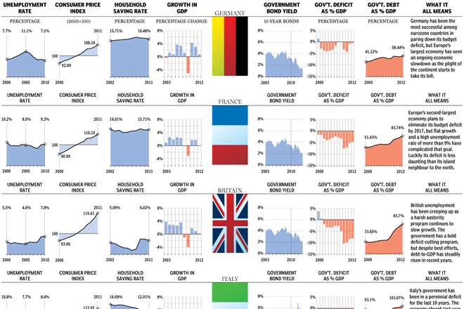
Cyprus has been in the news over the course of this past week because its financial system almost brought the country to bankruptcy. And that has meant trouble for European markets. So now it’s time to look at the economies of Europe once again. And the National Post has done a great job using clear and concise small multiples to examine key metrics for the ten largest European economies—not necessarily EU economies mind you. But at the end of each row, they summed up the country’s outlook in just one or two sentences.

Cropping of the overview for Europe's largest economies

Credit for the piece goes to Richard Johnson, Grant Ellis, John Shmuel, and Andrew Barr.

Pro Tip #314: Don’t Stare Into the Sun

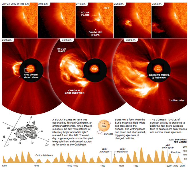
Don’t stare into the sun. It’ll burn your eyes out, kid. Okay, so maybe that’s a stretch of a reference, but, seriously, don’t. Let the professionals do it with (properly shielded) telescopes and such. This piece from the New York Times looks at a solar flare from 2012 and shows how quickly it developed. The bottom of the piece then shows the reader the frequency of solar minimums and maximums along with some explanatory graphics about just what flares and sunspots are and how they are created.

Also note the centre panel in the top row for the relative size of Earth. Yeah, who’s feeling big now? (Not me.)

Don't stare into it…

Credit for the piece goes to Jonathan Corum.

2012 Was the Hottest Year on Record

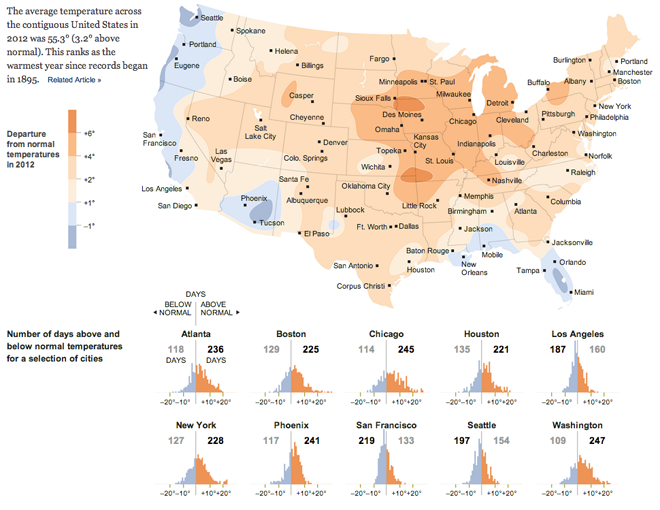
2012 was the hottest year since 1895. That’s 117 years by my count. Of course just being the hottest year ever recorded does not mean everywhere was warmer than usual. Some places were cooler. And the New York Times looked at the US pattern of warmer and cooler than average temperatures. Below the map are small multiples of charts recording the number of days above or below the normal for that day.

That's a lot of warmer than average temperatures…

And for anecdotal evidence, I will say that this past summer was godawfully hot in Chicago.