Facebook’s for the Old Folks

We start this work week with something that the young people use, but in a different way than older people do, including elder millennials like myself: social media. Of course, as an elder millennial, I remember Facebook when it was The Facebook when it expanded access to Penn State, which I attended for a single year.

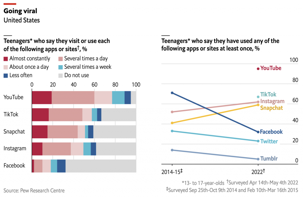
Pew Research conducted a study of teenagers that revealed they use social media more than ever before, but that they use new (sort of) platforms more than the venerable paragon of the past: Facebook.

The Economist’s Data Team looked at the data and created this graphic showing the trends.
What do you use? How often?

We see stacked bar charts on the left and then a line chart on the right. The left-hand chart shows the frequency with which teenagers use various social media platforms. What I don’t understand is how someone uses a social media application “almost constantly”. But that’s probably why I’m an elder millennial.

Get off my lawn, you whippersnappers.

On the right we see the percentage of teenagers who have used an application at least once. The biggest winners? Applications primarily featuring image over text. The losers? Those that use words.

Now longtime readers know that I am not terribly fond of stacked bar charts, especially because they make comparisons between, in this case, social media platforms very difficult. And I feel like we have a story in the occasional use responses, but it’s tough teasing it out from this graphic.

On the right, well, this is one I enjoy. You can tell just how much the social media environment has evolved in the last 7–8 years because TikTok did not exist and YouTube was not thought of as a social media platform.

I wonder if different colours were truly needed for the line chart. The lines do not really overlap and there is sufficient separation that each line can be read cleanly. If the designers wanted to highlight the fall of Facebook or another story line, they could have used accent colours.

But overall a solid graphic.

Now to check my feeds.

Credit for the piece goes to the Economist’s Data Team.

The Toll of the Trolls

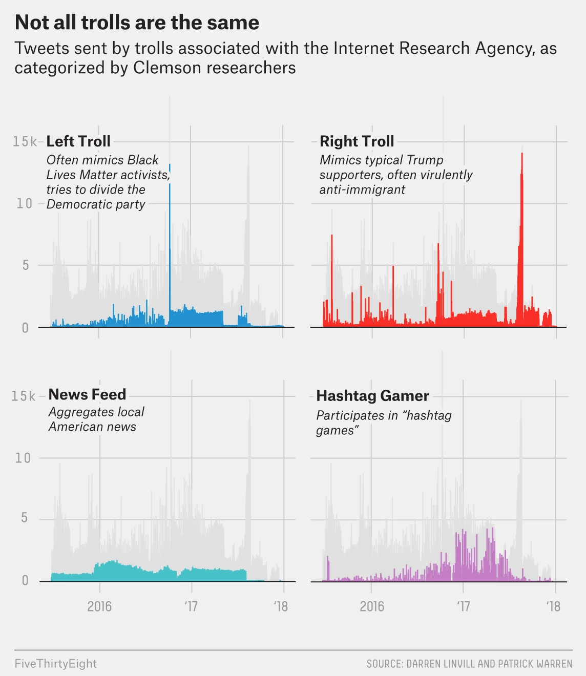
This is an older piece that I’ve been thinking of posting. It comes from FiveThirtyEight and explores some of the data about Russian trolling in the lead up to, and shortly after, the US presidential election in 2016.

They're all just ugly trolls. Nobody loves them.
They’re all just ugly trolls. Nobody loves them.

The graphic makes a really nice use of small multiples. The screenshot above focuses on four types of trolling and fits that into the greyed out larger narrative of the overall timeline. You can see that graphic elsewhere in the article in its total glory.

From a design standpoint this is just one of those solid pieces that does things really well. I might have swapped the axes lines for a dotted pattern instead of the solid grey, though I know that seems to be FiveThirtyEight’s house style. Here it conflicts with the grey timeline. But that is far from a dealbreaker here.

Credit for the piece goes to Oliver Roeder.

Trumping (Most) All on Twitter

Initially I wanted today’s piece to be coverage of the apparent coup d’état in Zimbabwe over night. But while I have found some coverage of the event, I have not yet seen a single graphic trying to explain what happened. Maybe if I have time…

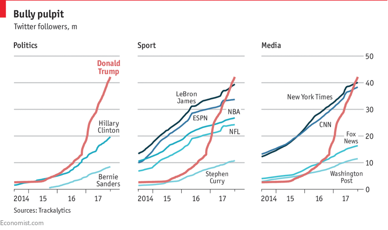
In the meantime, we have the Economist with a short little piece about Trump on Twitter and how he has bested his rivals. Well, most of them at least.

Trumping one's rivals
Trumping one’s rivals

The piece uses a nice set of small multiples to compare Trump’s number of followers to those of his rivals. The multiples come into play as the rivals are segmented into three groups: political, sport, and media. (Or is that fake media?)

Small multiples of course prevent spaghetti charts from developing, and you can easily see how that would have occurred had this been one chart. But I like the use of the reddish-orange line for Trump being the consistent line throughout each. And because the colour was consistent, the labelling could disappear after identifying the data series in the first chart.

And worth calling out too the attention to detail. Look at the line breaks in the chart for the labelling of Fox News and NBA. It prevents the line from interfering with and hindering the legibility of the type. Again, a very small point, but one that goes a long way towards helping the reader.

I think the only thing that could have made this a really standout, stellar piece of work is the inclusion of another referenced data series: the followers of Barack Obama. At 97 million followers, Obama dwarfs Trump’s 42.2 million. Would it not be fantastic to see that line soaring upwards, but cutting away towards the side of the graphic would be the text block of the article continuing on? Probably easier for them to do in their print edition.

Regardless, this is another example of doing solid work at small scale. (Because small multiples, get it?)

Credit for the piece goes to the Economist Data Team.

Fast Food on the Internets

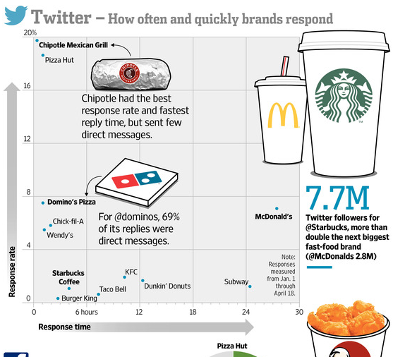
Let’s aim for something a bit lighter today. Well, lighter in all things but calories, perhaps. Today we have a piece from the Wall Street Journal that looks at the social media presence of several large fast food brands. Overall, it has a few too many gimmicky illustrations for my comfort. But, the strength of the piece is that it does look at some real data, e.g. plotted Twitter response rates, and then contextualises it with appropriate callouts.

Who cares about your tweets?

The illustrations are killing me, though.

Credit for the piece goes to Marcelo Prince and Carlos A. Tovar.