
Maps are tricky things. They are simplified means of conveying, often in two-dimensions, a highly complex three-dimensional object. An object that includes geological data, climatological data, human demographic data, biome data, and even geopolitical data. Consequently, any designer has to make decisions about what things to include and what not to include on a particular map.
Often times, a lot of things can be struck from a map. How often do you really need to explicitly see the tectonic plates? Climate regions? Plant hardiness? Even topographic figures? If you do not need to show them, omit them. Easy peasy.
One level, if you will, of data that is often difficult is that of geopolitics, or the placement of arbitrary lines on Earth that demarcate borders of sovereignty or authority. Everyone claims something. Alas, sometime those claims overlap. But if you are showing the world and a region in conflict, how do you show those borders? How would you, for example, show the limits of present-day Israel, it’s settlements, Palestinian territory pre-1967, Palestinian area of control today? Jammu and Kashmir (and China)? Abyei? The Senkaku Islands?
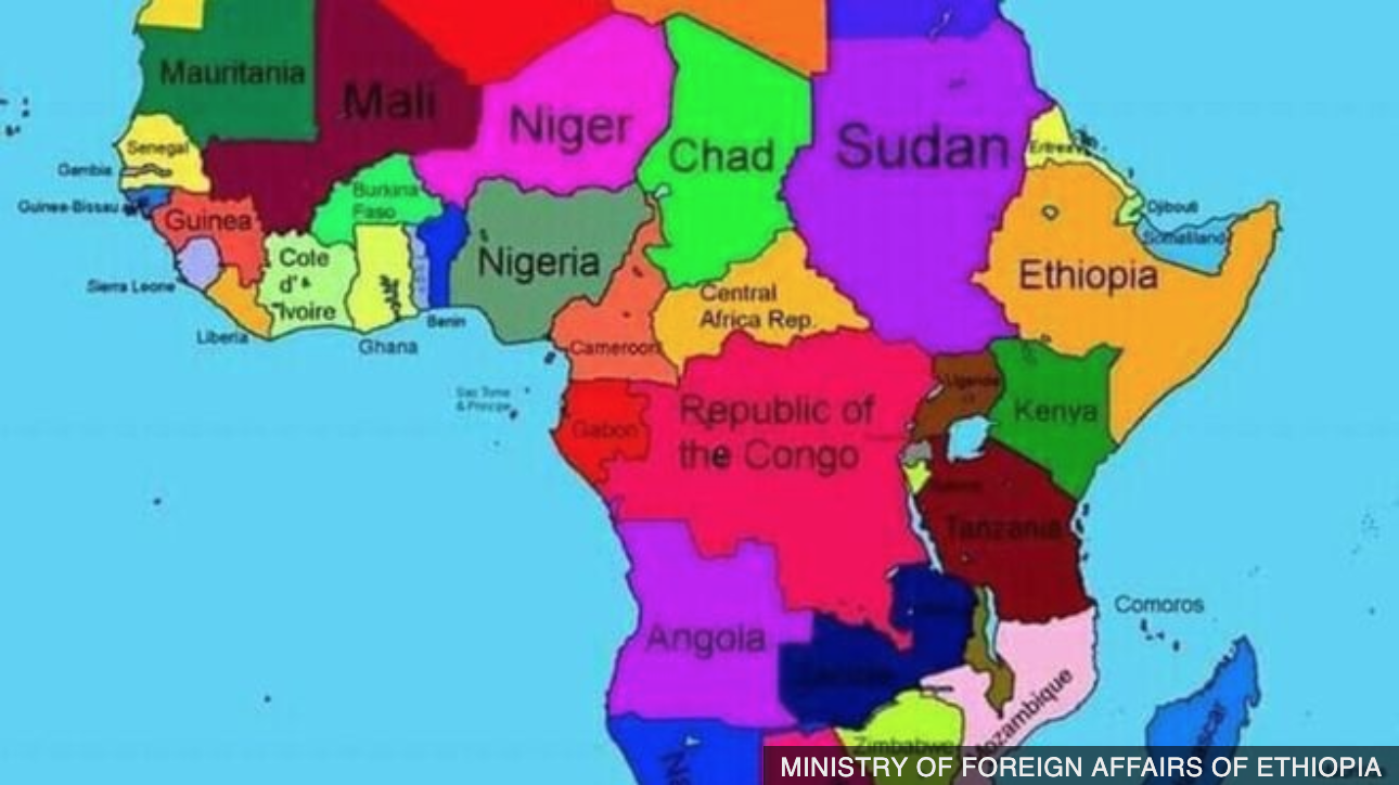
Well, last week, we got news from Ethiopia where the Ministry of Foreign Affairs published a map that, well, looked in part like this:
And that map set off a minor row. The entire ministry’s website is now offline and the ministry apologised for not knowing how the map “crept” onto the site.
But it potentially illustrates someone’s beliefs on the true extent of Ethiopian rule. Because, to the southeast, along the coast of the Indian Ocean, that is the sovereign country of Ethiopia. Oddest about the map, it shows Somaliland, a breakaway region of Somalia internationally recognised by very few states, as an independent country.
On the other hand, I doubt whether this was truly a malicious plot. It contains at least two other substantial errors. Immediately west of Ethiopia proper is Sudan. The map ignores the new state of South Sudan (and the aforementioned disputed territory of Abyei). And then a bit further west is the Republic of the Congo. And that one is all messed up. There is, of course, a country called the Republic of the Congo, but it is a relatively small fraction of that reddish-pink shape and exists in the west. The remainder of the shape is one of the largest countries in the world—the Democratic Republic of the Congo, DRC. (Often times you will hear the smaller state, Republic of the Congo, called Congo-Brazzaville after its capital to distinguish between the two.) But since the DRC is one of the more powerful states on the continent why would the Ethiopian Ministry of Affairs want to start something?
And that’s why I think this is a minor dustup about nothing. But, it shows how acknowledging which arbitrary lines drawn on a map we choose to display can create tensions. And worse.
Credit for the piece goes to the Ethiopian Ministry of Foreign Affairs.