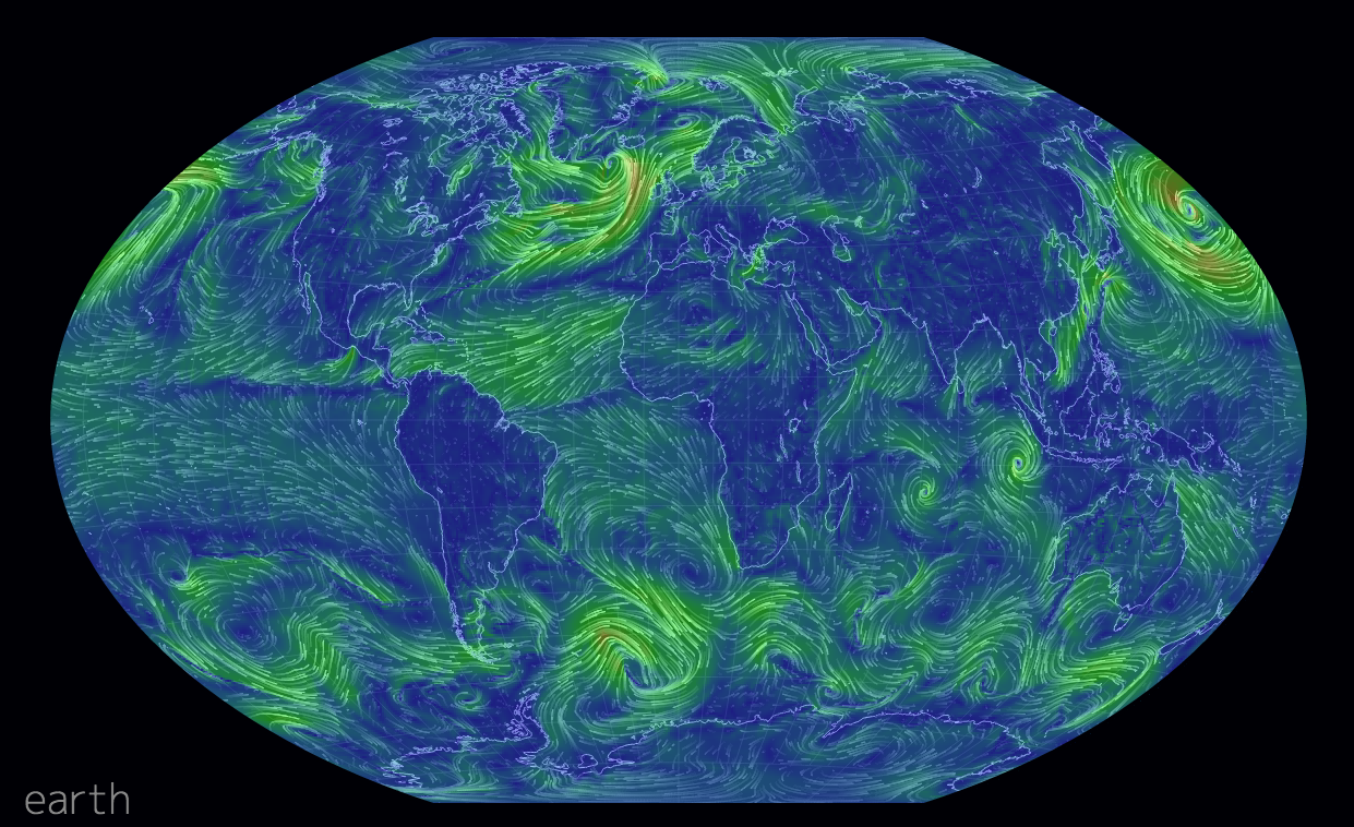
Most of us have likely seen the wind map by Fernanda Viegas and Martin Wattenberg. However, this new wind map takes the idea and makes it a bit more useful. It offers the user the opportunity to look at winds at different levels of the atmosphere. Or you can look at different projections. Some projections show wind patterns better than others. You can also see wind across the world, not just the United States.
Doctor Who? Exactly. This weekend, Saturday in fact, is the 50th anniversary of British sci-fi show Doctor Who. That is not to say it has been airing for 50 years. In the 1990s and early 2000s the show was off the air, living on only in audio broadcasts and novelisations. But in 2005, the show was relaunched and it slowly began to acquire a new generation of followers. Some, like your author, have watched it in the States first via SyFy since 2006.
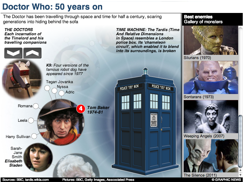
Still 50ish years of television about time travelling through space in a blue police box makes for lots of data. And so back in March Simon Rogers created this infographic to explain some of the history of the show.
The Guide to Doctor Who
If you intend on watching the 50th special this weekend—or Monday in some movie theatres here in the States—and you want to brush up on the timeline of the Doctor and his travelling companions, the Guardian also has this graphic.
The Guardian’s gallery of Doctors
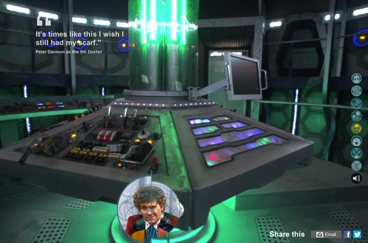
But of course the BBC, which produces Doctor Who, has a more in-depth site about the history of the character and the show. Did I mention the content is displayed within the TARDIS? I know, it’s bigger on the inside.
The BBC’s inside the TARDIS
Have you ever watched the show? Do you have a favourite Doctor? A favourite companion?
Credit for the first Guardian piece goes to Simon Rogers.
Credit for the second Guardian piece goes to the Guardian’s Graphic News team.
Credit for the BBC piece goes to Christopher Ashton, Christine Jeavans, Helene Sears, Tian Yuan, Nick Davey, and Ben Fell.
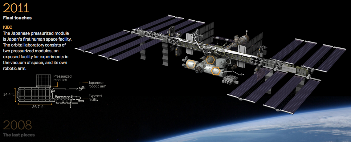
Gravity was released recently. You know, that film about a station in space that gets hit by something and drama ensues. The Washington Post has this fantastic infographic that illustrates how the station was built over the past 15 years. Scroll down the page and watch the station deconstruct itself into its initial Russian power module. Fantastic.
Deconstructing the ISS
Credit for the piece goes to Alberto Cuadra and Katie Park.
This interactive map from the Washington Post is one part of a long-form piece that looks at NASA and the improbable tasks facing the agency. Specifically the piece looks at how NASA wants to get to Mars, but how difficult that is and how an also difficult asteroid mission is as a backup plan.
Funding the improbable
Really fantastic is about all I can say.
Credit for the piece goes to Joel Achenbach, Alberto Cuadra, Kennedy Elliott, Rebecca Rolfe, and Ricky Carioti.
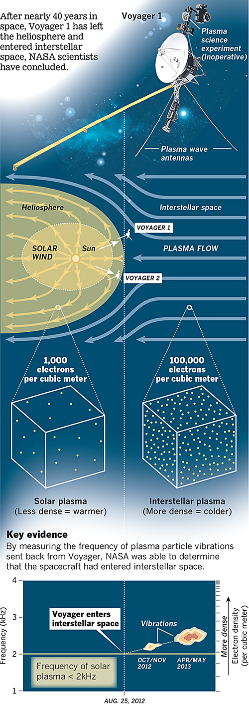
Last week NASA announced that last year, Voyager 1 left the Solar System about 25 August 2012. A lot of the graphics that were published to support that story chronicled the distance travelled by that probe. However, this excellent graphic by the Los Angeles Times instead looks at how NASA determined through the data returned that Voyager had left the Solar System.
Voyager 1 departs the Solar System
The piece does a really good job of setting up the story in illustrating the instrument packaged used to collect the data. Moving down the piece, it shows locations and the different environments and then how those environments differ in electron density. Lastly it looks at how NASA interpolated the date from the data collected. A really solid piece.
Credit for the piece goes to Monte Morin, Doug Stevens, and Anthony Pesce.
We already got to Mars. At the end of a week of maps and map-related things. Here’s a map of Mars. Well, sort of. It’s more of a map of Mars as explored by Curiosity. (Remember that guy?)
It’s an interactive piece from the New York Times that charts out just where the rover has driven and photographs of the stops along the way. There’s also a nice little chart that shows just how much of the trip has consisted of driving.
A day in the life…on Mars…
Credit for the piece goes to Jonathan Corum and Jeremy White.
A few weeks ago the Washington Post published a graphic that explained how space weather can have significant impacts on Earth. This is more of an illustrated diagram and less of a data visualisation piece, but it still worth a read. Why? Because, if scientists are correct, the sun’s magnetic poles should soon finish a polarity reversal. And that creates the potential for some stormy space weather.
Impacts of space weather
Credit for the piece goes to Bonnie Berkowitz and Alberto Cuadra.
Someday humanity will find a planet amongst the stars similar in temperament to Earth. One of the best star systems to explore is Gliese 581, a small and faint star some 20 light years away. Calculations show that there are a few planets that could exist in or near what is often called the Goldilocks Zone. The Goldilocks Zone describes the distance from the systems’ star where planets could exist with liquid water. But generally, one needs to take that with a grain of salt. Here in the Sol System, for example, Earth is joined by Venus and Mars. But neither of those planets appear capable of sustaining life at least at present.
The problem with Gliese 581 is that we are not yet certain as to exactly how many exoplanets form the planetary system. It might be four; it might be five. The different schools of thought lead to different conclusions about the possibility of there being liquid water. And life as we know it requires water. The New York Times looked at Gliese 581 earlier this summer and compared the two different orbital models.
Today’s post comes via one of my co-workers. I don’t have any information on it other than it being an infographic looking at our exploration of the solar system (and in the near future beyond, thanks Voyager). My guess is that it isn’t particularly new, as I would imagine that the designer would have liked to have called out the Curiosity mission that just landed on Mars. But so far as I can tell, that mission is absent from the infographic.
Curiosity shall soon be exploring the surface of Mars seeking to understand the geological history of the planet. But in this infographic, see the cropping below, from the National Post we can see previous missions to Mars. We have not always been successful in operations in and around Mars, but our recent track record is much improved.