How Worldly Is the World Series?

The World Series began Tuesday night. But, as many people reading this blog will know, baseball is not exactly a global sport. But is it really? CityLab looked at the origin of Major League Baseball players and it turns out that almost 30% of the players today are from outside the United States. They have a number of charts and graphics that explore the places of birth of ball players. But one of the things I learned is just how many players hail from the Dominican Republic—since 2000, 12% of all players.

There are quite a few players from countries around the Caribbean.

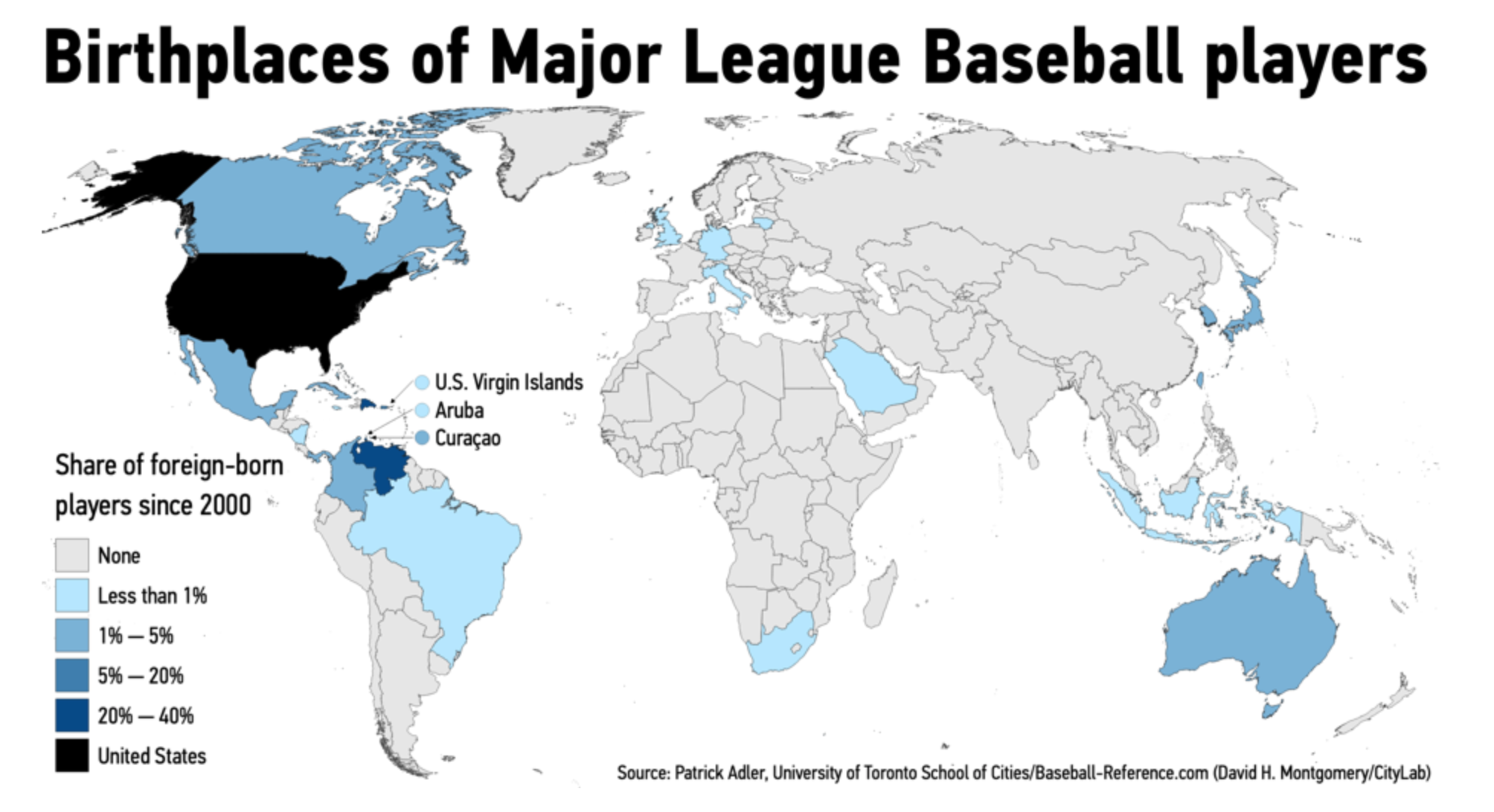
The choropleth here is an interesting choice. It’s a default choice, so I understand it. But when so many countries that are being highlighted are small islands in the Caribbean, a geographically accurate map might not be the ideal choice. Really, this map highlights from just how few countries MLB ball players originate.

Fortunately the other graphics work really well. We get bar charts about which cities provide MLB rosters. But the one I really enjoy is where they account for the overall size of cities and see which cities, for every 100,000 people, provide the most ballplayers.

One of the other things I want to pick on, however, is the inclusion of Puerto Rico. In the dataset, the designers included it as a foreign country. When, you know, it’s part of the United States.

Credit for the piece goes to David H. Montgomery.

Golden Buttered Popcorn

We are in the midst of basketball playoffs right now. And one of the teams participating is the Golden State Warriors. They are pretty good at this whole basketball thing. One of the reasons is their star player Steph Curry. And it turns out that he is an enormous fan of popcorn. So much so that despite the widespread focus on power foods and healthy eating and wellness lifestyle, he devours the stuff before matches. So much so that NBA minders had to remove it from his hands during an all-star match last year.

He agreed to a request from the New York Times to rank each stadium, from 1 to 29, on the best popcorn. But he then went further and suggested that he rank the popcorn on a five-point scale on five different metrics: freshness, saltiness, crunchiness, butter and presentation. Naturally, the Times agreed. And he prepared a dataset that the Times turned into this heat map.

He's so honest, his own stadium doesn't rank in the top five.
He’s so honest, his own stadium doesn’t rank in the top five.

The whole article is well worth a read for more insights into the player and his take on popcorn. I don’t know a thing about basketball, but if a player agrees to a request to rank stadiums based on their popcorn, but then goes further to create additional data that can be used to turn into a visualisation, he’s probably my favourite player. If only someone had asked this of Pedro, Nomar, or Big Papi back in the day. Here’s looking at you, Laser Show.

Happy Friday, everyone.

Credit for the piece goes to Steph Curry and Marc Stein.

Angry Birds? Bad Birds

Baseball is almost upon us. And oh boy do the Baltimore Orioles look bad. How bad? Historically bad. FiveThirtyEight went so far as to chart the expected WAR, wins above replacement, of each position of all teams since 1973. And the expected Orioles lineup looks remarkably bad.

They are going to be so bad.

What is nice about this graphic is the use of the medium grey for each team/year combination. I may have used a filled orange dot instead of open, but the dots do at least standout and show the poor positioning of just about everything but the second baseman.

Credit for the piece goes to the FiveThirtyEight graphics department.

Is Bryce Harper Another Ryan Howard?

No. Definitely not. But, the position of this article by FiveThirtyEight is that the Phillies, the Philadelphia baseball team that just made the largest guaranteed contract in North American sports, may have purchased the rights to somebody who is a few years past his prime.

The author tracked the performance of similar baseball players over history and found that they peaked earlier and tailed off earlier.

Ken Griffey Jr.'s swing though…
Ken Griffey Jr.’s swing though…

Now, the obvious thing about this graphic that I dislike is the spaghetti-fication of the lines. What does help alleviate it, however, are the greying and lighter weight of the non-identified lines in the background. Interestingly, they are even lighter than the axes’ value lines. There is also a thin outline to the lines that helps them standout against each other.

I also wonder if a few more added benchmark lines would be useful. Elite seasons are defined as those with 8+ wins above replacement (WAR), an advanced measurement statistic. Could that level not be indicated with a line on the y-axis? What about the age of 26, before which the players would have had to produce one and only one 8+ WAR season to be eligible for the data set?

Of course, as I said at the beginning, the answer to this post’s title is no. Harper will make the Phillies a better team and the length of his contract will not be the albatross that was Ryan Howard’s. However, the Phillies may be paying for 13 years of subprime Harper.

Credit for the piece goes to the FiveThirtyEight graphics department.

Are Baseball’s Big Contracts Worth It?

On Tuesday the San Diego Padres signed Manny Machado to a guaranteed contract worth $300 million over the next ten years—though he can opt out after five years. Machado was one of two big free agents on the market, the other being Bryce Harper. One question out there is whether or not these big contracts will be worth it for the signing teams. This piece yesterday from the New York Times tries to look at those contracts and how the players performed during them.

Oh, David Price…
Oh, David Price…

Like the piece we looked at Tuesday, this takes a narrative approach instead of a data exploratory approach—the screenshot above is halfway through the read. Unlike the Post piece, this one does not allow users to explore the data. Unlabelled dots do not reveal the player and there is no way to know who they are.

Overall it is a very strong piece that shows how large and long contracts are risky for baseball teams. The next big question is where, for how long, and how much will Bryce Harper sign?

Credit for the piece goes to Joe Ward and Jeremy Bowers.

Be Like Mike?

Back in 2012 the New York Times ran what is a classic data visualisation piece on Mariano Rivera. It tracked the number of saves the legendary Yankees closer had over his career and showed just how ridiculous that number was—and how quickly he had attained it. Last week, the Washington Post ran a piece that did something very similar about LeBron James, a future basketball legend, and Michael Jordan, definitely a basketball legend.

They might have game.

The key part of the piece is the line chart tracking points scored, screenshot above. It takes the same approach as the Rivera piece, but instead tracks scored points. Unlike the Rivera piece, which was more “dashboard” like in its appearance and function, allowing users to explore a dataset, this is more narratively constructed. The user scrolls through and reads the story the authors want you to read. Thankfully, for those who might be more interested in exploring the dataset, the interactivity remains intact as the user scrolls down the article.

While the main thrust of the piece is the line chart, it does offer a few other bar and line charts to put James’ career into perspective relative to the changing nature of NBA games. The line chart breaking down the composition of James’ scoring on a yearly basis is particularly fascinating.

But, don’t ask me about how he fits into the history of basketball or how he truly compares to Michael Jordan. Basketball isn’t my sport. But this is a great piece overall.

Credit for the piece goes to Armand Emamdjomeh and Ben Golliver.

Switching Sides

For those of you not baseball fans, Tuesday is Major League Baseball’s trading deadline. By that evening, trades of players between teams are sort of over for the year. (Yes, I understand this is the non-waiver deadline and the waiver deadline is at the end of August, but that is complicated to explain.) And so as the end of July approaches, trades can reach a frenetic pace as teams try and fill the holes in their rosters before the playoffs begin in October.

Thankfully the folks over at Cut 4 put together a flow chart to help teams figure out how to fill those needs.

A lot of these have paths have already been closed.

Of course by this point, a number of these players have already switched sides. In terms of design, this is more like a Friday post. Just enjoy it.

Credit for the piece goes to Jake Mintz and Jordan Shusterman.

Penalty Shoot Outs

Well, football is not coming home. But the World Cup continues. And should we get another final match tied at the end of extra time, that means penalty shoot outs. Thankfully, the Economist did a nice job detailing the success rates on goal by placement of the ball.

Coin flips
Coin flips

The only thing I am unsure about is whether the dots represent the actual placement or just positioning within the aggregate zone. The colours work well together and the graphic of the goal is not overpowering.

Credit for the piece goes to the Economist Data Team.

The Semifinalists

Today is the semifinal match between England and Croatia. I could have posted this yesterday, but the US Supreme Court selection seemed more important. But today’s post is a simple scatter plot from FiveThirtyEight. It is part of a broader article comparing the four semifinalists of the World Cup. (Spoiler alert, France won its match.)

No drama today, please

In terms of design, we can contrast this to yesterday’s dot plot about Kavanaugh. There the highlighted dot was orange with a black outline. Here, same deal. But yesterday, the other justices were shown with black dots and an empty dot for retiring Justice Kennedy. Here all the other countries in the World Cup are orange dots.

I wonder, given the orangeness of the other countries, maybe a solid black dot would have worked a little better for the four semifinalists. Or to keep the orange with black outline dots, maybe a lighter orange or grey dots for the other World Cup teams. (I think black would probably be too strong in this case.)

Overall, it shows that today’s match between England and Croatia will be tough. And should England advance, a match against France will be even tougher.

Credit for the piece goes to Bobby Gardiner.