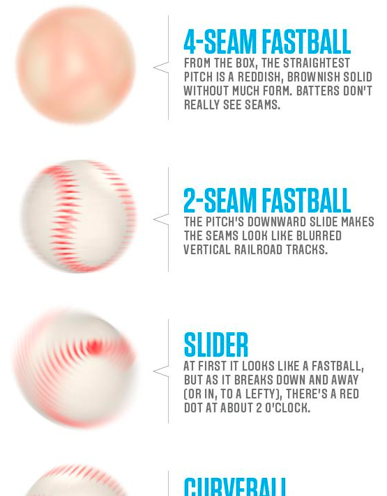
Hitting a baseball is hard. Really, really hard. You’re good at it if you fail 7 out of 10 times. Part of the way you get good at hitting baseballs is by recognising the spin or rotation of the red seams on the white outside of the ball. This article from CBS takes a look at five common pitches and what they look like to the batter.
I have certainly never been able to see these
Credit for the original piece goes to an unknown person, I don’t think it was the article’s author.
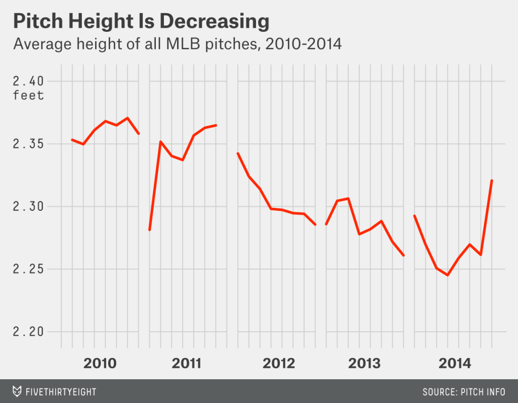
For most of us, baseball, the 2015 edition, began yesterday. For the Red Sox, it was an 8–0 victory over the Phillies in which Boston’s Clay Buchholz kept the ball down in the strike zone, where it is tougher for batters to make solid contact. Whereas Cole Hamels of the Phillies kept the ball up in the zone and thereby let the Boston lineup hit four home runs in five innings. (Boston added a fifth, a grand slam, in the ninth inning.)
But low strikes are nothing new. In fact, umpires increasingly have been calling low strikes as seen in this chart by FiveThirtyEight in an article looking at 2015’s trends in baseball. (Interestingly they also chart something on Cole Hamels.) It is not the most complicated chart, but it does serve as a reminder that for the next six months, baseball is back.
Baseball is my sport. I love it. Some of my favourite games are the four-hour long matches between my Red Sox and the scourge of the Earth, the Yankees. Games can take a long time for a number of reasons. But in an increasingly fast-paced world, critics argue that younger generations do not have the patience for even three-hour games. So Major League Baseball this year is actively trying to reduce the time of games through pace-of-play improvements. To do this, they are looking at and collecting more of baseball’s copious amounts of data.
Unfortunately, ESPN in an article about the improvements for this year took the data and did nothing with it.
For the love of god, why?
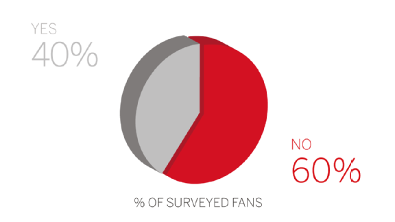
Above we have survey results. I want to vomit in my mouth. Wait, hold on…sorry about that, I am back now. Some organisations have done some really nice visualisations with baseball data, of which we have a lot because the sport plays 162 games per year. We surely could be looking at more timing data. But, instead we get three-dimensional pie charts from ESPN. The rest of the article is not much better, though their styling of bar charts still leaves things to be desired.
Credit for the piece goes to ESPN’s graphics department.
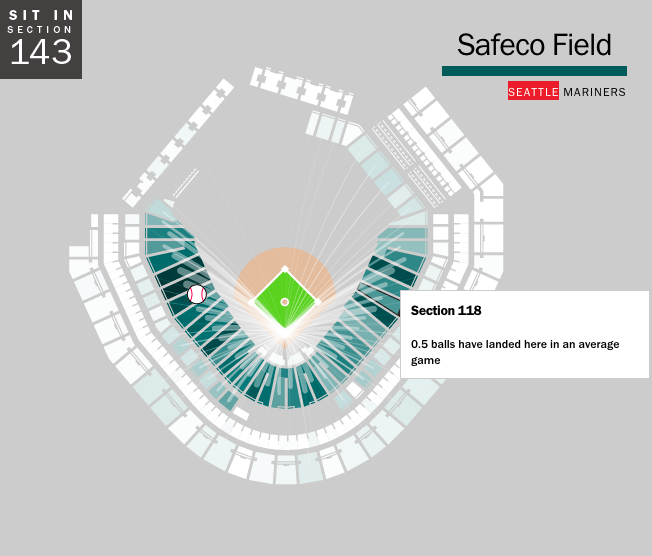
As we established yesterday, baseball is rumbling back to life with Spring Training. That means it is time to start buying tickets for games. But if, like me, you have never caught a foul ball or home run, you may want to sit in a location where you can optimise your chances. Where is that? Well, now we have an app for that, Ideal Seat, as covered by Time. It uses interactive maps of stadiums and data on where hit balls land to generate an average number of balls per game—an average of about 30 foul balls per game.
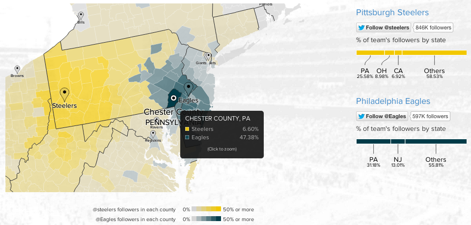
To continue with the sports theme from yesterday, today we have an interactive map from Twitter that looks at NFL team popularity. The methodology is simple, where are the users following the various football teams and map that out by county. The overall blog post features a country-wide map, but then narrows down into a few particular stories. The image below is from the divide in the state of Pennsylvania between Eagles fans and Steelers fans.
Philly vs. Pittsburgh
Credit for the piece goes to Simon Rogers and Krist Wongsuphasawat.
Baseball’s Winter Meetings often provide fans with lots of trade news and free agent signings. As a Red Sox fan, one of the unfortunate signings was the Cubs picking up Jon Lester. For my friends back in Philly, Jimmy Rollins is headed to Los Angeles. But then for Boston, at the time of writing it appears a deal may be imminent for Arizona’s Wade Miley in exchange for Allen Webster and Rubby de la Rosa.
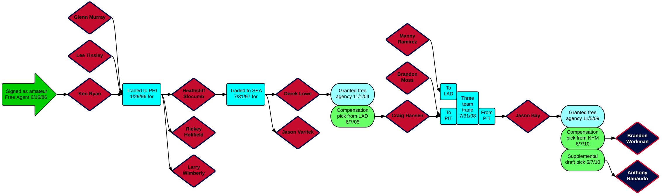
The reason I mention all those names is that they reminded me of a series of graphics from last month that looked at the longest transaction trees for each team. Put simply, how far back can one guy being traded for another guy being signed as compensation for another guy leaving get you back in history. The following graphic tracks a different Red Sox trade, of Anthony Ranaudo and Brandon Workman in 2014 back to the signing of Ken Ryan in 1986.
The transaction tree for Ranaudo and Workman
But what reminded me more specifically was the note that followed the above graphic that had Allen Webster as the longest trade-only tree for Boston. That starts because of the Hanley Ramirez signing in 2000—who returned to Boston only a few weeks in a free agent signing. Similarly, Jimmy Rollins was the longest transaction tree for the Phillies since his signing back in 1996. But that will now change once the players in exchange for Rollins are made clear.
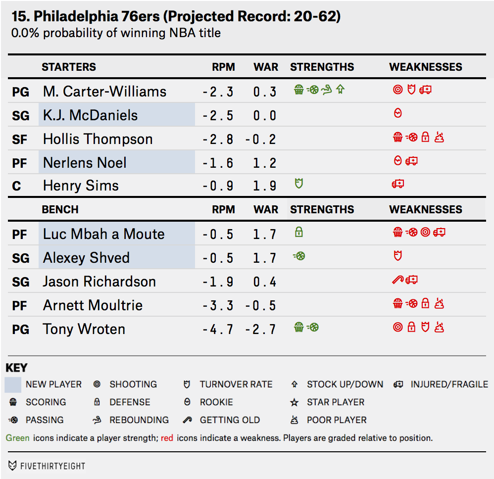
The Philadelphia 76ers are a terrible basketball team. FiveThirtyEight details the deficiencies of the team in this small table. Icons represent characteristics that can be either positive or negative. They are then placed within the table to quickly show how awful the team is. My favourite is the icon for poor player.
Just terrible
Credit for the piece goes to the FiveThirtyEight graphics department.
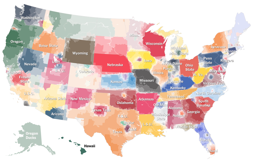
American college football. This is not a thing that Northeasters like myself understand. And it is not just because yours truly attended the University of the Arts whose only competitive sporting team was, I believe, fencing. Here in the Midwest, many things are strange and alien. One of them is their affinity for said sports that do not make sense. Thankfully the New York Times has attempted to explain specific programme affinities much like they did with their baseball map. (Which made infinitely more sense.)
Click the big map at the article’s beginning to get to the interactive version
Credit for the piece goes to Tom Giratikanon, Josh Katz, David Leonhardt, Kevin Quealy, and Marc Tracy.
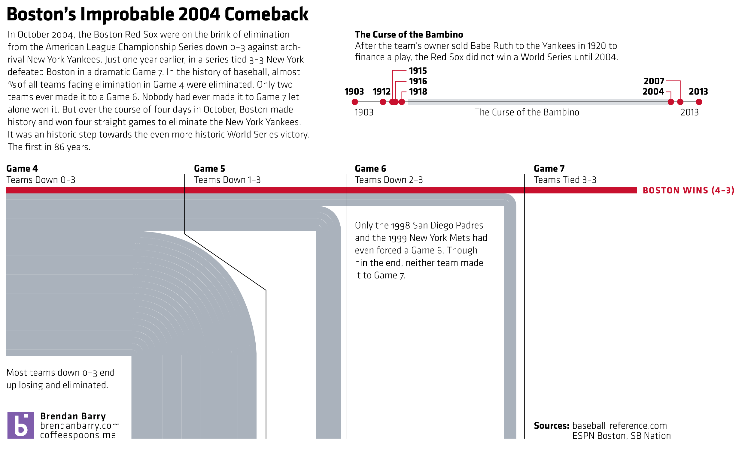
Was ten years ago this time in October. Boston was on their way to winning their World Series in 86 years. But to get there, they had to go through the New York Yankees. And they did it in dramatic fashion, winning a riveting best-of-seven series. Why riveting? Because it had never been done before. (Nor since, actually, but that’s not included in the graphic.)
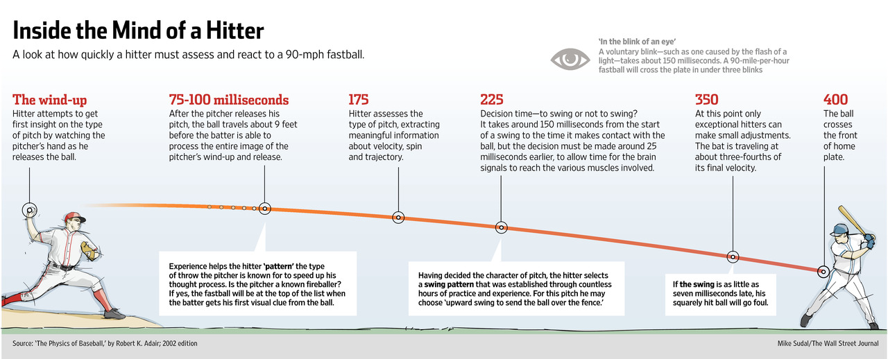
Tonight is Game 5 of the National League Championship Series. For those of you who do not follow baseball, this is the semi-finals for the national championship called the World Series. Anyway, hitting a baseball is hard because you have so little reaction time. The Wall Street Journal has an article about how some baseball teams are beginning to experiment with neuroscience. The idea is to better train hitters to recognise pitches earlier, in essence, giving them said reaction time. The article is accompanied by an illustration showing just how little time there is to hit a pitch.