No, Your Vaccine Is Now Fully Operational

Another week is over, and for the past few years I’ve often said we all made it to the end of the week. When in reality, for the last few months, thousands of people were not. We’ve started using Monday to sort of recap the state of the pandemic in a select region of the country. And then we moved straight into how the New York Times addressed the US reaching the grim milestone of 500,000 deaths.

So I want to end this week with a little story told over at xkcd that tries to explain these new mRNA vaccines. Who doesn’t love science, science fiction, and humour woven together into a narrative? True, this isn’t really data visualisation, but it dovetails nicely into the work we’ve been doing and reviewing of late. Plus, levity. We all need levity.

These are not the cells you’re looking for.

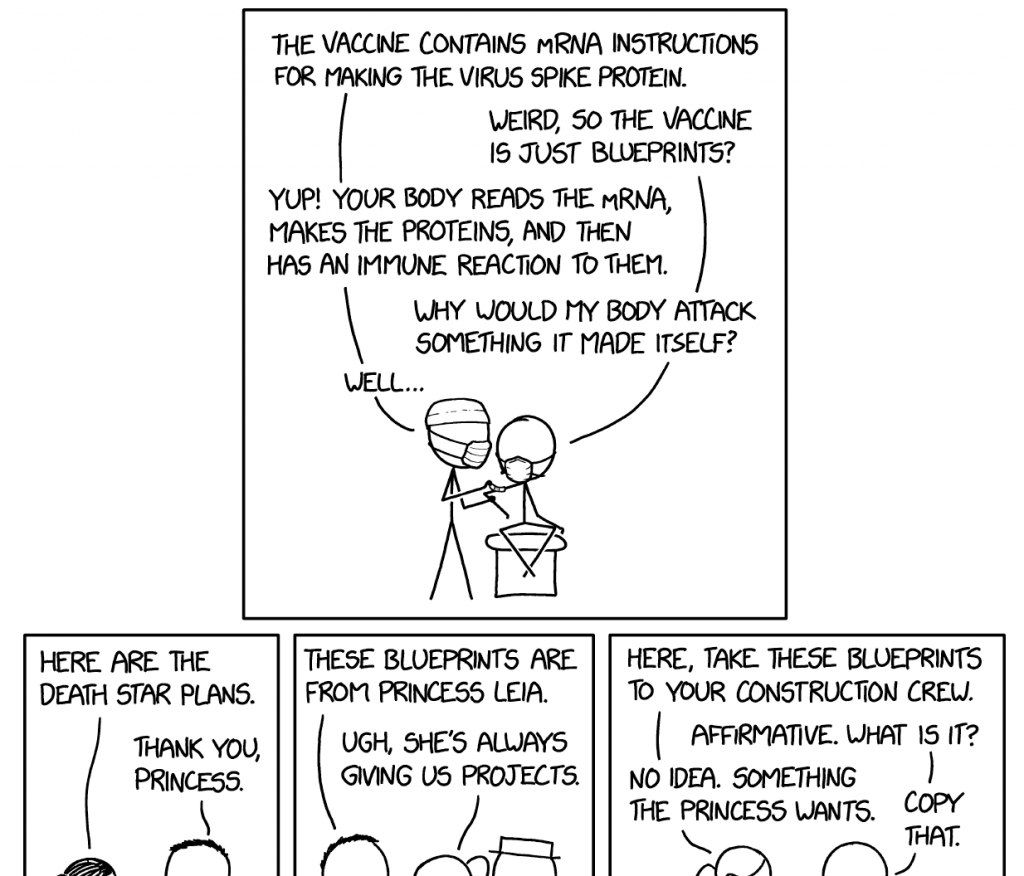
You’ll want to click through to read it all.

Credit for the piece goes to Randall Munroe.

All the Eggs

We made it to Friday, everyone. Huzzah.

This is based off absolutely one of my favourite infographics out there—Charles Joseph Minard’s map of Napoleon’s invasion of Russia. For those unfamiliar with it, he tracks the size of the French army as it invades Russia and gets thinned out along the way. Yes, some are to battles. But, the bottom of the plot also tracks temperature. The temperature of winter in Russia. And you can see how that too impacted French troop numbers.

So this modern work needed to get a shoutout here, even if it doesn’t have the temperature on Hoth. Or in the vacuum of space. I hesitated to post it for a few weeks because of the film and not wanting to post spoilers. But upon further reflection, we basically all know how Rogue One has to end—the plans get stolen and the Death Star eventually gets blown up. So I see no harm posting this now.

I wonder if it's just basically don't invade colder countries in winter.
I wonder if it’s just basically don’t invade colder countries in winter.

Credit for the piece goes to Walt Hickey.

A (Time and) Space Race

First of all, I grew up a fan of Star Trek and not Star Wars. Star Trek is, after all, more science-y. Now, for today’s post, I could make references to the battlestar Galactica, the good ship Tardis, Planet Express deliveries, or avoiding the Alliance throughout the Verse. Instead I’ll just submit this interactive graphic from Slate.

Voyager 1 is slow
Voyager 1 is slow

It compares the times needed by various nerd-loved starships/spaceships/space vehicles to reach very distant (and real) stellar destinations. Don’t worry, there is a bar chart in the end with Voyager 1 thrown in for comparison to reality. (Though I suppose they could have just made it Voyager 6.)

Not accounting for differing technologies or laws of physics

See, a bar chart. It fits within the scope of this blog.

Credit for the piece goes to Chris Kirk, Andrew Morgan, and Natalie Matthews.