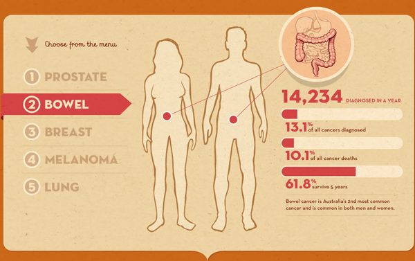
From the Sydney Morning Herald, we have a link to an interactive infographic published by the Cancer Council of Australia, a non-profit that seeks to reduce the impact of cancer upon Australia. It is not the most graphical by way of charts, but offers the user “playful” interactions with statistics to better inform him or her about the causes and impacts of cancer. The format is also interesting in that it mimics the fad in infographics of the long, vertical scroll page. But here it is done to much better and ostensibly more useful effect. Useful in the sense of trying to help people.

