Fighter Jets

A large-scale infographic with lots of drawings of fighter jets. That’s pretty much what this is. And that’s cool enough for me. The background is that the US fighter programme for the F-35 is increasingly ridiculously expensive and beyond budget. Some nations, like Canada, are starting to have second thoughts. This post outlines potential options and adversaries.

Not all of these aircraft are really options. For example, the US has banned the export of the F-22 and it is highly unlikely that Canada would purchase the Raptor. Will the Russians ever build the PAK FA? They’ve been trying to build them for years and the aircraft has yet to go into production. Regardless of the likelihood of facing the adversaries or procuring the options, they’re still pretty cool illustrations and side-by-side comparisons.

Fighter jet options and adversaries for Canada

Credit for the piece goes to Jonathon Rivait, Mike Faille, and Matt Gurney.

Electrical Outages from Sandy

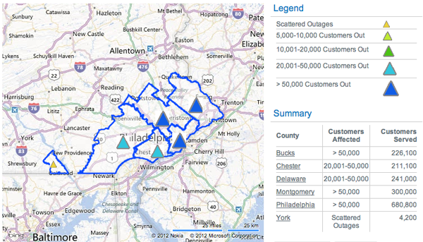
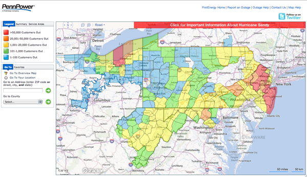
Hurricane Sandy hit the Jersey shore before moving northwest through southeastern Pennsylvania. These were two maps from two different electric utility companies providing information on the number of outages. This first and smaller graphic is from PECO. The second and larger is from FirstEnergy. The graphic from FirstEnergy breaks into the township level when zoomed in sufficiently. Clearly from being able to post this, I am among the fortunate with my electricity still up and running.

PECO Outages on Tuesday
First Energy Outages on Tuesday

Clearly these are not all outages, only the outages reported by these two electrical utilities. At the time of writing some 1.3 million people were without electricity in Pennsylvania and over 7 million in the Northeast while Sandy—now an extra-tropical low pressure system—continues to dump rain and snow on the interior reaches of the area.

Better, Safer Driving

Hannah Fairfield at the New York Times created a great infographic a few years ago that looked at the history of the price of gasoline and how many miles, on average, an American drove in a car per year. The piece told some rather interesting stories starting in the 1950s with the explosion of the suburb, interstate highways, and car ownership. The energy crises of the late 1970s and early 1980s provided a spike that eventually subsided for the 1990s and early 2000s when the United States was the dominant economic power and the only country that really consumed that much gasoline. (I remember those days well for that was when I first started filling my own car’s gas tank. How great $1.xx/gal gas was.)

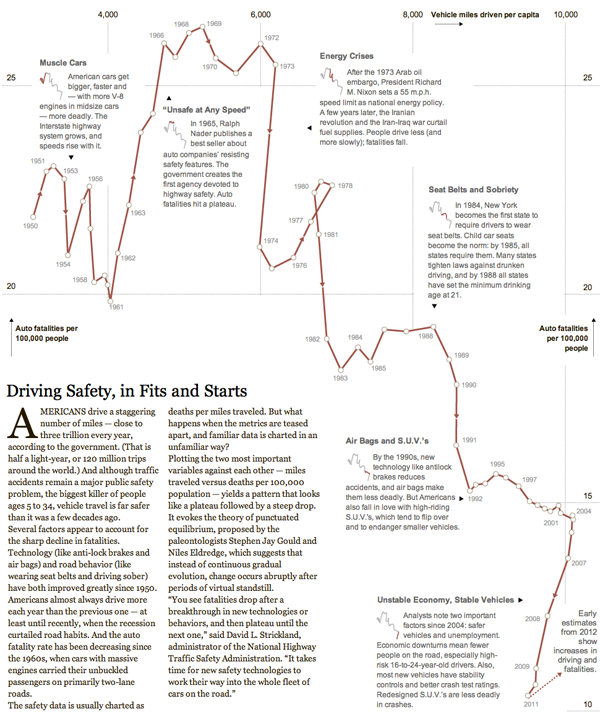
Earlier this week she returned in a similar fashion to look at driver safety over time. The metrics were average annual miles driven and the number of auto fatalities per 100,000 people. Segments of time characterised by a common theme, story, or technology are highlighted and the annotated to explain the change from the previous time period. It’s a rich story that walks the reader through the history of the American auto experience since World War II.

Driving safety
Driving safety

Credit for the piece goes to Hannah Fairfield.

Space. Something About a Frontier?

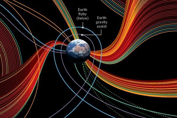
Today’s post comes via one of my co-workers. I don’t have any information on it other than it being an infographic looking at our exploration of the solar system (and in the near future beyond, thanks Voyager). My guess is that it isn’t particularly new, as I would imagine that the designer would have liked to have called out the Curiosity mission that just landed on Mars. But so far as I can tell, that mission is absent from the infographic.

We Start at Earth
We Start at Earth

Opportunity

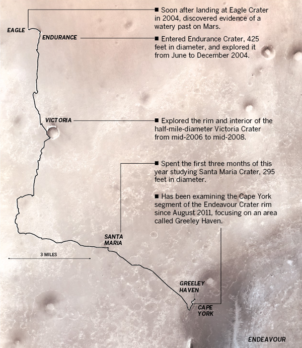
Curiosity is not the only rover on Mars, eight years after a 90-day mission, we still have Opportunity rolling around. The Los Angeles Times published this graphic detailing the exploration conducted by Opportunity. This is a map of Opportunity’s section of Mars.

Path of Opportunity
Path of Opportunity

Credit for the piece goes to Julie Sheer, Lorena Iñiguez, Raoul Rañoa, and Anthony Pesce.

World Bank—Mobile Phones

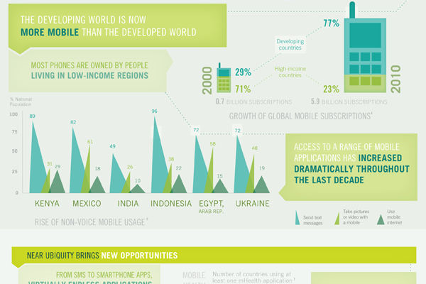
A little while ago the World Bank, generally a rich-country club that doles out loans to the developing world, published an infographic looking at mobile phones and their presence in the developing world.

The piece supplemented a report and is rather large. It actually exists as two separate images. The cropping below focuses just on how people in the developing world use mobile phones. Overall the piece is a bit weak in terms of data visualisation types and some of it is a bit confusing, but the story is clearly worth telling. And fortunately there are more hits than misses.

Developing world usage


Missions to Mars

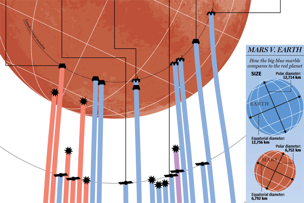
Curiosity shall soon be exploring the surface of Mars seeking to understand the geological history of the planet. But in this infographic, see the cropping below, from the National Post we can see previous missions to Mars. We have not always been successful in operations in and around Mars, but our recent track record is much improved.

Missions to Mars
Missions to Mars


Credit for the piece goes to Mike Faille.

Washington Monument

Last summer an earthquake rattled the East Coast; I felt it while lounging on the beach at the Jersey shore when I was on holiday. But Washington got hit pretty hard. The Washington Monument lost some stones. I just lost an iced tea that spilled. But, the Monument is now going to be closed until perhaps 2014 for repairs. This infographic from the Washington Post details where the damage is found on the Monument and how the slabs will be repaired.

Damage to the Washington Monument

Credit for the piece goes to Cristina Rivero.

Higgs Boson. You Can Call It God.

CERN may—or may not—have discovered a particle that may—or may not—be the Higgs Boson that would probably fill in a lot of the holes in our understanding of how the world may work at a sub-atomic level. That is a lot of ‘may’s.

Understanding just what a Higgs Boson does is not quite so easy. In really simplified language, it explains why things have mass. And when you put things of mass on a planet that has gravity, like Earth, why things have weight. Back in the early 1990s, the British minister for science offered a prize for the best explanation to be given in layman’s terms. The following image, via the BBC, is one part of that example. We all probably need to know it just a little more today.

Higgs Boson
Higgs Boson

Revisiting the End of the Shuttles

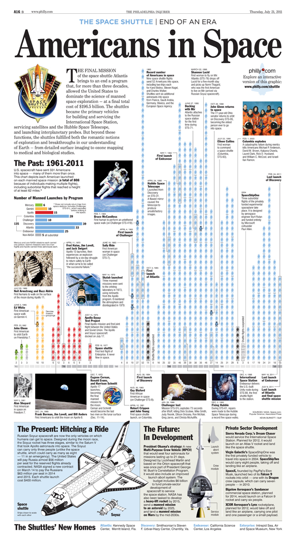
This is a post that goes back a little bit in time, but that I stumbled upon and found worth a post. Last summer the United States ended the Space Shuttle programme by retiring all of our orbiters. And of course this prompted many to attempt infographics about the history of bringing liberty and freedom to space.

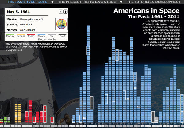
Amidst the fond farewells, I missed this interactive piece from the Philadelphia Inquirer about the history and the future of Americans in space.

Interactive history
Interactive history

The interactive piece contains three separate sections. The first looks at the individual Americans who made it into space. The second compares the Space Shuttle to the Russian Soyuz craft that we now must use to get into space. The third looks at the future, and what we might use.

But, the Inquirer also had a print edition to worry about, and published a static version of the piece. Is it perhaps a bit cluttered, yes, but the addition of the photographs and the annotations (even though the annotations are available as rollover conditions in the interactive piece) makes the print version more welcoming to explore and read at leisure. Additionally, the difference in scale of the three segments of the piece give a clear importance to the individuals rather than to the technology. This distinction is lost in the interactive piece because each segment is the same size and receives the same scale of treatment.

Static shuttle
Static shuttle

Credit for the interactive piece goes to Kevin Burkett and Rob Kandel. Credit for the print piece goes to Kevin Burkett.