Different Paths to Density

Yesterday we looked at the expansion of city footprints by sprawl, in modern years largely thanks to the automobile. Today, I want to go back to another article I’ve been saving for a wee bit. This one comes from the Economist, though it dates only back to the beginning of October.

This article looks at the different ways a city can achieve density. Usually one things of soaring skyscrapers, but there are other paths. For those interested, the article is a short read and I won’t cover it here. But for the sake of the graphic below, there are three basic paths: coverage, height, and crowding. Or to put in other terms, how much of the city is covered by homes, how tall those homes go, and how many people fit into each home.

Reticulating splines

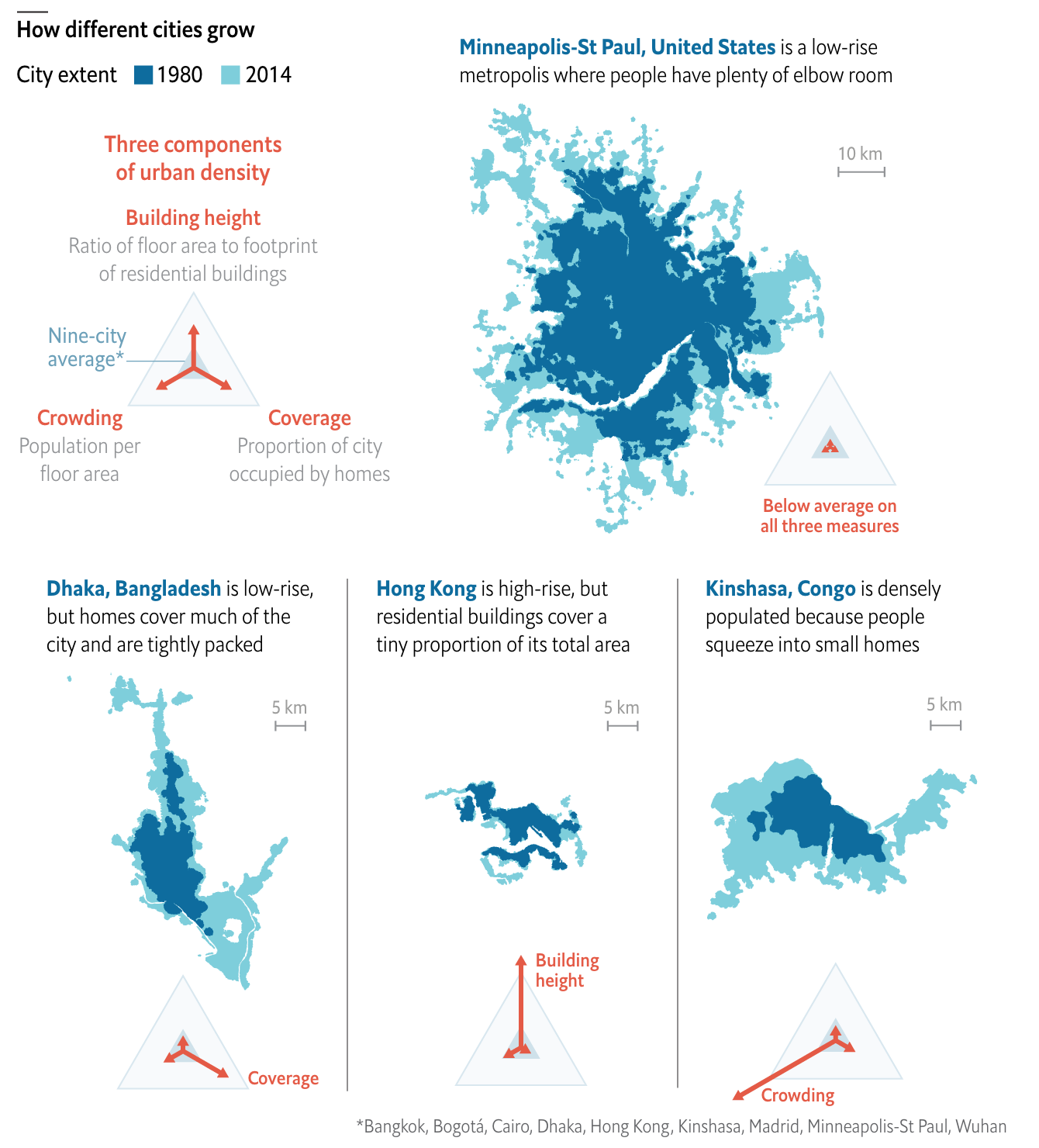
I really like this graphic. It does a great job of using small multiples to compare and contrast three cities that exemplify the different paths. Notably, it keeps each city footprint at the same scale, making it easier to see things such as why Hong Kong builds skyward. Because it has little land. (It is, after all, an island and the tip of a peninsula.)

One area where I wish the graphic had kept to the small multiples is its display of Minneapolis. There, the scale shifts (note the lines for 5 km below vs. Minneapolis’ 10 km). I think I understand why, because the sprawling city would not have fit within the confines of the graphic, but that would have also hammered home the point of sprawl.

I should also point out that the article begins with a graphic I chose not to screenshot, but that I also really enjoy. It uses small multiples to compare cities density over time, running population on the x-axis and people per hectare on the y-. It is not a perfect graphic (it uses I think unnecessary arrowheads at the end of the line), but scatter plots over time are, I think, an underused graphic to show how two variables (ideally related) have moved in tandem over time.

Overall, this is a strong piece from the Economist.

Credit for the piece goes to the Economist graphics department.

Albert Pujols Isn’t Too Bad at That Baseball Thing

On Friday Albert Pujols joined the very elite club of baseball players who have managed 3000 hits in their career. Thankfully FiveThirtyEight covered it with a few graphics in an article that pointed out just how hard it is to do. Especially because, and I did not know this, Pujols did it in a not terribly common fashion. (Funny story, I had to explain this past weekend how Randy Johnson was a ridiculous pitcher, in the lots-of-strikeouts-and-also-exploded-a-bird way.)

My video game version of me would probably be on there if only those games lasted more than one season…

The piece uses a ternary plot, which we can also just call a triangle chart because it is, you know, in the shape of an equilateral triangle, to look at three components of Pujols’ hit skill.

There are different types of hitters in baseball. The guys who crush home runs all the time, the guys who hit singles all the time, guys who walk a lot. (Technically a walk is not a hit, but they are still getting on base.) There are fancy metrics that can be used to tease out just how much power is in a person’s game, and when you compare that to the batting average and to their walk rate, you can see clusters of players.

These kind of charts can be difficult to read—what does it mean for a player in a certain area of the chart? But what the designer did real well here is label an example of the type of player. Ichiro, called out for being a singles machine, is notable because he just sort-of-retired last week. He also has something like another 1500 hits back in Japan. That guy can hit.

Credit for the piece goes to Neil Paine and Rachael Dottle.

The Ratio

And I’m not talking about walking into a bar late at night. Instead, I am talking about the ratio of likes to retweets to replies, which, for those of you unfamiliar with the service, refers to engagement with a person’s tweets on Twitter.

The Ratio does not come from FiveThirtyEight—read the article for the full background on the concept, it is well worth the read—but they applied it to President Trump, whom we all know has a penchant for tweeting. The basic premise of the ratio is that you want more retweets and likes than replies. Think of it like customer reviews. Rarely do people bother to put the effort in to complement good service, but they will often write scathing reviews if something does not fit their expectations. Same in Twitter. If I do not care for what you say, I will let you know. But if I do, it is easy for me to like it, or even retweet it.

Anyway, the point is they took this and applied it to the tweets of Donald Trump and received this chart.

The interactivity makes this chart worth checking out

What I truly enjoy is the interactivity. Each dot reflects a tweet, and you can reveal that tweet by hovering over it. (I would be curious to know if the dots move. That is, do they, say, refresh daily with new tabulations on the updated numbers of likes, retweets, and replies?)

But the post goes on using the same chart form, in both other interactive displays and as static, small multiple pieces, to explore the political realm of previous tweeting presidents and current senators.

A solid article with some really nice graphics to boot.

Credit for the piece goes to Oliver Roeder, Dhrumil Mehta, and Gus Wezerek.