Open Door Cabinets

Here in the States we are accustomed to unstable governments—the Trump administration has set records for the most departures so early in its term. But the United Kingdom is not to be outdone as Amber Rudd, the Home Secretary, resigned in response to an immigration scandal. She makes six the number of cabinet officials who have left the British government.

The Economist put together a small graphic showing how long it took various governments, British and otherwise, to reach the level of so many departures. May’s government has been the fastest to reach so many departures in recent years.

I wonder where the US administration falls…

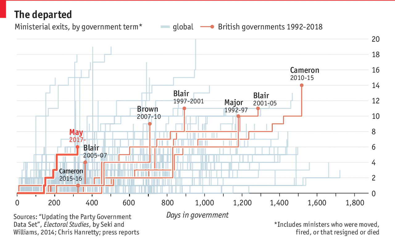
The key thing to note here is what I pointed out last week, which is the use of a thin white stroke on the outside of the lines being highlighted with the Theresa May government using a bolder weight to make it stand out just a wee bit more. This is a bit different than the Times version which uses the outline approach for only what would here be the May line, but it still works overall to draw attention to the British governments.

Credit for the piece goes to the Economist graphics department.

Brexit and the British General Election

On 8 June, Britons will go to the polls in a general election that Prime Minister Theresa May called to increase her parliamentary majority. The United Kingdom faces a number of issues—I am looking at you housing and the NHS for starters—but Brexit is on the minds of a lot of people.

That makes sense, because if you recall the nation split 52–48 to leave the European Union last June. But, as the Financial Times explained the other day, that split is not as even as it used to be and that may have significant ramifications for the Conservative Party not to mention Labour and the Liberal Democrats.

The author explains the piece in nice detail, but this graphic including along with the article does a fantastic job showing the movements.

Who's moved where?
Who’s moved where?

As you can probably guess, I am a huge fan of the annotations. Although I would argue that the centre and lower two, by being placed over the graphic, may be a bit illegible. But the concept is fantastic. It shows you just how difficult it will be for Labour and the Lib-Dems to beat May in June.

Credit for the piece goes to John Burn-Murdoch.