The Evolution of the S&P 500

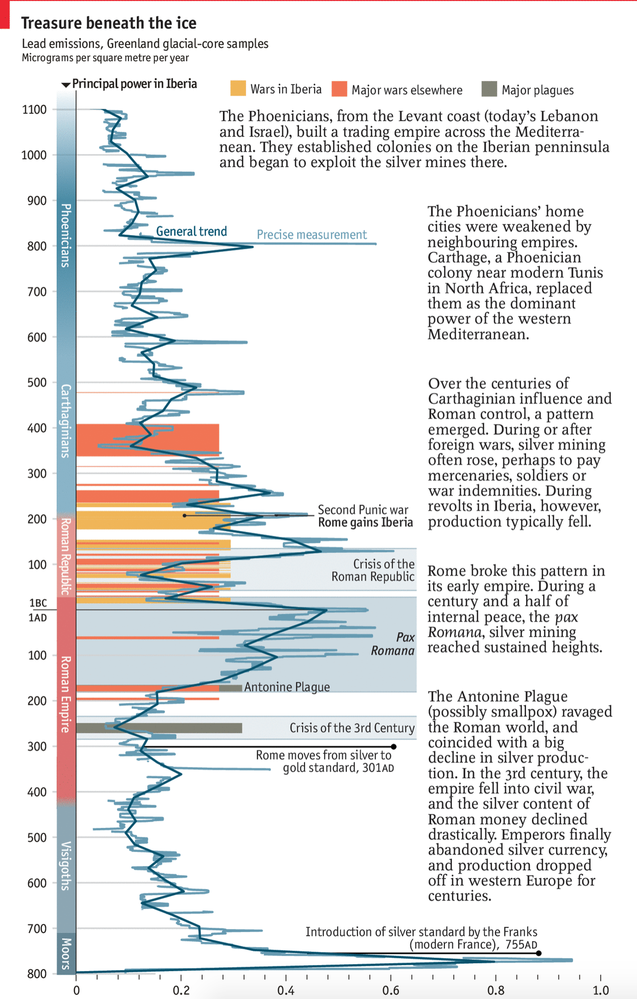
I found myself doing a bit of summer cleaning yesterday and I stumbled upon a few graphics of interest. This one comes from a September 2016 Wall Street Journal article about the changes in the S&P 500, a composite index of American stocks, some of the 500 largest.

In terms of the page design, if it were not for that giant 1/6 page advert in the lower right corner, this graphic could potentially dominate the visual page.  The bulk of it sits above the page’s fold and the only other competing element is a headshot to the upper-right. Regardless, it was clearly enough to grab my attention as I was going through some papers.

The overall page
The overall page

As for the graphic itself, I probably would have some done things differently.

Trees?
Trees?

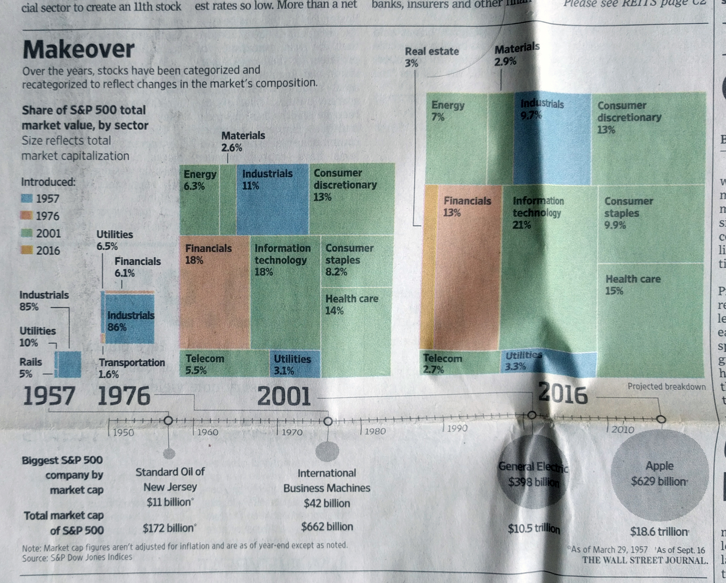
To start, are these actual tree maps? Or are they things attempting to look like tree maps? It is difficult to tell. In an actual tree map, the rectangles are not just arranged by convenience, as they appear to be here. Instead, they are in descending—or perhaps occasionally ascending—area, within groupings.

The groupings would have been particularly powerful here.  Imagine instead of disparate blue boxes for industrials and utilities in the latter two years that they were combined into a single box. In 2001, that box may have been larger than the orange financials. Then by 2016, you would have seen those boxes switch places—in both years well behind the green boxes of 2001 debuts. If instead the goal was to show the percentages, as it might be given each percentage is labelled, a straight bar chart would have sufficed.

I am not always a fan of the circle for sizes along the bottom. But the bigger problem I have here is the alignment of the labelling and the pseudo-tree maps. One of my first questions was “how big are these years?”. However, that was one of the last points displayed, and it is separated from the tree maps from the listing of the largest company in the index from that year. I would have kept the total market cap closer to the trees, and perhaps used the whole length of line beneath the trees and instead pushed the table labels somewhere between the rather large gap from 1976 and 2001.

Credit for the piece goes to the Wall Street Journal graphics department.

Spanish Silver

A few weeks back now the Economist posted a graphic about the link between lead, silver, and the rise and fall of the Roman Empire. But not in the way you probably think. Instead, they graph the appearance of lead deposits in the glaciers of Greenland.

I believe that final Iberian power is meant to be the Moops.

For the full explanation you should read the short article. But this piece was right up my alley. We have ancient history, economics, science, and a timeline. And all in one neat little chart.

Credit for the piece goes to the Economist’s Data Team.

Gun Control Legislation

Back in March I posted about a great graphic from the New York Times editorial board they made in the wake of the Parkland, Florida school shooting. Saturday morning, the day after Friday’s Santa Fe, Texas school shooting, I was reading the paper and found the updated graphic.

That is a whole lot of months since Sandy Hook…

Yeah, almost nothing has changed. Congress passed and the president signed an omnibus spending bill that included language to improve reporting on background checks.

Yeah.

Now from a design standpoint, what’s nice about this graphic is its restrained use of colour. The whole piece works in black and white. Of course it helps that there is nothing to show that needs to be highlighted in the data.

Yeah.

Credit for the piece goes to the New York Times graphics department.

To Infinity—

Wait, wrong film.

No, this weekend is Infinity War. Which is definitely not led by a Buzz Lightyear. For those of you who don’t know, Infinity War is sort of the culmination of ten years of Marvel superhero films, called the Marvel Cinematic Universe, that started with 2008’s Iron Man. Infinity War is the 19th film and brings together more than 30 main characters—and I believe I’ve read elsewhere as many as 85 when you count minor/side characters—into one two-part film. Yes, this will undoubtedly end on a cliffhanger leading into next year’s film.

If we assume each film is two hours (and I don’t think a single one has been under two hours), we are talking about 38 hours of film to watch to catch up before Friday’s release. Because both the previous Avengers films were 2h20m, I think we can round that up to at least an even 40. You know, a full work week.

Well, if your bosses won’t let you watch Marvel films all week, the Washington Post put together a nice interactive timeline that tries to sum it all up for you.

All the characters…but far from true.

What is really neat about the piece, beyond helping me recall just what happened ten years ago, you can filter the timeline based on character and major plot points.

What would be really neat, though I assume someone has already done it, is a social network map showing how all these disparate groups were before this weekend’s film. Get on that, internet.

Credit for the piece goes to Sonia Rao and Shelly Tan.

Where Syria Struck with Chemical Weapons

Friday night the US, UK, and France struck targets in Syria that play a role in the chemical weapons programme of the Bashir al-Assad regime. This is despite “eliminating” his chemical weapons several years ago. And so not surprisingly the media this past weekend covered Syria and the airstrikes. This print piece from the New York Times, however, looked backwards at the history of the chemical attacks Syria has unleashed against its own people.

Note the timeline in the lower-right to provide context of when and how frequent the chemical attacks have been

The map is straightforward and the timeline helpful. Though I would probably have added a point on the timeline highlighting the Ghouta attack of August 2013. That attack prompted the international community to pressure the Assad regime to, again, “eliminate” its chemical weapon stocks. Clearly it hid some sarin and chlorine gas has industrial uses, making it a classic dual-purpose object that is tricky to classify as a weapon. (Though using it against civilians is clearly a weaponised use of the element.)

On a side note, I wanted to point the editorial design here. The overall page is quite nice.

The whole article is well laid out

The map falls squarely within the middle of the article, with a nice gallery of photographs running along the top. It also features a devastating pull quote describing the Syrian government’s use of chemical weapons. The article fits almost entirely above not just the fold, but also another terrible line of text, in this case the title of another article: Officials Have Lost Count of How Many Thousands Have Died in Syria’s War.

Overall, this was a solid piece providing a backdrop and historical context for the news.

Credit for the piece goes to the New York Times graphics department.

Natural Decrease

The New York Times has posted a nice piece with an animated graphic. No, not that piece, I’ll probably cover that next week. This one looks at demographic changes in the United States, specifically in the population change at county levels. A number you arrive at by subtracting deaths from births and excluding migration.

That is a lot of red, especially in the Northeast and Midwest…

Basically what we are seeing is a whole lot of red outside the major cities, i.e. the outer suburbs. The article does a nice job of explaining the factors going into the declines and is well worth its quick read.

Credit for the piece goes to Robert Gebeloff.

Warmer Winters

Philadelphia is expecting a little bit of snow today, 20 March. We should not be seeing too much accumulate if anything, but still, flakes will likely be in the air this evening. That made me think of this piece from just last week where the New York Times looked at the change in winter temperatures across the United States for the last almost 120 years.

Of course, I would be remiss if I failed to mention that climate change does not mean that temperatures always rise. Instead, while the general average trends upward, the curve flattens out meaning more extreme events on both the hot and the cold parts of the spectrum. (Actually, the New York Times covered this very subject well back in August.)

As a cold weather person, yeah, this isn't great…
As a cold weather person, yeah, this isn’t great…

Anyway, the map from the Times shows how the biggest changes have been recorded in the north of the Plains states. But the same general shift is subject to local conditions, most notably in the southeast where temperatures are actually a lit bit lower.

Credit for the piece goes to Nadja Popovich and Blacki Migliozzi.

When No Change or Growth Is the Story

For many years I would often tell people that sometimes a visualisation can be “boring”, because the data itself is boring—a lack of growth in a market, no real mergers, or even steady and consistent but unspectacular growth. Those can all be stories, even if they likely result in very monotone choropleths or straight line charts or perfect steps of bar charts.

And then there are times when the lack of growth or change, when visualised, can be very powerful. I wanted to share this piece from the New York Times with everyone because it does just that.

Starting from the Sandy Hook Massacre and moving through to Parkland

You really need to click through and see the scale and scope, because the designers behind this did a fantastic job of capturing that sense of lack of change in a very large and expansive piece.

Credit for the piece goes to the New York Times Editorial Board.

Continuing Resolutions

The Senate reached a compromise on a two-year budget that increases spending by nearly half a trillion dollars on both the military and domestic programmes. This comes after a series of continuing resolutions, which are temporary spending bills that allow the government to function when the fiscal year has begun, but a budget has not been set.

It should pass the Senate, but there are questions about whether House Republicans will pass the budget because of their concerns about adding to the deficit. If it does pass, it could mark a significant step forward in getting the fiscal house in order.

To see just how chaotic the use of continuing resolutions has been, thankfully we have a piece from FiveThirtyEight exploring that issue. Spoiler: we have used it a lot since the late 1990s.

My favourites are when they are used instead of a budget…

Credit for the piece goes to Gus Wezerek.

Below Stockholm’s Streets

I survived my holidays and hopefully you did as well. My holiday included a two-week trip to Stockholm, Copenhagen, London, and York. Over the next few weeks, you can expect to see posts with graphics and diagrams that I captured whilst on holiday.

Today’s post is about a rather large piece from the Medieval Museum in Stockholm. The city dates probably from the 13th century, but there is no definite date nor any definite explanation of the origin of the name Stockholm. A lot of work thus has to be done via archaeology and this piece, easily twice as tall as me, shows just how deep those artifacts are buried. The years can be seen to the right for a sense of scale.

Layers of history
Layers of history

But why did I love it? Because Converse trainers. And did I ever see so many black Converse walking around.