Roundabouts in Philadelphia

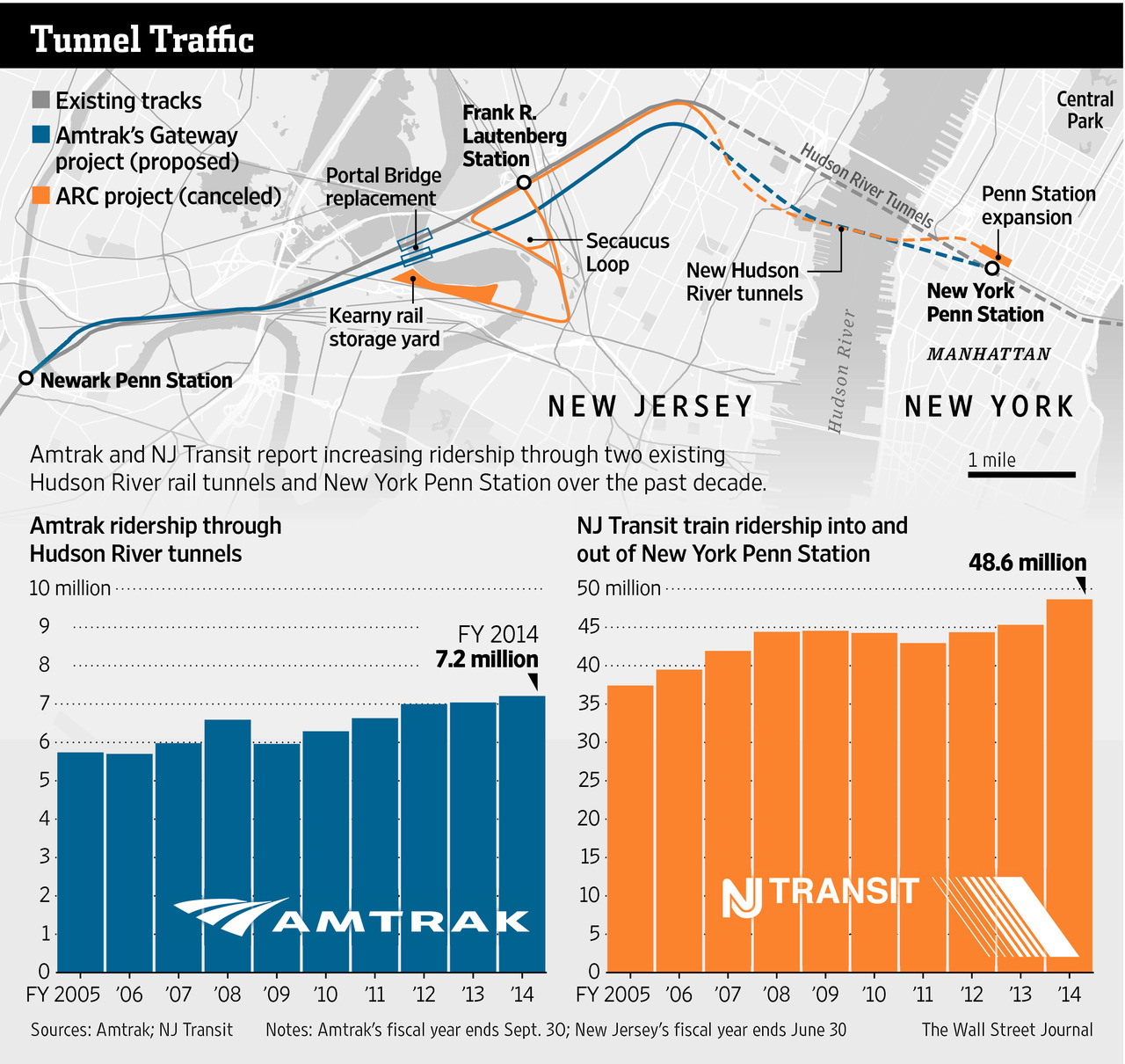
This is a piece I’ve been sitting on for a little while now, okay half a year now. There isn’t too much to it as it’s an illustration overlay on a satellite photo. But the graphic supports an article about the construction of a new roundabout in Philadelphia, coincidentally where I used to live.

That intersection is…tricky to navigate at best as a pedestrian because there are six and a half streets converging at the junction—I give a half to Arizona St because, well, you’ll see shortly. When I lived in the neighbourhood I saw several near accidents between vehicles and pedestrians and vehicles and cyclists. Anything to help improve the safety will be welcome. And that improvement is what the Philadelphia Inquirer covered back in January.

More roundabouts please.

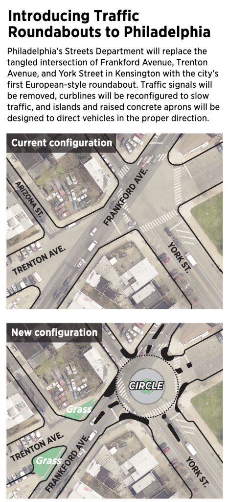
This definitely fits in the category of well done, small graphics. Not everything needs to be large and interactive. This does a great job by using transparency over the satellite image and layering illustration atop the photo.

Now if we could only restore the old rails on Trenton Ave to be some kind of tram/trolley or light rain corridor. Regardless, there are some good restaurants and drinks options in the neighbourhood, so maybe I’ll have to go investigate in person now that going out is an option again. You know, to a do a proper follow-up.

Credit for the piece goes to John Duchneskie.

Traffic Accidents in Philadelphia

I’m working on a set of stories and in the course of that research I came across this article from Philly.com exploring traffic accident in Philadelphia.

Lots of red there…
Lots of red there…

The big draw for the piece is the heat map for Philadelphia. Of course at this scale the map is pretty much meaningless. Consequently you need to zoom in for any significant insights. This view is of the downtown part of the city and the western neighbourhoods.

A more granular view


As you can see there are obvious stretches of red. As a new resident of the city, I can tell you that you can connect the dots along a few key routes: I-76, I-676, and I-95. That and a few arterial streets.

Now while I do not love the colour palette, the form of the visualisation works. The same cannot be said for other parts of the piece. Yes, there are too many factettes. But…pie charts.


This is the bad kind of pie

From a design standpoint, first is the layout. The legend needs to be closer to the actual chart. Two, well, we all know my dislike of pie charts, in particular those with lots of data points, which this piece has. But that gets me to point three. Note that there are so many pieces the pie chart loops round its palette and begins recycling colours. Automotives and unicycles are the same blue. Yep, unicycles. (Also bi- and tricycles, but c’mon, I just want to picture some an accident with a unicycle.)

If you are going to have so many data points in the pie chart, they should be encoded in different colours. Of course, with so many data points, it would be difficult to find so many distinguishable but also not garish colours. But when you get to that point, you might also be at the point where a pie chart is a bad form for the visualisation. If I had the time this morning I would create a quick bar chart to show how it would perform better, but I do not. Trust me, though, it would.

Credit for the piece goes to Michele Tranquilli.

Hudson River Tunnels

Readers of this blog know that I am a fan of rail travel. And in particular, how the rail system on the East Coast is brilliant when compared to anywhere else in the States. Unfortunately, the railway system on the East Coast is also old and in need of serious capital investment. The tunnels linking New York and New Jersey beneath the Hudson River are a prime example. But a few years ago, Governor Christie of New Jersey killed Amtrak’s plans to build new tunnels to provide a backup to the existing infrastructure and increase overall capacity. The Wall Street Journal takes a look at Amtrak’s new plan to cross the Hudson. Let’s hope this venture is a bit more successful.

The new project
The new project

Credit for the piece goes to the Wall Street Journal graphics department.

Walking Down the Street

Business Insider posted a neat graphic that compared the walkability of a suburban neighbourhood outside Seattle to a dense urban neighbourhood in Seattle. Turns out you can walk a lot more and further in a gridded mile than in a faux-organic sprawl.

How far can you walk?

Credit for the piece goes to Sightline Institute.