Choo Choo

I took two weeks off as work was pretty crazy, but we’re back to covering data visualisation and design with a graphic about trains. And anybody who knows me knows how I love trains. One of the early acts of the Biden administration was funding a proper expansion of rail service in the United States.

Last week the Washington Post published an article that explored some of the difficulties Amtrak, the national rail company, faces in that expansion. Most of it has to deal with the fact that outside the Northeast Amtrak largely uses rail lines owned by freight companies.

The article uses a map to show Amtrak routes and, in particular, where Amtrak wants to increase service or create new service.

No Alaska, no Hawaii

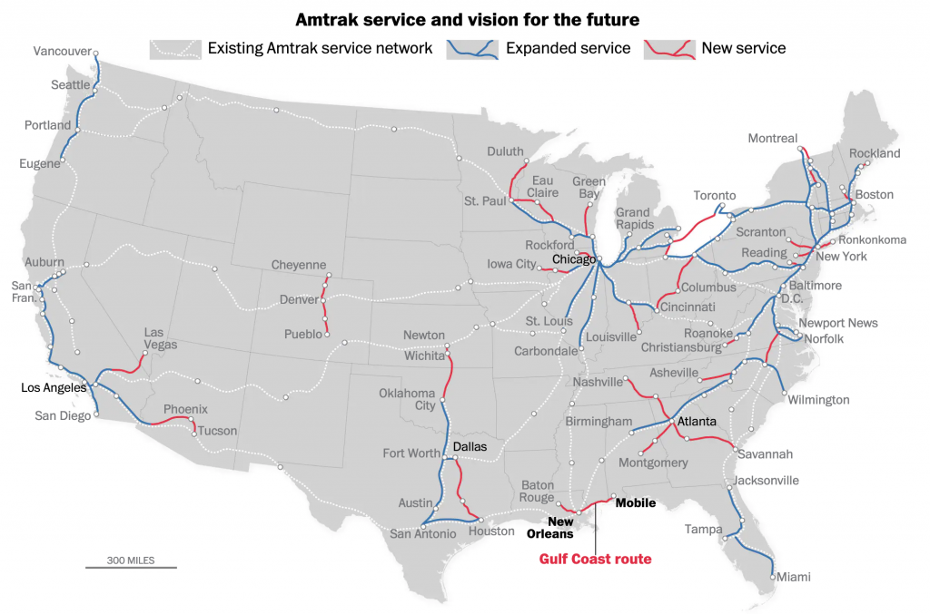
As far as the map goes, it does a nice job needing not to reinvent the wheel. When an existing route will have expanded service, e.g. the Northeast Corridor, the blue line sits next to the dotted white line. What remains a bit unclear to me is the use of black text for Chicago, Atlanta, Dallas, and Los Angeles. The bold type for New Orleans and Mobile makes sense because of the story’s focus on that particular route. Chicago is mentioned once, but Dallas is not. So that is unclear.

But what really stood out to me was what happened when I re-read the story on my mobile. The graphic split from a full map to three narrow graphics, each featuring 1/3 of the United States. The designers moved the text labels so that they are fully visible in each graphic.

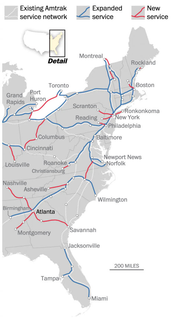
Overall, the piece does a great job at showing the map, but in particular it shines when it swaps out the large map for the smaller graphics on small screens. And the attention to detail in moving the text labels makes it all the better.

Credit for the piece goes to Luz Lazo.

Making Sense of the Interstate Highway System

Happy Friday, everyone. I prefer to travel via Amtrak and intercity rail, but from my flat I can see two routes of the US interstate highway system: I-676 and I-76. And when I drive to my hometown outside Philadelphia, I use those two routes. Plus, I live not far from I-95, the main highway corridor running through the East Coast of the United States.

But what a lot of people do not know is that the numbering system for US interstate highways—by and large—has an underlying principle. (I say by and large because I frequently drive on one of the most infamous exceptions.) Thankfully, the YouTuber CCP Grey just released a video that details the numbering system.

The north-to-south routes

And if you’re curious about that exception, which runs through Altoona, Pennsylvania, here’s a screenshot. But you should watch the full video.

I-99? You can thank a congressman for that one.

Credit for the piece goes to CCP Grey.

Building Back Better Boston Transit

The alliteration failed at that last word, but it gets the point across. No mater how you may want to define infrastructure, the term always includes transit. In the Boston Globe, an opinion piece proposed how the city and region of Boston could improve upon the city’s mass transit options.

And they made a map.

One key flaw remains…

The map is an interesting one. It uses thick purple lines to indicate the commuter rail branches—not the metro/subway lines. The problem is that the outside of those lines then encodes the suggested improvements. An orange outline indicates where tracks should be electrified—Boston still uses diesel engines for some of its commuter rail transit. But the problem is that the dark purple dominates the graphic. If, however, the purple were entirely replaced by an orange line, it would be clearer that the Providence needs electrification. (It’s actually already electrified, as that’s the same line Amtrak uses, but Boston’s transit service still uses diesel engines on the line.)

Similarly, the key to indicate upgraded tracks and signals is a blue line of similar “colour” to the purple. That makes it hard to distinguish between the two, especially when next to the green inline option, representing increased speeds.

The key flaw? A long-time wish for Boston transit lovers (or haters). Note how the system is divided into two, the two main hubs, South Station and North Station, do not connect. Connecting the two will require billions of dollars. But the benefits can be tremendous.

Philadelphia, for example, for decades had two rail hubs: Broad Street Station across from City Hall and Reading Terminal several blocks east along Market Street. Reading Terminal was the terminus for the Reading Railroad and Broad Street Station for the Pennsy, or Pennsylvania Railroad. In 1930, Broad Street Station was replaced by an underground station, today’s Suburban Station. But it would not be until 1984 when rail tunnels would finally be opened linking the western/southern Pennsylvania Railroad lines to the northern lines of Reading. But today you can take a train from a southwest suburb to the far northern suburbs without changing trains because of that connection.

Credit for the piece goes to TransitMatters.

A Very Loud Tube

As all my readers probably know, I love London. And in loving London, I love the Tube and the Oyster Card and all that goes along with Transport for London. But, I have noticed that sometimes when I take the Underground, there are segments where it gets a bit loud, especially with the windows open. The Economist covered this in a recent article where they looked at some data from a London-based design firm that makes noise protective gear. (For purposes of bias, that seems important to mention here.)

The data looks at decibels in a few Underground lines and when the levels reach potentially harmful levels. I took a screenshot of the Bakerloo line, with which I am familiar. (At least from Paddington to Lambeth.) Not surprisingly, there are a few segments that are quite loud.

I definitely recall it being loud

I like this graphic—but like I said about bias, I’m biased. The graphic does a good job of using the above the 85-decibel line area fill to show the regions where it gets loud. And in general it works. However, if you look at the beginning of the Bakerloo line noise levels the jumps up in down in noise levels, because they happen so quickly in succession, begin to appear as a solid fill. It masks the importance of those periods where the noise levels are, in fact, potentially dangerous.

I have had to deal with this problem often in my work at the Fed, where some data over decades is available on a weekly basis. One trick that works, besides averaging the data, is thinning out the stroke of the line so the overlaps do not appear so thick. It could make it difficult to read, but it avoids the density issues at the beginning of that chart.

All in all, though, I would love a London-like transport system here in Philly. I’d rather some loud noises than polluting cars on the road.

Credit for the piece goes to the Economist Data Team.

Baby, It’ Hot Outside Pt 2

Yesterday we looked at Billy Penn’s graphics about the cooler stations and I mentioned a few ways the graphic could be improved. So last night I created a graphic where I explored the limited scope of the data, but also showing how low the temperatures were, relative to the air temperature outside, using weather data from the National Weather Service, admittedly from Philadelphia International Airport, not quite Centre City, which I would expect to be warmer due to the urban heat bubble effect.

I'd be curious to see data for North Philly
I’d be curious to see data for North Philly

I opted to exclude the Patco Line since the original dataset did not include it either. However a section of it does run through Centre City and could be relevant.

Credit for the piece goes to me, though the data is all from Billy Penn and the National Weather Service.

Public Transit of Yesteryear

For my frequent readers, it will be no big surprise that I am avid supporter of public transit, especially the railways. Consequently I was delighted when I read a non-Brexit piece in the Guardian yesterday that looked at public transit systems in several cities.

But it did so by comparing earlier plans or systems to those in existence today.

That's definitely one time I'd like to live in the past.
That’s definitely one time I’d like to live in the past.

Each design is slightly different and reflects the source material for the various cities. But I naturally selected the Philadelphia map. One of the biggest things to notice are the lack of trams/trolleys north of Girard and the addition of the River Line.

Credit for the piece goes to Jake Berman.

Night Tube

Transport for London (TfL), the organisation that runs the London Underground or Tube, has announced a nighttime service called Night Tube. It is not for the entire system, but only a few specific lines. That means that TfL needed a new map. And that means that everyone will want to create their own version of the Night Tube map. So this article at City Metric looks at just that. The TfL version is shown below.

The official TfL map

Credit for the original goes to Transport for London.

Understanding the Boston Subway System

Today’s post is the graduate work of Michael Barry and Brian Card of Worcester Polytechnic Institute. The two looked at the available public data of the Massachusetts Bay Transportation Authority (MBTA)—the T to those that know—to better understand the Boston area subway system. Here the subway system refers to the heavy rail lines, i.e. the Blue, Orange, and Red lines.

T stations
T stations

In short, the piece has a lot to look at that is worth looking at. This particular screenshot is an analysis of the stations across all times on average weekdays and weekends. You can see how in this particular selection, the size of the station markers pulse depending upon the time of day and the number of turnstile entries. Meanwhile the charts to the right show you the density through time of said entries and then compares the average number of turnstiles entries per day. Text beneath the system map to the left provides a short analysis of the data, highlighting work vs. home stations.

Credit for the piece goes to Michael Barry and Brian Card.

Massimo Vignelli Dies

Massimo Vignelli died yesterday at the age of 83. Fastco has a much better article than I think I could read, this image is from their piece but is of Vignelli’s transit map for New York. I wrote about an interactive piece several years back that allowed you to compare Vignelli’s map to the new system map for the MTA.

Vignelli's subway map
Vignelli’s subway map

Credit for the piece goes to Massimo Vignelli.

New Transit Map for Springfield

Springfield from the Simpsons, of course. Happy Friday, and have fun visiting the Ethnictown station. The article comes from Atlantic Cities.

Springfield's transit map
Springfield’s transit map

Credit for the piece goes to the designers of the Simpsons.