Baby, It’s Hot Outside

Those of you living on the East Coast, specifically the Mid-Atlantic, know that presently the weather is quite warm outside. As in levels of dangerous heat and humidity. Personally, your author has not left his flat in a few days now because it is so bad.

Alas, not everyone has access to air conditioning in his or her abode. Consequently, they need to look to public spaces with air conditioning. Usually that means libraries or public buildings. But here in Philadelphia, have people considered the subway?

Billy Penn investigated the temperatures in Philadelphia’s subsurface stations along the Broad Street and Market–Frankford Lines—Philadelphia’s third and oft-forgot line, the Patco, was untested. What they found is that temperatures in the stations were significantly below the temperatures above ground. The Market–Frankford stations, for example, were less than 100ºF.

Just explore the rails…

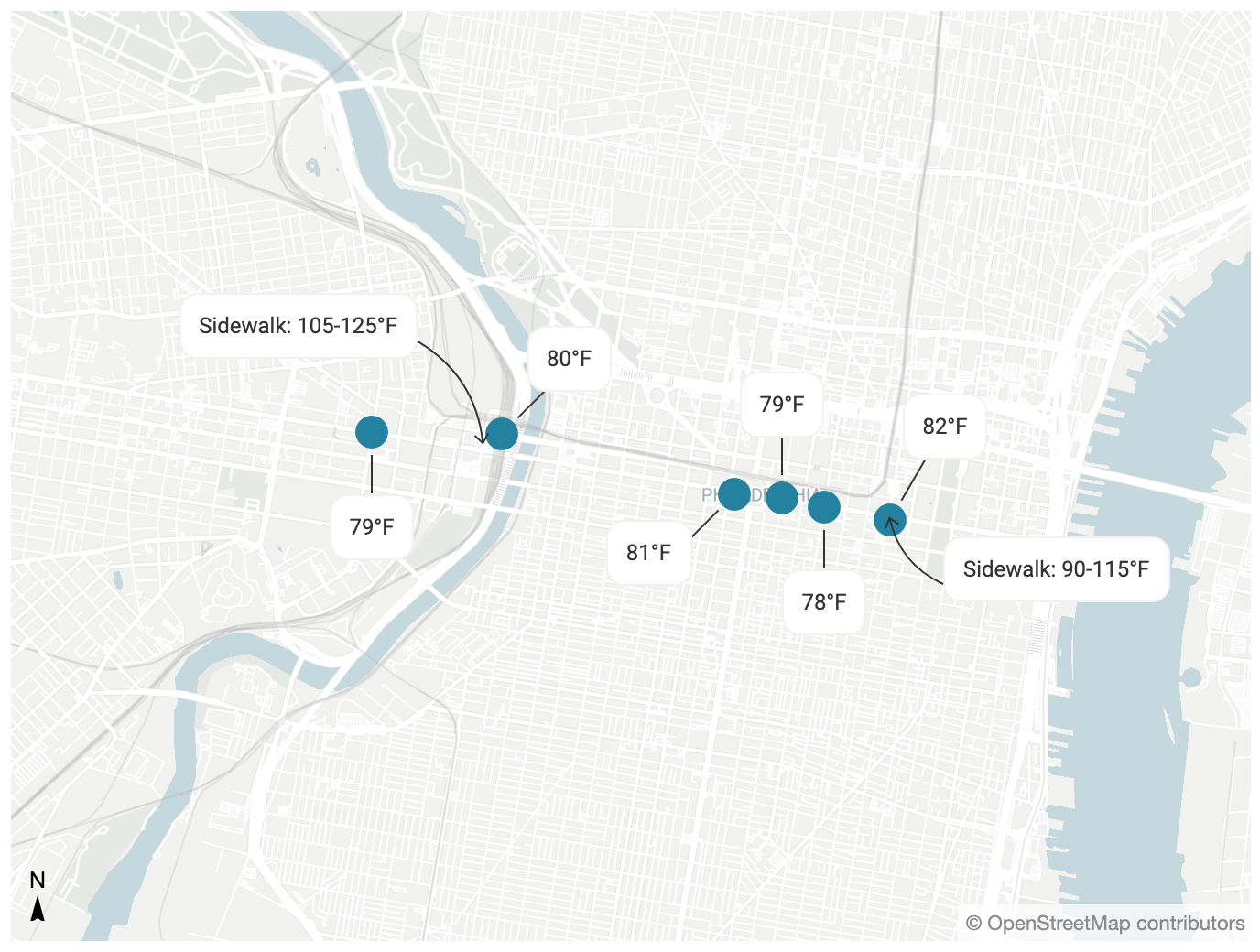
Of course that misses the 2nd Street station in Old City, but otherwise picks up all the Market–Frankford stations situated underground.

Then there is the Broad Street Line.

More rail riding…
More rail riding…

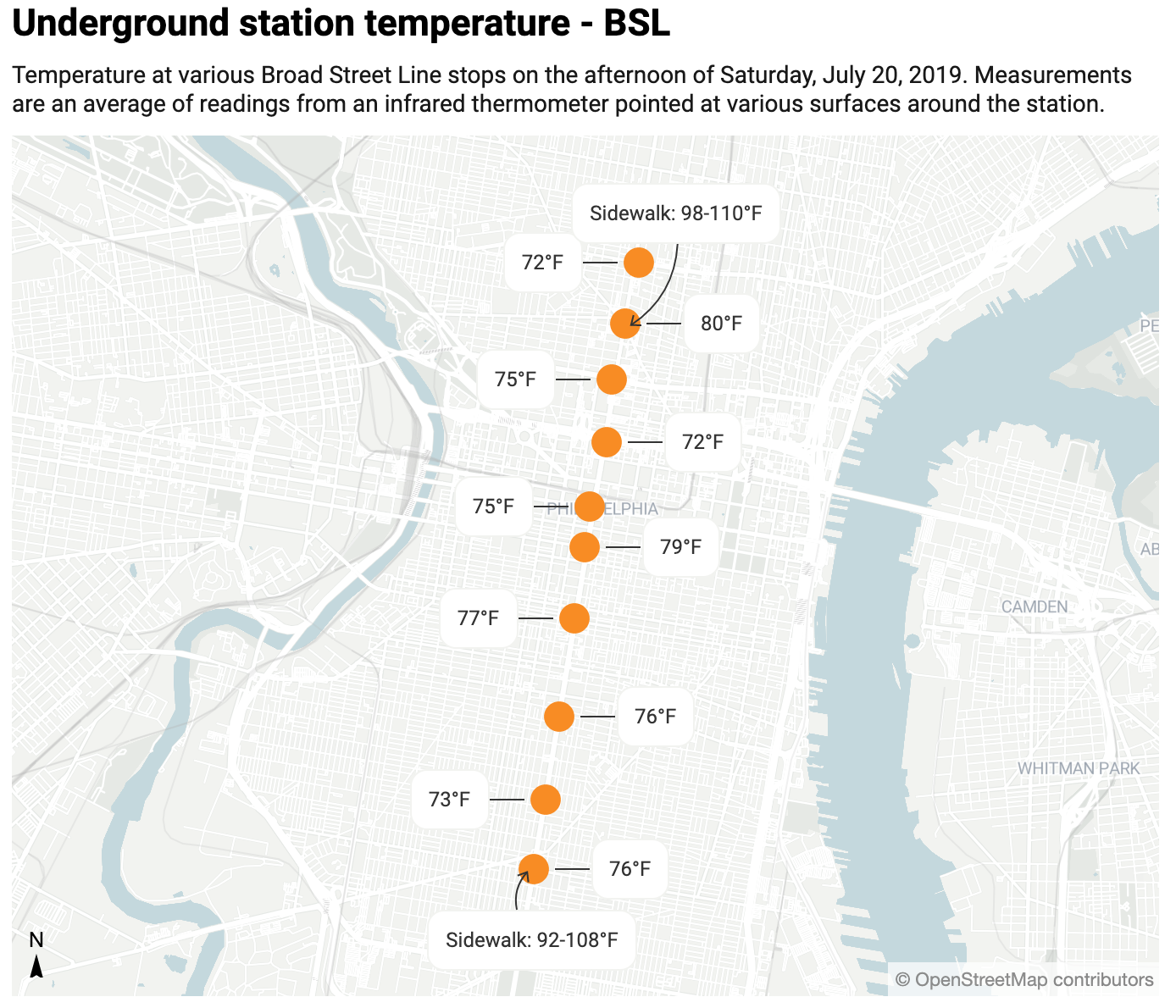
Here, I do have a question about why the line wasn’t investigated from north to south. It ran only as far north as Girard, stopping well short of north Philadelphia neighbourhoods, and then as far south as Snyder, missing both Oregon and Pattison (sorry, corporately branded AT&T) stations. The robustness of the dataset is a bit worrying.

The colours here too mean nothing. Instead blue is used for the blue-coloured Market–Frankford line and orange for the orange-coloured Broad Street line. (The Patco line would have been red.) Here was a missed opportunity to encode temperature data along the route.

Finally, if the sidewalk temperatures were measured at each station, I would want to see that data alongside and perhaps run some comparisons.

This is an interesting story, but some more exploration and visualisation of the data could have taken it to the next level.

Credit for the piece goes to Danya Henninger.

Public Transit of Yesteryear

For my frequent readers, it will be no big surprise that I am avid supporter of public transit, especially the railways. Consequently I was delighted when I read a non-Brexit piece in the Guardian yesterday that looked at public transit systems in several cities.

But it did so by comparing earlier plans or systems to those in existence today.

That's definitely one time I'd like to live in the past.
That’s definitely one time I’d like to live in the past.

Each design is slightly different and reflects the source material for the various cities. But I naturally selected the Philadelphia map. One of the biggest things to notice are the lack of trams/trolleys north of Girard and the addition of the River Line.

Credit for the piece goes to Jake Berman.

Similar Airspeed Patterns

Yesterday we looked at the isolation of the US and Canada in keeping the Boeing 737 Max aircraft in the air. Later that day, both countries grounded those aircraft. Today in the print edition of the New York Times the front page used significant space to chart the vertical speed of the two crashed aircraft.

They are remarkably similar…

It uses the same scale on the y-axis and clearly shows how the aircraft gaining and losing vertical speeds. I am not sure what is gained by the shading below the 0 baseline. I do really enjoy the method of using a chart below the airspeeds to show the periods of increasing and decreasing vertical speed.

Credit for the piece Jin Wu, K.K. Rebecca Lai, and Joe Ward.

The US Flies Alone

On Sunday, a Boeing 737 Max 8 aircraft crashed shortly after taking off from the airport in Addis Ababa, Ethiopia. This was the second crash in less than a year, since the another 737 Max 8 crashed into the sea shortly after taking off from Jakarta, Indonesia. And in the intervening months, there have been numerous reports to American regulators from pilots of problems with aircraft in flight. Unsurprisingly, international regulators have begun to take steps to protect their skies and their passengers from what might be an unsafe aircraft. American regulators, the Federal Aviation Administration, remains unconvinced.

Consequently, the New York Times put together a graphics-driven article that details just how extensive the global grounding of 737 Max 8 aircraft has been in the last 24 hours.

There's a lot more orange than blue.
There’s a lot more orange than blue.

It’s a route map to headline the article. And it shows that almost all aircraft on 737 Max 8 routes, except for those in Canada and the United States, have been grounded.

The rest of the article makes use of more maps highlighting the countries who civil aviation authorities have grounded flights and popular routes. It also includes a bar chart showing how many 737 Max 8 aircraft are in use with each airline and how many of those airlines have had their fleets grounded.

Overall, it’s a strong article that makes great use of graphics to illustrate its point about the magnitude of the grounding and the isolation of the United States and Canada.

Credit for the piece goes to Denise Lu, Allison McCann, Jin Wu, and K.K. Rebecca Lai.

New Plans for Old Subways

The New Yorkers among my readers know about the whole planned shutdown of the L train for repairs owing to Hurricane Sandy (tangentially mentioned in the graphic I commented upon yesterday). For those of you who don’t know, basically the salt water from the storm seriously damaged the tunnels and a whole lot of work needs to be done to repair them. The plan was that a segment of the line would be shut down, to no obvious insignificance to commuters along the route, and it would reopen in a year and a half.

Then the state governor realised that might be bad optics and since he controls the agency running the New York subway system, he cancelled the shutdown so engineers can look at a different type of design.

I love pieces like this one from the New York Times. They are not crazy and wide-ranging, instead we have illustrations to compare the plans. They do a really nice job complementing the story without overwhelming it.

The proposed design
The proposed design

Plus, I’m a sucker for train and infrastructure stories.

Credit for the piece goes to Anjali Singhvi and Mika Gröndahl.

The New Longest Flight

You might recall that back in March I wrote about the use of spherical maps to show great circles. This helps illustrate the actual routes that aircraft take in flight. (Yes, actual flight plans deviate based on routes, weather, traffic, &c.) At the time I wrote about how there was a soon-to-be Singapore–New York route. Ta da.

That's just a long time in one aircraft.
That’s just a long time in one aircraft.

Nothing fancy here in this graphic from the Economist. It probably is just a reuse of the original but with the additional routes removed. But, I still love these kinds of maps. From a design manager standpoint, in a way this is great efficiency in that an element from a graphic made once can now, with minimal effort, be used in a second piece. And not in a meaningless, throw-in way, but this graphic does very much help to illustrate the actual route and long across the globe it travels.

In a second note, not related to the graphic itself, I want to point out a subtle change made by the Economist. This is the first online graphic to use an updated chrome, which is the branding elements that surround the actual content of the piece.

Slight changes
Slight changes

The biggest change is a new or modified typeface for the graphic header. I have not seen anything about design changes at the Economist, but I will look into it. But the changes are, again, subtle. The best example in these two comparisons (new on the left, old on the right) is the shape of the letter e.

E, as in Economist
E, as in Economist

You can see how the terminal, or the part of the letter hooking and swinging out at the bottom, used to come to an end at an angle. Now it ends with a vertical chop. I haven’t looked too extensively at the typeface, but given the letter e, it appears to be a little bit wider of a face.

The other change, not quite as subtle, is the positioning of the iconic red rectangle around which so much of the Economist’s brand hangs. Bringing back the above graphic, you can see where I drew a black line to indicate the edge of the original graphic.

Slight changes

The box is now orientated horizontally (again, new is on the left), which actually brings it closer to the actual Economist logo. But, and probably more importantly, it allows the graphic’s edge to go to the, well, edge. And since their site uses generous whitespace around their graphics, they don’t necessarily need margins within the graphic.

They have also chosen to raise the level at which the header starts, i.e. there is less space between the red rule at the top of the graphic and the start of the words. This, however, appears to have been possible in the original design.

As more graphics roll out, I am going to be curious to see if there are other changes. Or even just to see how these subtle changes affect the rest of the graphics.

Credit for the piece goes to the Economist Data Team.

The James Webb Telescope: Delayed Again

A few weeks ago it was announced that NASA’s James Webb space telescope would see its launch delayed again. The successor to the Hubble telescope was originally supposed to launch several years ago, but now it won’t fly until at least 2021. Thankfully xkcd covered this slipping launch date.

Sad trombone
Sad trombone

Credit for the piece goes to Randall Munroe.

Southwest 1380

On Tuesday, Southwest Flight 1380 made an emergency landing here in Philadelphia after the Boeing 737-700’s port engine exploded. One passenger died, reportedly after being partially sucked out of the aircraft after the explosion broke a window. But the pilot managed to land the aircraft with only one engine and without any further deaths.

I wanted to take a look at some of the eventual graphics that would come out to visually explain the story. And as of Thursday, I have seen two: one from the Guardian and another from the New York Times.

The Guardian’s piece is the simpler of the two, but captures the key data. It locates the engine and the location of the window blown out by debris from the engine.

The Guardian's graphic
The Guardian’s graphic

The New York Times’ piece is a bit more complex (and accompanied elsewhere in the article by a route map). It shows the seat of the dead passenger and the approximate locations of other passengers who provided quotes detailing their experiences.

The Times' graphic
The Times’ graphic

So the first thing that struck me was the complexity of the graphic. The Times opted for a three-dimension model whereas the Guardian went with a flat, two-dimensional schematic of the aircraft. Notice, though, that the seating layout is different.

Four rows ahead of the circled window location are two seats, likely an exit row, in the Guardian’s graphic where in the Times’ piece they have a full three-seat configuration. If you check seating charts—seatguru.com was the first site that came up in the Google for me—you can see that neither configuration actually matches what the seating chart says should be the layout for a 737-700. Instead it, the Guardian’s more closely resembles the 737-800 model.

The 737-700 layout from SeatGuru.com
The 737-800 layout from SeatGuru.com

Nerding out on aircraft, I know. But, it is an interesting example of looking at the details in the piece. The Guardian’s piece is far closer to the layout, as least as provided by SeatGuru, and the New York Times’ is more representative of a generic narrow-body aircraft.

Personally, I prefer the Guardian in this case because of its improved accuracy at that level of detail. Though, the New York Times does offer some nice context with the passenger quotes. Unfortunately, the three-dimensional model ultimately provides just a flavour of the story, compared to the drier, but more accurate, schematic depiction of the Guardian.

Credit for the Guardian piece goes to the Guardian’s graphics department.

Credit for the New York Times piece goes to Anjali Singhvi, Sahil Chinoy, and Yuliya Parshina-Kottas.

Finding Yourself on the Pennsylvania Turnpike

I hope you all enjoyed your Easter holidays. Easter, wasn’t that two weekends ago you ask. Catholic/Protestant Easter, yes. This past weekend was Orthodox Easter. And since that is what my family celebrates, I was away on holiday this past weekend and only got back in town last night. But on the way out to the ancestral stomping grounds in western Pennsylvania, I realised that the Pennsylvania Turnpike Commission put a little bit of thought into the signage at their more modern service plazas.

The façade of the service plaza

The outside is basically what you expect, the symbol of the Pennsylvania Turnpike and the name of the plaza. But if you look closer, the name of the plaza, in this case the Lawn plaza outside of Lawn, Pennsylvania, is set not just on a blue sign, but a cropping of a blue map of the commonwealth.

This is where I was, where were you?

The yellow lines represent the Pennsylvania Turnpike and, with right being east, the Northeast Extension. The red star represents your current location along the turnpike system. Is this going to tell you how many miles until your next exit? No. I had to go inside and find out how many miles to Bedford, PA on a larger display map. But, this provides a wonderful low-fidelity display. After all, I roughly know where I am headed on the turnpike, and I know whence I came. So I can see that I am a little under half-way to my destination.

Credit for the piece goes to the designers of the Pennsylvania Turnpike Commission.

Circle This

Last week I met a friend for drinks and part of our conversation was about how on a trip to east Asia, he flew from New York and then over the North Pole. The North Pole! I then explained it was cool, but not unique. Instead aircraft typically fly between destinations via great circles. Basically, the shortest distance between two points on the Earth is a straight line, but remember the Earth is not exactly flat. Its spherical nature means that the shortest distance sometimes is what you would see as a curve on a flat map. And sometimes, those curves are shortest when plotted over the North Pole, because unlike a flat map, the east and west ends really do connect.

Lo and behold, yesterday the Economist published a piece about a new non-stop flight between London and Perth, on Australia’s southwest coast. The graphic shows the ten longest commercial flight paths. And what do you know, one of the longest is a soon-to-be flight from New York to Singapore that flies near the North Pole.

Great circles are cool.

Of course the key to this type of diagram is the type of projection. Instead of using the Mercator-like map made popular by direction-focused maps like those of Google, here we see an orthographic presentation. It presents the Earth as if we were to see it from space, allowing us to see the fullness of the flight paths. Tellingly, those that appear to cross the middle of the map are shown as straight lines (Atlanta to Johannesburg), but those nearer the edges show the curvature of the great circles (Houston to Sydney).

Credit for the piece goes to the Economist graphics department.