Data Displays

This past weekend I saw the film Darkest Hour with one of my mates. The film focuses on Winston Churchill at the very beginning of his term as prime minister. Coincidentally I was walking through some of the very rooms and corridors depicted in the film—and rather accurately I should say—just one week prior.

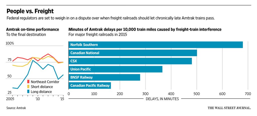
One of the things in the real place that caught my eye in particular was the Map Room Annex. Most people know about the Map Room proper, from which the British Empire’s war effort was coordinated, but the annex contained data on wartime casualties, material production, &c. Consequently the walls were lined with displays of that data. But this was also the early 1940s and so none of it was computerised. Instead, we had handmade charts.

Alas, the space is quite narrow and the museum was quite crowded. So I only managed a snapshot or two, but I think this one does some justice to the hardworking folks producing charts about the war.

They were not made to be mobile-friendly or responsive…

Credit for the piece goes to some junior officer/staffer back in the day.

Airport Codes

I managed to find myself in a handful of airports over the last few weeks. Consequently I brushed up on my airport codes, the three-letter abbreviations you often find on boarding passes and data displays. Well, if only I had seen this particular reference from xkcd.

Oh PHL…
Oh PHL…

Credit for the piece goes to Randall Munroe.

The Sinking of the Vasa

In 1628, Sweden launched one of its largest and most powerful warships not just in Sweden, but in all of Europe. She was to participate in the wars with Poland and Lithuania as Sweden sought to expand her growing empire. After two years of construction in Stockholm’s naval yard she set sail into a calm day with a light breeze.

After a strong gust pushed her hard to port, she righted herself and continued to set sail to a fortress to load 300 troops for the war. But only 20 minutes into her maiden voyage, a second gust of wind pushed her again hard to port so much so that water began to flood in via her open lower gunports. As the continued to rush in, she never righted herself and sank, not to be recovered for 300 years.

The recovery itself is a great story, but the question was why did she sink? This model in the large Vasa museum, built to host the recovered and preserved ship, shows just how dangerously she was designed. Take careful note of the faint blue waves signifying the waterline of the ship and how close they are to the lower gunports.

Note the waterline on the lower crossbeam of the barrel to which the model is connected

The short takeaway is that the ship was top-heavy and she needed to be both wider and deeper to support her displacement. I like the model here, but my one complaint with it is the waterline. Even when I was standing in front of it, I did not notice the waves at first. A little bit more emphasis or paint, perhaps to show the water beneath the ship, would really help to convey just how little of the ship was below the waterline.

Credit for the piece goes to the Vasa Museum design staff.

Building New Railways in America

I wasn’t expecting this piece to fall into the queue for today, but you all know me as a sucker for trains. So today we have this nice set of small multiples from the Guardian. It looks at…I guess we could call it train deserts. They’re like food deserts, except we’re talking about trains.

Some of the US train deserts

What strikes me is that in a perfect world at least three of these could be on one direct line. You can almost draw a straight line from Columbus, Ohio to Nashville, Tennessee and hit Louisville, Kentucky. Obviously things like property get in the way, but it is something to note.

Credit for the piece goes to Jan Diehm.

Septa’s Train and Trolley Service

Well, everyone, today you get two posts. The first and earlier (and planned) post is about polling in Pennsylvania. Relevant to those of you following the US election. But today’s post is about what trains are running in the city of Philadelphia.

If you haven’t heard, the city’s mass transit agency, SEPTA, and its primary union for workers within the city cannot come to an agreement on a contract. So…strike. And for those of you reading this from outside the Philly area, rest assured it’s just chaos right now. To put it into a wee bit of perspective, we have this graphic—actually an interactive map—of train routes in the city. And by train, Philadelphia has your standard suburban commuter heavy rail and subway lines and light rail lines, but we also make use of a number of trolley lines.

What's running and not
What’s running and not

What the map does not show are the city’s various bus routes, all of which that run within the city are suspended. There are bus routes and rail lines outside the city, most notably the commuter rail or the blue lines in the map, operated by a different union that is not on strike.

Credit for the piece goes to the Philly.com graphics department.

China’s Straddling Bus

Apologies for the lack of posts the last two days. I visited Wisconsin to trace some of the courthouse records of the Spellacys. And while I will try to return to them later next week, today we go to China.

During my recent holidays, the media made much ado about a new straddling bus in China. Except that it’s not that new. And now it might not be real or at least really viable. I recalled this graphic from 2012 via the Guardian and decided it would be relevant to try and explain how the bus should work.

How the straddling bus works

Credit for the piece goes to Graphic News.

Long-distance Amtrak

Today’s post is not super complex, but we all know I am a sucker for transit. Especially Amtrak. Back home on the East Coast, it runs both quickly and reliably along the Northeast Corridor and the Keystone Corridor. But as this graphic from the Wall Street Journal shows, that does not quite hold up for the longer distance Amtrak routes. Why? Freight trains.

Long distance is always difficult

Credit for the piece goes to the Wall Street Journal graphics department.

Striking the Balance Between Airline Prices and Service

Yesterday I took a look at the Alaskan Airlines and Virgin America merger. Part of the disappointment on the internets centres around the service and experience delivered by Virgin. I mean who doesn’t like mood lighting, right? Well the Economist took a look at international airlines by both price and service. And if we use Virgin Atlantic as the best proxy for Virgin America, you can see why people prefer it over American carriers.

Price vs. service
Price vs. service

Credit for the piece goes to James Tozer.

Merging Alaska Airlines and Virgin America

Alaska Airlines and Virgin America made some news the past few days when they announced Alaska would purchase Virgin America for $2.6 billion. I mapped out the flight routes of the two carriers to see where they overlapped. You can see the results in my piece for the blog today below.

A brief look at the merger of Alaska Airlines and Virgin America

Credit for the work is mine, except the underlying map, which I sourced from Brigham Young University Geography Department.

Fighting Off My Jet Lag

As I mentioned earlier this week, I visited London for work for a week and then took some rollover holiday time to stay around London and then visit Dublin. But now I am back. And this week that has meant all the jet lag. And while everybody experiences jet lag and recovers from it differently, I wanted to take a look at my experience. The data and such is below. But the basic point, it is about four days before I return to normal.

What is missing, unfortunately, is the Chicago-to-London data. Because anecdotally, that was far, far worse than the return flight.

My sleeping periods are in purple

Credit is my own.