Impeachment 2: The Insurrection

Like many Americans I closely followed the outcome of yesterday’s historic vote by the House of Representatives to impeach President Trump for his incitement of an insurrection at the US Capitol in a failed coup attempt to overturn the 2020 election.

Words I still never thought I’d write describing an American election.

So at the end of the vote, I created this first graphic to capture the bipartisan nature of the impeachment. Ten Republicans broke ranks and voted with the Democrats. Keep in mind that in 2020, zero Republicans did the same. Justin Amash had by then resigned from the Republican Party and sat as an independent.

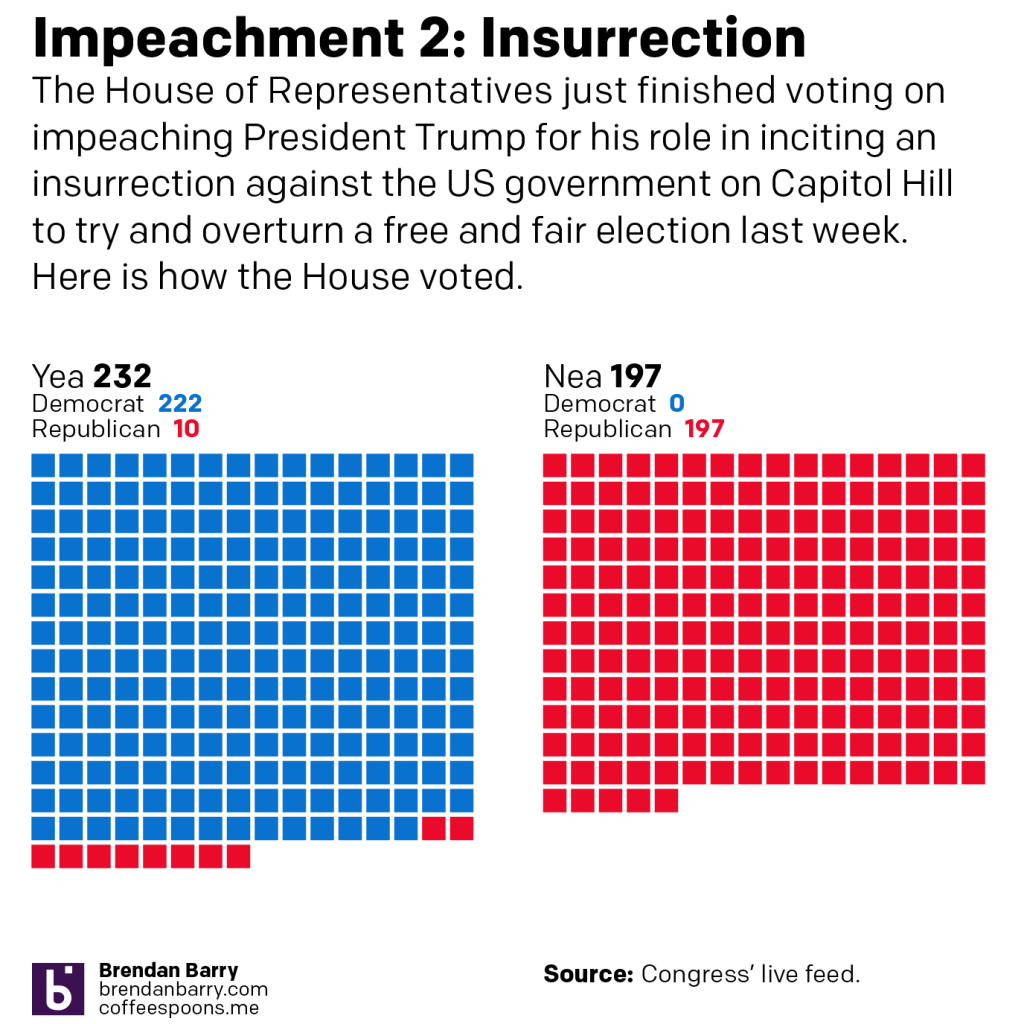
But I was also interested in how “courageous” these votes could be seen. Trump remains immensely popular with his base despite his attempt to overthrow the US government and keep himself in power. Did the Republicans who supported impeachment sit in districts won by Biden?

The answer? Not really. Two did: congressmen from New York and California. But a look at the other eight reveals they represent Trump-supporting districts.

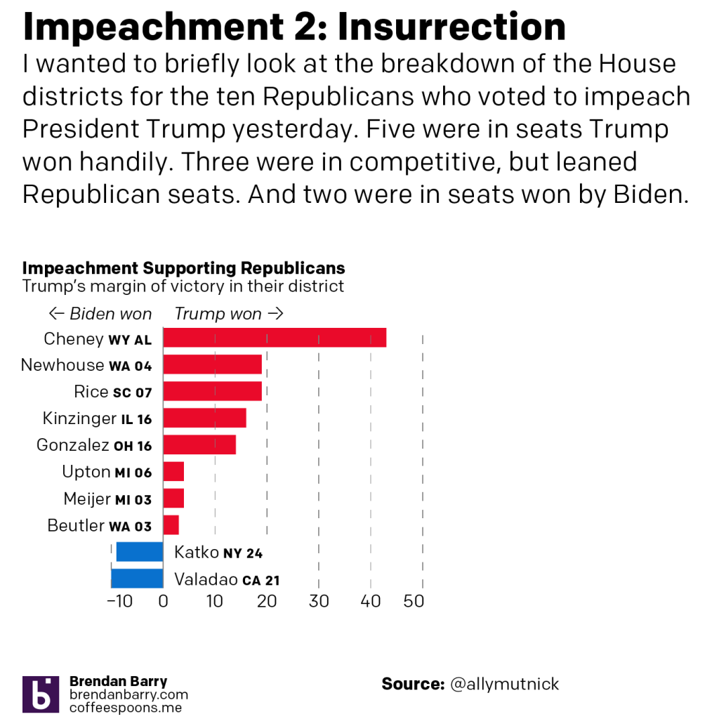
To be fair, there are probably three tiers of seats in that group. Liz Cheney, the No. 3 Republican in the House, is in her own Trump-supporting seat as Wyoming’s at large representative. But four other Republicans have seats where Trump won by more than 10 points.

Three more Republicans are in seats I’d label competitive, but lean Republican.

Clearly the argument can be made that for most of these Republicans, it was not a politically safe choice to vote for impeachment. House seats will be redistricted this year for the 2022 midterms, but I’ll be curious to see how these Republicans fare in those redistricting proceedings and then in the ultimate elections thereafter.

Credit for the piece is mine.

Trump’s White Wall

I meant to publish this yesterday, but this piece also offers a reminder that the hardest part of a data-driven story is usually finding the data. I was unable to find a single source of data for all the numbers I needed by the time I switched on for work. And so this had to wait until last night when I found what I needed.

And of course upon waking up this morning I found a few new articles with the data and more recent figures.

Since 2016, Trump has made building a great, big, beautiful wall on the US-Mexican border his signature policy. Of course, most illegal immigrants cross the border legally at checkpoints and normal ports of entry. A significant number are people who overstay the limits on their visas. So the efficacy of a great, big, beautiful wall is really not that great.

He also claimed that he would make Mexico pay for it.

So as he prepares to leave office, Trump this week is going on something of a victory tour and touting up his administration’s successes. The first stop? Alamo, Texas to highlight his wall.

Let’s look at that wall and how much the administration has accomplished.

For context, the US border with Mexico is nearly 2000 miles long. As of 18 December, the administration had built 452 miles, less than a quarter of the border’s total length.

Crucially, most of that construction merely replaced sections of existing wall and fence scheduled for replacement. The total amount of new wall built, as of 18 December, totals about 40 miles.

The cost of that 452 miles? More than $15 billion.

How much has Mexico paid? $0.

Credit for the piece is mine.

Trumpsylvania

After working pretty much non-stop all spring and summer, your humble author finally took a few days off and throw in a bank holiday and you are looking at a five-day weekend. But, because this is 2020 travelling was out of the question and so instead I hunkered down to finish writing/designing an article I have been working on for the last several weeks/few months.

The main write-up—it is a lengthy-ish read so you may want to brew a cup of tea—is over at my data projects site. This is the first project I have really written about for that since spring/summer 2016. Some of my longer-listening readers may recall that the penultimate piece there I wrote about Pennsyltucky was inspired by work I did here at Coffeespoons.

To an extent, so is this piece. I wrote about Trumpsylvania, the political realignment of the state of Pennsylvania. 2016 and the state’s vote for Donald Trump was less an aberration than many think. It was the near-end result of a decades-long transformation of the state’s political geography. And so I looked at the data underlying the shift and how and where it occurred.

And originally, I had a slightly different conclusion as to how this related to Pennsylvania in the upcoming 2020 election. But, the whole 2020 thing made me shift my thinking slightly. But you’ll have to read the whole thing to understand what I’m talking about. I will leave you with one of the graphics I made for the piece. It looks at who won each county in the state, but also whether or not the candidate was able to flip the county. In other words, was Clinton able to flip a Republican county? Was Trump able to flip a Democratic county?

Who won what? Who flipped what?

Let me know what you think.

And of course, many, many thanks to all the people who suffered my ideas, thoughts, and early drafts over the last several weeks. And even more thanks to those who edited it. Any and all mistakes or errors in the piece are all mine and not theirs.

Credit for the piece is mine.

Super Spreading Garden Parties

If you were unaware, in the wee hours of Friday, President Trump announced that he had tested positive for the coronavirus that causes Covid-19. It should be stated in the just three days hence, there is an enormous amount of confusion about the timeline as the White House is not commenting. From the prepared statement initially released it seems Trump first tested positive Wednesday. But that statement was then changed to fit the diagnosis in the wee hours of Friday morning. But just last night I saw reporting saying that test was actually a second, confirmatory test and the president first tested positive earlier Thursday.

The timeline is also important because it would allow us to more definitively determine when the president was infected. The reporting indicates that he caught the virus at a Rose Garden ceremony at the White House to introduce his Supreme Court nominee, Amy Coney Barrett. This BBC graphic does a great job showing who from that ceremony has tested positive with the virus.

The photo also does a great job showing how the seven people there were situated. Six of the seven did not wear masks, only North Carolina Senator Thom Tillis did. There is no social distancing whatsoever. And not shown in this photo are the indoor pre- and post-ceremony festivities where people are in close quarters, mingling, talking, hugging, shaking hands, all also without masks.

It should be noted others not in the photograph, e.g. campaign manager Bill Stepien, communications advisor Hope Hicks, and body man Nicholas Luna, have also now been confirmed positive.

The final point is that this goes to show how much the administration does not take the pandemic seriously. Right now the Covid data for some states indicates that the virus is beginning to spread once again. And so maybe this serves as a good reminder to the general public.

Just because you are socialising outdoors does not make you safe. Outdoors is better than indoors. No gatherings is better than small gatherings is better than large, well attended garden parties. Masks are better than no masks. Rapid result test screening is better than no test screening. Temperature checks are better than no temperature checks.

But the White House only did that last one, temperature checks, in order to protect the president before admitting people to the Rose Garden. Compare that to how they protect the president from other physical threats. He has Secret Service agents standing near him (or riding with him in hermetically sealed SUVs for joyrides whilst he is infected and contagious); he has checkpoints and armed fences further out to secure the perimeter. Scouts and snipers are on the White House roof for longer range threats. And there is a command centre coordinating this with I presume CCTV and aerial surveillance to monitor things even further out. In short, a multi-layered defence keeps the president safe.

If you just take temperatures; if you just hang out outside; if you just wear masks; if you just do one of those things without doing the others I mentioned above, you are putting yourself—and through both pre-diagnostic/pre-symptomatic and asymptomatic spreading, others—at risk.

But on Sunday night, Trump campaign strategist went on television said that now that President Trump has been infected, been hospitalised, he is ready to lead the fight on coronavirus. Great. We need leadership.

But where was that leadership seven months ago when your advisors told you in January about the impact this pandemic would likely have on the United States? Where was the leadership in February saying the coverage was a hoax? Where was it in March when he said the virus would go away in April with the warmer weather? Where was it in April when it didn’t go away, when things continued to get worse? Where was it in May when thousands of Americans were dying? Where was it in June when states began to reopen even though the virus was still out-of-control and testing and contact tracing was less available than necessary to contain outbreaks? Where was it in July? And August? And September? Where was the leadership at a Rose Garden party celebrating the nomination of a Supreme Court justice, a party where at least seven people have been infected and one of them, the president of the United States, has been hospitalised with moderate to severe symptoms?

Credit for the piece goes to the BBC.

How Are Officers Dying in the Line of Duty

Lately we have seen a few incidents of violence amid the large mass of peaceful protests in Kenosha, Wisconsin and other places across the United States. With death on both sides of the protest line, the situation risks devolving into chaos. Though the governor of Wisconsin has sent in National Guard troops (with some additional units later dispatched by the President) to tamp down on the violence, the threat of chaos remains. And sadly the President admitted during a television interview last night that his trip later today to Kenosha is meant to drive up the enthusiasm for one side of those protest line.

Another element that the President also adds when discussing this law and order theme is the threat to the rank and file law enforcement officers in the line of duty. And there have been incidents of violence. As Vice President noted in his acceptance speech at the Republican Convention last week, a federal law enforcement officer died in Oakland, California at the hands of a protestor. Interestingly, while Pence implied that the protestor was from the left, that particular alleged murderer was actually from a right-wing anti-government group. But the point here is to acknowledge that law enforcement officers in the line of duty to face certain threats.

However, is the threat of dying from a protest turned violent the most dangerous threat?

No, it isn’t.

Data from the Officer Down Memorial Page, which tracks the deaths in the line of duty for officers across the United States, shows that there is one threat that has killed more than 3-times as many LEOs as has gunfire. What is it? What else could it be? Covid-19.

So remember as the President speaks in Kenosha today about the dangers posed to law enforcement that yes, there have been a few incidents of violence directed at law enforcement in protests turned violent. But that the violence has not all been from the left, but also from the right.

And more importantly, the biggest threat to law enforcement remains that which is the biggest threat to all Americans: Covid-19.

Credit for the piece is mine.

Big Bar Chart Better

Today isn’t a Friday, but I want to take a quick look at something that made me laugh aloud—literally LOL—whilst simultaneously cringe.

Not surprisingly it has to do with Trump and data/facts.

This all stems from an interview Axios’ Jonathan Swan conducted with President Trump on 28 July and that was released yesterday. I haven’t watched the interview in its entirety, but I’ve seen some excerpts. Including this gem.

It’s eerily reminiscent of a British show called The Thick of It written by Armando Iannucci or probably more accurately an interview out of one his earlier works with Chris Morris, On the Hour or The World Today. He later went on to create Veep for American audiences, based loosely or inspired by the Thick of It, but I found it a weak substitute for the original. But I digress.

In that clip, the President talks about how he looks at the number of deaths as a share of cases, the case fatality rate, whilst Swan is discussing deaths as a share of total population, deaths per capita. Now the latter is not a great data point to use, especially in the middle of the pandemic, because we’re not certain what the actual denominator is. I’ve discussed this before in some of my “this is not the flu” posts where the case fatality rate, sometimes more commonly called simply the mortality rate, was in the 3–5% range.

Regardless of whether or not one should use the metric, here is how the President visualised that data.

2+2=5

Four big and beautiful bar charts. The best charts.

The President claims the United States “Look, we’re last. Meaning we’re first. We have the best. Take a look again, it’s cases [it’s actually still the case mortality rate]. And we have cases because of the testing.”

The problem is that one, it’s the wrong metric. Two, the idea that testing creates cases is…insane. Third, the United States is last in that big set of bar charts. Why is every country a different colour? In the same data series, they should all be the same, unless you’re encoding a variable such as, say, region via colour. But with four data points, a bar chart taking up the entirety of a US-letter sized paper is grossly inefficient.

But that’s not even the full picture. Because if you look at a more robust data set, this one from Our World in Data, we get a better sense of where the United States sits.

2+2=4

Still not the highest on the chart, true. But even in this set; Norway (of not a shithole fame), India, South Korea, New Zealand, South Africa, and Congo all rank lower. The United States is far from last. And for those wondering, yes, I took the data from the same date as the interview.

There’s another clip within that clip I linked to earlier that deals with South Korea’s numbers and how the President says we “don’t know that”. And this is the bigger problem. We all know that data can be manipulated. But if we cannot agree that the data is real, we cannot have a framework for a real discourse on how to solve very real problems.

As someone who works with data to communicate information or stories on a near daily basis, this is just frightening. It’s as if you say to me, the sky is a beautiful shade of blue today without a cloud in the sky and I reply, no, I think it’s a foreboding sky with those heavy clouds of green with red polka dots. At that point we cannot even have a discussion about the weather.

And it’s only Tuesday.

Credit for the Trump graphic goes to somebody in the White House I assume.

Credit for the complete graphics goes to Our World in Data.

Trump’s Executive Time

Tonight President Trump will give his State of the Union address, the annual speech about the president’s goals and agenda. Today I have a work meeting about management practices. So when I read this piece yesterday by Axios on Trump’s schedule (from a leak of November and December dates), I figured what better piece to highlight here on Coffeespoons.

All the orange…
All the orange…

To be fair, the concept is pretty straightforward. We have a stacked bar chart with each type of time block represented by a colour. Because the focus of the piece is the Executive Time blocks, I really think the designer did a great job summing the other types of time, e.g. travel and meetings, into one bin. And by being a lighter colour on nearly the same scale as the grey, it helps the orange Executive Time pop. Clearly Executive Time dominates the schedule, which as many analysts have been pointing out, is a departure from recent past presidents.

And, if you’re curious how the time blocks compare, elsewhere in the piece is a stacked bar chart summing all the types of time. Not surprisingly, most of his schedule is Executive Time.

Credit for the piece goes to Lazaro Gamio.

A Look Back

Well, we are one day away now. And I’ve been saving this piece from the New York Times for today. They call it simply 2016 in Charts, but parts of it look further back while other parts try to look ahead to new policies. But all of it is well done.

I chose the below set of bar charts depicting deaths by terrorism to show how well the designers paid attention to their content and its placement. Look how the scale for each chart matches up so that the total can fit neatly to the left, along with the totals for the United States, Canada, and the EU. What it goes to show you is best summarised by the author, whom I quote “those 63 [American] deaths, while tragic, are about the same as the number of Americans killed annually by lawn mowers.”

Deaths by terrorism
Deaths by terrorism

I propose a War on Lawn Mowers.

The rest of the piece goes on to talk about the economy—it’s doing well; healthcare—not perfect, but reasonably well; stock market—also well; proposed tax cuts—good for the already wealthy; proposed spending—bad for public debt; and other things.

The commonality is that the charts work really well for communicating the stories. And it does all through a simple, limited, and consistent palette.

But yeah, one day away now.

Credit for the piece goes to Steven Rattner.

Trumpland vs. Clintonopolis

I was not sure if I wanted to file this under either my humourous Friday posts or my regular weekday posts, but I ultimately decided to go with the weekly postings. Why?

It’s simply a different way of visualising the election results, by separating the two camps into two separate Americas. One is the geography connected by Trump’s victory, the other are those disconnected cities and geographies united around Clinton. A collection of almost Greek-like city states.

Trumpland.

Trumpland
Trumpland

Clintonopolis.

Clintonopolis
Clintonopolis

And what I can say as someone who often drove from the Chicago Sea to the Acela Channel, the United States is very much divided by economics and by culture. But in theory that is the great advantage of the pluralist, multicultural society—it allows for all people of all different types to cohabit an entire continent. Well, in theory at least.

Credit for the piece goes to Tim Wallace.

Deportation of Immigrants

Donald Trump announced how he wants to deport 2–3 million undocumented immigrants that have criminal convictions or that belong to gangs. I read up on the issue at FiveThirtyEight and came across the following graphic from the US Immigration and Customs Enforcement (ICE).

The government's chart on deportations
The government’s chart on deportations

However, when I review the graphic, I found it difficult to understand the FiveThirtyEight article’s point that President Obama has lessened the focus on deportation, but those deported are those convicted of serious criminal offences. So I expanded the size of the y-axis and broke apart the stacked bar chart to show the convicted criminals vs. the non-criminal immigration violators. This graphic more clearly shows the dramatic falloff in deportations, and the emphasis on those with criminal convictions.

A general decline in deportations has also seen a focus on convicted criminals over non-criminal immigration violators

Credit for the original goes to the graphics department of the US Immigration and Customs Enforcement. The other one is mine.