Joblessness in the Developed World

  • We have been looking at tariffs a little bit this week, but unfortunately one of the side effects of tariffs is job losses. And of course when it comes to people losing jobs, not all countries in the  developed world handle them the same. Last month the Washington Post published an article examining how those countries compare in a number of related metrics such as unemployment compensation, notice for termination, and income inequality.
Not all countries give people the short stick.

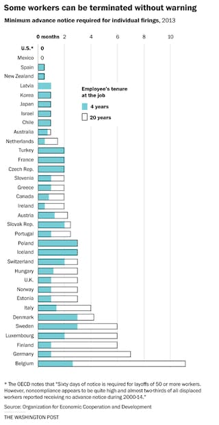
It uses a series of bar charts to show the dataset and reveal how the United States fares poorly compared to its peers. The chart above looks at the earning needed for termination from employment and the differences are stark. The outlined bar chart shows longer tenured employees and the full bars as coloured. Of course this makes it look like a stacked bar chart or filled bar chart. Instead I wonder if a dot plot would be clearer. It would eliminate the confusion in determining what if any share of the empty bar is held by the full bar.

The US offers shockingly little assistance to people

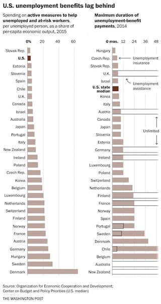
The chart for unemployment insurance versus assistance is a bit better. Here the bar represents insurance and the lines assistance. I like how the lines continue off beyond the margins to indicate an unlimited timeframe for assistance. However, for those countries where assistance is short-lived, the bars versus lines again begin to look like an instance of a share of a total, which they are not.

Vive la France

Emmanuel Macron won the French presidential election yesterday. So Guess what we have a graphic or two of this week? If you guessed Mongolian puppies, you were wrong.

Thursday afternoon the Wall Street Journal—they seem to really be upping their game of late—published an article breaking down the connection between a Le Pen support in the first round and unemployment. For me, the key to the article was the following graphic, which plots those two variables by department. The departments that she won, generally speaking, suffer higher unemployment.

Unemployment and Len Pen support

Colour coding relates to the winner of the department. I am not certain that the size of the voters in the department matters as much. But the annotation of particular departments, qualified as being limited to the French mainland—see my problem back in April about when France is more than France—flows through the several graphics in the piece.

This is a piece from the Thursday running up to Sunday’s vote. Tomorrow we will look at a piece from the day before the vote that looked at another key component of Macron’s win.

Credit for the piece goes to Martin Burch and Renée Rigdon.